The Future of Web Dev
The Future of Web Dev
26+ Animated React Components for Next.js – Vengeance UI
A UI component library for Next.js with animated buttons, heroes, and interactive elements. Uses Radix UI and Tailwind CSS with CLI installation.
Vengeance UI is a collection of modern, animated UI components for React/Next.js applications. Built with Radix UI primitives and Tailwind CSS for styling.
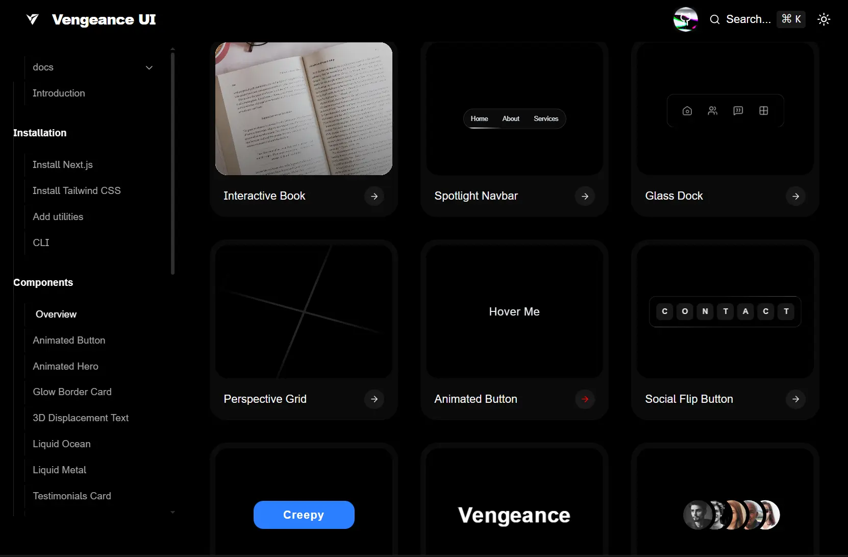
The library includes 26+ UI components ranging from animated buttons and hero sections to interactive books and perspective grids. It also includes a CLI that allows you to add the components directly into your project’s source directory.
Features
✨ 26+ Production Components: Animated buttons, hero sections, glow border cards, 3D displacement text, liquid effects, testimonial cards, flip text, creepy buttons, masked avatars, dock interfaces, pixelated image trails, perspective grids, social flip buttons, interactive books, spotlight navbars, staggered grids, expandable bento grids, flip fade text, folder previews, light lines, line hover links, logo sliders, stacked logos, animated numbers, and reveal loaders.
🎨 Radix UI Foundation: Components use Radix UI primitives for accessibility features, keyboard navigation, and focus management.
💅 Tailwind CSS Styling: All styling runs through Tailwind utility classes with zero custom CSS files required.
📦 CLI Component Installation: The Vengeance UI CLI copies individual component source files into your project rather than installing npm packages.
🔧 Full Source Control: Components install as editable TypeScript files in your src directory so you can customize behavior and styling.
⚡ Framer Motion Animations: Animation components leverage Framer Motion for smooth transitions and interactive effects.
🛠️ TypeScript Support: All components ship with TypeScript definitions and type safety.
Use Cases
- Landing Page: Build animated landing pages with hero sections, testimonial cards, and interactive elements that grab user attention.
- Dashboard: Create admin panels or analytics dashboards using dock navigation, expandable bento grids, and staggered layouts.
- Portfolio Websites: Showcase work with interactive books, folder previews, pixelated image trails, and flip text animations.
- Marketing Sites: Deploy social proof sections with logo sliders, testimonial cards, and animated CTAs that drive conversions.
How to Use It
1. Create a new Next.js project with the required configuration. Run the command to initialize a TypeScript project with Tailwind CSS, ESLint, App Router, and src directory structure.
npx create-next-app@latest my-app --typescript --tailwind --eslint --app --src-dir --import-alias '@/*'2. Navigate into your project directory.
cd my-app3. Install Tailwind CSS and its dependencies if your project lacks them.
npm install tailwindcss @tailwindcss/postcss postcss4. Create or update the PostCSS configuration file at the project root.
// postcss.config.mjs
export default {
  plugins: {
    "@tailwindcss/postcss": {},
  },
};
5. Import Tailwind directives in your global CSS file.
/* src/app/globals.css */
@import "tailwindcss";
6. Create a utilities file to handle conditional class merging. Add this helper function to combine Tailwind classes without conflicts.
// src/lib/utils.ts
import { ClassValue, clsx } from "clsx";
import { twMerge } from "tailwind-merge";
export function cn(...inputs: ClassValue[]) {
  return twMerge(clsx(inputs));
}
7. Install the required dependencies for class manipulation and animations.
npm install framer-motion clsx tailwind-merge lucide-react8. Install individual components using the Vengeance UI CLI tool. The CLI copies component source code into your project rather than adding npm dependencies.
npx vengeance-ui add [component-name]For example, add the animated button component to your project.
npx vengeance-ui add animated-button9. Initialize Vengeance UI in your project to set up the basic configuration.
npx vengeance-ui init10. List all available components to see what you can install.
npx vengeance-ui list11. Import installed components directly from your components directory. Components land in your src folder as editable files.
import AnimatedButton from "@/components/ui/animated-button"
export function AnimatedButtonDemo() {
return (
  <AnimatedButton>
    Get Started
  </AnimatedButton>
)
}
Related Resources
- Shadcn UI: A collection of re-usable components built with Radix UI and Tailwind CSS.
- Framer Motion: The production-ready motion library for React that powers Vengeance UI animations.
FAQs
Q: Can I modify the component code after installation?
A: Yes. Components install as source files in your project directory. Edit TypeScript files directly to change styling, behavior, or animation parameters.
Q: How do I update components after installation?
A: Run the add command again to overwrite existing component files. Back up custom modifications before updating since the CLI replaces files completely.
Q: Do animations affect page load performance?
A: Framer Motion loads asynchronously and components lazy load by default. Bundle size increases based on which components you install since unused components stay out of the build.