The Future of Web Dev
The Future of Web Dev
Vercel-like Scroll-aware Header Nav for Next.js – Animated Header
Add Vercel-style animated headers to Next.js projects. Features scroll detection, sticky positioning, animated tabs, and Motion-powered transitions.
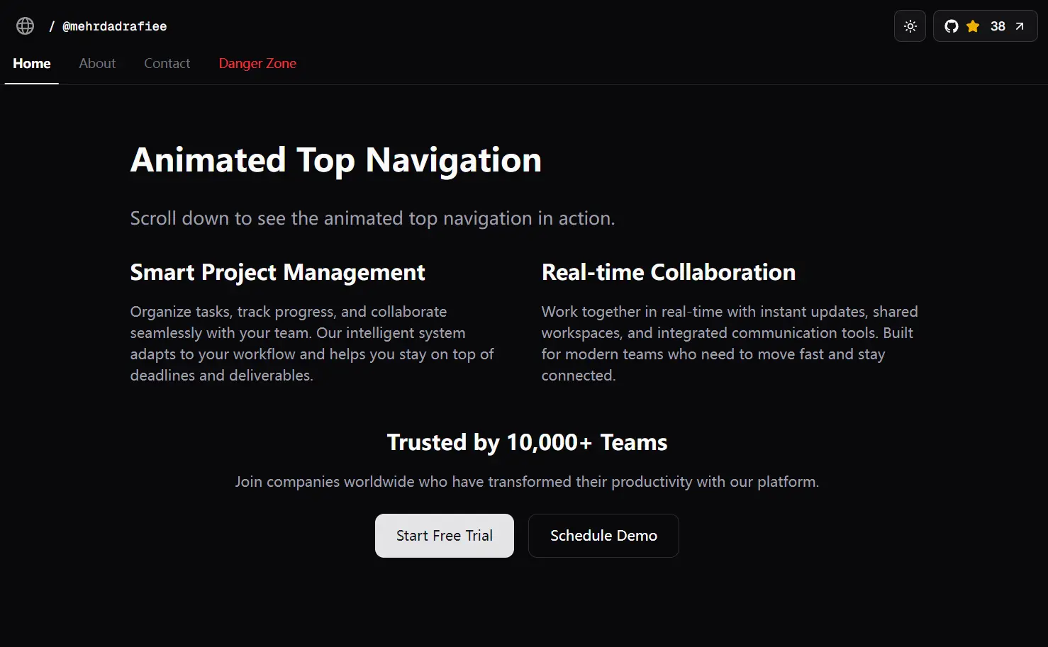
Animated Header is a UI component that allows you to create a sticky, scroll-aware navigation bar. Built with Next.js, shadcn/ui, and TailwindCSS.
This component replicates the header navigation experience on Vercel.com. It handles scroll event listening and state management internally to adjust the scale of the logo and the horizontal position of the navigation tabs
Features
🎯 Scroll-Aware Animations: The component detects scroll position and scales the logo while shifting navigation tabs horizontally based on scroll depth.
⚡ Sticky Navigation: The header remains fixed at the top of the viewport with proper z-index layering and background styling.
🎨 Animated Tabs: Navigation links feature a sliding background effect that tracks the active or hovered item.
📱 Motion-Powered Transitions: Uses Motion (Framer Motion) for smooth, performant animations with configurable easing and duration.
How to Use It
1. Clone the repository and install dependencies using pnpm. The project requires Next.js with the app directory structure enabled.
git clone https://github.com/mehrdadrafiee/animated-header.git
cd animated-header
pnpm install
2. Start the development server to preview the component at localhost:3000.
pnpm dev3. Import the AnimatedHeader component into your Next.js application layout or page files. The component must be placed within a client component context since it uses React hooks for scroll detection.
import AnimatedHeader from "@/components/shared/AnimatedHeader";
export default function Layout({ children }) {
  return (
    <>
      <AnimatedHeader />
      {children}
    </>
  );
}
4. Configure the tabs array within the component to match your site structure. Each tab object requires a label, value, and href property for routing.
const tabs = [
  { label: "Home", value: "home", href: "/" },
  { label: "About", value: "about", href: "/about" },
  { label: "Services", value: "services", href: "/services" },
  { label: "Contact", value: "contact", href: "/contact" },
];
5. Customize the GitHub repository integration by replacing the API endpoint URL with your repository path. The component fetches star counts on mount through the fetchStarsCount function.
const fetchStarsCount = async () => {
  const res = await fetch("https://api.github.com/repos/your-username/your-repo");
  const data = await res.json();
  setStarsCount(data.stargazers_count || 0);
};
6. Adjust scroll animation parameters in the motion.div animate properties. The scale calculation uses a multiplier that you can modify for different animation speeds.
<motion.div
  animate={{
    scale: Math.max(0.8, 1 - (scrollY * 0.006))
  }}
  transition={{
    duration: 0.1,
    ease: "linear"
  }}
>
7. Modify the horizontal tab shift by changing the x-axis animation value. The current implementation moves tabs right as users scroll down.
<motion.div
  animate={{
    x: Math.min(scrollY * 0.5, 40)
  }}
  transition={{
    duration: 0.05,
    ease: "linear"
  }}
>
8. Replace the logo SVG file in the public directory and update the Image component src path. The component applies dark mode inversion through the dark:invert Tailwind class.
<Image
  src="/your-logo.svg"
  alt="Logo"
  width={20}
  height={20}
  className="dark:invert"
/>
API Reference
- scrollY: State variable that stores the current vertical scroll position in pixels. Updated through a scroll event listener attached to the window object.
- starsCount: State variable that holds the GitHub repository star count fetched from the GitHub API. Defaults to 0 if the API request fails.
- fetchStarsCount: Async function that retrieves repository data from the GitHub API and updates the starsCount state with the stargazers_count value.
- tabs: Array of navigation tab objects containing label, value, and href properties. Passed to the AnimatedTabs component for rendering navigation links.
- scale animation: Motion property that shrinks the logo from 1 to 0.8 based on scroll position. Calculated as Math.max(0.8, 1 – (scrollY * 0.006)).
- x animation: Motion property that shifts the navigation tabs horizontally. Calculated as Math.min(scrollY * 0.5, 40) with a maximum offset of 40 pixels.
- transition.duration: Controls animation speed for both scale and horizontal movement. Set to 0.1 seconds for logo scaling and 0.05 seconds for tab shifting.
- transition.ease: Defines the easing function for animations. Both animations use “linear” easing for consistent motion throughout the scroll range.
Related Resources
- Next.js Documentation: Official guide for building React applications with server-side rendering and static site generation.
- Motion (Framer Motion): Animation library for React that powers the scroll-based transitions in this component.
- Shadcn/UI: Component library providing the Button and other UI primitives used in the header implementation.
- Animated Tabs: Companion component integrated into this project for interactive tab navigation with smooth transitions.
FAQs
Q: Can I use this component outside of Next.js projects?
A: The component depends on Next.js-specific features like the Image and Link components. You can adapt it for standard React applications by replacing these with regular img tags and anchor elements, but you’ll need to handle image optimization and routing differently.
Q: How do I change the scroll animation speed?
A: Modify the multiplier values in the animate properties. For the logo scale, adjust the 0.006 value in the calculation (scrollY * 0.006). For tab movement, change the 0.5 multiplier in (scrollY * 0.5). Higher values create faster animations.
Q: Can I animate other header elements based on scroll position?
A: Yes, you can apply the same pattern to any element within the header. Access the scrollY state variable and create motion.div wrappers with custom animate properties.