The Future of Web Dev
The Future of Web Dev
Unstyled Emoji Picker for Nuxt.js – Vue Frimousse
Lightweight emoji picker built for Vue & Nuxt. Works with shadcn/vue and supports custom styling through Tailwind or CSS-in-JS.
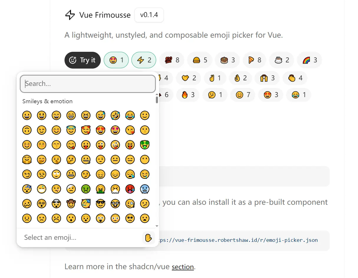
Vue Frimousse is an emoji picker component that adds unstyled, composable emoji selection to your Vue/Nuxt.js applications.
The component breaks the picker into modular parts. You can compose Root, Search, Viewport, and List components to build the interface you need.
It fetches current emoji data at runtime and caches it locally. Unsupported emojis hide automatically based on your browser’s Unicode support.
Features
🎯 1:1 React Port: Matches the React Frimousse emoji picker feature for feature across all functionality.
🚀 Vue 3 Composition API: Uses modern Vue 3 patterns and TypeScript for type safety.
🎨 Unstyled Components: Parts ship without preset styles. You can style them with Tailwind CSS, CSS-in-JS, or vanilla CSS.
🔄 Live Emoji Data: Fetches the latest emoji dataset when needed and stores it in browser cache.
🔣 Unicode Filtering: Hides emojis your browser cannot display automatically.
♿️ Keyboard Navigation: Works with screen readers and keyboard controls for accessibility.
Use Cases
- Chat Interfaces: Add emoji reactions or message formatting to messaging apps.
- Content Editors: Let users insert emojis into posts, comments, or documentation.
- Design Systems: Integrate a custom-styled emoji picker that matches your brand guidelines.
- Form Enhancements: Give users emoji selection in feedback forms or survey responses.
How to Use It
Table Of Contents
- Installation
- Basic Setup
- Handling Emoji Selection
- Styling the Picker
- Using with shadcn/vue
- Popover Integration
- Custom Styling Patterns
- EmojiPicker.Root
- EmojiPicker.Search
- EmojiPicker.Viewport
- EmojiPicker.List
- EmojiPicker.Loading
- EmojiPicker.Empty
- EmojiPicker.SkinToneSelector
- EmojiPicker.SkinTone
- EmojiPicker.ActiveEmoji
- useSkinTone Composable
- useActiveEmoji Composable
Installation
Install the package
npm install vue-frimousse
# or
pnpm add vue-frimousse
# or
yarn add vue-frimousse
For shadcn/vue projects, install the pre-built component through the CLI:
npx shadcn-vue@latest add https://vue-frimousse.robertshaw.id/r/emoji-picker.jsonBasic Setup
Import the EmojiPicker namespace and compose the parts you need. The picker breaks into Root, Search, Viewport, and List components.
<template>
  <EmojiPicker.Root>
    <EmojiPicker.Search />
    <EmojiPicker.Viewport>
      <EmojiPicker.Loading>Loading…</EmojiPicker.Loading>
      <EmojiPicker.Empty>No emoji found.</EmojiPicker.Empty>
      <EmojiPicker.List />
    </EmojiPicker.Viewport>
  </EmojiPicker.Root>
</template>
<script setup lang="ts">
import { default as EmojiPicker } from "vue-frimousse";
</script>
The components render without styles by default. You apply styling through Tailwind classes, CSS-in-JS, inline styles, or by targeting the [frimousse-*] attributes on each part.
Handling Emoji Selection
Pass an onEmojiSelect callback to Root to capture when users pick an emoji:
<template>
  <EmojiPicker.Root :onEmojiSelect="onEmojiClick">
    <EmojiPicker.Search placeholder="Search..." />
    <EmojiPicker.Viewport>
      <EmojiPicker.List />
    </EmojiPicker.Viewport>
  </EmojiPicker.Root>
</template>
<script setup lang="ts">
import { default as EmojiPicker } from 'vue-frimousse'
import type { EmojiPickerEmoji } from 'vue-frimousse'
const onEmojiClick = (emoji: EmojiPickerEmoji) => {
  console.log('Selected emoji:', emoji)
}
</script>
The callback receives an emoji object with properties like the emoji character and its label.
Styling the Picker
The library includes minimal sizing and overflow defaults. You control all visual styling. Here’s an example with Tailwind CSS:
<template>
  <EmojiPicker.Root
    :onEmojiSelect="onEmojiClick"
    class="flex flex-col w-fit h-[372px] bg-white dark:bg-neutral-900 rounded-xl border border-neutral-200 dark:border-neutral-800"
  >
    <EmojiPicker.Search
      class="mt-2 mx-2 px-2.5 py-2 bg-neutral-100 dark:bg-neutral-800 text-neutral-800 dark:text-neutral-400 rounded-md text-sm placeholder:text-neutral-500"
      placeholder="Search..."
    />
    <EmojiPicker.Loading class="absolute inset-0 flex items-center justify-center text-neutral-500 text-sm">
      <div class="p-6 text-center">
        🔄 Loading emojis...
      </div>
    </EmojiPicker.Loading>
    <EmojiPicker.Empty class="absolute inset-0 flex items-center justify-center text-neutral-500 text-sm">
      <template #default="{ search }">
        <div class="p-6 text-center">
          😕 No emojis found for "{{ search }}"
        </div>
      </template>
    </EmojiPicker.Empty>
    <EmojiPicker.Viewport class="relative flex-1">
      <EmojiPicker.List class="pb-3" row-class="px-1.5">
        <template #category-header="{ category }">
          <div class="bg-white dark:bg-neutral-900 px-3 pt-3 pb-1.5 text-neutral-600 dark:text-neutral-400 text-xs font-medium">
            {{ category.label }}
          </div>
        </template>
        <template #emoji="{ emoji }">
          <button
            :class="[
              'flex size-8 items-center justify-center rounded-md text-lg',
              emoji.isActive ? 'bg-neutral-100 dark:bg-neutral-800' : ''
            ]"
          >
            {{ emoji.emoji }}
          </button>
        </template>
      </EmojiPicker.List>
    </EmojiPicker.Viewport>
  </EmojiPicker.Root>
</template>
<script setup lang="ts">
import { default as EmojiPicker } from 'vue-frimousse'
import type { EmojiPickerEmoji } from 'vue-frimousse'
const onEmojiClick = (emoji: EmojiPickerEmoji) => {
  console.log('Selected emoji:', emoji)
}
</script>
Using with shadcn/vue
The shadcn/vue version wraps the base components with preconfigured styles. Install it through the CLI:
npx shadcn-vue@latest add https://vue-frimousse.robertshaw.id/r/emoji-picker.jsonImport the wrapped components from your UI directory:
<template>
  <EmojiPicker class="h-[325px]" @emoji-select="onEmojiClick">
    <EmojiPickerSearch />
    <EmojiPickerContent />
  </EmojiPicker>
</template>
<script setup lang="ts">
import {
  EmojiPicker,
  EmojiPickerSearch,
  EmojiPickerContent
} from '~/components/ui/emoji-picker'
import type { EmojiPickerEmoji } from 'vue-frimousse'
const onEmojiClick = (emoji: EmojiPickerEmoji) => {
  console.log('Selected emoji:', emoji)
}
</script>
You can combine it with other shadcn/vue components like Popover:
<template>
  <Popover v-model:open="isOpen">
    <PopoverTrigger as-child>
      <Button>Open emoji picker</Button>
    </PopoverTrigger>
    <PopoverContent class="w-fit p-0 rounded-xl">
      <EmojiPicker class="h-[342px]" @emoji-select="handleEmojiSelect">
        <EmojiPickerSearch />
        <EmojiPickerContent />
        <EmojiPickerFooter />
      </EmojiPicker>
    </PopoverContent>
  </Popover>
</template>
<script setup lang="ts">
import { ref } from 'vue'
import { Button } from '~/components/ui/button'
import { Popover, PopoverContent, PopoverTrigger } from '~/components/ui/popover'
import {
  EmojiPicker,
  EmojiPickerSearch,
  EmojiPickerContent,
  EmojiPickerFooter
} from '~/components/ui/emoji-picker'
import type { EmojiPickerEmoji } from 'vue-frimousse'
const handleEmojiSelect = (emoji: EmojiPickerEmoji) => {
  isOpen.value = false
  console.log(emoji)
}
const isOpen = ref(false)
</script>
Popover Integration
You can wrap the picker in any popover component. The library works with Reka UI, shadcn/vue, and Nuxt UI popover implementations. Place the EmojiPicker.Root component inside your popover’s content area.
Custom Styling Patterns
The picker adapts to dynamic dimensions based on content. The --frimousse-viewport-width CSS variable tracks the viewport width. You can reference it when styling elements that should match the picker’s width:
.custom-footer {
  max-width: var(--frimousse-viewport-width);
}
For list padding, apply horizontal padding to rows and category headers. Add vertical padding to the list itself. Set scroll-margin-block on rows to match the vertical padding for smooth keyboard navigation:
.emoji-list {
  padding-block: 12px;
}
.emoji-row {
  padding-inline: 6px;
  scroll-margin-block: 12px;
}
You can create colorful hover states with nth-child selectors. This example alternates through red, green, and blue backgrounds on active emoji buttons:
<template #emoji="{ emoji }">
  <button
    :class="[
      'flex size-8 items-center justify-center rounded-md text-lg',
      emoji.isActive ? 'active-emoji' : ''
    ]"
  >
    {{ emoji.emoji }}
  </button>
</template>
<style scoped>
.emoji-row:nth-child(odd) .active-emoji:nth-child(3n+1) {
  background-color: #fee;
}
.emoji-row:nth-child(odd) .active-emoji:nth-child(3n+2) {
  background-color: #efe;
}
.emoji-row:nth-child(odd) .active-emoji:nth-child(3n+3) {
  background-color: #eef;
}
</style>
Another approach duplicates the emoji as a pseudo-element, scales it to fill the background, and blurs it:
<template #emoji="{ emoji }">
  <button
    :class="[
      'relative flex size-8 items-center justify-center rounded-md text-lg overflow-hidden',
      emoji.isActive ? 'emoji-blur-bg' : ''
    ]"
  >
    {{ emoji.emoji }}
  </button>
</template>
<style scoped>
.emoji-blur-bg::before {
  content: attr(data-emoji);
  position: absolute;
  inset: 0;
  font-size: 3rem;
  filter: blur(8px);
  opacity: 0.3;
  z-index: -1;
}
</style>
API Reference
EmojiPicker.Root
Wraps all picker parts and controls global settings.
Props:
onEmojiSelect(function): Callback triggered when an emoji is selected. Receives an Emoji object with character, label, and metadata.locale(string): Picker locale for emoji labels and search. Defaults to “en”. Accepts any Emojibase-supported locale code.skinTone(string): Default skin tone preference. Options include “none”, “light”, “medium-light”, “medium”, “medium-dark”, “dark”. Defaults to “none”.columns(number): Number of emoji columns in the list grid. Defaults to 10.sticky(boolean): Makes category headers stick to the top during scroll. Defaults to true.emojiVersion(number): Sets which Emoji Unicode version to display. Defaults to the highest version your browser supports. Lower values hide newer emojis.emojibaseUrl(string): Base URL for fetching Emojibase data files. Defaults to “https://cdn.jsdelivr.net/npm/emojibase-data”. The library constructs URLs as${emojibaseUrl}/{locale}/{file}.json.
The component accepts all standard div props like className, style, and event handlers.
Attributes:
[frimousse-root]: Attribute for targeting the root element in CSS selectors.[data-focused]: Present when the picker or any of its children have focus.
CSS Variables:
--frimousse-emoji-font: Font family stack for rendering emoji characters.--frimousse-viewport-width: Measured width of the viewport container.--frimousse-viewport-height: Measured height of the viewport container.--frimousse-row-height: Measured height of a single emoji row.--frimousse-category-header-height: Measured height of category header elements.
EmojiPicker.Search
Search input for filtering emojis by name or keyword.
Props:
Accepts all standard input element props including placeholder, value, onChange, onFocus, onBlur, className, and style.
Attributes:
[frimousse-search]: Attribute for targeting the search input in CSS selectors.
EmojiPicker.Viewport
Scrolling container that holds the emoji list and manages overflow behavior.
Props:
Accepts all standard div props including className, style, and event handlers.
Attributes:
[frimousse-viewport]: Attribute for targeting the viewport element in CSS selectors.
EmojiPicker.List
Virtualized list of emojis organized by category. Customize inner components through template slots.
Props:
rowClass(string): CSS class applied to each emoji row.
The component accepts all standard div props.
Attributes:
[frimousse-list]: Attribute for targeting the list element in CSS selectors.
Template Slots:
#category-header="{ category }": Renders sticky category headers. Receives the category object with label (display name) and key (category identifier).#emoji="{ emoji }": Renders individual emoji buttons. Receives emoji object with emoji (character), label (name), and isActive (boolean for hover/keyboard state).#row="{ children }": Renders the container for each emoji row. Receives children nodes to display.
All inner components should maintain consistent dimensions to prevent layout shifts during virtualization.
Category Header Attributes:
[frimousse-category-header]: Attribute for targeting category headers in CSS.
Row Attributes:
[frimousse-row]: Attribute for targeting row elements in CSS.
Emoji Button Attributes:
[frimousse-emoji]: Attribute for targeting emoji buttons in CSS.[data-active]: Present when the emoji is hovered or selected via keyboard navigation.
EmojiPicker.Loading
Displays a loading message while emoji data fetches from the network.
Props:
Children prop accepts any content to display during loading state. Accepts all standard span props.
Attributes:
[frimousse-loading]: Attribute for targeting the loading state in CSS.
EmojiPicker.Empty
Shows when search returns no matching emojis.
Props:
Accepts all standard span props. Use the default slot with { search } parameter to access the current search term.
Usage:
<EmojiPicker.Empty>
  <template #default="{ search }">
    No emojis found for "{{ search }}"
  </template>
</EmojiPicker.Empty>
Attributes:
[frimousse-empty]: Attribute for targeting the empty state in CSS.
EmojiPicker.SkinToneSelector
Button that cycles through available skin tone variations when clicked.
Props:
emoji(string): Emoji to display skin tone variations for. Defaults to “✋” (raised hand).
Accepts all standard button props including onClick, className, and style.
Attributes:
[frimousse-skin-tone-selector]: Attribute for targeting the selector in CSS.
EmojiPicker.SkinTone
Exposes current skin tone state and controls through a render callback.
Slots:
#default="{ skinTone, setSkinTone, skinToneVariations }": Receives current skin tone setting, function to update it, and array of variations for the specified emoji.
Props:
emoji(string): Emoji to generate variations for. Defaults to “✋” (raised hand).
Usage:
<EmojiPicker.SkinTone emoji="👋">
  <template #default="{ skinTone, setSkinTone, skinToneVariations }">
    <button
      v-for="{ skinTone, emoji } in skinToneVariations"
      :key="skinTone"
      @click="() => setSkinTone(skinTone)"
    >
      {{ emoji }}
    </button>
  </template>
</EmojiPicker.SkinTone>
EmojiPicker.ActiveEmoji
Exposes the currently active emoji through a render callback. Active means either hovered with mouse or selected via keyboard navigation.
Slots:
#default="{ emoji }": Receives the active emoji object or null when no emoji is active.
Usage:
<EmojiPicker.ActiveEmoji>
  <template #default="{ emoji }">
    <div v-if="emoji">
      <span>{{ emoji.emoji }}</span>
      <span>{{ emoji.label }}</span>
    </div>
    <span v-else>Hover over an emoji</span>
  </template>
</EmojiPicker.ActiveEmoji>
useSkinTone Composable
Returns skin tone state and controls as reactive refs.
Usage:
import { useSkinTone } from 'vue-frimousse'
const { skinTone, setSkinTone, skinToneVariations } = useSkinTone("👋")
Parameters:
emoji(string): Emoji to generate variations for. Defaults to “✋” (raised hand).
Returns:
skinTone(Ref): Current skin tone setting as a reactive reference.setSkinTone(function): Function to update the skin tone preference.skinToneVariations(Ref): Array of skin tone variations for the provided emoji, each containing skinTone and emoji properties.
useActiveEmoji Composable
Returns the currently active emoji as a reactive ref.
Usage:
import { useActiveEmoji } from 'vue-frimousse'
const activeEmoji = useActiveEmoji()
Returns:
activeEmoji(Ref): The active emoji object or null when no emoji is active. Updates reactively as users hover or navigate.
Related Resources
- shadcn/vue: Component library for Vue 3 with Tailwind CSS integration and accessible primitives.
- Emojibase: Emoji dataset library that powers the picker’s Unicode data and localization.
FAQs
Q: How do I change the number of emoji columns?
A: Set the columns prop on EmojiPicker.Root. The default is 10 columns. Adjust this based on your container width.
Q: Does the picker work offline after the first load?
A: Yes. The library caches emoji data in browser storage after the initial fetch. Subsequent loads pull from cache instead of the network.
Q: Can I limit which emoji versions appear?
A: Set the emojiVersion prop to control which Unicode versions display. This filters out newer emojis that may not render on older browsers or operating systems.

