The Future of Web Dev
The Future of Web Dev
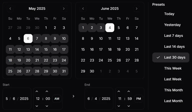
Advanced Date, Time & Date Range Picker Components for shadcn/ui
Advanced date and time selection components for shadcn/ui projects. Perfect for forms, dashboards, and booking applications.
ShadCN Date Time Picker is a collection of reusable components for React applications that require date and time selection.
The collection offers several variations, including single date pickers, date range selectors, and combined date and time inputs in both 12-hour and 24-hour formats.
Features
📱 Responsive design that adapts to mobile and desktop interfaces.
🎨 Consistent styling that follows ShadCN design principles.
✅ Built-in form validation support with React Hook Form and Zod integration.
🔧 Customizable styling and behavior through component props.
♿ Accessibility features including keyboard navigation and screen reader support.
📦 TypeScript support with full type definitions.
Use Cases
- Booking and Reservation Systems. Allow users to select check-in and check-out dates or schedule appointments.
- Data Filtering. Filter data tables or analytics dashboards by a specific date or a date range.
- User Profile Forms. Let users input their date of birth or other important dates in a structured format.
- Event Schedulers. Create forms for scheduling events, webinars, or meetings with specific start and end times.
How to Use It
1. Set up shadcn/ui in your project and follow the prompts to configure settings like your tailwind.config.js and global CSS files.
npx shadcn-ui@latest init2. Add the individual components that the date pickers depend on. These include the Button, Calendar, and Popover.
npx shadcn-ui@latest add button
npx shadcn-ui@latest add calendar
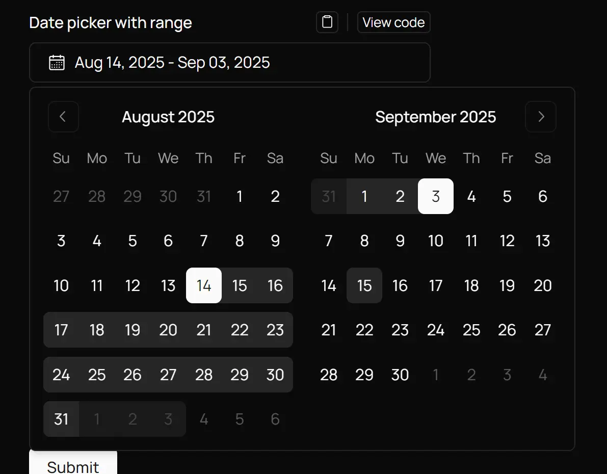
npx shadcn-ui@latest add popover3. Create a Date Range Picker:
// date-picker-range.tsx
"use client"

import * as React from "react"
import { CalendarIcon } from "@radix-ui/react-icons"
import { addDays, format } from "date-fns"
import { DateRange } from "react-day-picker"

import { cn } from "@/lib/utils"
import { Button } from "@/components/ui/button"
import { Calendar } from "@/components/ui/calendar"
import {
  Popover,
  PopoverContent,
  PopoverTrigger,
} from "@/components/ui/popover"

export function DatePickerWithRange({
  className,
}: React.HTMLAttributes<HTMLDivElement>) {
  const [date, setDate] = React.useState<DateRange | undefined>({
    from: new Date(),
    to: addDays(new Date(), 20),
  })

  return (
    <div className={cn("grid gap-2", className)}>
      <Popover>
        <PopoverTrigger asChild>
          <Button
            id="date"
            variant={"outline"}
            className={cn(
              "w-full justify-start text-left font-normal",
              !date && "text-muted-foreground"
            )}
          >
            <CalendarIcon className="mr-2 h-4 w-4" />
            {date?.from ? (
              date.to ? (
                <>
                  {format(date.from, "LLL dd, y")} -{" "}
                  {format(date.to, "LLL dd, y")}
                </>
              ) : (
                format(date.from, "LLL dd, y")
              )
            ) : (
              <span>Pick a date</span>
            )}
          </Button>
        </PopoverTrigger>
        <PopoverContent className="w-auto p-0" align="start">
          <Calendar
            initialFocus
            mode="range"
            defaultMonth={date?.from}
            selected={date}
            onSelect={setDate}
            numberOfMonths={2}
          />
        </PopoverContent>
      </Popover>
    </div>
  )
}
4. Create a Date Picker:
// date-picker.tsx
import * as React from "react"
import { CalendarIcon } from "@radix-ui/react-icons"
import { format } from "date-fns"

import { cn } from "@/lib/utils"
import { Button } from "@/components/ui/button"
import { Calendar } from "@/components/ui/calendar"
import {
  Popover,
  PopoverContent,
  PopoverTrigger,
} from "@/components/ui/popover"

export function DatePickerDemo() {
  const [date, setDate] = React.useState<Date>()

  return (
    <Popover>
      <PopoverTrigger asChild>
        <Button
          variant={"outline"}
          className={cn(
            "w-full justify-start text-left font-normal",
            !date && "text-muted-foreground"
          )}
        >
          <CalendarIcon className="mr-2 h-4 w-4" />
          {date ? format(date, "PPP") : <span>Pick a date</span>}
        </Button>
      </PopoverTrigger>
      <PopoverContent className="w-auto p-0" align="start">
        <Calendar
          mode="single"
          selected={date}
          onSelect={setDate}
          initialFocus
        />
      </PopoverContent>
    </Popover>
  )
}
5. Create a Date Time Picker (24h):
// date-time-picker-24h.tsx
"use client";

import * as React from "react";
import { CalendarIcon } from "@radix-ui/react-icons"
import { format } from "date-fns";

import { cn } from "@/lib/utils";
import { Button } from "@/components/ui/button";
import { Calendar } from "@/components/ui/calendar";
import {
  Popover,
  PopoverContent,
  PopoverTrigger,
} from "@/components/ui/popover";
import { ScrollArea, ScrollBar } from "@/components/ui/scroll-area";

export function DateTimePicker24h() {
  const [date, setDate] = React.useState<Date>();
  const [isOpen, setIsOpen] = React.useState(false);

  const hours = Array.from({ length: 24 }, (_, i) => i);
  const handleDateSelect = (selectedDate: Date | undefined) => {
    if (selectedDate) {
      setDate(selectedDate);
    }
  };

  const handleTimeChange = (
    type: "hour" | "minute",
    value: string
  ) => {
    if (date) {
      const newDate = new Date(date);
      if (type === "hour") {
        newDate.setHours(parseInt(value));
      } else if (type === "minute") {
        newDate.setMinutes(parseInt(value));
      }
      setDate(newDate);
    }
  };

  return (
    <Popover open={isOpen} onOpenChange={setIsOpen}>
      <PopoverTrigger asChild>
        <Button
          variant="outline"
          className={cn(
            "w-full justify-start text-left font-normal",
            !date && "text-muted-foreground"
          )}
        >
          <CalendarIcon className="mr-2 h-4 w-4" />
          {date ? (
            format(date, "MM/dd/yyyy HH:mm")
          ) : (
            <span>MM/DD/YYYY HH:mm</span>
          )}
        </Button>
      </PopoverTrigger>
      <PopoverContent className="w-auto p-0">
        <div className="sm:flex">
          <Calendar
            mode="single"
            selected={date}
            onSelect={handleDateSelect}
            initialFocus
          />
          <div className="flex flex-col sm:flex-row sm:h-[300px] divide-y sm:divide-y-0 sm:divide-x">
            <ScrollArea className="w-64 sm:w-auto">
              <div className="flex sm:flex-col p-2">
                {hours.reverse().map((hour) => (
                  <Button
                    key={hour}
                    size="icon"
                    variant={date && date.getHours() === hour ? "default" : "ghost"}
                    className="sm:w-full shrink-0 aspect-square"
                    onClick={() => handleTimeChange("hour", hour.toString())}
                  >
                    {hour}
                  </Button>
                ))}
              </div>
              <ScrollBar orientation="horizontal" className="sm:hidden" />
            </ScrollArea>
            <ScrollArea className="w-64 sm:w-auto">
              <div className="flex sm:flex-col p-2">
                {Array.from({ length: 12 }, (_, i) => i * 5).map((minute) => (
                  <Button
                    key={minute}
                    size="icon"
                    variant={date && date.getMinutes() === minute ? "default" : "ghost"}
                    className="sm:w-full shrink-0 aspect-square"
                    onClick={() => handleTimeChange("minute", minute.toString())}
                  >
                    {minute.toString().padStart(2, '0')}
                  </Button>
                ))}
              </div>
              <ScrollBar orientation="horizontal" className="sm:hidden" />
            </ScrollArea>
          </div>
        </div>
      </PopoverContent>
    </Popover>
  );
}
6. Create a Date Picker form with react-hook-form & zod.
import { zodResolver } from "@hookform/resolvers/zod";
import { CalendarIcon } from "@radix-ui/react-icons";
import { format } from "date-fns";
import { useForm } from "react-hook-form";
import { z } from "zod";

import { cn } from "@/lib/utils";
import { Button } from "@/components/ui/button";
import { Calendar } from "@/components/ui/calendar";
import {
  Form,
  FormControl,
  FormDescription,
  FormField,
  FormItem,
  FormLabel,
  FormMessage,
} from "@/components/ui/form";
import {
  Popover,
  PopoverContent,
  PopoverTrigger,
} from "@/components/ui/popover";
import { toast } from "sonner";

const FormSchema = z.object({
  dob: z.date({
    required_error: "A date of birth is required.",
  }),
});

export function DatePickerForm() {
  const form = useForm<z.infer<typeof FormSchema>>({
    resolver: zodResolver(FormSchema),
  });

  function onSubmit(data: z.infer<typeof FormSchema>) {
    toast.success(`Selected date of birth: ${format(data.dob, "PPP")}`);
  }

  return (
    <Form {...form}>
      <form onSubmit={form.handleSubmit(onSubmit)} className="space-y-5">
        <FormField
          control={form.control}
          name="dob"
          render={({ field }) => (
            <FormItem className="flex flex-col">
              <FormLabel>Date of birth</FormLabel>
              <Popover>
                <PopoverTrigger asChild>
                  <FormControl>
                    <Button
                      variant={"outline"}
                      className={cn(
                        "w-full pl-3 text-left font-normal",
                        !field.value && "text-muted-foreground"
                      )}
                    >
                      {field.value ? (
                        format(field.value, "PPP")
                      ) : (
                        <span>Pick a date</span>
                      )}
                      <CalendarIcon className="ml-auto h-4 w-4 opacity-50" />
                    </Button>
                  </FormControl>
                </PopoverTrigger>
                <PopoverContent className="w-auto p-0" align="start">
                  <Calendar
                    mode="single"
                    selected={field.value}
                    onSelect={field.onChange}
                    disabled={(date) =>
                      date > new Date() || date < new Date("1900-01-01")
                    }
                    initialFocus
                  />
                </PopoverContent>
              </Popover>
              <FormDescription>
                provided by <a href="https://ui.shadcn.com/docs/components/date-picker#form" target="_blank" className="underline">shadcn</a>
              </FormDescription>
              <FormMessage />
            </FormItem>
          )}
        />
        <Button type="submit">Submit</Button>
      </form>
    </Form>
  );
}
Related Resources
- Shadcn/ui Official Documentation – Complete guide to shadcn/ui components and installation.
- React Day Picker Documentation – Official documentation for the underlying calendar component.
- Date-fns Documentation – A date utility library for formatting and manipulation.
- React Hook Form Guide – Modern forms library for React with validation support.
FAQs
Q: Can I customize the styling of the date time picker components?
A: Yes, the components use Tailwind CSS classes and can be customized through the className prop. You can also modify the underlying ShadCN UI theme variables to change the overall appearance.
Q: Does the date time picker support internationalization?
A: The components support internationalization through the date-fns library. You can import and use different locales to display dates and times in various languages and formats.
Q: How do I restrict date selection to specific ranges?
A: Use the disabled prop on the Calendar component to restrict date selection. You can pass a function that returns true for dates that should be disabled, such as past dates or dates outside a specific range.
Q: Can I disable certain dates in the calendar?
A: Yes, the Calendar component accepts a disabled prop. You can pass a function to this prop that returns true for any date you wish to disable, such as dates in the past or future.