The Future of Web Dev
The Future of Web Dev
Svelte Time Picker with Keyboard Navigation and Mobile Support
Add a lightweight and customizable time picker to your Svelte app. Integrates with shadcn/ui or works as a headless component.
This is a lightweight and customizable time picker component built for Svelte/SvelteKit apps. It works with shadcn/ui or functions as a standalone headless component.
This component is a Svelte adaptation of the React-based TimePickerInput, using svelte-shadcn components to deliver an accessible and configurable time selection UI.
Features
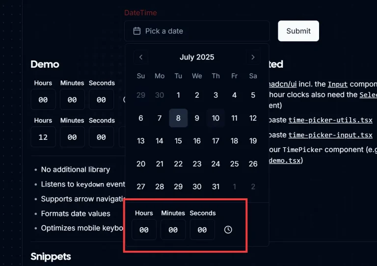
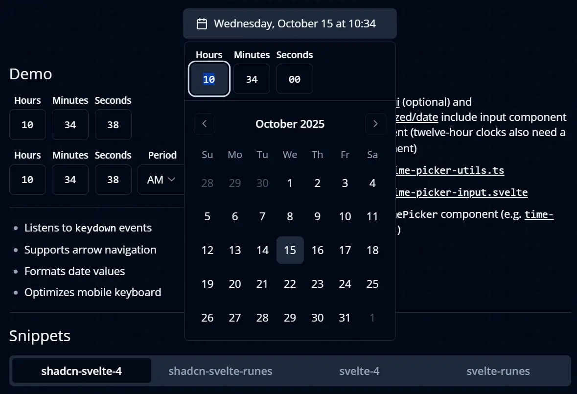
⌨️ Keyboard navigation allows users to increment or decrement time values using arrow keys.
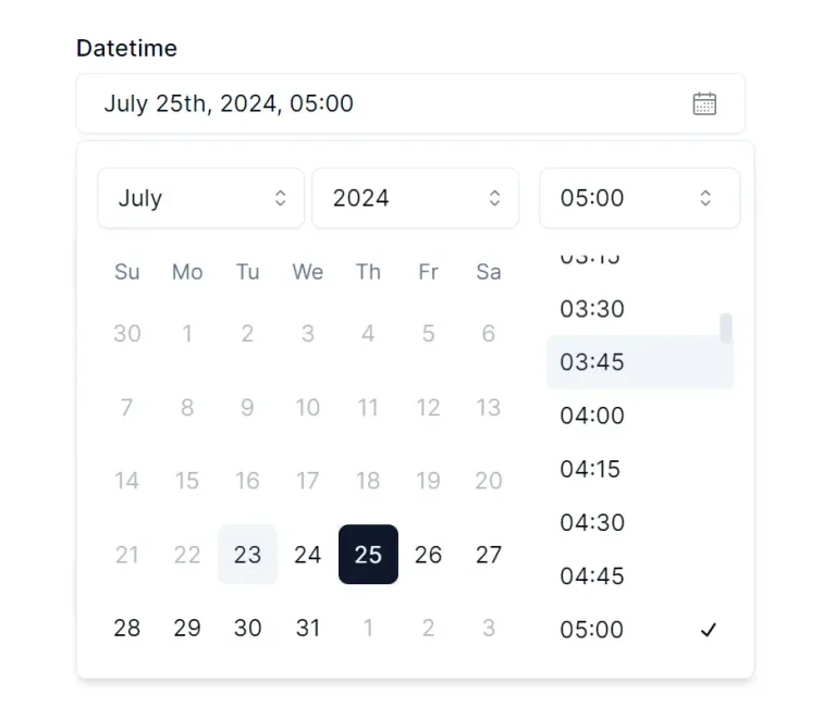
📅 Date formatting handles time values through @internationalized/date for consistent display across locales.
📱 Mobile optimization adjusts keyboard behavior for better time input on touch devices.
🎨 Headless mode enables custom styling without shadcn/ui dependencies.
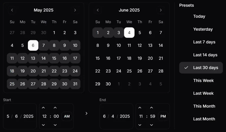
Use Cases
- Appointment Booking Systems: Allow users to select specific times for appointments or reservations.
- Event Schedulers: Let users define the start and end times for calendar events.
- Task Management Tools: Enable setting deadlines or time entries for tasks and projects.
- Delivery Services: Permit customers to choose a preferred delivery time slot.
How to Use It
1. You need SvelteKit for this setup. The component does not work with standalone Svelte projects that lack SvelteKit routing and configuration.
2. Initialize shadcn-svelte in your SvelteKit project. OPTIONAL.
npx shadcn-svelte@latest init3. Add the required input component to your project. OPTIONAL.
npx shadcn-svelte@latest add input4. Add optional UI components for enhanced functionality. The label component helps with accessibility, select enables period selection for 12-hour format, and calendar, popover, and button components support combined date and time selection.
npx shadcn-svelte@latest add select label calendar popover button5. Install the @internationalized/date package for date formatting capabilities.
npm install @internationalized/date6. Copy the time-picker-input.svelte and time-picker-utils.ts files from the repo’s /src/lib/snippets/shadcn-svelte-runes directory into your project.
7. Create a basic time picker in your Svelte component by importing the time picker input and setting up a date value.
Here’s how you implement a simple time picker in shadcn-svelte-4:
<script lang="ts">
	import { Time } from '@internationalized/date';
	import { Label } from '$lib/components/ui/label';
	import TimePickerInput from './time-picker-input.svelte';
	import { cn } from '$lib/utils';

	type $$Props = {
		time: Time | undefined;

		view?: 'labels' | 'dotted';

		setTime?: (time: Time) => void;
	};

	export let time: $$Props['time'] = new Time(0, 0);
	export let view: $$Props['view'] = 'labels';
	export let setTime: $$Props['setTime'] = undefined;

	let minuteRef: HTMLInputElement | null = null;
	let hourRef: HTMLInputElement | null = null;
	let secondRef: HTMLInputElement | null = null;
</script>

<div class={cn('flex items-center gap-2', view === 'dotted' && 'gap-1')}>
	<div class="grid gap-1 text-center">
		{#if view === 'labels'}
			<Label for="hours" class="text-xs">Hours</Label>
		{/if}

		<TimePickerInput
			picker="hours"
			bind:time
			bind:ref={hourRef}
			{setTime}
			onRightFocus={() => minuteRef?.focus()}
		/>
	</div>

	{#if view === 'dotted'}
		<span class="-translate-y-[2px]">:</span>
	{/if}

	<div class="grid gap-1 text-center">
		{#if view === 'labels'}
			<Label for="minutes" class="text-xs">Minutes</Label>
		{/if}

		<TimePickerInput
			picker="minutes"
			bind:time
			bind:ref={minuteRef}
			{setTime}
			onLeftFocus={() => hourRef?.focus()}
			onRightFocus={() => secondRef?.focus()}
		/>
	</div>

	{#if view === 'dotted'}
		<span class="-translate-y-[2px]">:</span>
	{/if}

	<div class="grid gap-1 text-center">
		{#if view === 'labels'}
			<Label for="seconds" class="text-xs">Seconds</Label>
		{/if}

		<TimePickerInput
			picker="seconds"
			bind:time
			bind:ref={secondRef}
			{setTime}
			onLeftFocus={() => minuteRef?.focus()}
		/>
	</div>
</div>
Related Resources
- svelte-shadcn provides Svelte ports of shadcn/ui components for building consistent user interfaces in SvelteKit.
- bits-ui offers unstyled, accessible UI components for Svelte that serve as building blocks for custom designs.
- @internationalized/date handles date and time manipulation across different locales and calendars.
- Original TimePicker by OpenStatus presents the React version that inspired this Svelte adaptation.
FAQs
Q: Can I use this component in a regular Svelte project without SvelteKit?
A: The shadcn/ui version requires SvelteKit because shadcn-svelte depends on SvelteKit’s file structure and configuration. You can use the headless version in regular Svelte projects, but you need to handle the component imports and dependencies manually.
Q: How do I change the time format to 12-hour instead of 24-hour?
A: Add a select component for period selection and adjust the hour values based on the selected AM or PM period. The component outputs values in 24-hour format, so you need to convert them in your application logic when displaying or storing times.
Q: Does the component support seconds and milliseconds?
A: Yes. Set the granularity prop to “second” or “millisecond” to enable finer time precision. The component will display additional input fields for these values.
Q: Can I customize the input styling?
A: The shadcn/ui version uses Tailwind classes that you can override by modifying the component file. The headless version accepts custom class names through the class prop.
Q: How do I handle time validation and constraints?
A: The component uses @internationalized/date, which provides built-in validation for valid time ranges. You can add custom validation by checking the bound value against your requirements and displaying error messages based on your form state.