The Shadcn Timeline Component allows you to create customizable, animated chronological displays in your React web applications.
It is fully typed with TypeScript and compatible with server-side rendering, handling client-side date hydration to prevent mismatches.
Features
🎨 Multiple size options and color themes for different design needs
🎪 Multiple status states including completed, in-progress, and pending
♿️ Built-in accessibility features with proper ARIA attributes
🔄 Loading states and error handling for dynamic data
🎭 Smooth animations powered by Framer Motion
🌐 Server-side rendering compatibility with proper hydration handling
📚 Complete Storybook documentation with interactive examples
🔧 Copy-and-paste installation with full source code ownership
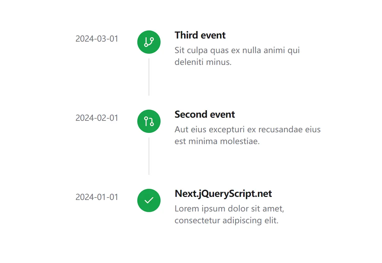
Preview

Use Cases
- Project Roadmaps: Display key milestones, deadlines, and phases for software or business projects.
- Activity Feeds: Show a chronological log of user actions, system notifications, or updates within an application.
- Version History: Detail the release history of a product, including new features, bug fixes, and changes for each version.
- Company Milestones: Present a company’s history, showcasing significant achievements and product launches in a clear format.
Installation
# Clone the repository
git clone https://github.com/timDeHof/shadcn-timeline.git
# Install dependencies
npm install
# Run Storybook locally
npm run storybook
Usage
1. Import Timeline and TimelineItem into your React file. You can then structure your timeline by nesting TimelineItem components within a Timeline wrapper. Each item can be configured with props for the date, title, description, and status.
import { Timeline, TimelineItem } from '@/components/timeline';
import { Check } from 'lucide-react';
export default function Example() {
  return (
    <Timeline>
      <TimelineItem
        date={new Date('2024-01-01')}
        title="Feature Released"
        description="New timeline component is now available"
        icon={<Check />}
        status="completed"
      />
      <TimelineItem
        date={new Date('2024-01-02')}
        title="In Progress"
        description="Working on documentation"
        status="in-progress"
      />
      <TimelineItem
        date={new Date('2024-01-03')}
        title="Upcoming"
        description="Planning future updates"
        status="pending"
      />
    </Timeline>
  );
}
2. Available component props
Timeline Props
- size:
'sm' | 'md' | 'lg'(default:'md') – Sets the overall size of the timeline. - iconsize:
'sm' | 'md' | 'lg'(default:'md') – Defines the size of the icons within the timeline.
TimelineItem Props
- date:
Date | string | number– Specifies the date of the timeline event. - title:
string– Sets the title for the timeline event. - description:
string– Provides a description for the event. - icon:
ReactNode– Allows you to use a custom React component as the icon. - iconColor:
'primary' | 'secondary' | 'muted' | 'accent'(default:'primary') – Determines the color theme of the icon. - status:
'completed' | 'in-progress' | 'pending'(default:'completed') – Indicates the current status of the event. - loading:
boolean(default:false) – Toggles the loading state display for the item. - error:
string– Shows an error message for the item if a string is provided.
TimelineTime Props
- className:
string– Allows for adding extra CSS classes for custom styling. - date:
Date | string | number– The date that will be displayed and formatted. - format:
string | Intl.DateTimeFormatOptions– Specifies the formatting options for the date.
Related Resources
- shadcn/ui: The foundational component library that provides the design system and base components for building consistent user interfaces. Visit the official documentation at https://ui.shadcn.com for installation guides and component references.
- Framer Motion: Animation library used for smooth transitions and interactive effects within the timeline component. Learn more about animation patterns and configuration options at https://www.framer.com/motion/.
- Tailwind CSS: Utility-first CSS framework that powers the styling system for responsive design and theme customization. Explore the complete utility reference at https://tailwindcss.com/docs.
FAQs
Q: Does the component work with server-side rendering frameworks like Next.js?
A: Yes, the component handles server-side rendering properly and prevents hydration mismatches by managing date formatting on the client side.
Q: Can I customize the appearance of timeline items beyond the provided props?
A: Yes, since you own the source code after installation, you can modify the component styling and add custom CSS classes to match your design requirements.
Q: What happens if I need to display a large number of timeline items?
A: The component supports virtualization patterns and you can implement pagination or infinite scrolling by managing the data passed to the Timeline component.
Q: How do I handle dynamic data loading with the timeline component?
A: The TimelineItem component includes loading and error props that you can use to show loading states and error messages while fetching data from APIs.


