The Future of Web Dev
The Future of Web Dev
Composable Chart Components Built on Shadcn/UI – Bklit UI
A chart component library for Next.js that renders line, area, ring, and radar charts through composable React components.
Bklit UI is a chart component library that extends shadcn/ui with data visualization components.
It renders line charts, area charts, ring charts, radar charts, and legend components through a composable API.
You can combine individual chart elements like Grid, XAxis, and ChartTooltip to build the exact visualization you need.
Features
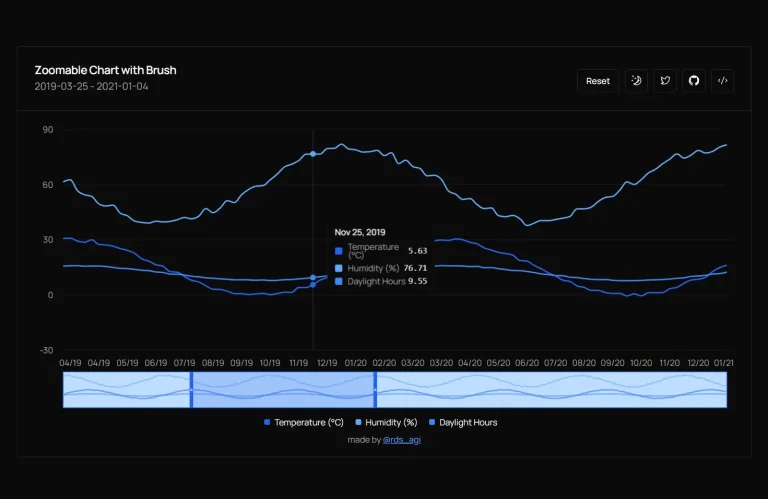
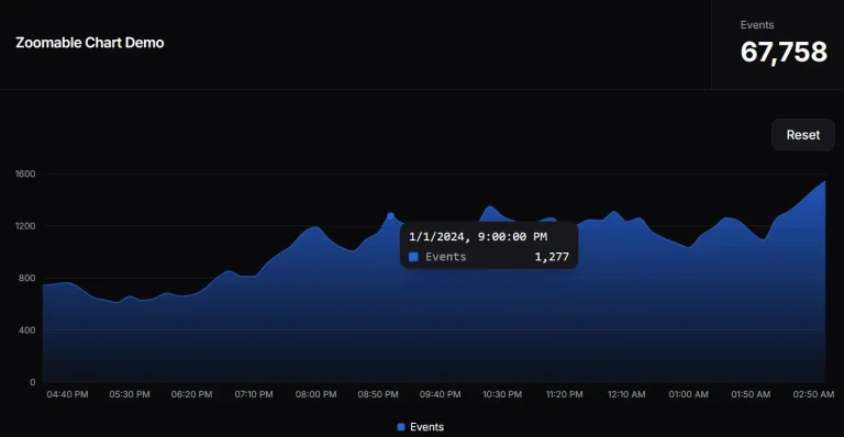
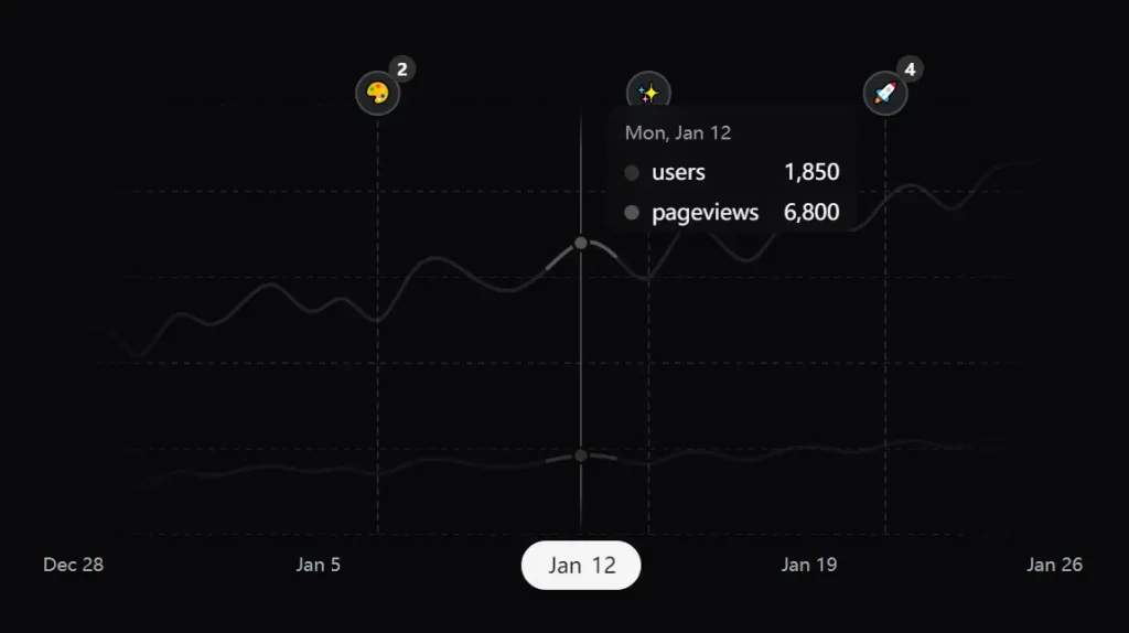
📊 Line Chart Component: Renders time series data with customizable lines, grid overlays, and tooltip interactions.
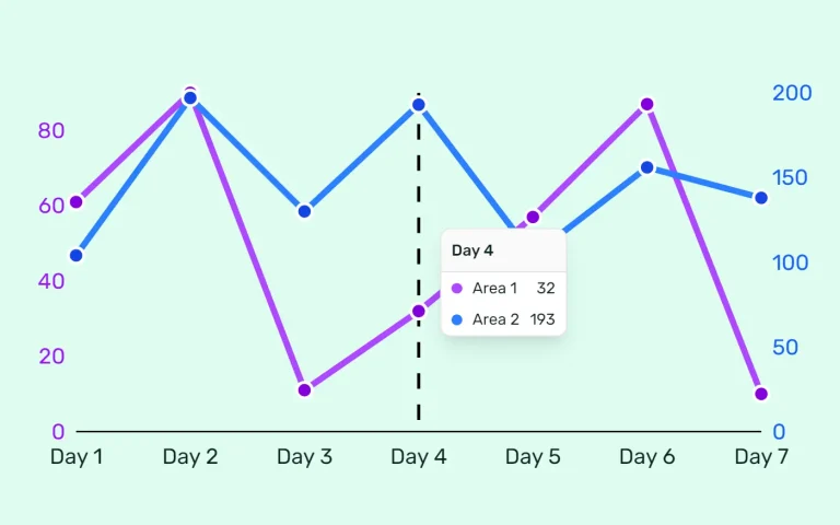
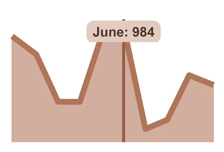
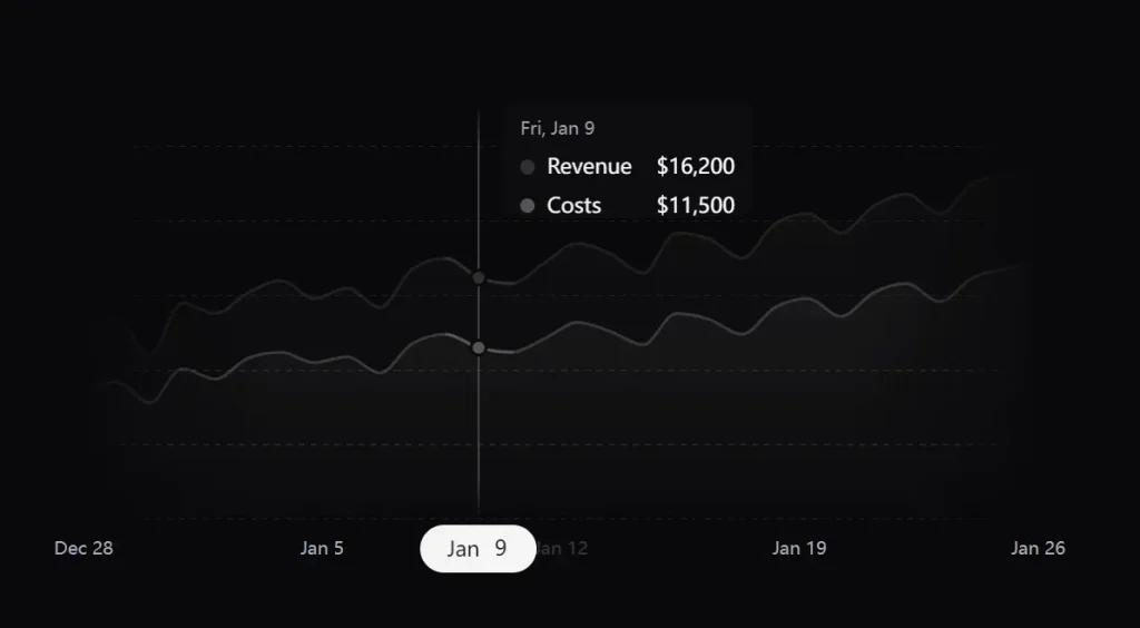
📈 Area Chart Component: Displays filled area visualizations with gradient support.
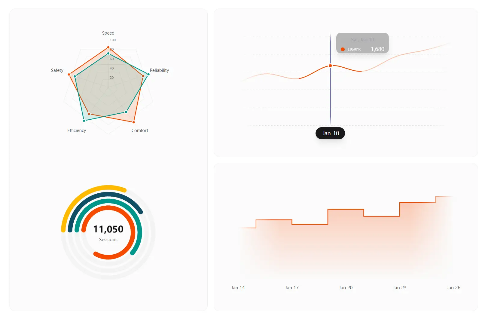
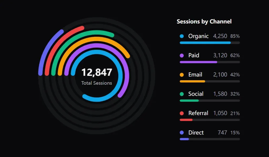
🔵 Ring Chart Component: Creates multi-ring progress indicators with animated arcs. Each ring responds to hover events and connects to a composable legend system.
🕸️ Radar Chart Component: Plots multi-dimensional data across radial axes.
🏷️ Legend System: Builds reusable legends from composable parts.
⚡ Motion Animations: Transitions chart elements smoothly when data updates. Motion handles enter and exit animations without manual keyframe definitions.
🎨 TailwindCSS Support: Accepts Tailwind classes and CSS variables for theming.
⚡ Modern Tech Stack: Runs on Next.js and React 19+ to support the latest React features.
Use Cases
- Analytics Dashboard: Build revenue tracking UI with area charts to show income trends and ring charts to display traffic source distribution across time periods.
- Performance Monitoring: Create radar charts to compare server metrics across different instances or time windows to identify bottlenecks and optimization opportunities.
- Data Exploration Tools: Combine line charts with interactive tooltips and legends so users can toggle data series visibility and examine specific data points in detail.
- Progress Visualization: Display project completion status using ring charts with animated progress bars that update as tasks complete throughout the workflow.
How to Use It
Installation
Install the package through npm or pnpm.
npm install @bklitui/uiImport the chart components you need for your visualization.
import { LineChart, Line, Grid, XAxis, ChartTooltip } from "@bklitui/ui/charts";Line Chart
Create a simple line chart by combining the LineChart container with a Line component and tooltip.
import { LineChart, Line, ChartTooltip } from "@bklitui/ui/charts";
const data = [
  { date: new Date("2025-01-01"), users: 1200 },
  { date: new Date("2025-01-02"), users: 1350 },
  { date: new Date("2025-01-03"), users: 1100 },
  { date: new Date("2025-01-04"), users: 1450 },
];
export default function SimpleChart() {
  return (
    <LineChart data={data}>
      <Line dataKey="users" />
      <ChartTooltip />
    </LineChart>
  );
}
Area Chart
Build area charts with gradient fills using the AreaChart container and Area components.
import { AreaChart, Area, Grid, XAxis, ChartTooltip } from "@bklitui/ui/charts";
const data = [
  { date: new Date("2025-01-01"), revenue: 12000, costs: 8500 },
  { date: new Date("2025-01-02"), revenue: 13500, costs: 9200 },
  { date: new Date("2025-01-03"), revenue: 11800, costs: 8800 },
  { date: new Date("2025-01-04"), revenue: 14200, costs: 9500 },
];
export default function RevenueChart() {
  return (
    <AreaChart data={data}>
      <Grid horizontal />
      <Area dataKey="revenue" fill="var(--chart-line-primary)" />
      <Area dataKey="costs" fill="var(--chart-line-secondary)" />
      <XAxis />
      <ChartTooltip />
    </AreaChart>
  );
}
Ring Chart
Create multi-ring progress charts with animated arcs and center labels.
import { RingChart, Ring, RingCenter } from "@bklitui/ui/charts";
const data = [
  { label: "Organic", value: 4250, maxValue: 5000, color: "#0ea5e9" },
  { label: "Paid", value: 3120, maxValue: 5000, color: "#a855f7" },
  { label: "Email", value: 2100, maxValue: 5000, color: "#f59e0b" },
];
export default function SessionsChart() {
  return (
    <RingChart data={data} size={300}>
      {data.map((item, index) => (
        <Ring key={item.label} index={index} />
      ))}
      <RingCenter defaultLabel="Total Sessions" />
    </RingChart>
  );
}
Radar Chart
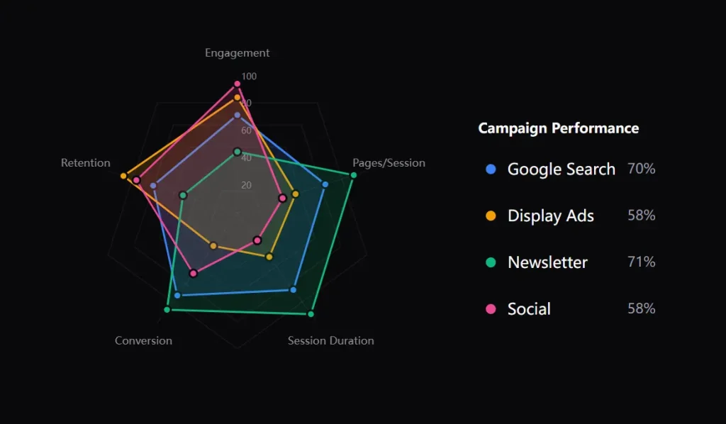
Plot multi-dimensional data across radial axes with the RadarChart system.
import { RadarChart, RadarGrid, RadarAxis, RadarLabels, RadarArea } from "@bklitui/ui/charts";
const metrics = [
  { key: "speed", label: "Speed" },
  { key: "power", label: "Power" },
  { key: "technique", label: "Technique" },
  { key: "endurance", label: "Endurance" },
  { key: "agility", label: "Agility" },
];
const data = [
  { label: "Player A", color: "#3b82f6", values: { speed: 85, power: 70, technique: 90, endurance: 75, agility: 80 } },
  { label: "Player B", color: "#f59e0b", values: { speed: 65, power: 95, technique: 60, endurance: 85, agility: 70 } },
];
export default function PerformanceRadar() {
  return (
    <RadarChart data={data} metrics={metrics} size={400}>
      <RadarGrid />
      <RadarAxis />
      <RadarLabels />
      {data.map((item, index) => (
        <RadarArea key={item.label} index={index} />
      ))}
    </RadarChart>
  );
}
Legend Component
Build legends that match your chart layout using composable legend parts.
import {
  Legend,
  LegendItemComponent,
  LegendLabel,
  LegendMarker,
  LegendProgress,
  LegendValue,
} from "@bklitui/ui/charts";
const data = [
  { label: "Organic", value: 4250, maxValue: 5000, color: "#0ea5e9" },
  { label: "Paid", value: 3120, maxValue: 5000, color: "#a855f7" },
  { label: "Email", value: 2100, maxValue: 5000, color: "#f59e0b" },
];
export default function ChartLegend() {
  return (
    <Legend items={data} title="Traffic Sources">
      <LegendItemComponent>
        <LegendMarker />
        <LegendLabel />
        <LegendValue />
        <LegendProgress />
      </LegendItemComponent>
    </Legend>
  );
}
Combining Charts with Legends
Connect ring charts with legends to create complete visualizations.
import { RingChart, Ring, RingCenter } from "@bklitui/ui/charts";
import { Legend, LegendItemComponent, LegendMarker, LegendLabel, LegendValue } from "@bklitui/ui/charts";
const sessionData = [
  { label: "Organic", value: 4250, maxValue: 5000, color: "#0ea5e9" },
  { label: "Paid", value: 3120, maxValue: 5000, color: "#a855f7" },
  { label: "Email", value: 2100, maxValue: 5000, color: "#f59e0b" },
];
export default function SessionsDashboard() {
  return (
    <div className="flex gap-8">
      <RingChart data={sessionData} size={300}>
        {sessionData.map((item, index) => (
          <Ring key={item.label} index={index} />
        ))}
        <RingCenter defaultLabel="Total Sessions" />
      </RingChart>
      <Legend items={sessionData} title="Session Breakdown">
        <LegendItemComponent>
          <LegendMarker />
          <LegendLabel />
          <LegendValue />
        </LegendItemComponent>
      </Legend>
    </div>
  );
}
Related Resources
- Recharts: A React charting library built on D3 primitives that renders responsive charts through a declarative component API with customization options.
FAQs
Q: How do I handle responsive chart sizing?
A: Wrap charts in a container div with responsive width classes. The chart components read their container dimensions when you omit the width prop. Motion handles resize animations when container dimensions change.
Q: Can I customize tooltip content and styling?
A: Yes. Pass a formatter function to the ChartTooltip component to control content. The function receives the active data point and returns your custom JSX. Style tooltips through CSS variables or by targeting the tooltip class names.
Q: Does the library support real-time data updates?
A: Yes. Update your data array through React state and the chart re-renders automatically. Motion animates transitions between data points. Ring charts and area charts handle smooth updates without flickering.
Q: How do I customize the colors?
A: You apply colors using Tailwind utility classes or CSS variables passed to the fill or stroke props.