The Future of Web Dev
The Future of Web Dev
Date & Time Ranger Picker Components for shadcn/ui
A set of date time range picker components for shadcn/ui. Features date ranges, time selection, presets, and accessibility. Easy integration with existing themes.
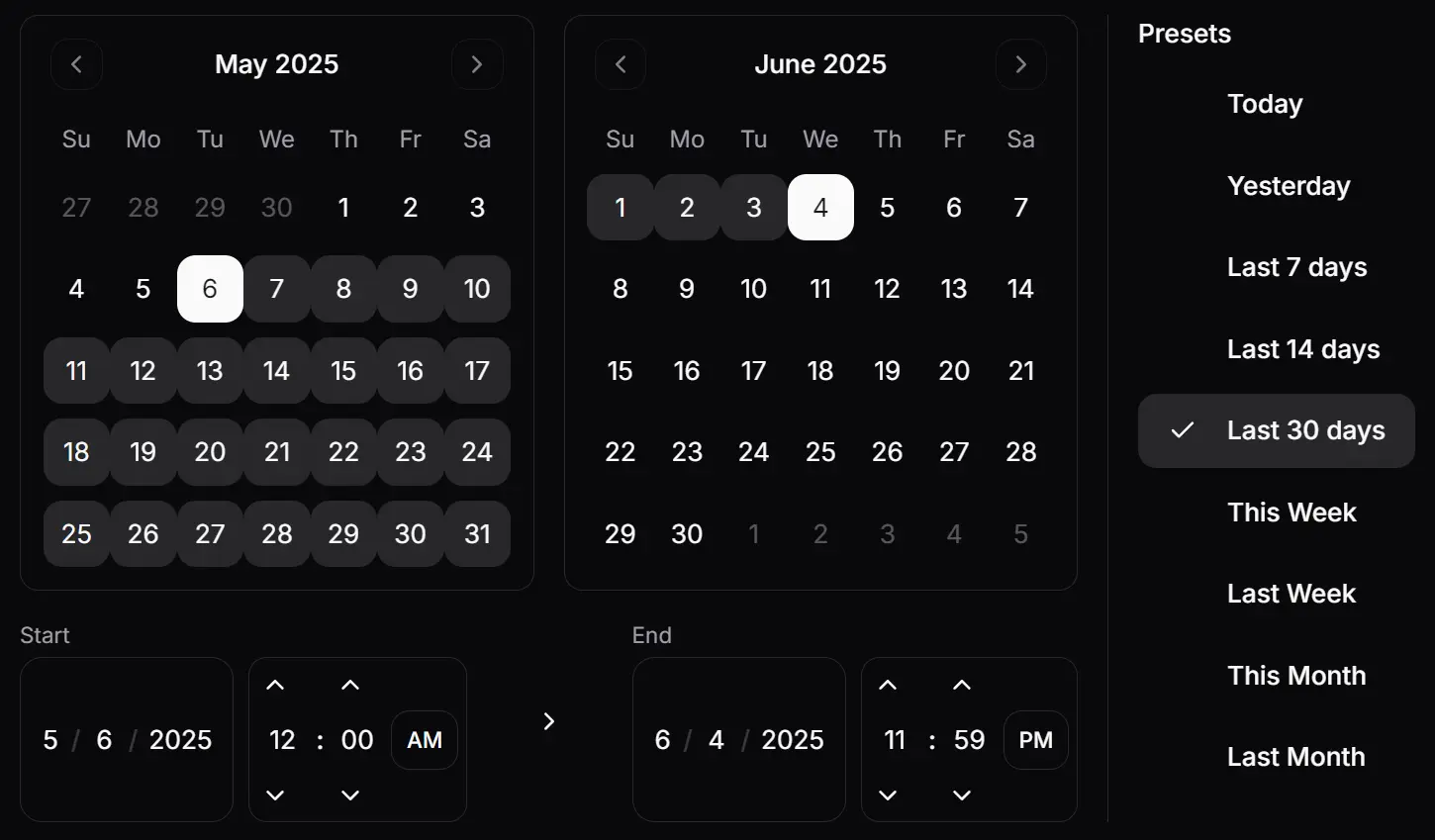
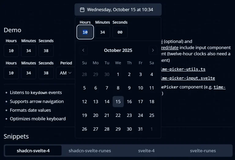
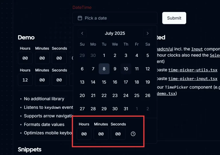
This is a date & time UI component library that provides calendar, date/time input, and date/time picker functionality for selecting dates, times, and ranges.
You can integrate these components into various applications like booking systems, event schedulers, or any interface that requires users to specify date and time periods.
Features
🌙 Light and dark mode support with automatic theme detection
⌨️ Full keyboard navigation for accessibility compliance
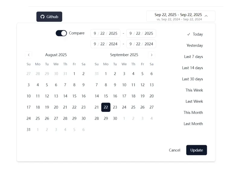
📅 Date range selection with start and end date picking
⏰ Time selection with hour and minute precision
🎯 Preset date ranges for quick common selections
🔄 Comparison mode for analyzing different time periods
🎨 Complete customization through shadcn/ui theming system
♿ Accessible design following WCAG guidelines
Use Cases
- Content Management Systems: Schedule blog posts, social media content, or marketing campaigns with precise publication dates and times
- Analytics Dashboards: Filter data by specific date ranges and compare metrics across different time periods using the comparison mode functionality
- Booking and Reservation Systems: Allow users to select check-in/check-out dates and times for hotels, restaurants, or appointment scheduling applications
- Project Management Tools: Set project deadlines, milestone dates, and track time-sensitive tasks with precise date and time selection
- E-commerce Platforms: Filter orders, sales reports, and inventory data by date ranges, or schedule promotional campaigns with specific start and end times
How To Use It
1. Install the necessary shadcn/ui components and other dependencies as follows:
npx shadcn@latest add calendar input button label
npm install date-fns react-day-picker
2. Copy the following files into your components directory.
date-time-range-picker.tsxtime-input.tsxdate-input.tsxdate-time-input.tsxdate-range-picker.tsx
3. Create a date & time range picker:
import { DateTimeRangePicker } from "@/components/date-time-range-picker";
function MyComponent() {
  return (
    <DateTimeRangePicker
      onUpdate={(values) => console.log(values)}
      initialDateFrom={new Date()}
      initialDateTo={new Date(new Date().setDate(new Date().getDate() + 7))}
    />
  );
}
4. Create a date range picker:
import { DateRangePicker } from "@/components/date-range-picker";
function MyComponent() {
  return (
    <DateRangePicker
      onUpdate={(values) => console.log(values)}
      initialDateFrom={new Date()}
      initialDateTo={new Date(new Date().setDate(new Date().getDate() + 7))}
    />
  );
}
5. Create a date & time input:
import { DateTimeInput } from "@/components/date-time-input";
function MyComponent() {
  return (
    <DateTimeInput value={new Date()} onChange={(date) => console.log(date)} />
  );
}
6. Create a date input:
import { DateInput } from "@/components/date-input";
function MyComponent() {
  return (
    <DateInput value={new Date()} onChange={(date) => console.log(date)} />
  );
}
7. Create a time input:
import { TimeInput } from "@/components/time-input";
function MyComponent() {
  return (
    <TimeInput value={new Date()} onChange={(date) => console.log(date)} />
  );
}
Related Resources
- shadcn/ui: The foundational UI library that provides the base components and theming system for this date picker collection – shadcn/ui documentation
- React Day Picker: The underlying calendar component library that powers the date selection functionality – React Day Picker docs
- date-fns: JavaScript date utility library used for date manipulation and formatting operations – date-fns documentation