Shadcn/ui + Downshift Combobox is a UI component that combines Shadcn/ui’s styling with Downshift’s accessibility-focused combobox logic. It provides a customizable autocomplete input with suggestion lists.
The component handles common autocomplete patterns including keyboard navigation, selection management, and filtered suggestions. It’s useful for creating searchable dropdowns, command palettes, and other interface elements where users need to quickly find and select from a list of options.
Features
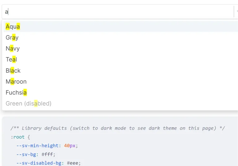
🔍 Autocomplete Functionality – Type-ahead searching to quickly filter through options.
🎹 Keyboard Navigation – Full keyboard support for improved accessibility.
📱 Responsive Design – Works across different screen sizes and devices.
🎯 Command Palette Support – Works as a command center for application actions.
🧩 Shadcn/ui Integration – Styled with the popular shadcn/ui design system.
🔄 Downshift Hook – Built on Downshift’s battle-tested useCombobox hook.
Use Cases
- Search Interfaces – Implement in search bars that offer suggestions as users type, helping them find content more quickly
- Form Selects – Replace traditional dropdown selects with a more user-friendly autocomplete component for long lists of options
- Command Palettes – Create a keyboard-accessible command center (like VS Code’s Command Palette) to navigate application features
- Tagging Systems – Build tag selection interfaces where users can search and select from existing tags
- Address/Location Inputs – Provide geographic location suggestions from an API as the user types
Installation
Prerequisites
- A React project
- shadcn/ui installed in your project
- Downshift library
Using the shadcn CLI:
pnpm dlx shadcn@latest add https://downshift-shadcn-combobox.vercel.app/r/downshift-combobox.jsonThis will install the Combobox component into your project’s component library.
Basic Implementation
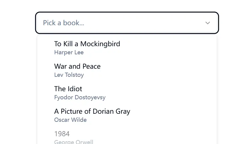
<Combobox>
  <ComboboxInput placeholder='Pick an item...' />
  <ComboboxContent>
    <ComboboxItem label='One' value='one' />
    <ComboboxItem label='Two' value='two' />
    <ComboboxItem label='Three' value='three' />
    <ComboboxEmpty>No results.</ComboboxEmpty>
  </ComboboxContent>
</Combobox>Combobox: The main wrapper component that manages stateComboboxInput: The input field where users typeComboboxContent: Container for the dropdown listComboboxItem: Individual selectable optionsComboboxEmpty: Message displayed when no results match the search
Related Resources
- Shadcn/ui Documentation: https://ui.shadcn.com/docs – Official documentation for the Shadcn/ui library.
- Downshift Documentation: https://www.downshift-js.com/ – Comprehensive documentation for the Downshift library, including the
useComboboxhook. - WAI-ARIA Authoring Practices – Combobox Pattern: https://www.w3.org/WAI/ARIA/apg/patterns/combobox/ – Guidelines for building accessible combobox widgets.
FAQs
Q: Can I fetch suggestions asynchronously?
A: Yes, you can manage the state for items externally and update them based on user input, typically involving useState and useEffect hooks to fetch data when the input value changes.
Q: How do I customize the appearance?
A: Since the component uses Shadcn/ui components and is added directly to your codebase, you can customize its appearance using Tailwind CSS utility classes or by modifying the component’s source code directly, just like any other Shadcn/ui component.
Q: Is this component fully accessible?
A: It leverages Downshift, which prioritizes accessibility by managing ARIA attributes and keyboard interactions according to WAI-ARIA guidelines for combobox patterns. You should always test your specific implementation for full compliance.
Preview