Shadcn Image Uploader is a reusable, production-ready UI component that handles the complete image upload workflow from file selection to cropping and processing.
Features
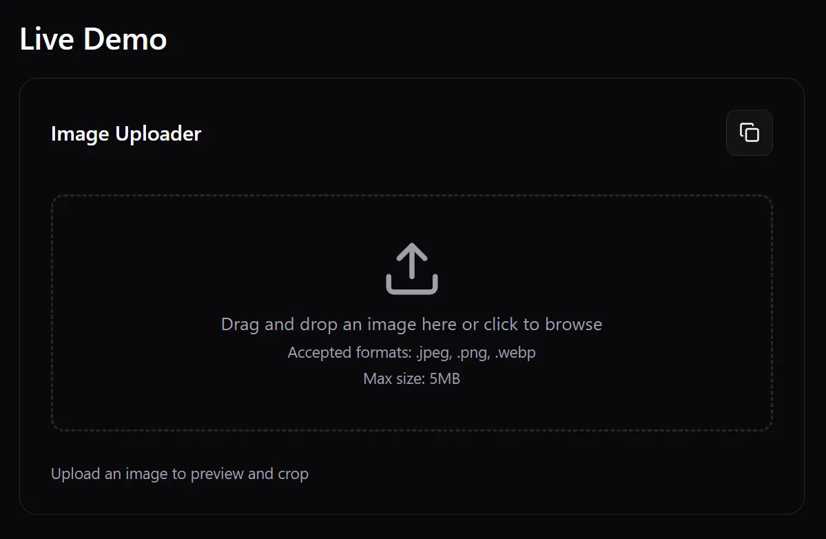
📤 Drag and drop file upload with click-to-select fallback
✅ Built-in file type validation for JPEG, PNG, and WebP formats
📏 Configurable file size limits with clear error messaging
🖼️ Real-time image preview before and after cropping
✂️ Interactive cropping interface with zoom and pan controls
📐 Customizable aspect ratios for different use cases
📦 Flexible output options supporting both Blob and File formats
🎨 Consistent styling using Shadcn UI design system
Use Cases
- Profile picture uploads – Perfect for user avatars with square aspect ratios and size constraints
- Product image management – Handle product photos for e-commerce platforms with specific dimensions
- Blog post featured images – Crop and resize hero images for articles and blog posts
- Social media content creation – Prepare images for different platform requirements and aspect ratios
- Document processing applications – Upload and crop scanned documents or certificates
Installation
1. Clone the repository from GitHub.
git clone https://github.com/0xrasla/shadcn-image-uploader.git
cd shadcn-image-uploader
2. Install dependencies
npm install
# or
yarn install
# or
bun install
3. Install the required Shadcn UI components
npx shadcn@latest add button card dialog slider tooltip4. Start the development server
npm run devUsage
Here is a simple example of how to use the component and log the cropped image data to the console.
import { ImageUploader } from "@/components/ImageUploader";
function MyComponent() {
  const handleImageCropped = (blob: Blob) => {
    console.log("Cropped image blob:", blob);
    // Process the blob, e.g., upload to a server
  };
  return <ImageUploader onImageCropped={handleImageCropped} />;
}
This example demonstrates how to customize the component with props and upload the resulting image to a server.
import { ImageUploader } from "@/components/ImageUploader";
function MyAdvancedComponent() {
  const handleImageCropped = (blob: Blob) => {
    const file = new File([blob], "cropped-image.jpg", { type: "image/jpeg" });
    const formData = new FormData();
    formData.append("image", file);
    fetch("/api/upload", {
      method: "POST",
      body: formData,
    })
      .then((response) => response.json())
      .then((data) => console.log("Upload success:", data))
      .catch((error) => console.error("Upload error:", error));
  };
  return (
    <ImageUploader
      aspectRatio={16 / 9}
      maxSize={10 * 1024 * 1024} // 10MB
      acceptedFileTypes={["image/jpeg", "image/png"]}
      onImageCropped={handleImageCropped}
      className="w-full max-w-lg"
    />
  );
}
Available Component Props
aspectRatio(number): Sets the width-to-height ratio for the cropping area. The default is1for a square crop.maxSize(number): Defines the maximum allowed file size in bytes. The default is5242880(5MB).acceptedFileTypes(string[]): An array of strings representing the accepted MIME types. The default is['image/jpeg', 'image/png', 'image/webp'].className(string): Applies a CSS class to the component’s root container for custom styling. It isundefinedby default.onImageCropped((blob: Blob) => void): A callback function that runs after the user finishes cropping an image. The function receives the final imageBlobas its argument.
The following code shows how to use the props to configure the ImageUploader for a specific use case, such as uploading a widescreen banner image with a 2MB size limit.
import { ImageUploader } from "@/components/ImageUploader";
function BannerImageUpload() {
  // Define the callback function to handle the cropped image
  const handleBannerCrop = (imageBlob: Blob) => {
    console.log("Banner image blob received:", imageBlob);
    // Create a File object from the blob to prepare for upload
    const imageFile = new File([imageBlob], "banner.jpeg", { type: "image/jpeg" });
    const formData = new FormData();
    formData.append("bannerImage", imageFile);
    // You can now send the formData to your server
    // fetch('/api/upload-banner', { method: 'POST', body: formData });
  };
  return (
    <div className="p-8 bg-gray-50">
      <h3 className="text-lg font-medium mb-4">Upload a New Banner</h3>
      <ImageUploader
        aspectRatio={16 / 9}
        maxSize={2 * 1024 * 1024} // 2MB limit
        acceptedFileTypes={["image/jpeg", "image/png"]}
        onImageCropped={handleBannerCrop}
        className="w-full max-w-xl p-4 border-2 border-dashed rounded-md"
      />
    </div>
  );
}
Related Resources
- Shadcn UI: The collection of reusable components used to build the uploader’s interface. Visit Shadcn UI.
- react-easy-crop: The underlying React library that provides the core interactive cropping functionality. View on GitHub.
- Lucide React: The icon library used for icons within the component, such as the upload and trash icons. Explore Lucide Icons.
- Tailwind CSS: The utility-first CSS framework used for styling the component. Official Documentation.
FAQs
Q: How do I change the crop area’s aspect ratio?
A: You can change the crop area’s aspect ratio by passing a number to the aspectRatio prop. For example, use aspectRatio={16 / 9} for a widescreen crop or aspectRatio={1} for a square crop.
Q: Can I restrict uploads to certain file types or sizes?
A: Yes, you can control file restrictions. Use the acceptedFileTypes prop with an array of MIME types (e.g., ['image/jpeg', 'image/png']) and the maxSize prop with the maximum file size in bytes.
Q: What format is the cropped image returned in?
A: The component returns the cropped image as a Blob object via the onImageCropped callback. You can convert this Blob into a File object if needed or upload it directly.