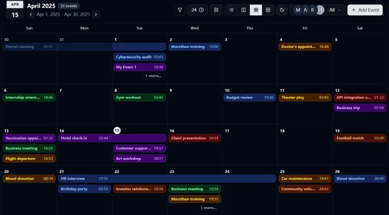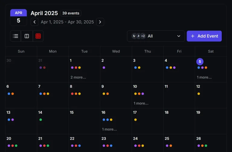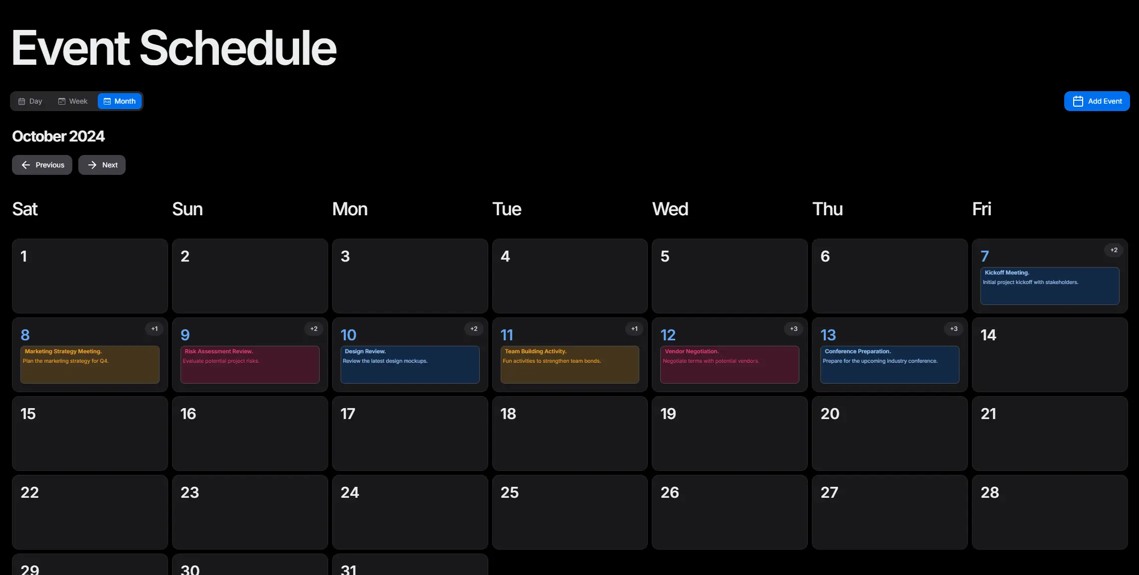
Mina Scheduler is a React & Shadcn/ui event calendar component that provides modern event management capabilities across day, week, and month views.
You can use it for project management dashboards, booking systems, personal calendar applications, or any web project that requires event scheduling and calendar visualization.
Features
📅 Multiple calendar views with day, week, and month options.
✏️ Complete event management system with add, update, and delete operations.
🎨 Customizable UI components including buttons, tabs, and event modals.
📱 Mobile-responsive design with optimized touch interactions.
⚡ Smooth view transitions powered by Framer Motion animations.
🔒 Built-in form validation using Zod schema validation.
🎯 Shadcn UI components for consistent design.
🔧 Flexible configuration options for week start days and view preferences.
🎨 Event styling variants with primary, danger, success, warning, and default options.
📝 Custom form components support.
Use Cases
- Project management applications that need task scheduling and deadline tracking across team workflows.
- Healthcare systems requiring appointment booking with doctor availability and patient scheduling.
- Educational platforms managing class schedules, exam dates, and academic calendar events.
- Event management websites coordinating conferences, workshops, and meeting room reservations.
- Personal productivity applications combining calendar functionality with task management features.
How to Use It
1. Install the necessary shadcn/ui in your project.
npx shadcn-ui@latest init2. You have two installation options for Mina Scheduler. You can clone the repository directly and copy the required folders to your project structure.
git clone https://github.com/Mina-Massoud/mina-schedulerCopy the /types, /components/schedule, and /providers folders to your project directory after cloning.
3. Or install the package through npm.
npm install mina-scheduler4. To set up a basic calendar, import SchedulerProvider and SchedularView. Wrap your calendar component with SchedulerProvider. This provides the necessary context for the scheduler. Place SchedularView inside the provider. This renders the default calendar interface.
"use client";
import { SchedulerProvider, SchedularView } from "mina-scheduler";
export default function MyCalendarDisplay() {
return (
<section className="flex w-full flex-col items-center justify-center gap-4 py-8 md:py-10">
<SchedulerProvider>
<SchedularView />
</SchedulerProvider>
</section>
);
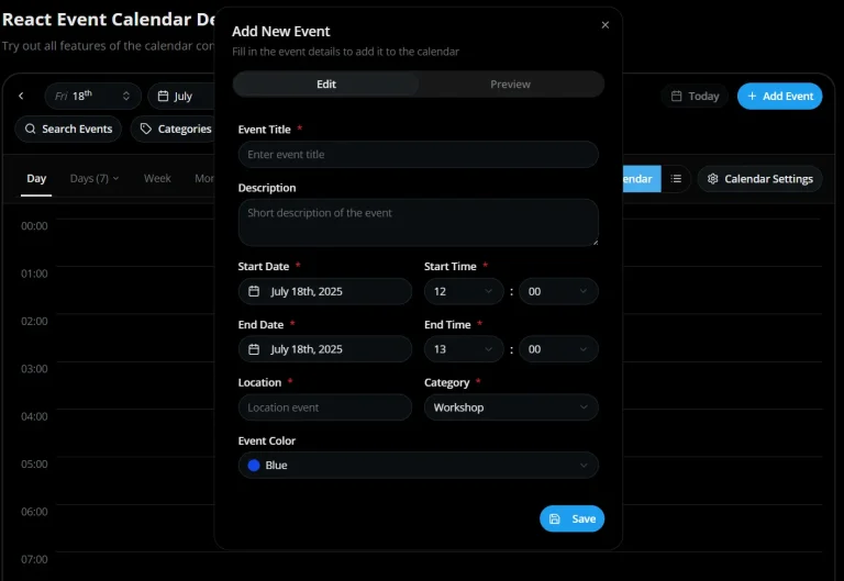
}5. You can initialize the calendar with existing events. Use the initialState prop on the SchedulerProvider component. Define your events as an array of Event objects. Each event needs an id, title, startDate, and endDate. You can also include a description and variant.
import { Event } from "mina-scheduler"; // Assuming Event type is exported
const initialEvents = [
  {
    id: "event-1",
    title: "Project Planning Session",
    description: "Discuss Q3 project goals.",
    startDate: new Date(),
    endDate: new Date(new Date().getTime() + 2 * 60 * 60 * 1000), // 2 hours later
    variant: "primary",
  },
  {
    id: "event-2",
    title: "Team Sync Up",
    description: "Weekly team meeting.",
    startDate: new Date(new Date().setDate(new Date().getDate() + 1)), // Tomorrow
    endDate: new Date(new Date().setDate(new Date().getDate() + 1) + 1 * 60 * 60 * 1000), // Tomorrow plus 1 hour
    variant: "success",
  },
] as Event[];
Now, pass this initialEvents array to the SchedulerProvider. You can also specify the weekStartsOn prop.
import { SchedulerProvider } from "mina-scheduler";
// import initialEvents from './your-events-file'; // Your event data
export default function CalendarWithEvents() {
  return (
    <SchedulerProvider initialState={initialEvents} weekStartsOn="monday">
      <SchedulerWrapper
        classNames={{
          tabs: {
            panel: "pt-3",
          },
        }}
      />
    </SchedulerProvider>
  );
}
6. The useScheduler hook allows dynamic event dispatching. You can use it to update events after the component mounts. Ensure SchedulerProvider is higher in the component tree for proper context.
import { useEffect } from "react";
import { useScheduler } from "mina-scheduler";
const EventUpdater = ({ eventsToLoad }) => {
  const { dispatch } = useScheduler();
  useEffect(() => {
    dispatch({ type: "SET_EVENTS", payload: eventsToLoad });
  }, [eventsToLoad, dispatch]);
  return null; // This component does not render anything
};
7. Modify button styles, available views, and event modals.
"use client";
import { SchedulerProvider, SchedularView } from "mina-scheduler";
import React from "react";
// A simple custom form component
const MyCustomAddEventForm = ({ register, errors }) => (
  <>
    <input
      {...register("title")}
      placeholder="Your Event Title"
      className={`input-field ${errors.title ? "error-border" : ""}`}
    />
    {errors.title && (
      <span className="text-red-500 text-sm">{errors.title.message}</span>
    )}
    <textarea
      {...register("description")}
      placeholder="Event Description"
      className="textarea-field"
    />
    <input
      {...register("startDate")}
      type="datetime-local"
      className={`input-field ${errors.startDate ? "error-border" : ""}`}
    />
    <input
      {...register("endDate")}
      type="datetime-local"
      className={`input-field ${errors.endDate ? "error-border" : ""}`}
    />
    <button type="submit" className="submit-button">
      Create Event
    </button>
  </>
);
export default function CustomizedCalendar() {
  return (
    <section className="flex w-full flex-col items-center justify-center gap-4 py-8 md:py-10">
      <SchedulerProvider>
        <SchedularView
          classNames={{
            buttons: {
              addEvent: "bg-purple-600 text-white hover:bg-purple-700",
              next: "bg-teal-500 text-white hover:bg-teal-600",
              prev: "bg-orange-500 text-white hover:bg-orange-600",
            },
          }}
          views={{ views: ["day", "week", "month"], mobileViews: ["day"] }}
          CustomComponents={{
            CustomEventModal: {
              CustomAddEventModal: {
                title: "Add New Schedule Item",
                CustomForm: MyCustomAddEventForm,
              },
            },
          }}
        />
      </SchedulerProvider>
    </section>
  );
}
API Documentation
SchedulerProvider
This component wraps your calendar. It manages the state and context for events and views.
onAddEvent(optional): A function that runs when an event is added. It receives the new event object.onUpdateEvent(optional): A function that runs when an event is updated. It receives the updated event object.onDeleteEvent(optional): A function that runs when an event is deleted. It receives the event ID.weekStartsOn(optional): Sets the first day of the week. Options are"sunday"or"monday". The default is"sunday".children: The React components rendered inside the provider.
SchedularView
This is the main calendar display component. It supports day, week, and month views. It also allows custom components for event modals and buttons.
views(optional): Specifies available views. It includesviewsfor desktop andmobileViewsfor mobile devices.CustomComponents(optional): Customizes elements like event modals, buttons, and tabs. You can defineCustomEventModalfor forms orcustomTabsfor view navigation.classNames(optional): Provides CSS class names for styling buttons, tabs, and other elements.
useScheduler Hook
The useScheduler hook gives you access to the scheduler’s state and functions. You can retrieve events, dispatch actions to modify the state, and use utility or handler functions.
events: The current state of the scheduler, including the array of events.dispatch: A function to modify the scheduler state. Use it to send actions to the reducer.ADD_EVENT: Adds a new event.REMOVE_EVENT: Removes an event by its ID.UPDATE_EVENT: Updates an existing event.
getters: Utility functions to retrieve information.getDaysInMonth(month, year): Returns an array of day objects for a specific month.getEventsForDay(day, currentDate): Retrieves events for a specific day.getDaysInWeek(week, year): Returns an array of Date objects for a specific week.getWeekNumber(date): Returns the week number for a given date.getDayName(day): Returns the name of the day for a given index.
handlers: Functions to handle event related actions.handleEventStyling(event, dayEvents): Returns styling properties for an event.handleAddEvent(event): Adds a new event.handleUpdateEvent(event, id): Updates an existing event.handleDeleteEvent(id): Deletes an event.
Event Schema and Form Data
The library uses Zod for form validation and React Hook Form for handling form data.
Event Schema (Zod)
The eventSchema defines validation rules for event forms.
export const eventSchema = z.object({
  title: z.string().nonempty("Event name is required"),
  description: z.string().optional(),
  startDate: z.date(),
  endDate: z.date(),
  variant: z.enum(["primary", "danger", "success", "warning", "default"]),
  color: z.string().nonempty("Color selection is required"),
});
EventFormData
This type corresponds to the schema structure.
export type EventFormData = z.infer<typeof eventSchema>;SelectDate Component
The SelectDate component assists with selecting date ranges and times for events.
data(optional): Initial start and end dates and times.setValue: A function from React Hook Form to set form values.
Example usage:
import { UseFormSetValue } from "react-hook-form";
import SelectDate from "@/components/schedule/_components/add-event-components/select-date"; // Adjust path as needed
// Inside your form component
<SelectDate data={initialDateData} setValue={setValue} />
Related Resources
- React Hook Form – Form state management library that Mina Scheduler uses for event forms.
- Zod – TypeScript-first schema validation library integrated for form validation.
- Next UI – Modern React UI library that provides the base components.
- Framer Motion – Animation library used for smooth calendar view transitions.
FAQs
Q: Can I customize the appearance of the calendar?
A: Yes, you can customize the calendar’s appearance. The library provides classNames props to style buttons, tabs, and other elements. You can also pass custom components for event modals and view tabs.
Q: How do I add initial events to the calendar?
A: You can add initial events by passing an array of event objects to the initialState prop of the SchedulerProvider component. Each event object should follow the Event type structure.
Q: How do I customize the event colors and styling?
A: Use the variant prop on individual events with values like “primary”, “danger”, “success”, “warning”, or “default”. You can also apply custom CSS classes through the classNames prop for more detailed styling control.