The Future of Web Dev
The Future of Web Dev
Display Events Interactively with shadcn/ui Event Timeline Components
The shadcn/ui Event Timeline Roadmap provides two customizable, animated event timeline components to present chronological data.
The shadcn/ui Event Timeline Roadmap provides two customizable, animated event timeline components to present chronological data.
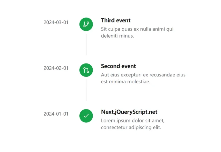
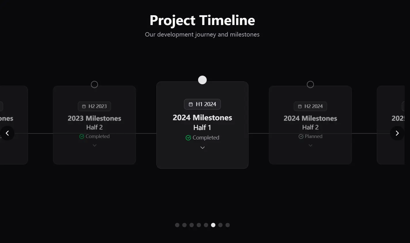
The HorizontalEventTimelineCarousel presents events in a swipeable, card-based carousel format suitable for horizontal browsing. The VerticalEventTimeline arranges events in a stacked, expandable list with alternating card positions for a clear vertical progression.
Features
✨ Interactive Navigation: Supports swipe gestures, arrow buttons, and pagination dots for the horizontal carousel. Both components feature expandable cards for detailed views.
🗓️ Dynamic Period Formatting: Displays time periods flexibly, supporting quarterly (Q1 2025) or half-year (H1 2025) formats based on your data.
🎨 Customizable: Modify appearance using Tailwind CSS utility classes. Extend functionality by adjusting props and the event data structure.
📱 Responsive Design: Components adapt to different screen dimensions. The horizontal carousel allows custom height, while the vertical timeline adjusts card alignment on desktop screens.
✅ Visual Feedback: Clearly marks completed versus planned events using checkmark icons for quick status recognition.
🎬 Smooth Animations: Leverages Framer Motion for fluid transitions during navigation and card expansion/collapse.
Use Cases
- Project Roadmaps: Visualize key deliverables, phases, and deadlines for software projects or business initiatives.
- Company History/Milestones: Showcase significant achievements, product launches, or historical events in a chronological format.
- Release Schedules: Display upcoming software releases, feature rollouts, or version updates clearly.
- Event Calendars: Present conference schedules, workshop timelines, or personal achievement tracks interactively.
- Tutorial/Process Steps: Guide users through multi-step processes or learning modules sequentially.
Installation
1. Your project must have shadcn/ui installed and configured. You need the Card and Badge components from shadcn/ui.
2. Add Framer Motion and Lucide React to your project.
npm install framer-motion lucide-reactor
yarn add framer-motion lucide-reactUsage
1. Create a data source for your timeline events. Typically, this involves creating a file like data/events.ts. Structure your data according to the component’s requirements.
// Example: data/events.ts
export const events = [
  {
    year: 2025,
    periodType: "Q", // "Q" for Quarter, "H" for Half-year
    periodNumber: 1,  // The specific quarter or half
    isChecked: true, // Indicates if the period is complete
    events: [
      { title: "Launch MVP", isChecked: true },
      { title: "User Testing", isChecked: false },
    ],
  },
  {
    year: 2025,
    periodType: "H",
    periodNumber: 2,
    isChecked: false,
    events: [
      { title: "Feature Expansion", isChecked: false }
    ],
  },
  // Add more event periods
];
// Optional: Define a TypeScript type for safety
// Example: types/events.ts
export type Events = {
  year: number;
  periodType: "Q" | "H" | "Y"; // Quarter, Half-year, or Year
  periodNumber?: number;      // Required for Q or H
  isChecked: boolean;         // Period status
  events: { title: string; isChecked: boolean }[]; // Events within the period
}[];
2. Import and use the timeline components in your React application. Pass the event data (adjust import paths as necessary).
Horizontal Carousel:
import { HorizontalEventTimelineCarousel } from './components/HorizontalEventTimelineCarousel'; // Adjust path
import { events } from './data/events'; // Adjust path
function MyTimelinePage() {
  // Note: The component likely imports 'events' internally by default
  // or you might need to pass it as a prop depending on the final implementation.
  // Check the component source for data handling. Assuming internal import for now.
  return <HorizontalEventTimelineCarousel height="40rem" />;
}
Adjust the height prop as needed for your layout. Users navigate via swipe, arrows, or dots and click cards to see details.
Vertical Timeline:
import { VerticalEventTimeline } from './components/VerticalEventTimeline'; // Adjust path
import { events } from './data/events'; // Adjust path
function MyTimelinePage() {
  // Similar assumption about data handling as above.
  return <VerticalEventTimeline />;
}
Cards expand upon clicking. The layout automatically alternates card positions on wider screens.
FAQs
Q: Can I customize the appearance beyond basic Tailwind classes?
A: Yes, you can modify the underlying Framer Motion animation variants or override component styles more deeply if needed, though direct Tailwind class adjustments are the primary method.
Q: What data structure is required for the events?
A: You need an array of objects, each representing a time period (year + period type/number) containing nested event objects (title + checked status). Check the Usage section for the exact structure.
Q: How are the animations handled?
A: Framer Motion manages the animations for card expansion, collapse, and carousel transitions, providing smooth visual effects.
Q: How can I add more details to each timeline event?
A: Extend the event data structure with additional fields such as descriptions, links, or images, then update the card rendering logic to display this information when a card is expanded.
Q: Do these components work with server-side rendering frameworks like Next.js?
A: Yes, the components are compatible with Next.js and other React frameworks. For server-side rendering, you may need to implement dynamic imports with Next.js’s dynamic function for Framer Motion components.
Preview