The Future of Web Dev
The Future of Web Dev
Hierarchical Data Display with Shadcn/ui Tree View
Add the Shadcn UI Tree View component to your React project. Display nested data with custom icons, actions, and drag-and-drop support.

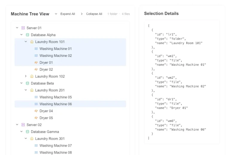
A simple Tree View component for shadcn/ui that displays hierarchical data in a collapsible tree structure. It helps organize nested information with expandable and collapsible nodes.
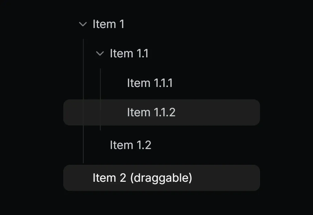
The component supports custom icons, drag-and-drop functionality, and interactive actions. It works well for file explorers, nested menus, or any structured data requiring parent-child relationships.
Features
🌳 Hierarchical Structure – Navigate through multi-level nested data with expandable and collapsible nodes.
🔄 Drag & Drop Support – Move items within the tree structure through intuitive drag and drop functionality.
📱 Responsive Design – Works across various screen sizes and devices.
⚡ Performance Optimized – Renders efficiently even with large data structures.
🔍 Default Node Icons – Set global icons for leaf and node items throughout the tree.
🖱️ Item Interaction – Select items with full support for expand, collapse, and selection states.
🎨 Custom Icons – Personalize with different icons for default, open, and selected states.
⚙️ Action Buttons – Add custom actions to tree items like adding, editing, or deleting nodes.
🔗 Click Handlers – Implement custom functionality for both individual items and the entire tree.
Use Cases
- File system navigation – Browse folders and files in a structured layout
- Nested menus – Display multi-level navigation with expandable sections
- Project management – Organize tasks and subtasks in a tree format
- Data visualization – Show hierarchical relationships in APIs or databases
- Admin dashboards – Manage permissions or settings with nested categories
How To Use It
1. Install the necessary dependencies and add the component to your shadcn/ui project.
npx shadcn add "https://mrlightful.com/registry/tree-view"
2. Import the component and define your data structure:
import { TreeView, TreeDataItem } from '@/components/ui/tree-view';
// Define the hierarchical data structure
const data: TreeDataItem[] = [
  {
    id: '1',
    name: 'Documents',
    children: [
      {
        id: '2',
        name: 'Work',
        children: [
          { id: '3', name: 'Report.docx' },
          { id: '4', name: 'Presentation.pptx' },
        ],
      },
      { id: '5', name: 'Personal' },
    ],
  },
  {
    id: '6',
    name: 'Downloads',
    draggable: true, // Example: Make this item draggable
    droppable: true, // Example: Allow dropping items onto this item
  },
];
// Render the TreeView component
export function MyComponent() {
  return <TreeView data={data} />;
}
Props Reference
TreeView Component Props
data: (Required) An array ofTreeDataItemobjects or a singleTreeDataItemrepresenting the root of the tree structure.initialSelectedItemId: (Optional) Theidof the item that should be selected when the component initially renders.onSelectChange: (Optional) A callback function triggered when an item’s selection state changes. It receives the selectedTreeDataItemorundefined.expandAll: (Optional) Iftrue, all expandable items will be initially expanded. Defaults tofalse.defaultNodeIcon: (Optional) A React node to use as the default icon for items with children (nodes).defaultLeafIcon: (Optional) A React node to use as the default icon for items without children (leaves).- (Standard HTMLDivElement attributes): Includes standard
divattributes likeclassName,style, etc.
TreeDataItem Interface Props
id: (Required) A unique string identifier for the tree item.name: (Required) The text label displayed for the tree item.icon: (Optional) A React node to use as the default icon for this specific item.selectedIcon: (Optional) A React node to use as the icon when this specific item is selected.openIcon: (Optional) A React node to use as the icon when this specific item is expanded (if it has children).children: (Optional) An array ofTreeDataItemobjects representing the nested children of this item.actions: (Optional) A React node (e.g., buttons, links) to display alongside the item, often for interactions like adding or deleting.onClick: (Optional) A callback function triggered when this specific tree item is clicked.draggable: (Optional) Iftrue, allows this item to be dragged. Defaults tofalse.droppable: (Optional) Iftrue, allows other items to be dropped onto this item. Defaults tofalse.
FAQs
Q: How can I handle item selection events?
A: Use the onSelectChange prop on the TreeView component. It provides the selected TreeDataItem object or undefined when an item is deselected.
Q: Is it possible to set default icons for all nodes and leaves?
A: Yes, you can use the defaultNodeIcon and defaultLeafIcon props on the TreeView component to specify default icons for parent items (nodes) and items without children (leaves).
Q: Can I add buttons or other interactive elements to tree items?
A: Yes, the actions property within the TreeDataItem interface accepts React.ReactNode, allowing you to render custom buttons or controls for specific items.
Q: How do I enable drag and drop?
A: Set the draggable property to true on the TreeDataItem you want to drag. Set the droppable property to true on items you want to allow dropping onto. You will need to implement the logic for handling the drop event.
Preview