The Future of Web Dev
The Future of Web Dev
30+ Animated UI Components for Next.js/Shadcn – Joly UI
Add accessible, animated components to your React/Next.js app with Joly UI. Built with Tailwind CSS, and Framer Motion for shadcn/ui projects.
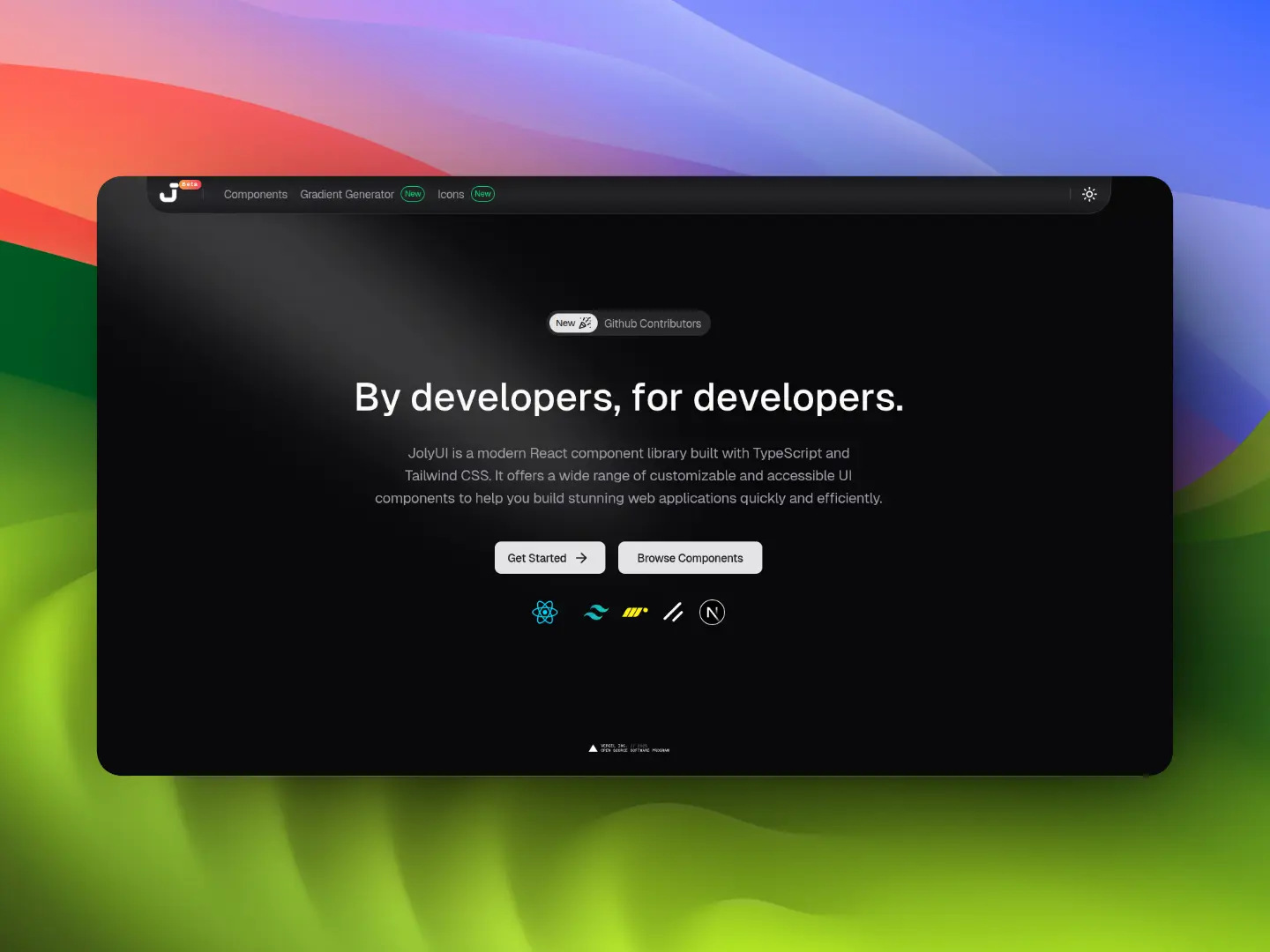
Joly UI provides a collection of animated, customizable, copy-paste UI components built with React/Next.js, shadcn/ui and TailwindCSS.
The registry currently includes over 30 UI components organized into categories like buttons, text animations, inputs, navigation, and feedback. All components come with Framer Motion animations that run at 60fps.
Features
🎨 Detailed Design: Components match modern UI standards with careful attention to spacing, typography, and visual hierarchy.
⚡ Framer Motion: Animations run at 60fps through Framer Motion’s optimized rendering engine.
♿ WAI-ARIA: Components implement proper semantic HTML, ARIA attributes, and keyboard navigation patterns.
🎯 Tailwind CSS: You can modify component appearance through Tailwind utility classes.
📋 Copy-Paste: Allows you to puts component source code directly in your project for full modification control.
🔒 TypeScript Definitions: All components include type definitions for props, events, and return values.
Use Cases
- Marketing Landing Pages: Implement “Liquid Metal” buttons or “Text Morphing” effects to capture user attention on conversion points.
- Interactive Dashboards: Use the “Bento Grid” or “Animated Table” to organize dense data sets into readable layouts.
- Developer Portfolios: Apply the “Dock” navigation or “GitHub Contributors” card to showcase projects and activity.
- Creative Forms: Integrate the “AI Prompt Box” or “Date Wheel Picker” to improve user input experiences.
How to Use It
1. Run the shadcn/ui initialization command in your project directory. This sets up the component structure and configuration files.
npx shadcn@latest initPNPM
pnpm dlx shadcn@latest initYarn
yarn dlx shadcn@latest initBun
bun x shadcn@latest init2. Add individual components using the shadcn CLI with the Joly UI registry URL. Each component downloads with its dependencies and places the files in your components directory.
Replace the component name in the URL with any component from the registry.
npx shadcn@latest add "https://jolyui.dev/r/calender"PNPM
pnpm dlx shadcn@latest add "https://jolyui.dev/r/calender"Yarn
yarn dlx shadcn@latest add "https://jolyui.dev/r/calender"Bun
bun x shadcn@latest add "https://jolyui.dev/r/calender"3. After adding a component, import it from your components directory and use it like any React component.
import { useState } from "react"
import { AnimatedCalendar } from "@/components/ui/calender"
export default function MyComponent() {
  const [date, setDate] = useState<Date>()
  return (
    <AnimatedCalendar
      mode="single"
      value={date}
      onChange={setDate}
      placeholder="Select a date"
    />
  )
}
4. You’re also allowed to install components manually. For example, to add a vertical tabs component to your project:
"use client";

import type React from "react";
import { useEffect, useRef, useState } from "react";
import { Tabs, TabsContent, TabsList, TabsTrigger } from "@/components/ui/tabs";

interface TabData {
  label: string;
  value: string;
  content: React.ReactNode;
}

interface VercelTabsProps {
  tabs: TabData[];
  defaultTab?: string;
  className?: string;
}

export function VercelTabs({ tabs, defaultTab, className }: VercelTabsProps) {
  const [hoveredIndex, setHoveredIndex] = useState<number | null>(null);
  const [activeTab, setActiveTab] = useState(defaultTab || tabs[0]?.value);
  const [hoverStyle, setHoverStyle] = useState({});
  const [activeStyle, setActiveStyle] = useState({ left: "0px", width: "0px" });
  const tabRefs = useRef<(HTMLButtonElement | null)[]>([]);

  const activeIndex = tabs.findIndex((tab) => tab.value === activeTab);

  useEffect(() => {
    if (hoveredIndex !== null) {
      const hoveredElement = tabRefs.current[hoveredIndex];
      if (hoveredElement) {
        const { offsetLeft, offsetWidth } = hoveredElement;
        setHoverStyle({
          left: `${offsetLeft}px`,
          width: `${offsetWidth}px`,
        });
      }
    }
  }, [hoveredIndex]);

  useEffect(() => {
    const activeElement = tabRefs.current[activeIndex];
    if (activeElement) {
      const { offsetLeft, offsetWidth } = activeElement;
      setActiveStyle({
        left: `${offsetLeft}px`,
        width: `${offsetWidth}px`,
      });
    }
  }, [activeIndex]);

  useEffect(() => {
    requestAnimationFrame(() => {
      const activeElement = tabRefs.current[activeIndex];
      if (activeElement) {
        const { offsetLeft, offsetWidth } = activeElement;
        setActiveStyle({
          left: `${offsetLeft}px`,
          width: `${offsetWidth}px`,
        });
      }
    });
  }, [activeIndex]);

  return (
    <Tabs
      defaultValue={activeTab}
      onValueChange={setActiveTab}
      className={`flex w-full flex-col items-center ${className}`}
    >
      <TabsList className="relative h-auto select-none gap-[6px] bg-transparent p-0">
        {/* Hover Highlight */}
        <div
          className="absolute top-0 left-0 flex h-[30px] items-center rounded-[6px] bg-[#0e0f1114] transition-all duration-300 ease-out dark:bg-[#ffffff1a]"
          style={{
            ...hoverStyle,
            opacity: hoveredIndex !== null ? 1 : 0,
          }}
        />

        {/* Active Indicator */}
        <div
          className="absolute bottom-[-6px] h-[2px] bg-[#0e0f11] transition-all duration-300 ease-out dark:bg-white"
          style={activeStyle}
        />

        {tabs.map((tab, index) => (
          <TabsTrigger
            key={tab.value}
            value={tab.value}
            ref={(el) => {
              tabRefs.current[index] = el;
            }}
            className={`z-10 h-[30px] cursor-pointer rounded-md border-0 bg-transparent px-3 py-2 outline-none transition-colors duration-300 focus-visible:outline-none focus-visible:ring-0 focus-visible:ring-offset-0 data-[state=active]:bg-transparent data-[state=active]:shadow-none ${
              activeTab === tab.value
                ? "text-[#0e0e10] dark:text-white"
                : "text-[#0e0f1199] dark:text-[#ffffff99]"
            }`}
            onMouseEnter={() => setHoveredIndex(index)}
            onMouseLeave={() => setHoveredIndex(null)}
          >
            <span className="whitespace-nowrap font-medium text-sm leading-5">
              {tab.label}
            </span>
          </TabsTrigger>
        ))}
      </TabsList>

      {/* Content Area */}
      <div className="mt-8 w-full px-4">
        {tabs.map((tab) => (
          <TabsContent
            key={tab.value}
            value={tab.value}
            className="fade-in-50 w-full animate-in duration-500"
          >
            {tab.content}
          </TabsContent>
        ))}
      </div>
    </Tabs>
  );
}
Available Component Categories
Buttons
- Button: Standard interactive element.
- Liquid Metal Button: Button with fluid, metallic animation effects.
- Rainbow Button: Button featuring a multi-color gradient animation.
Text Animations
- Character Morph: Text transforms one character at a time.
- Glitch Text: Simulates digital distortion effects.
- Gooey Text Morphing: Text transitions with a viscous fluid effect.
- Highlight Text: Emphasizes specific words with animated backgrounds.
- Number Counter: Animates numerical values from zero to a target.
- Rotate Text: Cycles through different text strings.
- Scroll Text: Triggers text reveals based on scroll position.
- Typewriter Text: Simulates typing one character at a time.
- Velocity Morph: Changes text shape based on scroll speed.
Inputs
- AI Prompt Box: Specialized input for generative AI queries.
- Animated Theme Toggle: Switcher for light/dark modes with motion.
- Calendar: Date selection interface.
- Command Palette: Modal interface for global search and actions.
- Date Wheel Picker: iOS-style scrolling date selector.
- Feedback Widget: Component to collect user ratings or comments.
- Segmented Button: Toggle group for selecting a single option.
Navigation
- Dock: macOS-style application dock.
- File Tree: Hierarchical directory visualization.
- Vercel Tabs: Tabbed navigation styled like Vercel’s dashboard.
Surfaces
- Animated Table: Data grid with row/column transition effects.
- Bento Grid: Grid layout for dashboard widgets.
- Code Block: Syntax-highlighted code display.
- Phone Card: Mobile-device styled container.
Creative
- Animated Beam: Light beam effects connecting elements.
- Expanded Map: Interactive map visualization.
- GitHub Contributors: Displays contributor avatars.
- GitHub Star Button: Social proof button for repositories.
- Hover Preview: Shows content previews on mouse hover.
- Image Comparison: Slider to compare two images.
- Image Sphere: 3D rotating sphere of images.
- Magnetic: Elements that stick to the cursor movement.
- Video Player: Custom video playback interface.
Feedback
- Animated Tooltip: Contextual hints with motion.
- Animated Toast: Notification popups with entrance/exit motions.
Related Resources
- shadcn/ui: The foundational component library that Joly UI extends.
- Framer Motion: The production-ready motion library for React.
- Lucide React: The icon library used within the components for consistent visual language.
FAQs
Q: Can I use Joly UI without Next.js?
A: Yes. The components work with any React setup including Vite, Create React App, or Remix. You just need React, Tailwind CSS, and Framer Motion installed.
Q: How do I update components after adding them?
A: Run the add command again with the same component URL. The CLI asks if you want to overwrite existing files. Your customizations will be lost, so save them first or use version control.
Q: Do the animations work on mobile devices?
A: Yes. Framer Motion handles touch events and optimizes animations for mobile browsers.
Q: Can I use individual components without the full registry?
A: Yes. Each component is standalone. Add only the components you need and they will not pull in unused code.


