The Future of Web Dev
The Future of Web Dev
Copy-Paste Map Components with MapLibre GL – mapcn
Copy-paste map components for React. Built on MapLibre GL with automatic theme switching and free CARTO tiles. No API keys required.
mapcn is a map component library that allows you to display interactive maps in your apps using MapLibre GL, Tailwind CSS, and shadcn/ui components.
You can install the map component library with a single npx command that copies the components into your project. It includes markers, popups, routes, and standard map controls without requiring API keys or additional configuration.
The default setup uses CARTO’s free basemap tiles. These tiles switch between light and dark variants based on your theme settings. You can replace them with custom MapLibre style specifications if your project needs different cartography.
Features
🎨 Dark/Light Modes: Switches between light and dark map styles automatically based on your application theme settings.
🎯 Zero Configuration: Installs with one command and renders maps immediately without additional setup steps.
📦 shadcn/ui Compatibility: Follows the same component patterns and styling conventions used throughout the shadcn/ui ecosystem.
🗺️ MapLibre GL: Exposes the full MapLibre API for advanced mapping operations while abstracting common use cases into React components.
🧩 Composable Architecture: Combines Map, MapMarker, MapPopup, MapRoute, and MapControls components to build complex interfaces.
📍 Rich Marker System: Supports custom marker content, labels, popups, tooltips, and drag events through nested component composition.
🛤️ Route Rendering: Draws paths and routes on maps with customizable colors, widths, opacity levels, and dash patterns.
🎮 Built-in Controls: Includes zoom buttons, compass reset, geolocation finder, and fullscreen toggle components.
Use Cases
- Store Locators: Display multiple business locations with interactive markers and popups.
- Real Estate Dashboards: Visualize property data on a map with custom tooltips and distinct markers.
- Travel Itineraries: Draw routes between destinations to show travel paths.
- Delivery Tracking: Monitor live positions and visualize delivery zones.
How to Use It
1. To get started, you need a project with Tailwind CSS and shadcn/ui installed.
2. Install the map component library with shadcn/ui CLI. This command installs maplibre-gl as a dependency and copies the map components into your components/ui directory. You now own the component code and can modify it directly.
npx shadcn@latest add https://mapcn.vercel.app/maps/map.json3. Import the Map component and wrap it in a container with defined dimensions:
The
centerprop takes[longitude, latitude]coordinates. Thezoomprop sets the initial zoom level where higher numbers show more detail. The Map component must have a height defined on its container.
import { Map, MapControls } from "@/components/ui/map";
import { Card } from "@/components/ui/card";
export function BasicMap() {
  return (
    <Card className="h-[400px] p-0 overflow-hidden">
      <Map center={[-74.006, 40.7128]} zoom={12}>
        <MapControls />
      </Map>
    </Card>
  );
}
4. Add custom markers to your map.
import {
Map,
MapMarker,
MarkerContent,
MarkerLabel,
MarkerPopup,
} from "@/components/ui/map";
import { Button } from "@/components/ui/button";
import { Star, Navigation, Clock, ExternalLink } from "lucide-react";
import Image from "next/image";
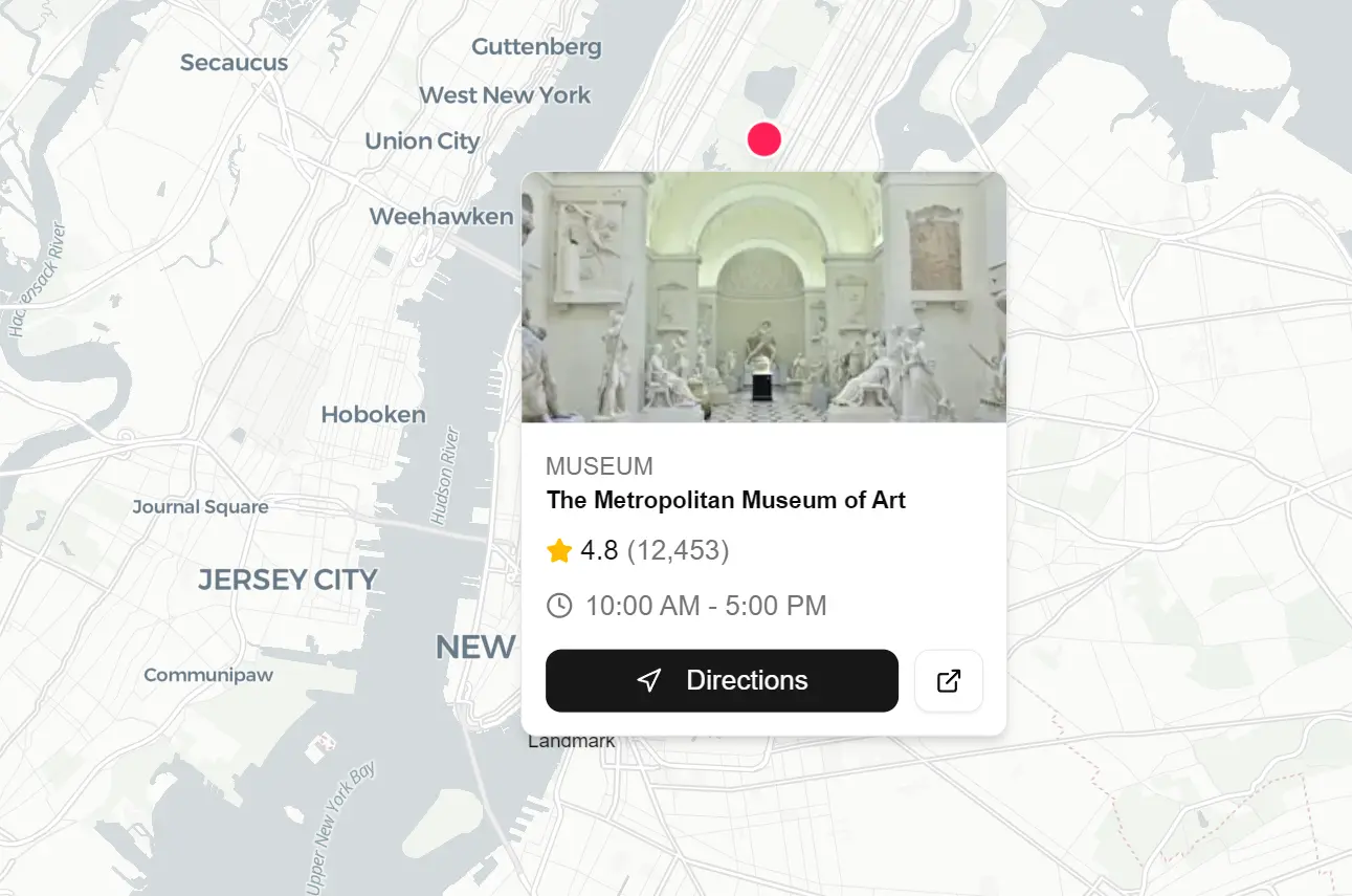
const places = [
{
id: 1,
name: "The Metropolitan Museum of Art",
label: "Museum",
category: "Museum",
rating: 4.8,
reviews: 12453,
hours: "10:00 AM - 5:00 PM",
image:
"https://images.unsplash.com/photo-1575223970966-76ae61ee7838?w=300&h=200&fit=crop",
lng: -73.9632,
lat: 40.7794,
},
{
id: 2,
name: "Brooklyn Bridge",
label: "Landmark",
category: "Landmark",
rating: 4.9,
reviews: 8234,
hours: "Open 24 hours",
image:
"https://images.unsplash.com/photo-1496588152823-86ff7695e68f?w=300&h=200&fit=crop",
lng: -73.9969,
lat: 40.7061,
},
{
id: 3,
name: "Grand Central Terminal",
label: "Transit",
category: "Transit",
rating: 4.7,
reviews: 5621,
hours: "5:15 AM - 2:00 AM",
image:
"https://images.unsplash.com/photo-1534430480872-3498386e7856?w=300&h=200&fit=crop",
lng: -73.9772,
lat: 40.7527,
},
];
export function PopupExample() {
return (
<div className="h-[500px] w-full">
<Map center={[-73.98, 40.74]} zoom={11}>
{places.map((place) => (
<MapMarker key={place.id} longitude={place.lng} latitude={place.lat}>
<MarkerContent>
<div className="size-5 rounded-full bg-rose-500 border-2 border-white shadow-lg cursor-pointer hover:scale-110 transition-transform" />
<MarkerLabel position="bottom">{place.label}</MarkerLabel>
</MarkerContent>
<MarkerPopup className="p-0 w-62">
<div className="relative h-32 overflow-hidden rounded-t-md">
<Image
fill
src={place.image}
alt={place.name}
className="object-cover"
/>
</div>
<div className="space-y-2 p-3">
<div>
<span className="text-xs font-medium text-muted-foreground uppercase tracking-wide">
{place.category}
</span>
<h3 className="font-semibold text-foreground leading-tight">
{place.name}
</h3>
</div>
<div className="flex items-center gap-3 text-sm">
<div className="flex items-center gap-1">
<Star className="size-3.5 fill-amber-400 text-amber-400" />
<span className="font-medium">{place.rating}</span>
<span className="text-muted-foreground">
({place.reviews.toLocaleString()})
</span>
</div>
</div>
<div className="flex items-center gap-1.5 text-sm text-muted-foreground">
<Clock className="size-3.5" />
<span>{place.hours}</span>
</div>
<div className="flex gap-2 pt-1">
<Button size="sm" className="flex-1 h-8">
<Navigation className="size-3.5 mr-1.5" />
Directions
</Button>
<Button size="sm" variant="outline" className="h-8">
<ExternalLink className="size-3.5" />
</Button>
</div>
</div>
</MarkerPopup>
</MapMarker>
))}
</Map>
</div>
);
}5. Use MapRoute to connect coordinate points with lines:
import {
  Map,
  MapMarker,
  MarkerContent,
  MarkerTooltip,
  MapRoute,
} from "@/components/ui/map";
const route = [
  [-74.006, 40.7128], // NYC City Hall
  [-73.9857, 40.7484], // Empire State Building
  [-73.9772, 40.7527], // Grand Central
  [-73.9654, 40.7829], // Central Park
] as [number, number][];
const stops = [
  { name: "City Hall", lng: -74.006, lat: 40.7128 },
  { name: "Empire State Building", lng: -73.9857, lat: 40.7484 },
  { name: "Grand Central Terminal", lng: -73.9772, lat: 40.7527 },
  { name: "Central Park", lng: -73.9654, lat: 40.7829 },
];
export function RouteExample() {
  return (
    <div className="h-[400px] w-full">
      <Map center={[-73.98, 40.75]} zoom={11.2}>
        <MapRoute coordinates={route} color="#3b82f6" width={4} opacity={0.8} />
        {stops.map((stop, index) => (
          <MapMarker key={stop.name} longitude={stop.lng} latitude={stop.lat}>
            <MarkerContent>
              <div className="size-4.5 rounded-full bg-blue-500 border-2 border-white shadow-lg flex items-center justify-center text-white text-xs font-bold">
                {index + 1}
              </div>
            </MarkerContent>
            <MarkerTooltip>{stop.name}</MarkerTooltip>
          </MapMarker>
        ))}
      </Map>
    </div>
  );
}
6. Configure which map controls appear and where they are positioned:
import { Map, MapControls } from "@/components/ui/map";
export function MapControlsExample() {
  return (
    <div className="h-[400px] w-full">
      <Map center={[2.3522, 48.8566]} zoom={11}>
        <MapControls
          position="bottom-right"
          showZoom
          showCompass
          showLocate
          showFullscreen
        />
      </Map>
    </div>
  );
}
7. Use the useMap hook to interact with the underlying MapLibre map object:
import { Map, useMap } from "@/components/ui/map";
function MyComponent() {
  const { map, isLoaded } = useMap();
  useEffect(() => {
    if (!map || !isLoaded) return;

    // Access the underlying MapLibre GL map instance
    map.on("click", (e) => {
      console.log("Clicked at:", e.lngLat);
    });
    // Use any MapLibre GL method
    map.flyTo({ center: [-74, 40.7], zoom: 12 });
  }, [map, isLoaded]);
  return null;
}
Available Props
Map Component
The root component initializes the MapLibre instance. It passes context to all child components.
| Prop | Type | Default | Description |
|---|---|---|---|
children | ReactNode | – | Child components (markers, controls, routes). |
styles | Object | – | Custom styles for light and dark themes. Overrides CARTO defaults. |
center | [number, number] | [0, 0] | Initial center coordinates [lng, lat]. |
zoom | number | 0 | Initial zoom level. |
useMap
A hook that returns the MapLibre instance. It must run inside a <Map> component.
- Returns:
{ map: MapLibre.Map, isLoaded: boolean }
MapControls
Renders navigation buttons on the map interface.
| Prop | Type | Default | Description |
|---|---|---|---|
position | string | “bottom-right” | Placement: “top-left”, “top-right”, “bottom-left”, “bottom-right”. |
showZoom | boolean | true | Displays zoom in/out buttons. |
showCompass | boolean | false | Displays a compass to reset bearing. |
showLocate | boolean | false | Displays a button to find the user’s location. |
showFullscreen | boolean | false | Displays a fullscreen toggle. |
onLocate | function | – | Callback returns { longitude, latitude } when located. |
MapMarker
A container that positions content at specific coordinates.
| Prop | Type | Default | Description |
|---|---|---|---|
longitude | number | – | Longitude coordinate. |
latitude | number | – | Latitude coordinate. |
children | ReactNode | – | Subcomponents like MarkerContent or MarkerPopup. |
onClick | function | – | Triggered on click. |
onDragEnd | function | – | Triggered when drag finishes. Returns {lng, lat}. |
MarkerContent
Defines the visual appearance of a marker. If omitted, the map renders a default blue dot.
| Prop | Type | Default | Description |
|---|---|---|---|
children | ReactNode | Blue Dot | Custom JSX for the marker icon. |
className | string | – | CSS classes for the marker container. |
MarkerPopup
Attaches a popup to a marker that opens upon clicking.
| Prop | Type | Default | Description |
|---|---|---|---|
children | ReactNode | – | Content inside the popup. |
className | string | – | CSS classes for the popup container. |
closeButton | boolean | false | Displays a close (X) button. |
MarkerTooltip
Renders a tooltip that appears when hovering over a marker.
| Prop | Type | Default | Description |
|---|---|---|---|
children | ReactNode | – | Content inside the tooltip. |
className | string | – | CSS classes for the tooltip container. |
MapRoute
Draws a polyline connecting a series of coordinates.
| Prop | Type | Default | Description |
|---|---|---|---|
coordinates | Array | – | Array of [lng, lat] pairs. |
color | string | “#4285F4” | CSS color value for the line. |
width | number | 3 | Line width in pixels. |
opacity | number | 0.8 | Line opacity (0 to 1). |
dashArray | [number, number] | – | Pattern for dashed lines [dash, gap]. |
Related Resources
- MapLibre GL JS: The underlying mapping library that mapcn builds upon.
- React Leaflet: Alternative React components for Leaflet maps.
- shadcn/ui: The component library that mapcn’s patterns and styling conventions match.
- mapcn-svelte: A Svelte port of mapcn.
FAQs
Q: Do I need an API key to use mapcn?
A: No. The library uses CARTO’s free basemap tiles by default. You can use mapcn immediately after installation.
Q: Can I use custom map styles or different tile providers?
A: Yes. Pass custom MapLibre style specifications to the styles prop on the Map component. You can use any tile provider that works with MapLibre GL.
Q: How do I handle marker click events to update React state?
A: Use the onClick prop on MapMarker components. This callback receives the click event and runs your state update logic just like any other React event handler.
Q: Does mapcn work with Next.js App Router?
A: Yes. Mark map components with “use client” directive if you’re using them in Server Components. MapLibre GL requires browser APIs that only run on the client side.
Q: Can I modify the component code after installation?
A: Yes. The npx command copies the components into your project. You own the code and can edit it directly to match your specific requirements.
