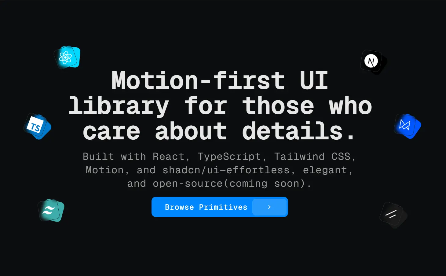
SHSF UI is a motion-first UI library built with React, TypeScript, Tailwind CSS, Motion, and shadcn/ui.
It’s created for developers who understand that user experience depends heavily on micro-interactions and smooth transitions.
Each component includes carefully orchestrated animations that provide immediate visual feedback
Features
🎯 Motion-first – Every component includes thoughtfully designed animations using Framer Motion.
📱 Accessible – Built with proper ARIA labels and keyboard navigation support.
🎨 Themeable – Full integration with Tailwind CSS for consistent design systems.
🔧 shadcn/ui – Built on top of proven, well-tested component patterns.
📦 Copy-paste – No package installation required, just copy components into your project.
⚡ Performant – Smooth 60fps animations with proper cleanup and memory management.
Use Cases
- Dashboard applications – Interactive cards, buttons, and navigation that respond to user actions with smooth animations.
- E-commerce platforms – Product cards with hover effects, animated add-to-cart buttons, and wishlist toggles that provide immediate feedback.
- Social media interfaces – Like buttons, bookmark toggles, and interaction elements that create better user experiences.
- Admin panels – Status indicators, form controls, and data visualization components that guide users through complex workflows.
- Mobile-first applications – Touch-optimized components with haptic-like visual feedback for a better mobile user experience.
Installation
1. Install the required dependencies for your React project:
# Install Shadcn Button component
npx shadcn@latest add button
# Install Framer Motion
npm install framer-motion
# Install Lucide React for icons
npm install lucide-react
2. Create the component directory structure:
mkdir -p components/shsfui/icon-button3. After installing the dependencies, you can start incorporating SHSF UI components into your project. The following example demonstrates how to add an icon button.
Create the component file:
mkdir -p components/shsfui/icon-button && touch components/shsfui/icon-button/bookmark-icon-button.tsxAdd the following code to the newly created file:
"use client";
import * as React from "react";
import { motion, AnimatePresence } from "framer-motion";
import { Bookmark } from "lucide-react";
import { Button, type ButtonProps } from "@/components/ui/button";
type BookmarkButtonProps = ButtonProps & {
  initialState?: boolean;
  onChange?: (isSaved: boolean) => void;
  className?: string;
};
const variants = {
  icon: {
    initial: { scale: 1, rotate: 0 },
    active: { scale: 1.1 },
    inactive: { scale: 1 },
    tapActive: { scale: 0.85, rotate: -10 },
    tapInactive: { scale: 1, rotate: 0 },
  },
  burst: {
    initial: { scale: 0, opacity: 0 },
    animate: { scale: [0, 1.4, 1], opacity: [0, 0.4, 0] },
    transition: { duration: 0.7, ease: "easeOut" },
  },
};
const createParticleAnimation = (index: number) => {
  const angle = (index / 5) * (2 * Math.PI);
  const radius = 18 + Math.random() * 8;
  const scale = 0.8 + Math.random() * 0.4;
  const duration = 0.6 + Math.random() * 0.1;
  return {
    initial: { scale: 0, opacity: 0.3, x: 0, y: 0 },
    animate: {
      scale: [0, scale, 0],
      opacity: [0.3, 0.8, 0],
      x: [0, Math.cos(angle) * radius],
      y: [0, Math.sin(angle) * radius * 0.75],
    },
    transition: { duration, delay: index * 0.04, ease: "easeOut" },
  };
};
const BookmarkButton = React.forwardRef<HTMLDivElement, BookmarkButtonProps>(
  (props, ref) => {
    const { initialState = false, onChange, className, ...restProps } = props;
    const [isSaved, setIsSaved] = React.useState(initialState);
    const handleClick = () => {
      const newState = !isSaved;
      setIsSaved(newState);
      onChange?.(newState);
    };
    return (
      <div
        ref={ref}
        className={`relative flex items-center justify-center ${
          className || ""
        }`}
      >
        <Button
          variant="ghost"
          size="icon"
          onClick={handleClick}
          aria-pressed={isSaved}
          aria-label={isSaved ? "Remove bookmark" : "Add bookmark"}
          {...restProps}
        >
          <motion.div
            initial="initial"
            animate={isSaved ? "active" : "inactive"}
            whileTap={isSaved ? "tapInactive" : "tapActive"}
            variants={variants.icon}
            transition={{ type: "spring", stiffness: 300, damping: 15 }}
            className="relative flex items-center justify-center"
          >
            <Bookmark className="opacity-60" size={16} aria-hidden="true" />
            <Bookmark
              className="absolute inset-0 text-blue-500 fill-blue-500 transition-all duration-300"
              size={16}
              aria-hidden="true"
              style={{ opacity: isSaved ? 1 : 0 }}
            />
            <AnimatePresence>
              {isSaved && (
                <motion.div
                  className="absolute inset-0 rounded-full"
                  style={{
                    background:
                      "radial-gradient(circle, rgba(59,130,246,0.4) 0%, rgba(59,130,246,0) 80%)",
                  }}
                  variants={variants.burst}
                  initial="initial"
                  animate="animate"
                  transition={variants.burst.transition}
                  exit={{ opacity: 0 }}
                />
              )}
            </AnimatePresence>
          </motion.div>
        </Button>
        <AnimatePresence>
          {isSaved && (
            <motion.div className="absolute inset-0 flex items-center justify-center pointer-events-none">
              {Array.from({ length: 5 }).map((_, i) => {
                const particle = createParticleAnimation(i);
                return (
                  <motion.div
                    key={i}
                    className="absolute rounded-full bg-blue-500"
                    style={{
                      width: `${4 + Math.random() * 2}px`,
                      height: `${4 + Math.random() * 2}px`,
                      filter: "blur(1px)",
                      transform: "translate(-50%, -50%)",
                    }}
                    initial={particle.initial}
                    animate={particle.animate}
                    transition={particle.transition}
                    exit={{ opacity: 0 }}
                  />
                );
              })}
            </motion.div>
          )}
        </AnimatePresence>
      </div>
    );
  }
);
BookmarkButton.displayName = "BookmarkButton";
export { BookmarkButton };
5. All available UI components:
- Icon Buttons: Interactive buttons that use icons for actions.
- Buttons: Standard clickable buttons for various user interactions.
- Avatar: Represents a user and can display an image or initials.
- Switch: A toggle control that allows users to turn a setting on or off.
- Tabs: A navigation element for switching between different views or sections.
- Sliders: Allows users to select a value from a range by moving a handle.
- Cards: A container for content and actions about a single subject.
Related Resources
- Framer Motion – The animation library that powers SHSF UI’s smooth transitions and effects
- shadcn/ui – The foundational component library that provides the base structure for SHSF UI components
- Tailwind CSS – The utility-first CSS framework used for styling and theming
- Lucide React – The icon library providing consistent iconography across all components
FAQs
Q: Do I need to install SHSF UI as a package?
A: No, SHSF UI follows a copy-paste approach. You visit the documentation, select the components you need, and copy the code directly into your project.
Q: Can I customize the animations and styling?
A: Yes, all components are fully customizable. You can modify the Framer Motion variants, adjust Tailwind classes, and even replace the animation logic to match your design system.
Q: Can I use SHSF UI with other component libraries?
A: Yes, since SHSF UI components are standalone, you can integrate them with other libraries.