The Future of Web Dev
The Future of Web Dev
Extended Shadcn/ui Components & Blocks for Next.js – GooseUI
A UI component library built on shadcn/ui. Adds custom components, visual effects, and pre-built blocks for Next.js apps.
GooseUI is a React/Next.js component library that extends shadcn/ui with additional UI components, visual effects, and theme customization tools. Built of top of React/Next.js, Tailwind CSS, and Radix UI primitives.
You can copy components into your components/ui folder via shadcn CLI and modify styles, adjust behavior, and customize implementations without fighting package abstractions.
GooseUI currently comes with 17+ UI components, animated effects like border beams, and five theme customizer variants. It also includes pre-built blocks for headers, footers, hero sections, and FAQ layouts.
Features
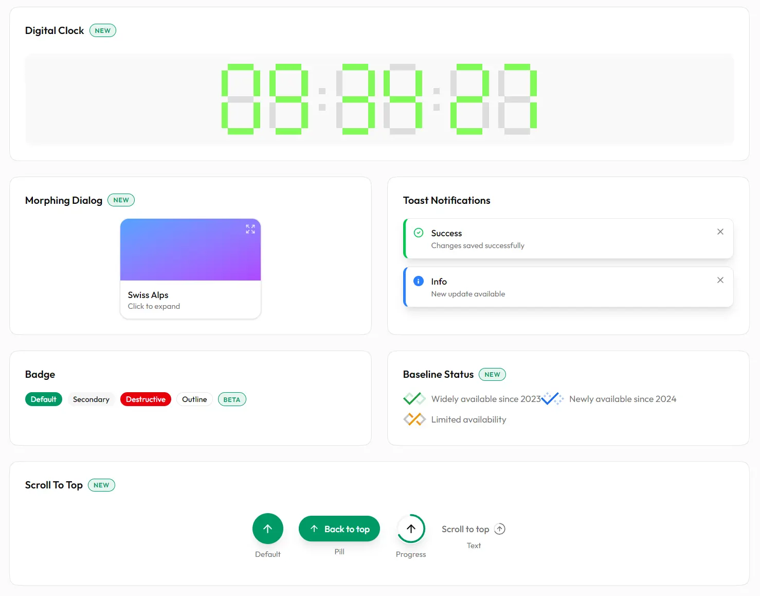
🎨 Custom Component Set: Adaptive Grid, Animated Timer, Morphing Dialog, Digital Clock, and more.
✨ Visual Effects: Border Beam creates animated borders that travel along container edges using CSS animations.
🎭 Theme Customizer Options: Five floating theme picker variants let users switch between color schemes and light/dark modes.
💅 Tailwind CSS: Styles compile through Tailwind’s latest version with CSS variable-based theming.
🌓 Theme System: Dark and light modes work through next-themes with persistent user preferences.
⚡ CLI-Based Installation: Install components via shadcn CLI.
♿ Accessible: Build on Radix UI primitives that handle ARIA attributes and keyboard navigation.
🧩 Pre-Built Blocks: Nine layout blocks like navigation bars, footers, hero sections, and service showcases.+ to support the latest React features.
Best For
- Marketing Landing Pages: Construct high-conversion pages using pre-built Hero sections, Brand carousels, and Service grids.
- SaaS Dashboards: Organize data visualization and controls with Adaptive Grids, Digital Clocks, and Search Panels.
- Interactive Applications: Manage user feedback and notifications with the Sonner-based Toast system.
- Documentation Sites: Implement clear navigation and information hierarchy using Accordions and Typography components.
How To Use It
1. Install individual components through the shadcn CLI. The command copies component files into your project’s components/ui directory.
npx shadcn@latest add @gooseui/buttonFor pnpm:
pnpm dlx shadcn@latest add @gooseui/buttonFor Yarn:
npx shadcn@latest add @gooseui/buttonFor Bun:
bunx --bun shadcn@latest add @gooseui/button2. After installation, import components from your local components folder. The files exist in your project, not in node_modules.
import { Button } from "@/components/ui/button"
export function MyComponent() {
  return <Button>Click me</Button>
}
Available Components
| Component | Description |
|---|---|
adaptive-grid | Grid layout that adjusts columns based on viewport width |
animated-timer | Countdown timer with animation effects |
badge | Small label component for status indicators |
baseline-status | Status indicator aligned to text baseline |
button | Interactive button with multiple variants |
card | Container component for grouped content |
carousel | Image and content slider with navigation |
checkbox | Form control for boolean selections |
digital-clock | Real-time clock display with formatting options |
input | Text input field with validation states |
morphing-dialog | Modal dialog with animated transitions |
promo-banner | Announcement banner for promotions |
scroll-to-top | Button that scrolls page to top when clicked |
search-panel | Expandable search interface |
theme-customizer | Floating panel for theme and color selection |
toast | Notification system with multiple variants |
typography | Text components with semantic styles |
Visual Effects
| Effect | Description |
|---|---|
border-beam | Animated beam that travels along container borders |
Pre-Built Blocks
| Block Type | Count | Description |
|---|---|---|
| Headers | 3 | Navigation bars, mega menus, sticky header variants |
| Footers | 3 | Site footers with newsletter forms and social links |
| Hero Sections | 2 | Landing page heroes with split layouts and media support |
| Brands | 2 | Logo showcases, client carousels, trust badge sections |
| Services | 2 | Feature card grids and service offering layouts |
| FAQ | 1 | Accordion-style FAQ section |
Related Resources
- shadcn/ui: The foundational component library that GooseUI extends.
- Radix UI: Unstyled accessible components that form the base layer for both shadcn/ui and GooseUI implementations.
- Tailwind CSS: Utility-first CSS framework used for all component styling and theming.
FAQs
Q: Can I modify component styles after installation?
A: Yes. Components copy into your components/ui folder as editable source files. You can change any Tailwind classes, adjust CSS variables, or rewrite component logic directly.
Q: Does GooseUI work with existing shadcn/ui projects?
A: Yes. GooseUI follows the same architecture and file structure. You can install components from both libraries in the same project.
Q: How do I update components after installation?
A: Since components exist as local files rather than npm packages, you manually update them by re-running the CLI add command. This overwrites the existing file with the latest version.


