The Future of Web Dev
The Future of Web Dev
Shadcn/ui Palette/Theme Generator with Live Preview – Shadesigner
Use Shadesigner to generate custom color themes for your shadcn/ui projects. Preview changes in real-time and export CSS instantly.
Shadesigner is a web-based shadcn/ui palette generator for generating custom shadcn/ui themes.
It allows you to generate, customize, and export theme configurations with real-time preview capabilities.
You can start with predefined color schemes, import existing CSS variables, or generate completely random palettes to match your project requirements.
Features
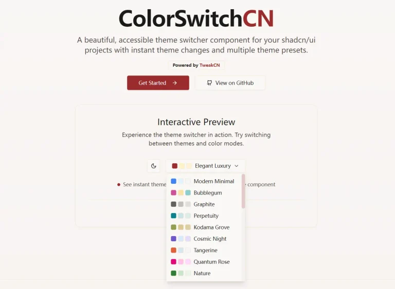
🎨 Pre-built Theme Presets: Choose from ten carefully crafted color schemes.
🎲 Random Theme Generation: Generate unexpected color combinations with a single click to spark creative inspiration.
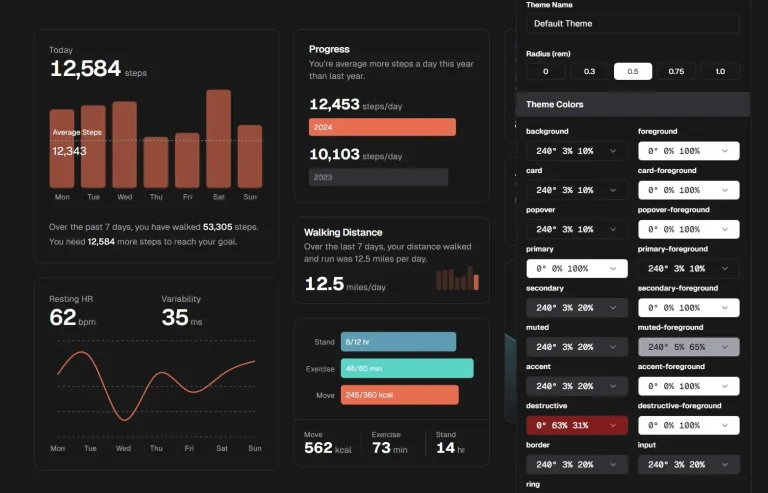
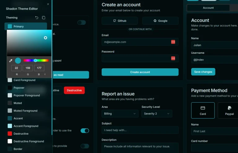
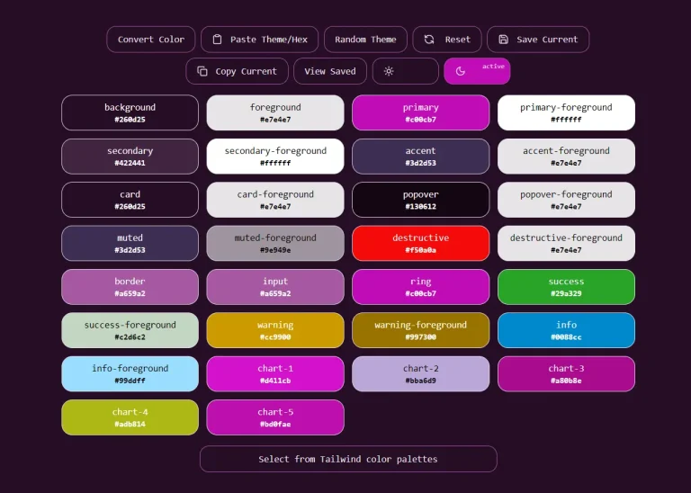
🔧 Granular Color Control: Adjust individual CSS custom properties including background, foreground, card, primary, secondary, muted, accent, and destructive colors.
📊 Chart Color Variables: Configure five distinct chart colors for data visualization components.
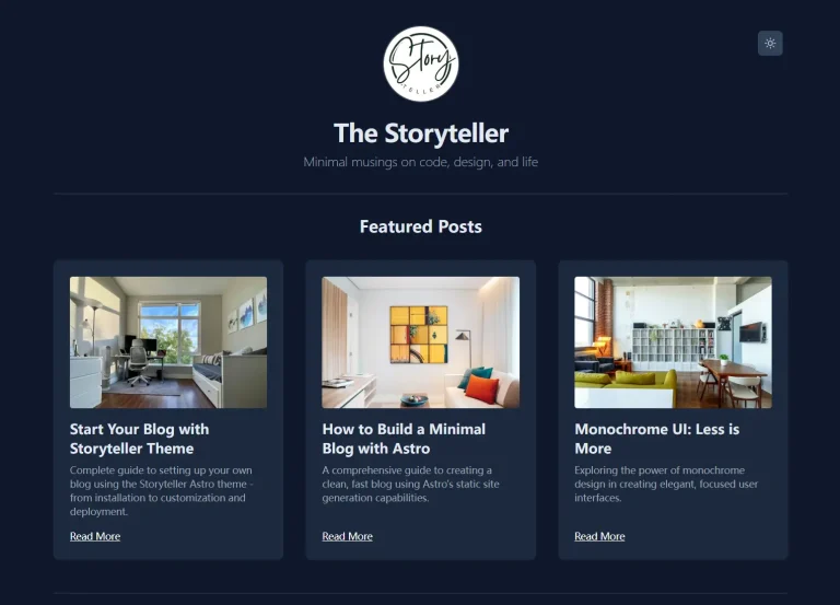
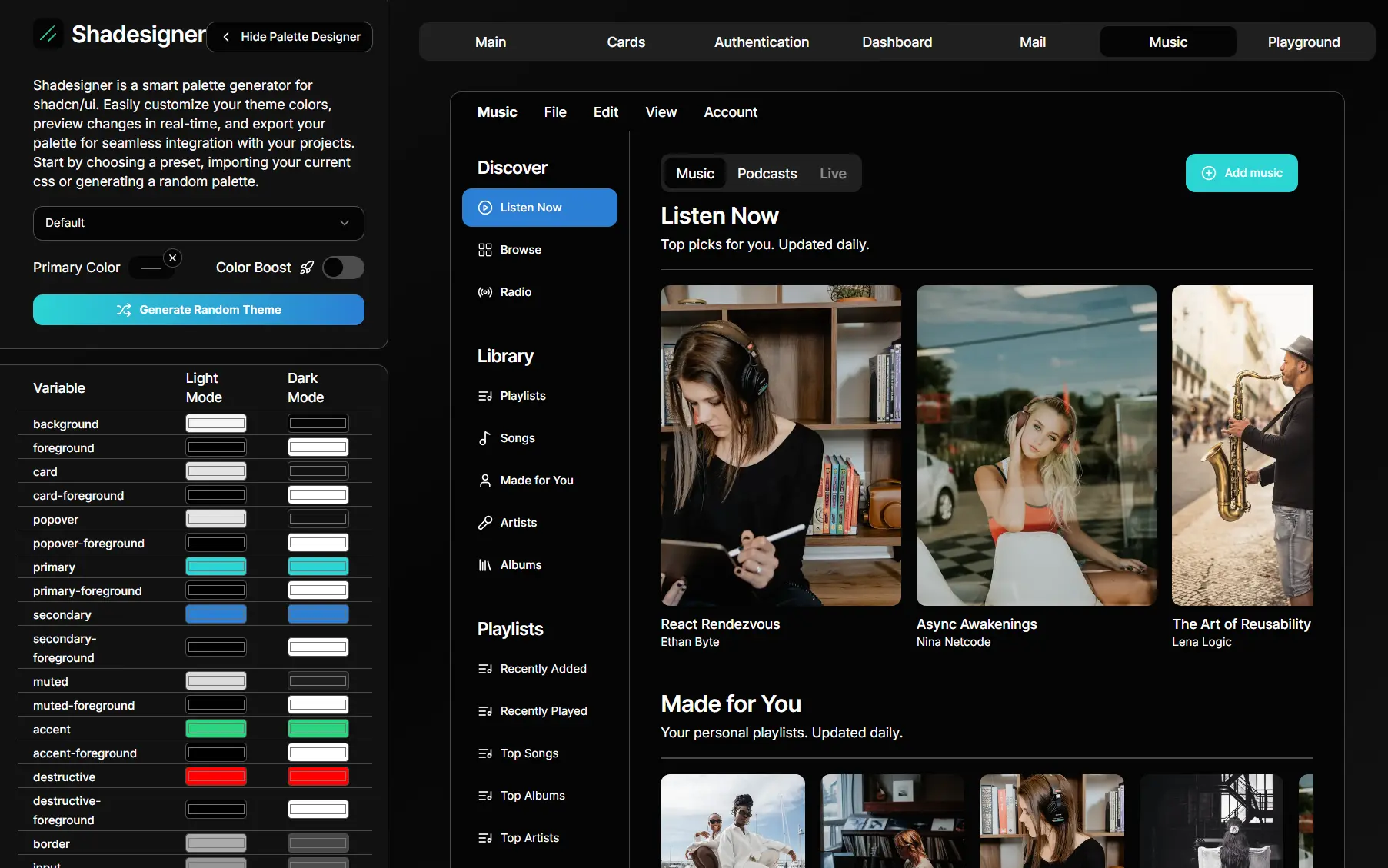
👀 Real-time Preview: View theme changes instantly on sample shadcn/ui components displayed in the interface.
🌙 Dual Mode Support: Generate themes that work for both light and dark mode implementations.
📁 CSS Export: Export complete theme configurations as ready-to-use CSS custom properties.
🎚️ Border Radius Control: Adjust the global border radius variable to match your design system.
Use Cases
- Rapid Prototyping: Quickly cycle through different color schemes for a new project to find the perfect look and feel.
- Brand Alignment: Adapt an existing shadcn/ui application to match a company’s specific brand guidelines and color palette.
- Creating Design Systems: Generate and maintain consistent color themes across multiple web development projects.
- Personal Projects: Experiment with unique and creative color combinations for your personal website or application.
How to Use It
1. Visit Shadesigner and select a predefined color theme from the dropdown menu. Available presets include Default, AquaCoast, Blushing Coral, Celestial Dusk, Galactic Dream, Neon, Ocean, Pastel Breeze, Sunlit Sands, and Sunset.
2. If you prefer to explore different options, click the ‘Generate Random Theme’ button for a unique, randomly created palette.
3. You can also paste your current CSS variables into the tool to edit an existing theme.
4. After your initial palette is loaded, you can customize it. The tool allows you to modify numerous CSS variables that control the appearance of your shadcn/ui components.
These variables include background, foreground, primary, secondary, destructive, card, popover, muted, accent, border, input, and ring. You can also adjust the Border Radius for all components.
5. As you make changes, a live preview of sample components on the right side of the screen updates in real-time. This allows you to see the immediate effect of your adjustments.
6. When your theme is complete, click the ‘Export CSS’ button. This generates a block of CSS code containing all the variables for both light and dark modes, ready to be copied and pasted into your project’s global stylesheet.
Related Resources
- shadcn/ui Official Documentation – Complete component library documentation and installation guides.
- Tailwind CSS Color Palette Generator – Official Tailwind documentation for creating custom color scales.
- shadcn/ui Customizer – An open-source web-based tool that helps you create and fine-tune themes for projects built with the shadcn/ui component library.