The Future of Web Dev
The Future of Web Dev
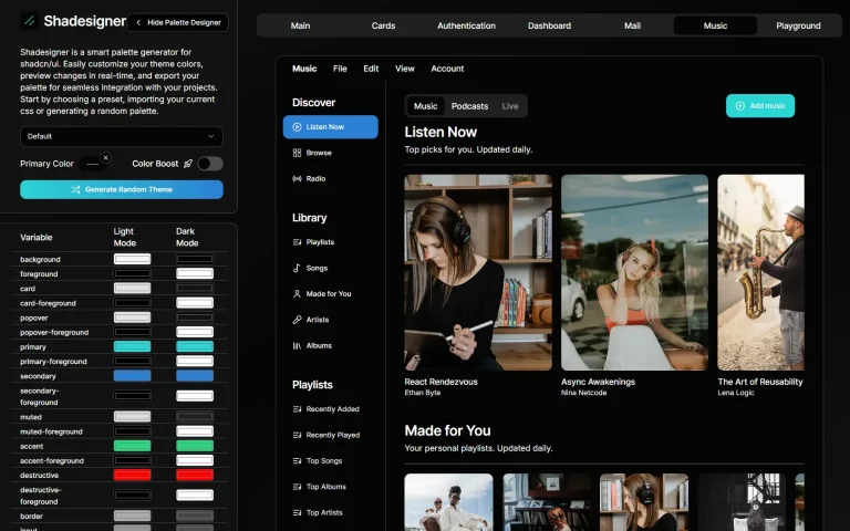
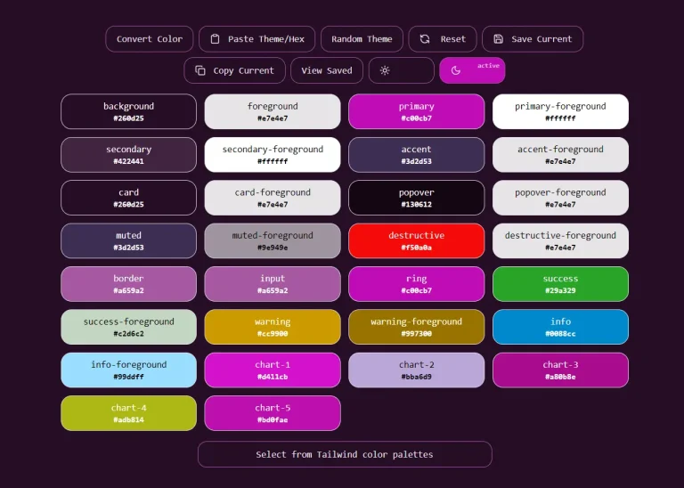
Shadcn Theme Editor: Real-Time Color Customization Tool
Use Shadcn Theme Editor for visual color customization in your Shadcn UI projects. Real-time previews, easy-to-integrate.
The Shadcn Theme Editor assists developers in managing and customizing theme colors within projects built using Shadcn UI.
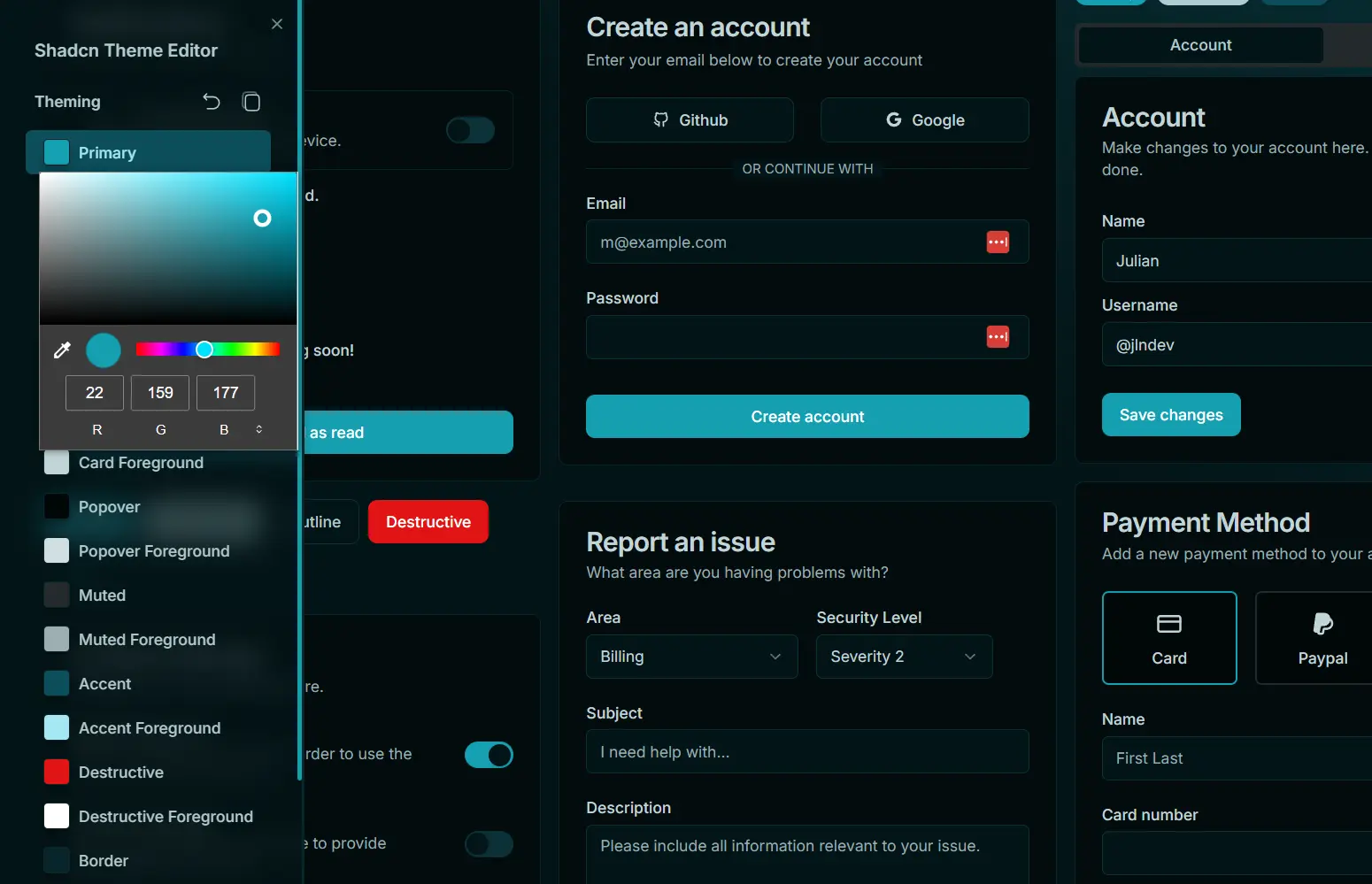
It provides a user interface with controls for different color properties. This allows for direct adjustments and immediate visual feedback on theme color changes.
Features
🎨 Color Management: A user interface offers direct control over theme color properties.
🔄 Real-Time Previews: Observe color changes instantly as you make adjustments.
📋 Copy Theme: Copy the current theme configuration to your clipboard for sharing or backup.
🌈 Integrated Color Picker: A built-in color picker activates for any selected theme color.
⏪ Reset Functionality: Revert themes to their default state with a single click. Use ⌘ + Click to clear all themes from Local Storage.
🌗 Theme Mode Switching: Change between System, Dark, or Light modes, leveraging next-themes.
✂️ Clipboard Actions: Double-click a color button to copy its specific color value. Hover over a color button to view its current value in a tooltip.
Editor Controls
- Reset Button: Click to reset the current theme.
⌘ + Click(orCtrl + Clickon Windows/Linux) deletes all themes stored in Local Storage. - Copy Button: Click to copy the current theme’s configuration to your clipboard.
- Color Picker Trigger: Opens the color picker for the selected theme color property.
- Color Button & Tooltip: Displays the name of the color. Double-click to copy the color’s current value. Hover to see the current value in a tooltip.
- Theme Changer: Allows switching between ‘System’, ‘Dark’, or ‘Light’ theme modes.
Development
To add Shadcn Theme Editor to your project as a development dependency.
npm:
npm install shadcn-theme-editor --save-devyarn:
yarn add shadcn-theme-editor --devpnpm:
pnpm add shadcn-theme-editor --save-devImport the component into your app/layout.tsx file. For optimal performance, especially regarding production builds, consider conditional importing. This method prevents the component from being included in the final production bundle.
Default Import:
import ShadcnThemeEditor from "shadcn-theme-editor";Conditional Import for Development Only:
let ShadcnThemeEditor: any;
if (process.env.NODE_ENV === 'development') {
  import('shadcn-theme-editor').then(module => {
    ShadcnThemeEditor = module.default; // Adjust if the module uses a different export
  });
} else {
  // eslint-disable-next-line react/display-name
  ShadcnThemeEditor = () => null;
}
After importing, include the component in your JSX:
<ShadcnThemeEditor />It is good practice to place this component within the ThemeProvider from next-themes.
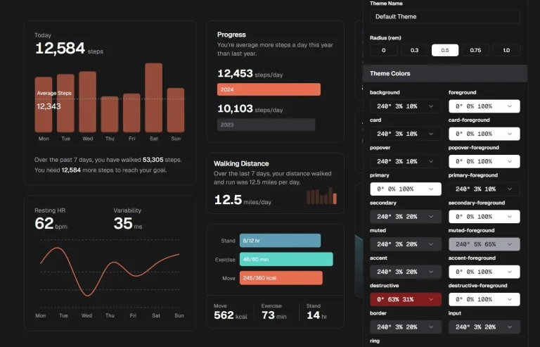
Preview