Shadcn Phone Input is a UI component that brings international phone number validation to your applications with zero configuration.
It extends the popular Shadcn/ui design system by adding a phone input field that handles country selection, number formatting, and validation automatically.
Features
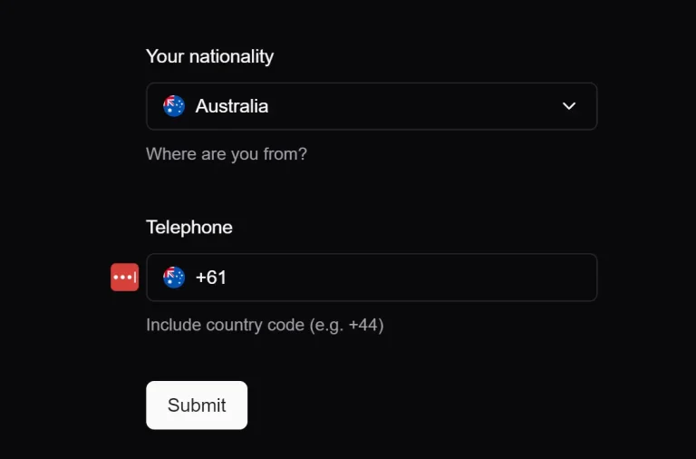
🌍 International Support – Handles phone number formats for all countries with automatic country detection.
✅ Built-in Validation – Integrates with React Hook Form and Zod for robust form validation.
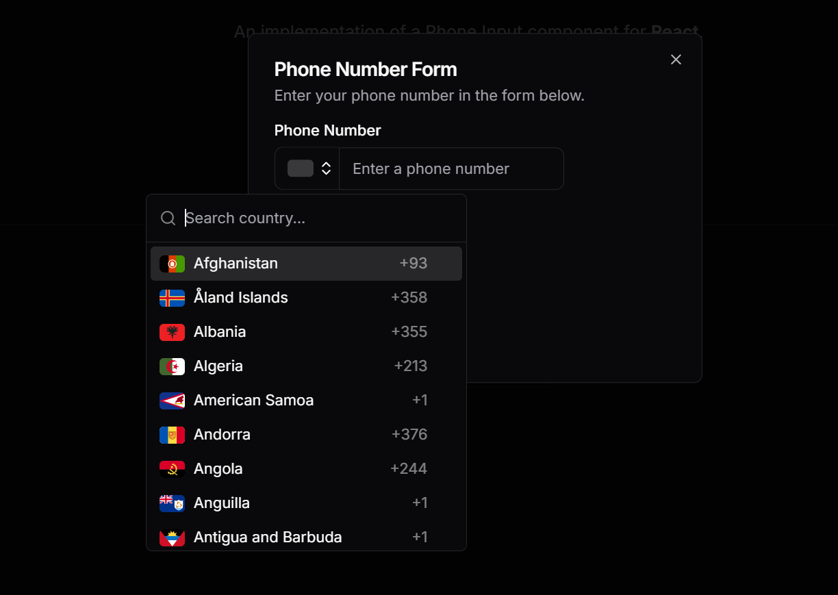
🔍 Country Search – Users can search for their country in the dropdown selector.
📱 Smart Formatting – Automatically formats phone numbers as users type.
🎯 TypeScript Support – Full TypeScript definitions for better development experience.
🎭 Customizable – Adapts to your theme and can be styled like other Shadcn components.
Use Cases
- User Authentication: Implement it in sign-up and login forms that use phone numbers for verification or two-factor authentication.
- Contact & Lead Forms: Capture accurate international contact information from potential customers or clients on your website.
- E-commerce Checkouts: Collect customer phone numbers for order updates, shipping notifications, or contact purposes during the checkout process.
- User Profile Settings: Allow users to add or update their phone number in their account or profile settings page.
How to Use It
1. Run the initialization command if you haven’t already set up Shadcn/ui in your project:
npx shadcn@latest init2. The phone input component depends on several Shadcn/ui components:
npx shadcn@latest add input
npx shadcn@latest add button
npx shadcn@latest add command
npx shadcn@latest add popover
npx shadcn@latest add scroll-area
npx shadcn@latest add form
3. It also uses react-phone-number-input for phone number handling:
npm install react-phone-number-input4. Create a new file named phone-input.tsx inside your components/ui directory. Copy the source code from the official Shadcn Phone Input component file and paste it into your new file.
import * as React from "react";
import { CheckIcon, ChevronsUpDown } from "lucide-react";
import * as RPNInput from "react-phone-number-input";
import flags from "react-phone-number-input/flags";

import { Button } from "@/components/ui/button";
import {
  Command,
  CommandEmpty,
  CommandGroup,
  CommandInput,
  CommandItem,
  CommandList,
} from "@/components/ui/command";
import { Input } from "@/components/ui/input";
import {
  Popover,
  PopoverContent,
  PopoverTrigger,
} from "@/components/ui/popover";
import { ScrollArea } from "@/components/ui/scroll-area";
import { cn } from "@/lib/utils";

type PhoneInputProps = Omit<
  React.ComponentProps<"input">,
  "onChange" | "value" | "ref"
> &
  Omit<RPNInput.Props<typeof RPNInput.default>, "onChange"> & {
    onChange?: (value: RPNInput.Value) => void;
  };

const PhoneInput: React.ForwardRefExoticComponent<PhoneInputProps> =
  React.forwardRef<React.ElementRef<typeof RPNInput.default>, PhoneInputProps>(
    ({ className, onChange, value, ...props }, ref) => {
      return (
        <RPNInput.default
          ref={ref}
          className={cn("flex", className)}
          flagComponent={FlagComponent}
          countrySelectComponent={CountrySelect}
          inputComponent={InputComponent}
          smartCaret={false}
          value={value || undefined}
          /**
           * Handles the onChange event.
           *
           * react-phone-number-input might trigger the onChange event as undefined
           * when a valid phone number is not entered. To prevent this,
           * the value is coerced to an empty string.
           *
           * @param {E164Number | undefined} value - The entered value
           */
          onChange={(value) => onChange?.(value || ("" as RPNInput.Value))}
          {...props}
        />
      );
    },
  );
PhoneInput.displayName = "PhoneInput";

const InputComponent = React.forwardRef<
  HTMLInputElement,
  React.ComponentProps<"input">
>(({ className, ...props }, ref) => (
  <Input
    className={cn("rounded-e-lg rounded-s-none", className)}
    {...props}
    ref={ref}
  />
));
InputComponent.displayName = "InputComponent";

type CountryEntry = { label: string; value: RPNInput.Country | undefined };

type CountrySelectProps = {
  disabled?: boolean;
  value: RPNInput.Country;
  options: CountryEntry[];
  onChange: (country: RPNInput.Country) => void;
};

const CountrySelect = ({
  disabled,
  value: selectedCountry,
  options: countryList,
  onChange,
}: CountrySelectProps) => {
  const scrollAreaRef = React.useRef<HTMLDivElement>(null);
  const [searchValue, setSearchValue] = React.useState("");
  const [isOpen, setIsOpen] = React.useState(false);

  return (
    <Popover
      open={isOpen}
      modal
      onOpenChange={(open) => {
        setIsOpen(open);
        open && setSearchValue("");
      }}
    >
      <PopoverTrigger asChild>
        <Button
          type="button"
          variant="outline"
          className="flex gap-1 rounded-e-none rounded-s-lg border-r-0 px-3 focus:z-10"
          disabled={disabled}
        >
          <FlagComponent
            country={selectedCountry}
            countryName={selectedCountry}
          />
          <ChevronsUpDown
            className={cn(
              "-mr-2 size-4 opacity-50",
              disabled ? "hidden" : "opacity-100",
            )}
          />
        </Button>
      </PopoverTrigger>
      <PopoverContent className="w-[300px] p-0">
        <Command>
          <CommandInput
            value={searchValue}
            onValueChange={(value) => {
              setSearchValue(value);
              setTimeout(() => {
                if (scrollAreaRef.current) {
                  const viewportElement = scrollAreaRef.current.querySelector(
                    "[data-radix-scroll-area-viewport]",
                  );
                  if (viewportElement) {
                    viewportElement.scrollTop = 0;
                  }
                }
              }, 0);
            }}
            placeholder="Search country..."
          />
          <CommandList>
            <ScrollArea ref={scrollAreaRef} className="h-72">
              <CommandEmpty>No country found.</CommandEmpty>
              <CommandGroup>
                {countryList.map(({ value, label }) =>
                  value ? (
                    <CountrySelectOption
                      key={value}
                      country={value}
                      countryName={label}
                      selectedCountry={selectedCountry}
                      onChange={onChange}
                      onSelectComplete={() => setIsOpen(false)}
                    />
                  ) : null,
                )}
              </CommandGroup>
            </ScrollArea>
          </CommandList>
        </Command>
      </PopoverContent>
    </Popover>
  );
};

interface CountrySelectOptionProps extends RPNInput.FlagProps {
  selectedCountry: RPNInput.Country;
  onChange: (country: RPNInput.Country) => void;
  onSelectComplete: () => void;
}

const CountrySelectOption = ({
  country,
  countryName,
  selectedCountry,
  onChange,
  onSelectComplete,
}: CountrySelectOptionProps) => {
  const handleSelect = () => {
    onChange(country);
    onSelectComplete();
  };

  return (
    <CommandItem className="gap-2" onSelect={handleSelect}>
      <FlagComponent country={country} countryName={countryName} />
      <span className="flex-1 text-sm">{countryName}</span>
      <span className="text-sm text-foreground/50">{`+${RPNInput.getCountryCallingCode(country)}`}</span>
      <CheckIcon
        className={`ml-auto size-4 ${country === selectedCountry ? "opacity-100" : "opacity-0"}`}
      />
    </CommandItem>
  );
};

const FlagComponent = ({ country, countryName }: RPNInput.FlagProps) => {
  const Flag = flags[country];

  return (
    <span className="flex h-4 w-6 overflow-hidden rounded-sm bg-foreground/20 [&_svg:not([class*='size-'])]:size-full">
      {Flag && <Flag title={countryName} />}
    </span>
  );
};

export { PhoneInput };
5. You can now use the PhoneInput component within a form. The following example demonstrates its use with react-hook-form and zod for validation.
// components/YourForm.tsx
import { zodResolver } from "@hookform/resolvers/zod";
import { useForm } from "react-hook-form";
import { isValidPhoneNumber } from "react-phone-number-input";
import { z } from "zod";
import { Button } from "@/components/ui/button";
import { Form, FormControl, FormField, FormItem, FormLabel, FormMessage } from "@/components/ui/form";
import { PhoneInput } from "@/components/ui/phone-input";
// Define the validation schema
const formSchema = z.object({
  phoneNumber: z.string().refine(isValidPhoneNumber, { message: "Invalid phone number." }),
});
export function YourForm() {
  const form = useForm<z.infer<typeof formSchema>>({
    resolver: zodResolver(formSchema),
    defaultValues: {
      phoneNumber: "",
    },
  });
  function onSubmit(data: z.infer<typeof formSchema>) {
    console.log("Submitted phone number:", data.phoneNumber);
  }
  return (
    <Form {...form}>
      <form onSubmit={form.handleSubmit(onSubmit)} className="space-y-4">
        <FormField
          control={form.control}
          name="phoneNumber"
          render={({ field }) => (
            <FormItem>
              <FormLabel>Phone Number</FormLabel>
              <FormControl>
                <PhoneInput placeholder="Enter phone number" {...field} />
              </FormControl>
              <FormMessage />
            </FormItem>
          )}
        />
        <Button type="submit">Submit</Button>
      </form>
    </Form>
  );
}
Related Resources
- Shadcn/ui – The UI component library that this phone input extends.
- React Hook Form – Form library that integrates perfectly with this component.
- React Phone Number Input – The underlying library handling phone number logic.
- Zod – Schema validation library for robust form validation.
FAQs
Q: Can I use this component without React Hook Form?
A: Yes, you can use the PhoneInput component as a controlled component by passing value and onChange props directly. However, you’ll miss out on the automatic validation integration.
Q: Does this component work with Next.js?
A: Absolutely. The component works with any React framework including Next.js, Remix, and Gatsby.
Q: How do I customize the country dropdown?
A: The component uses the Command component from Shadcn/ui for country selection. You can modify the styling through CSS classes or customize the component code directly.
Q: Can I restrict the available countries?
A: Yes, react-phone-number-input supports country restrictions. You can pass a countries prop to limit which countries appear in the dropdown.