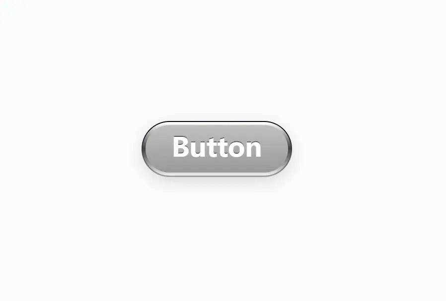
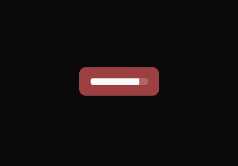
Metal Buttons is a lightweight and customizable Shadcn/ui component that creates realistic metallic buttons with tactile feedback.
It currently comes with six distinct variants, including a default style and five themed options ranging from primary and success indicators to error signals and metallic finishes like gold and bronze.
Features
🔧 Full customization capabilities through TailwindCSS
📱 Responsive design that works across device sizes
⚡ Seamless integration with existing shadcn/ui components
🧩 Easy installation through shadcn/ui CLI
Use Cases
- Premium Web Applications: Enhance subscription-based web applications with gold or bronze metal buttons to signify premium features or paid upgrades.
- Gaming Interfaces: Implement metal buttons in game UIs or gaming-related websites to create immersive, textured control elements that align with game aesthetics.
- Financial Applications: Use metal buttons for transaction confirmations or payment processes, lending a sense of security and importance to critical actions.
- Portfolio Websites: Add distinctive call-to-action elements with metal buttons to make portfolio websites stand out and draw attention to important sections.
- E-commerce Platforms: Incorporate metal buttons for “Add to Cart” or “Checkout” actions to create a premium shopping experience.
How to use it
1. Add the Metal Buttons component to your project using the Shadcn/ui command-line interface. Choose the command corresponding to your package manager:
pnpm
pnpm dlx shadcn-ui@latest add https://button.lakshb.dev/r/metal-button.jsonnpm
npx shadcn-ui@latest add https://button.lakshb.dev/r/metal-button.jsonyarn
yarn dlx shadcn-ui@latest add https://button.lakshb.dev/r/metal-button.jsonbun
bunx --bun shadcn-ui@latest add https://button.lakshb.dev/r/metal-button.json2. To create a default metal button:
import { MetalButton } from "@/components/metal-button";
export function MetalButtonDefault() {
  return (
    <div className="flex min-h-screen items-center justify-center">
      <MetalButton variant="default">Default</MetalButton>
    </div>
  );
}
3. The Metal Button component comes with five additional themed variants:
Primary Variant
import { MetalButton } from "@/components/metal-button";
export function MetalButtonPrimary() {
  return (
    <div className="flex min-h-screen items-center justify-center">
      <MetalButton variant="primary">Primary</MetalButton>
    </div>
  );
}
Success Variant
import { MetalButton } from "@/components/metal-button";
export function MetalButtonSuccess() {
  return (
    <div className="flex min-h-screen items-center justify-center">
      <MetalButton variant="success">Success</MetalButton>
    </div>
  );
}
Error Variant
import { MetalButton } from "@/components/metal-button";
export function MetalButtonError() {
  return (
    <div className="flex min-h-screen items-center justify-center">
      <MetalButton variant="error">Error</MetalButton>
    </div>
  );
}
Gold Variant
import { MetalButton } from "@/components/metal-button";
export function MetalButtonGold() {
  return (
    <div className="flex min-h-screen items-center justify-center">
      <MetalButton variant="gold">Gold</MetalButton>
    </div>
  );
}
Bronze Variant
import { MetalButton } from "@/components/metal-button";
export function MetalButtonBronze() {
  return (
    <div className="flex min-h-screen items-center justify-center">
      <MetalButton variant="bronze">Bronze</MetalButton>
    </div>
  );
}
Related Resources
- Shadcn/ui: The UI component library Metal Buttons extends. https://ui.shadcn.com/
- Tailwind CSS: The utility-first CSS framework used for styling Metal Buttons. https://tailwindcss.com/
FAQs
Q: Does Metal Buttons require Shadcn/ui?
A: Yes, this component is designed for integration with projects already using Shadcn/ui.
Q: Can I customize the appearance beyond the provided themes?
A: Yes, since it uses Tailwind CSS, you can apply additional Tailwind utility classes or modify the component’s source code after installation for deeper customization.
Q: Are there different sizes available for Metal Buttons?
A: The base component follows standard button sizing, but you can adjust padding and font size using Tailwind classes for custom dimensions.
Q: Can I add icons to Metal Buttons?
A: Yes, you can add icons to Metal Buttons just as you would with standard shadcn/ui button components. Import your preferred icon library and add icons as children within the button component.
Preview