The Future of Web Dev
The Future of Web Dev
Easy shadcn/ui Theme Switcher Component – ColorSwitchCN
Add professional theme switching to shadcn/ui projects. ColorSwitchCN provides multiple color schemes with persistent user preferences.
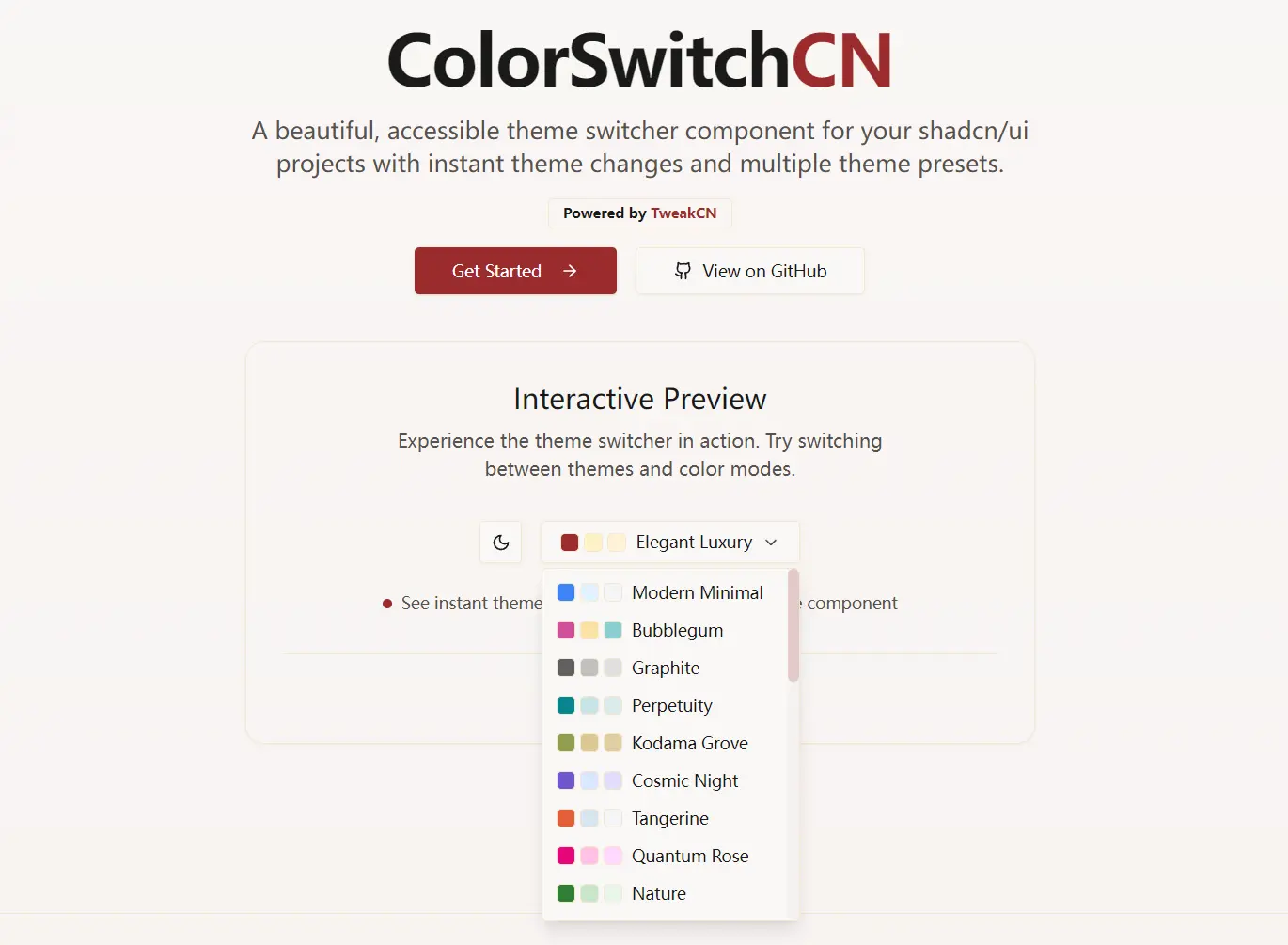
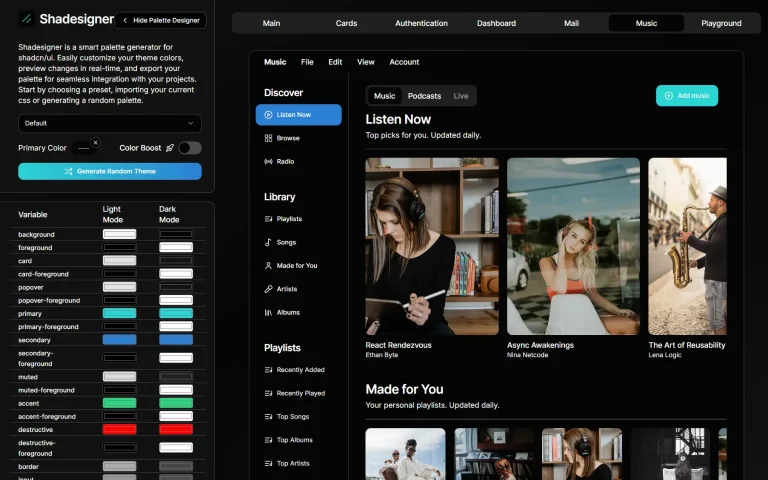
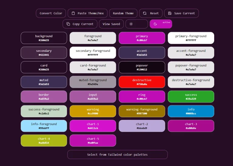
ColorSwitchCN is a theme management component for shadcn/ui. It allows you to handle light and dark mode switching alongside multiple predefined color schemes in your shadcn/ui-powered apps.
The component draws inspiration from TweakCN, a visual theme editor for Tailwind CSS and shadcn/ui components.
ColorSwitchCN extends it by providing a production-ready component that you can drop into any shadcn/ui project.
It helps you handle the complexity of theme management while exposing a clean API for customization and extension.
Features
🌓 Toggle between light and dark modes with automatic system preference detection.
🎨 Select from multiple predefined color schemes including modern, cyberpunk, and nature themes.
💾 Persist theme preferences in local storage for consistent user experience.
⚡ Automatically apply theme changes to document root for instant visual feedback.
🔧 Fully customizable theme presets with support for custom color definitions.
🔄 Seamless integration with Next.js themes and other React applications.
Use Cases
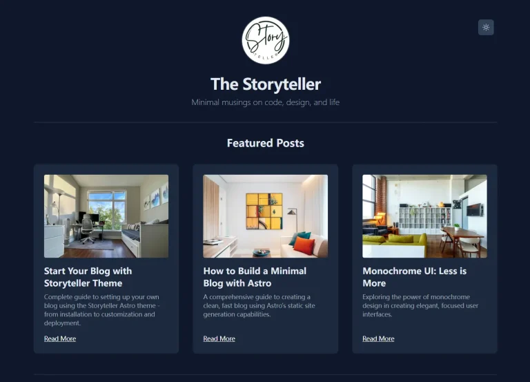
- Building modern web applications that require both light and dark mode support with additional color scheme options.
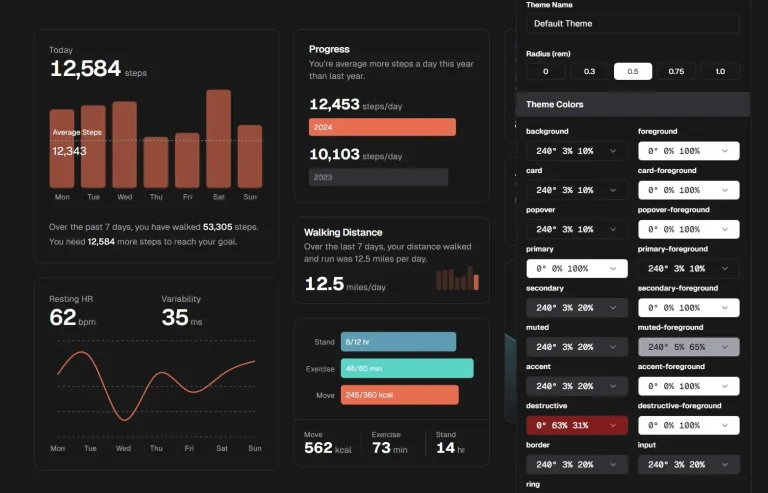
- Creating dashboard interfaces where users need to switch between different visual themes based on their preferences or usage context.
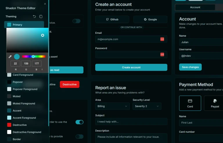
- Developing SaaS applications that want to offer branded color schemes alongside standard light and dark modes.
- Building documentation sites or blogs that need elegant theme switching without complex configuration.
- Creating e-commerce platforms where different color schemes can match seasonal campaigns or brand variations.
How to Use It
1. Add the component to your project using the shadcn/ui CLI.
For npm:
npx shadcn@latest add https://colorswitchcn.heywinit.me/r/colorswitchcn.jsonFor pnpm:
pnpm dlx shadcn@latest add https://colorswitchcn.heywinit.me/r/colorswitchcn.jsonFor yarn:
yarn dlx shadcn@latest add https://colorswitchcn.heywinit.me/r/colorswitchcn.jsonFor bun:
bunx shadcn@latest add https://colorswitchcn.heywinit.me/r/colorswitchcn.json2. Wrap your application’s root layout with the theme providers. This makes the theme context available to all components.
Navigate to your root layout file, such as app/layout.tsx, and modify it as follows.
import { ThemeProvider } from "next-themes";
import { CustomThemeProvider } from "@/lib/theme-provider";
export default function RootLayout({ children }: { children: React.ReactNode }) {
  return (
    <html lang="en" suppressHydrationWarning>
      <head />
      <body>
        <ThemeProvider attribute="class" defaultTheme="system" enableSystem>
          <CustomThemeProvider defaultPreset="modern-minimal">
            {children}
          </CustomThemeProvider>
        </ThemeProvider>
      </body>
    </html>
  );
}
3. You can now import and use the ThemeSwitcher component anywhere in your application.
import { ThemeSwitcher } from "@/components/ui/theme-switcher";
export default function SiteHeader() {
  return (
    <header className="flex items-center justify-between p-4 border-b">
      <p>My Application</p>
      <ThemeSwitcher />
    </header>
  );
}
The ThemeSwitcher component accepts an optional align prop which can be set to "start", "center", or "end" to control the horizontal alignment of the dropdown menu.
4. For more control, you can manage the theme programmatically with the useTheme hook. This is useful for creating custom UI elements that change the theme.
import { useTheme } from "@/lib/theme-provider";
function ThemeControlButtons() {
  const { themeState, setThemeMode, applyThemePreset } = useTheme();
  const handleToggleMode = () => {
    const newMode = themeState.currentMode === "light" ? "dark" : "light";
    setThemeMode(newMode);
  };
  const handleApplyPreset = (presetName: string) => {
    applyThemePreset(presetName);
  };
  return (
    <div>
      <button onClick={handleToggleMode}>
        Switch to {themeState.currentMode === "light" ? "Dark" : "Light"} Mode
      </button>
      <button onClick={() => handleApplyPreset("cyberpunk")}>
        Apply Cyberpunk Theme
      </button>
    </div>
  );
}
5. You can define your own theme presets. Open the lib/theme-presets.ts file and add a new entry to the presets object.
Each preset requires a label and a styles object containing color definitions for both light and dark modes.
// In lib/theme-presets.ts
export const presets: Record<string, ThemePreset> = {
  // ... existing presets
  "oceanic-blue": {
    label: "Oceanic Blue",
    styles: {
      light: {
        background: "#f0f9ff",
        foreground: "#0c4a6e",
        primary: "#0ea5e9",
        // ... other color properties
      },
      dark: {
        background: "#0c4a6e",
        foreground: "#f0f9ff",
        primary: "#38bdf8",
        // ... other color properties
      }
    }
  }
};
FAQs
Q: Can I customize the appearance of the theme switcher dropdown?
A: Yes, you can modify the component styling by editing the theme-switcher.tsx file in your components directory. The component uses standard ShadCN UI components, so all customization techniques that work with ShadCN UI apply here.
Q: How does theme persistence work across browser sessions?
A: ColorSwitchCN uses local storage to save user theme preferences. When users return to your application, their selected theme mode and color preset are automatically restored. The component also falls back to system preferences when no explicit choice has been saved.
Q: Does ColorSwitchCN require a specific framework?
A: The component is built for Next.js applications using ShadCN UI. It relies on the next-themes library for theme management.