The Future of Web Dev
The Future of Web Dev
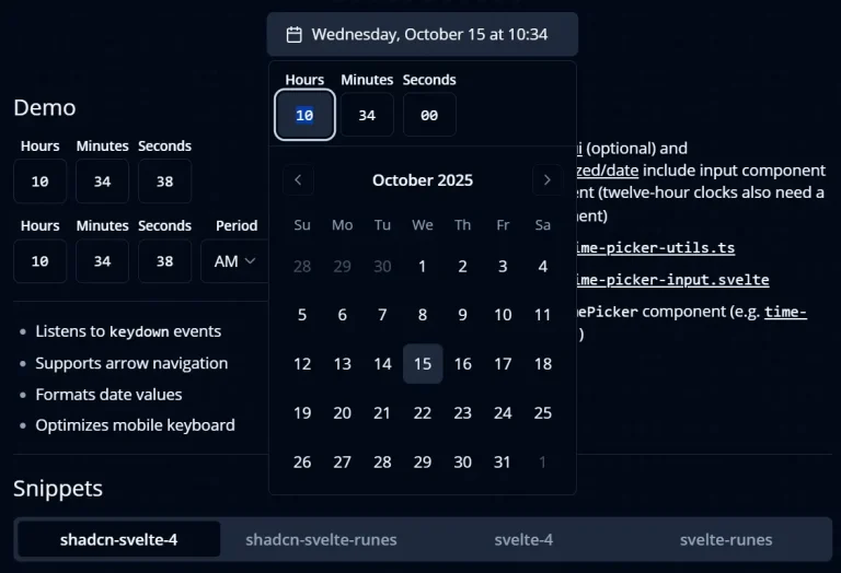
Easy Shadcn/ui Time Picker with Keyboard Navigation and Validation
Lightweight TimePicker component for Shadcn/UI projects. No external dependencies, full keyboard support, and 12/24-hour format options.

This is a simple shadcn/ui time picker component that allows you to select hours, minutes, and seconds with support for keyboard navigation and validation.
Features
⚡ No external dependencies required
⌨️ Full keyboard navigation support with arrow keys for time adjustment
🔢 Automatic input validation for hours, minutes, and seconds
📱 Mobile-optimized keyboard input with decimal mode
🕒 Support for both 12-hour and 24-hour time formats
🎯 Individual input fields for precise time control
♿ Accessible interface with proper focus management
🔄 Real-time date object updates
Preview
How to use it:
1. To get started, make sure you have shadcn/ui installed in your project.
2. Install the necessary shadcn/ui components:
npx shadcn-ui@latest add input
npx shadcn-ui@latest add label
npx shadcn-ui@latest add select  # Only needed for 12-hour format
3. Create the utility file by copying time-picker-utils.tsx code into your project’s utilities folder.
/**
 * regular expression to check for valid hour format (01-23)
 */
export function isValidHour(value: string) {
  return /^(0[0-9]|1[0-9]|2[0-3])$/.test(value);
}

/**
 * regular expression to check for valid 12 hour format (01-12)
 */
export function isValid12Hour(value: string) {
  return /^(0[1-9]|1[0-2])$/.test(value);
}

/**
 * regular expression to check for valid minute format (00-59)
 */
export function isValidMinuteOrSecond(value: string) {
  return /^[0-5][0-9]$/.test(value);
}

type GetValidNumberConfig = { max: number; min?: number; loop?: boolean };

export function getValidNumber(
  value: string,
  { max, min = 0, loop = false }: GetValidNumberConfig
) {
  let numericValue = parseInt(value, 10);

  if (!isNaN(numericValue)) {
    if (!loop) {
      if (numericValue > max) numericValue = max;
      if (numericValue < min) numericValue = min;
    } else {
      if (numericValue > max) numericValue = min;
      if (numericValue < min) numericValue = max;
    }
    return numericValue.toString().padStart(2, "0");
  }

  return "00";
}

export function getValidHour(value: string) {
  if (isValidHour(value)) return value;
  return getValidNumber(value, { max: 23 });
}

export function getValid12Hour(value: string) {
  if (isValid12Hour(value)) return value;
  return getValidNumber(value, { min: 1, max: 12 });
}

export function getValidMinuteOrSecond(value: string) {
  if (isValidMinuteOrSecond(value)) return value;
  return getValidNumber(value, { max: 59 });
}

type GetValidArrowNumberConfig = {
  min: number;
  max: number;
  step: number;
};

export function getValidArrowNumber(
  value: string,
  { min, max, step }: GetValidArrowNumberConfig
) {
  let numericValue = parseInt(value, 10);
  if (!isNaN(numericValue)) {
    numericValue += step;
    return getValidNumber(String(numericValue), { min, max, loop: true });
  }
  return "00";
}

export function getValidArrowHour(value: string, step: number) {
  return getValidArrowNumber(value, { min: 0, max: 23, step });
}

export function getValidArrow12Hour(value: string, step: number) {
  return getValidArrowNumber(value, { min: 1, max: 12, step });
}

export function getValidArrowMinuteOrSecond(value: string, step: number) {
  return getValidArrowNumber(value, { min: 0, max: 59, step });
}

export function setMinutes(date: Date, value: string) {
  const minutes = getValidMinuteOrSecond(value);
  date.setMinutes(parseInt(minutes, 10));
  return date;
}

export function setSeconds(date: Date, value: string) {
  const seconds = getValidMinuteOrSecond(value);
  date.setSeconds(parseInt(seconds, 10));
  return date;
}

export function setHours(date: Date, value: string) {
  const hours = getValidHour(value);
  date.setHours(parseInt(hours, 10));
  return date;
}

export function set12Hours(date: Date, value: string, period: Period) {
  const hours = parseInt(getValid12Hour(value), 10);
  const convertedHours = convert12HourTo24Hour(hours, period);
  date.setHours(convertedHours);
  return date;
}

export type TimePickerType = "minutes" | "seconds" | "hours" | "12hours";
export type Period = "AM" | "PM";

export function setDateByType(
  date: Date,
  value: string,
  type: TimePickerType,
  period?: Period
) {
  switch (type) {
    case "minutes":
      return setMinutes(date, value);
    case "seconds":
      return setSeconds(date, value);
    case "hours":
      return setHours(date, value);
    case "12hours": {
      if (!period) return date;
      return set12Hours(date, value, period);
    }
    default:
      return date;
  }
}

export function getDateByType(date: Date, type: TimePickerType) {
  switch (type) {
    case "minutes":
      return getValidMinuteOrSecond(String(date.getMinutes()));
    case "seconds":
      return getValidMinuteOrSecond(String(date.getSeconds()));
    case "hours":
      return getValidHour(String(date.getHours()));
    case "12hours":
      const hours = display12HourValue(date.getHours());
      return getValid12Hour(String(hours));
    default:
      return "00";
  }
}

export function getArrowByType(
  value: string,
  step: number,
  type: TimePickerType
) {
  switch (type) {
    case "minutes":
      return getValidArrowMinuteOrSecond(value, step);
    case "seconds":
      return getValidArrowMinuteOrSecond(value, step);
    case "hours":
      return getValidArrowHour(value, step);
    case "12hours":
      return getValidArrow12Hour(value, step);
    default:
      return "00";
  }
}

/**
 * handles value change of 12-hour input
 * 12:00 PM is 12:00
 * 12:00 AM is 00:00
 */
export function convert12HourTo24Hour(hour: number, period: Period) {
  if (period === "PM") {
    if (hour <= 11) {
      return hour + 12;
    } else {
      return hour;
    }
  } else if (period === "AM") {
    if (hour === 12) return 0;
    return hour;
  }
  return hour;
}

/**
 * time is stored in the 24-hour form,
 * but needs to be displayed to the user
 * in its 12-hour representation
 */
export function display12HourValue(hours: number) {
  if (hours === 0 || hours === 12) return "12";
  if (hours >= 22) return `${hours - 12}`;
  if (hours % 12 > 9) return `${hours}`;
  return `0${hours % 12}`;
}
4. Copy the time-picker-input.tsx component code into your components directory.
import { Input } from "@/components/ui/input";

import { cn } from "@/lib/utils";
import React from "react";
import {
  Period,
  TimePickerType,
  getArrowByType,
  getDateByType,
  setDateByType,
} from "./time-picker-utils";

export interface TimePickerInputProps
  extends React.InputHTMLAttributes<HTMLInputElement> {
  picker: TimePickerType;
  date: Date | undefined;
  setDate: (date: Date | undefined) => void;
  period?: Period;
  onRightFocus?: () => void;
  onLeftFocus?: () => void;
}

const TimePickerInput = React.forwardRef<
  HTMLInputElement,
  TimePickerInputProps
>(
  (
    {
      className,
      type = "tel",
      value,
      id,
      name,
      date = new Date(new Date().setHours(0, 0, 0, 0)),
      setDate,
      onChange,
      onKeyDown,
      picker,
      period,
      onLeftFocus,
      onRightFocus,
      ...props
    },
    ref
  ) => {
    const [flag, setFlag] = React.useState<boolean>(false);
    const [prevIntKey, setPrevIntKey] = React.useState<string>("0");

    /**
     * allow the user to enter the second digit within 2 seconds
     * otherwise start again with entering first digit
     */
    React.useEffect(() => {
      if (flag) {
        const timer = setTimeout(() => {
          setFlag(false);
        }, 2000);

        return () => clearTimeout(timer);
      }
    }, [flag]);

    const calculatedValue = React.useMemo(() => {
      return getDateByType(date, picker);
    }, [date, picker]);

    const calculateNewValue = (key: string) => {
      /*
       * If picker is '12hours' and the first digit is 0, then the second digit is automatically set to 1.
       * The second entered digit will break the condition and the value will be set to 10-12.
       */
      if (picker === "12hours") {
        if (flag && calculatedValue.slice(1, 2) === "1" && prevIntKey === "0")
          return "0" + key;
      }

      return !flag ? "0" + key : calculatedValue.slice(1, 2) + key;
    };

    const handleKeyDown = (e: React.KeyboardEvent<HTMLInputElement>) => {
      if (e.key === "Tab") return;
      e.preventDefault();
      if (e.key === "ArrowRight") onRightFocus?.();
      if (e.key === "ArrowLeft") onLeftFocus?.();
      if (["ArrowUp", "ArrowDown"].includes(e.key)) {
        const step = e.key === "ArrowUp" ? 1 : -1;
        const newValue = getArrowByType(calculatedValue, step, picker);
        if (flag) setFlag(false);
        const tempDate = new Date(date);
        setDate(setDateByType(tempDate, newValue, picker, period));
      }
      if (e.key >= "0" && e.key <= "9") {
        if (picker === "12hours") setPrevIntKey(e.key);

        const newValue = calculateNewValue(e.key);
        if (flag) onRightFocus?.();
        setFlag((prev) => !prev);
        const tempDate = new Date(date);
        setDate(setDateByType(tempDate, newValue, picker, period));
      }
    };

    return (
      <Input
        ref={ref}
        id={id || picker}
        name={name || picker}
        className={cn(
          "w-[48px] text-center font-mono text-base tabular-nums caret-transparent focus:bg-accent focus:text-accent-foreground [&::-webkit-inner-spin-button]:appearance-none",
          className
        )}
        value={value || calculatedValue}
        onChange={(e) => {
          e.preventDefault();
          onChange?.(e);
        }}
        type={type}
        inputMode="decimal"
        onKeyDown={(e) => {
          onKeyDown?.(e);
          handleKeyDown(e);
        }}
        {...props}
      />
    );
  }
);

TimePickerInput.displayName = "TimePickerInput";

export { TimePickerInput };
5. Create your Time Picker using the following time-picker-demo.tsx as a reference.
"use client";

import * as React from "react";
import { Clock } from "lucide-react";
import { Label } from "@/components/ui/label";
import { TimePickerInput } from "./time-picker-input";

interface TimePickerDemoProps {
  date: Date | undefined;
  setDate: (date: Date | undefined) => void;
}

export function TimePickerDemo({ date, setDate }: TimePickerDemoProps) {
  const minuteRef = React.useRef<HTMLInputElement>(null);
  const hourRef = React.useRef<HTMLInputElement>(null);
  const secondRef = React.useRef<HTMLInputElement>(null);

  return (
    <div className="flex items-end gap-2">
      <div className="grid gap-1 text-center">
        <Label htmlFor="hours" className="text-xs">
          Hours
        </Label>
        <TimePickerInput
          picker="hours"
          date={date}
          setDate={setDate}
          ref={hourRef}
          onRightFocus={() => minuteRef.current?.focus()}
        />
      </div>
      <div className="grid gap-1 text-center">
        <Label htmlFor="minutes" className="text-xs">
          Minutes
        </Label>
        <TimePickerInput
          picker="minutes"
          date={date}
          setDate={setDate}
          ref={minuteRef}
          onLeftFocus={() => hourRef.current?.focus()}
          onRightFocus={() => secondRef.current?.focus()}
        />
      </div>
      <div className="grid gap-1 text-center">
        <Label htmlFor="seconds" className="text-xs">
          Seconds
        </Label>
        <TimePickerInput
          picker="seconds"
          date={date}
          setDate={setDate}
          ref={secondRef}
          onLeftFocus={() => minuteRef.current?.focus()}
        />
      </div>
      <div className="flex h-10 items-center">
        <Clock className="ml-2 h-4 w-4" />
      </div>
    </div>
  );
}
FAQs
Q: Can I customize the appearance of the TimePicker component?
A: Yes, the component uses Tailwind CSS classes and follows the Shadcn UI design system. You can customize the styling by modifying the className props or updating your Tailwind configuration to match your design requirements.
Q: How do I handle time zone conversions with this component?
A: The component works with JavaScript Date objects, so you can use libraries like date-fns-tz or moment-timezone to handle time zone conversions before passing the date to the component or after receiving the updated value.
Q: Can I disable specific time ranges or add validation rules?
A: You can extend the component by adding validation logic to the utility functions or wrapping the component with additional validation.