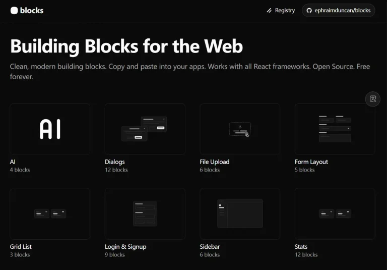
Commercn is a UI component library that provides a collection of UI blocks for modern e-commerce websites.
The library extends shadcn/ui with 12 production-ready UI blocks like shopping carts, product cards, and checkout forms built with React and Tailwind CSS.
The component library is actively developed and will expand with additional components in future releases.
Features
⌨️ CLI-Based Installation: Install any component with a single npx command. The shadcn CLI handles all dependencies and configuration.
⚡ Full Source Code Control: Components are added directly to your project. You can modify, extend, or refactor them as needed.
▶️ Built on Modern Stack: Uses React for component logic, Tailwind CSS for styling, and shadcn/ui for base components.
📁 Production-Ready Patterns: Components follow e-commerce best practices.
🔧 Active Development: The library currently includes 12 components. More blocks are planned and will be added regularly.
🎨 Multiple Variants: Key components like product cards and promo banners include multiple design variations.
How to Use It
Commercn components integrate directly through the shadcn CLI. You don’t install Commercn as a package. Instead, you add individual components to your project on demand.
1. You need an existing React project with shadcn/ui already configured. If you haven’t set up shadcn/ui yet, run:
npx shadcn@latest init2. Each component has a unique JSON URL. Use the shadcn CLI to fetch and install the component:
# Install the checkout form component
npx shadcn@latest add "https://commercn.com/r/checkout-01.json"
3. The CLI downloads the component source code and places it in your components/ui directory. You can use pnpm, yarn, or bun as alternatives:
# Using pnpm
pnpm dlx shadcn@latest add "https://commercn.com/r/checkout-01.json"
# Using yarn
yarn dlx shadcn@latest add "https://commercn.com/r/checkout-01.json"
# Using bun
bun x shadcn@latest add "https://commercn.com/r/checkout-01.json"
4. After installation, import and use the component like any React component:
import { CheckoutForm } from '@/components/ui/checkout-01';
export default function CheckoutPage() {
  ...
}
Available Components.
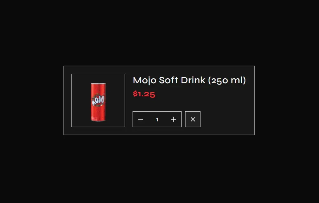
Shopping Cart 01
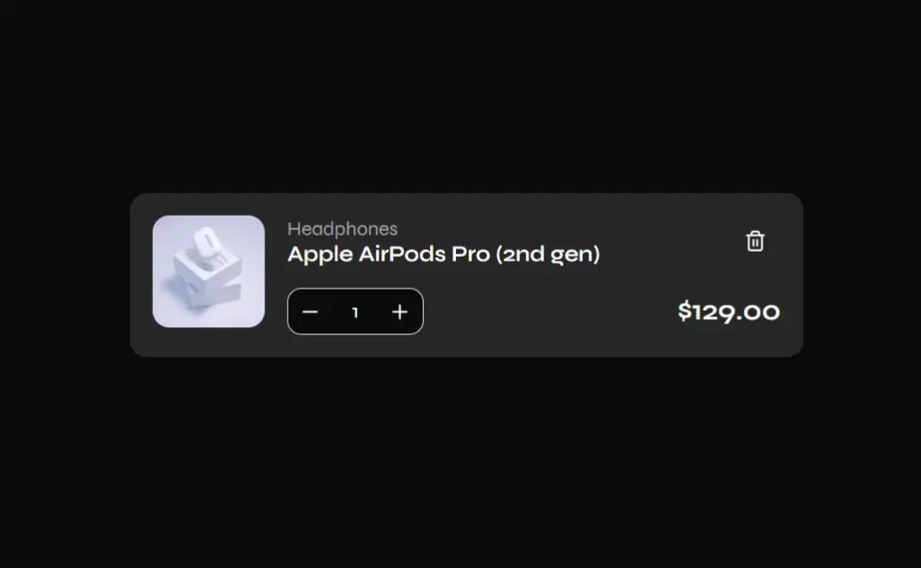
npx shadcn@latest add "https://commercn.com/r/cart-01.json"Shopping Cart 02
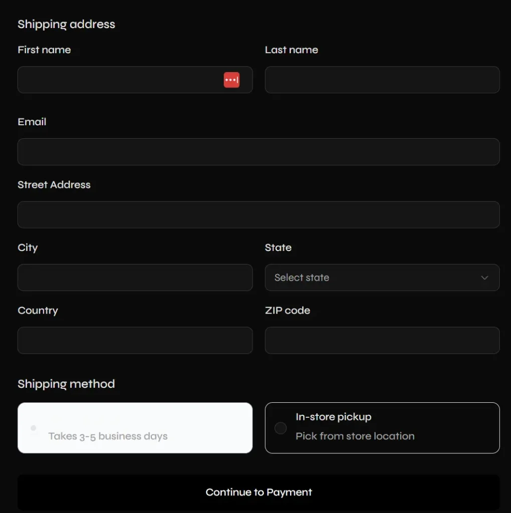
npx shadcn@latest add "https://commercn.com/r/cart-02.json"Checkout Form 01
npx shadcn@latest add "https://commercn.com/r/checkout-01.json"Order Confirmation and Summary Display 01
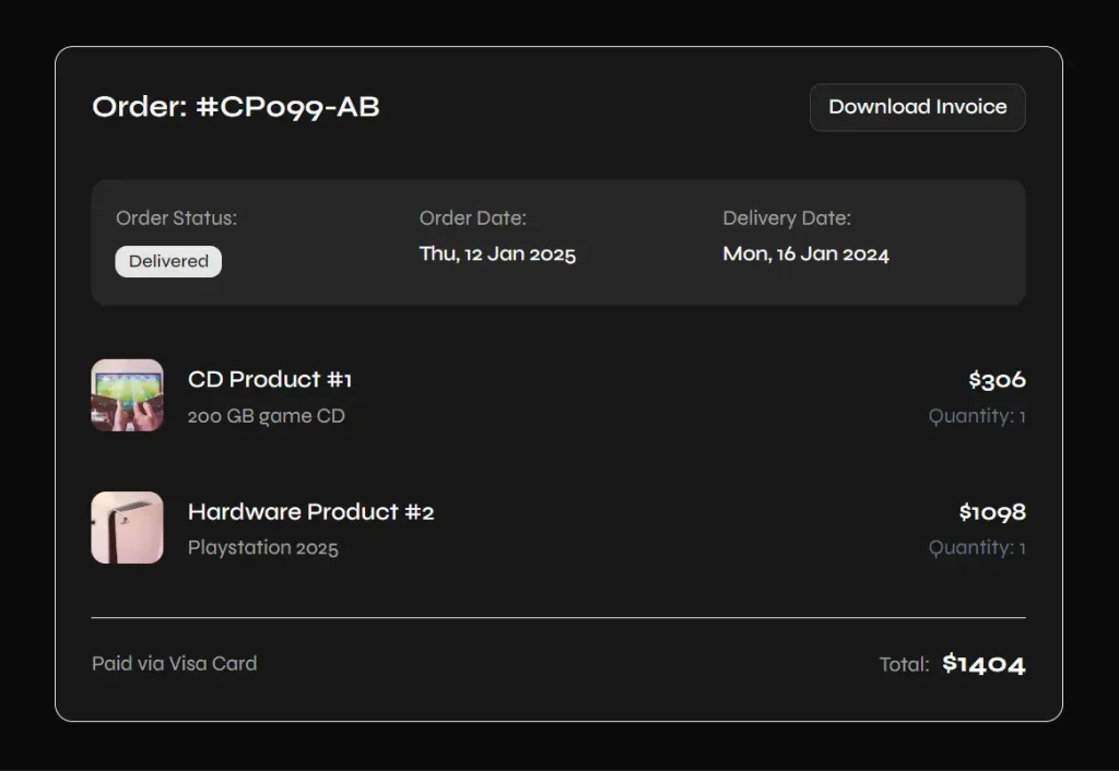
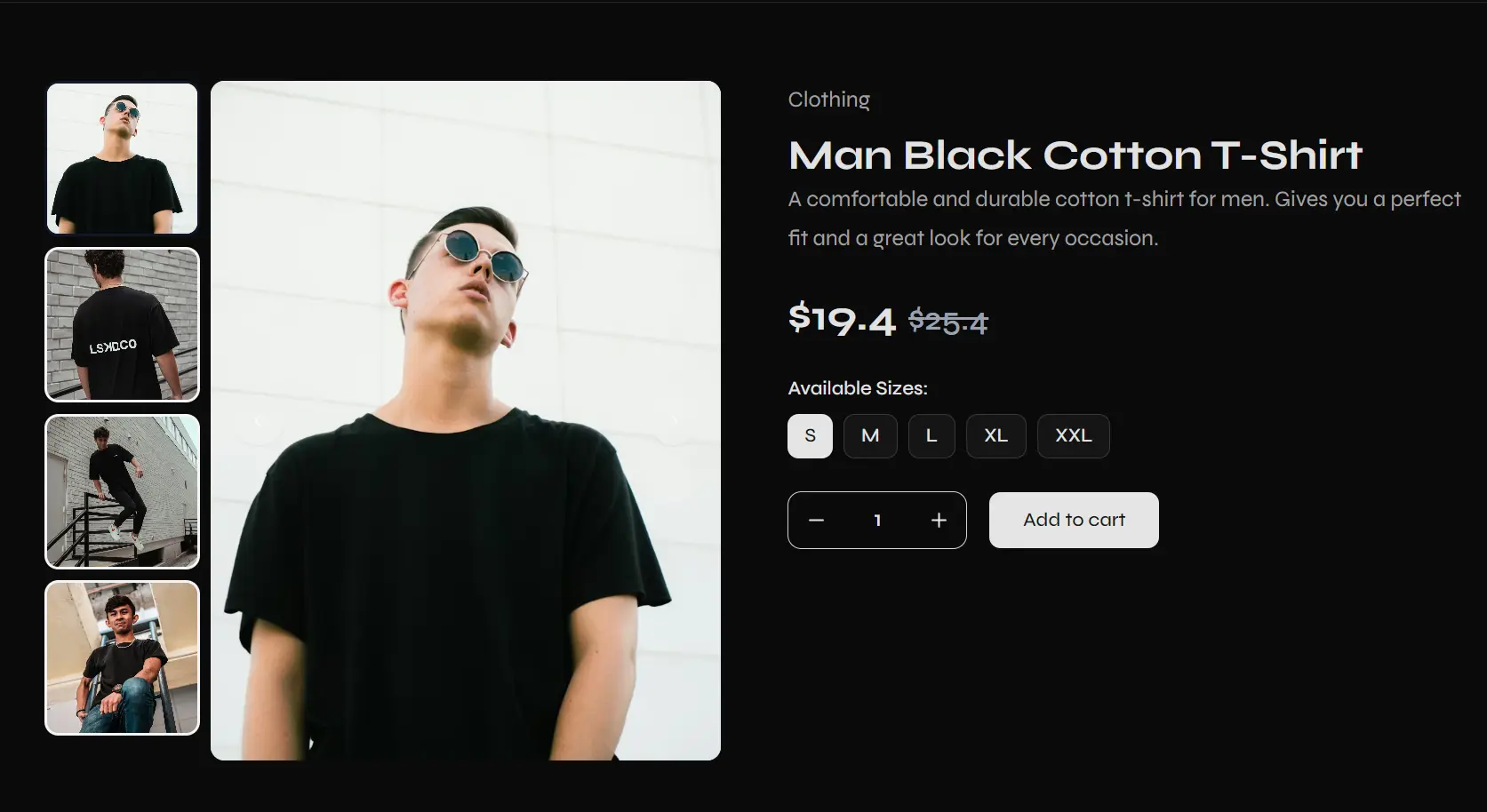
npx shadcn@latest add "https://commercn.com/r/order-01.json"Product Detail 01
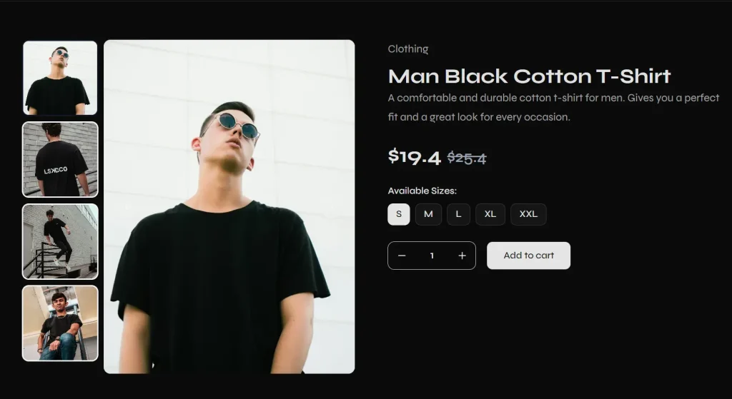
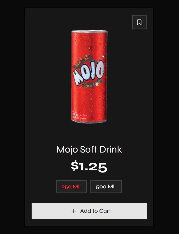
npx shadcn@latest add "https://commercn.com/r/product-detail-01.json"Product Card 01

npx shadcn@latest add "https://commercn.com/r/product-card-01.json"Product Card 02

npx shadcn@latest add "https://commercn.com/r/product-card-02.json"Product Card 03
npx shadcn@latest add "https://commercn.com/r/product-card-03.json"Promo Banner 01
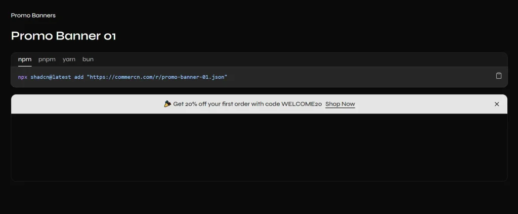
npx shadcn@latest add "https://commercn.com/r/promo-banner-01.json"Promo Banner 02
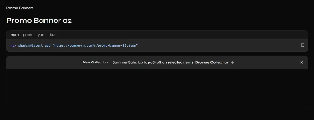
npx shadcn@latest add "https://commercn.com/r/promo-banner-02.json"Promo Banner 03
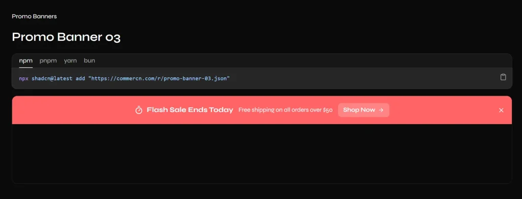
npx shadcn@latest add "https://commercn.com/r/promo-banner-03.json"Review 01

npx shadcn@latest add "https://commercn.com/r/review-01.json"FAQs
Q: Is Commercn an NPM package?
A: No. It is a registry of components. You use the CLI to download the source code directly into your project.
Q: Can I use this with vanilla HTML/CSS?
A: No. These blocks are built specifically for React and rely on Tailwind CSS for styling and Shadcn UI for base primitives.
Q: Do these components handle cart logic or payment processing?
A: No. These are strictly UI (User Interface) blocks. You must wire up your own state management (like Redux or Zustand) and backend logic (like Stripe).
Q: Can I customize the colors and fonts?
A: Yes. Since the components use Tailwind CSS classes, they will automatically inherit your project’s tailwind.config.js theme settings.
Q: Can I use these components in a Next.js project?
A: Yes. Commercn components work in any React environment that supports shadcn/ui. This includes Next.js (App Router and Pages Router), Remix, Vite, and Create React App.