The Future of Web Dev
The Future of Web Dev
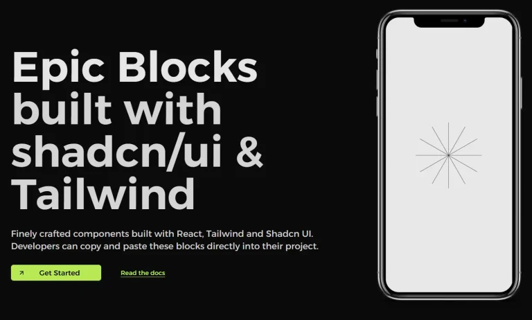
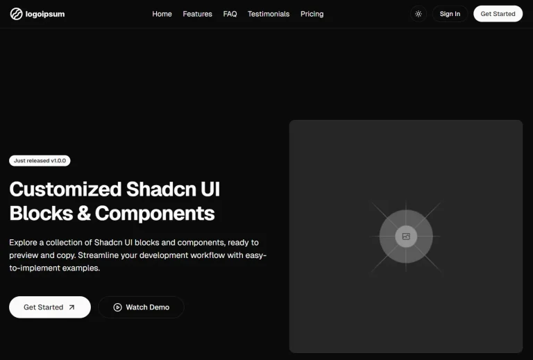
70+ shadcn/ui Blocks for Business Applications – ShadcnUI Vaults
A collection of open-source, copy-paste UI blocks for dashboards, admin panels, and CMS. Built with Tailwind CSS & Next.js.

ShadcnUI Vaults is a collection of UI components and blocks designed for business applications like dashboards, monitoring systems, admin panels, and content management systems.
These ready-to-use UI blocks are built with Tailwind CSS and ShadCN/UI components. Each of them comes with full customization options, responsive design, and accessibility features baked in from the start.
Features
🎨 Copy & Paste Ready – Instantly copy code for any block and integrate it into your project
🔧 Production Ready – Optimized components tested for real-world applications
📚 Multiple Categories – Organized blocks for different use cases and application types
🚀 Modern Stack – Uses Next.js, React, TypeScript, and ShadCN/UI components
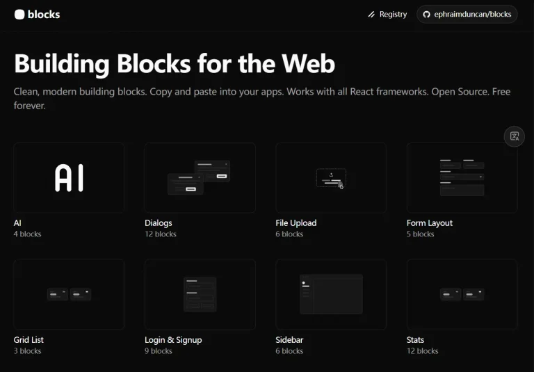
Available Blocks
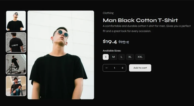
- Hero Sections: 14 components for landing page headers and primary sections.
- Feature Showcase: 4 components designed to highlight product capabilities and benefits.
- Authentication System: 7 components for a complete authentication flow, including login, signup, password reset, and two-factor authentication.
- Footers: 2 components for website navigation, links, and branding at the bottom of a page.
- Access Control: 5 components for handling restricted content, premium features, and security alerts.
- Pricing Tables: 2 components for comparing subscription plans, features, and pricing tiers.
- Marketplaces UI: 6 blocks for SaaS platforms that require shopping carts and product management functionalities.
- SaaS Billing Dashboards: 12 dashboards for managing customer subscriptions, plans, add-ons, and invoices.
- Minecraft RCON Dashboards: 4 dashboards specifically for server management and command execution via Remote Console.
- System Monitoring & Backup Dashboards: 14 dashboards for tracking database backups, system health, and other administrative tasks.
- Money Transfer Dashboards: 5 dashboards for managing transactions with features like payment tracking and fee breakdowns.
- Forms: 1 form component designed for collecting user reviews and feedback.
Installation
1. Install the required dependencies in your Next.js project:
npm install @radix-ui/react-icons @radix-ui/react-slot class-variance-authority clsx tailwind-merge2. Set up ShadCN/UI in your project:
npx shadcn-ui@latest init3. Install Tailwind CSS if not already present:
npm install -D tailwindcss postcss autoprefixer
npx tailwindcss init -p
4. Configure your tailwind.config.js file with the ShadCN/UI setup and copy the desired component code from the ShadcnUI Vaults library.
5. Browse the available block categories on the ShadcnUI Vaults website. Each category contains multiple component variations with live previews.
6. Select a component that matches your needs and click the copy button to get the complete code. The copied code includes all necessary imports and styling.
7. Here’s a basic example of how to add a hero section to your app:
"use client";

import { Button } from "@/components/ui/button";
import { ArrowRight, Play } from "lucide-react";

export function HeroBlock1() {
  return (
    <section className="w-full py-20 md:py-32 bg-gradient-to-b from-background to-muted/20">
      <div className="container mx-auto px-4 md:px-6">
        <div className="flex flex-col items-center space-y-8 text-center">
          <div className="space-y-4 max-w-4xl">
            <h1 className="text-4xl font-bold tracking-tighter sm:text-5xl md:text-6xl lg:text-7xl">
              Build Amazing
              <span className="bg-gradient-to-r from-primary to-primary/60 bg-clip-text text-transparent">
                {" "}
                Websites{" "}
              </span>
              Faster
            </h1>
            <p className="mx-auto max-w-2xl text-lg text-muted-foreground md:text-xl">
              Create stunning, responsive websites with our modern components
              and templates. Perfect for startups, agencies, and developers.
            </p>
          </div>

          <div className="flex flex-col sm:flex-row gap-4">
            <Button size="lg" className="gap-2 px-8">
              Get Started
              <ArrowRight className="h-4 w-4" />
            </Button>
            <Button variant="outline" size="lg" className="gap-2 px-8">
              <Play className="h-4 w-4" />
              Watch Demo
            </Button>
          </div>

          <div className="flex items-center gap-8 pt-8">
            <div className="text-center">
              <div className="text-2xl font-bold">10k+</div>
              <div className="text-sm text-muted-foreground">Happy Users</div>
            </div>
            <div className="text-center">
              <div className="text-2xl font-bold">99%</div>
              <div className="text-sm text-muted-foreground">Uptime</div>
            </div>
            <div className="text-center">
              <div className="text-2xl font-bold">24/7</div>
              <div className="text-sm text-muted-foreground">Support</div>
            </div>
          </div>
        </div>
      </div>
    </section>
  );
}
FAQs
Q: How do I customize the components?
A: All blocks are built with utility-first Tailwind CSS classes and Shadcn/UI components. You can customize them by editing the class names directly in your code to match your brand and specific requirements.
Q: What technologies are used in ShadcnUI Vaults?
A: The tech stack includes Next.js, React, Tailwind CSS, Shadcn/UI, Radix UI, and TypeScript.