The Future of Web Dev
The Future of Web Dev
50+ Free Marketing UI Blocks for Shadcn/ui
Get 50+ free marketing blocks built on shadcn/ui. Copy TypeScript components for heroes, pricing, CTAs, and more into your React/Next.js project.

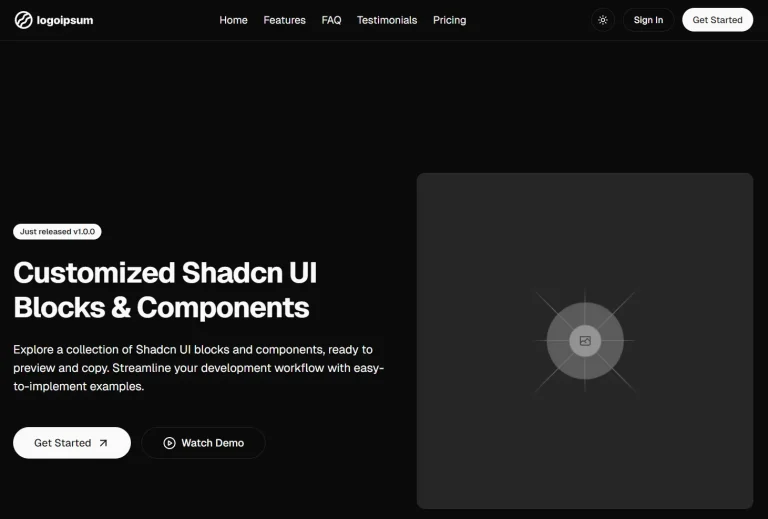
Shadcn UI Blocks is a collection of 50+ free, ready-to-use marketing UI blocks built upon the popular shadcn/ui library.
You can easily integrate these blocks directly into your existing projects through the shadcn/ui CLI or manual code copying.
Features
🎨 50+ Marketing Blocks: Access heroes, CTAs, pricing sections, testimonials, feature grids, contact forms, blog layouts, team profiles, stats displays, and authentication pages.
🎭 Theme Preview System: Test blocks against different color schemes and dark mode variations before implementation through the built-in theme switcher.
⚡ Multiple Installation Methods: Install blocks through the shadcn CLI registry, copy component code directly from the preview page, or download JSX files for manual integration.
🔧 Props-Based Customization: Modify content, URLs, and visual elements through component props rather than editing internal component logic.
Use Cases
- SaaS Landing Pages: Build product landing pages with hero sections, feature comparisons, pricing tiers, customer testimonials, and email capture forms using pre-configured blocks.
- Developer Documentation Sites: Create documentation portals with code example blocks, changelog timelines, integration guides, and FAQ sections that maintain consistent styling.
- Agency Portfolio Websites: Generate case study showcases, team member profiles, service offering grids, and client logo displays for digital agency presentations.
- Content Marketing Platforms: Deploy blog list views, individual post layouts, author bio sections, and related content recommendations for content-driven websites.
How to Use It
1. Visit the official website to browse all the free UI blocks. The preview page displays each block with example content and allows you to switch between light and dark modes. Use the theme selector to test how blocks render with different color palettes before committing to a specific component.
2. Once you have an existing shadcn/ui project set up, you can add a block directly from your terminal. Use the appropriate command for your package manager, replacing hero47 with the name of the block you wish to add.
pnpm dlx shadcn add @shadcnblocks/hero47npx shadcn add @shadcnblocks/hero47yarn dlx shadcn add @shadcnblocks/hero47bunx shadcn add @shadcnblocks/hero473. You can click the “Copy” button on the block’s preview page to copy its source code. Paste this code into a new component file within your project, for example, components/ui/hero-47.tsx.
import { ArrowUpRight } from "lucide-react";

import { Button } from "@/components/ui/button";

interface Hero47Props {
  heading?: string;
  subheading?: string;
  description?: string;
  image?: {
    src: string;
    alt: string;
  };
  buttons?: {
    primary?: {
      text: string;
      url: string;
    };
    secondary?: {
      text: string;
      url: string;
    };
  };
}

const Hero47 = ({
  heading = "Epic Blocks",
  subheading = " built with shadcn/ui & Tailwind",
  description = "Finely crafted components built with React, Tailwind and Shadcn UI. Developers can copy and paste these blocks directly into their project.",
  buttons = {
    primary: {
      text: "Get Started",
      url: "#",
    },
    secondary: {
      text: "Read the docs",
      url: "#",
    },
  },
  image = {
    src: "https://deifkwefumgah.cloudfront.net/shadcnblocks/block/placeholder-dark-7-tall.svg",
    alt: "Placeholder",
  },
}: Hero47Props) => {
  return (
    <section className="bg-background py-20 lg:py-32">
      <div className="container flex flex-col items-center gap-10 lg:my-0 lg:flex-row">
        <div className="flex flex-col gap-7 lg:w-2/3">
          <h2 className="text-foreground text-5xl font-semibold md:text-5xl lg:text-8xl">
            <span>{heading}</span>
            <span className="text-muted-foreground">{subheading}</span>
          </h2>
          <p className="text-muted-foreground text-base md:text-lg lg:text-xl">
            {description}
          </p>
          <div className="flex flex-wrap items-start gap-5 lg:gap-7">
            <Button asChild>
              <a href={buttons.primary?.url}>
                <div className="flex items-center gap-2">
                  <ArrowUpRight className="size-4" />
                </div>
                <span className="whitespace-nowrap pl-4 pr-6 text-sm lg:pl-6 lg:pr-8 lg:text-base">
                  {buttons.primary?.text}
                </span>
              </a>
            </Button>
            <Button asChild variant="link" className="underline">
              <a href={buttons.secondary?.url}>{buttons.secondary?.text}</a>
            </Button>
          </div>
        </div>
        <div className="relative z-10">
          <div className="left-1/2! h-[92%]! w-[69%]! absolute top-2.5 -translate-x-[52%] overflow-hidden rounded-[35px]">
            <img
              src={image.src}
              alt={image.alt}
              className="size-full object-cover object-[50%_0%]"
            />
          </div>
          <img
            className="relative z-10"
            src="https://deifkwefumgah.cloudfront.net/shadcnblocks/block/mockups/phone-2.png"
            width={450}
            height={889}
            alt="iphone"
          />
        </div>
      </div>
    </section>
  );
};

export { Hero47 };
4. Import the block into the desired page or layout. You can then render it and pass props to customize its content.
Related Resources
- shadcn/ui: The foundational component library that provides the base primitives used throughout these blocks, including buttons, cards, dialogs, and form elements.
- Tailwind CSS Documentation: Reference for understanding and customizing the utility classes applied to block components.
- Lucide React: Icon library used throughout the blocks for arrows, checkmarks, and interface symbols.
- React TypeScript Cheatsheet: Guide for working with TypeScript interfaces and props in React components.
FAQs
Q: Can I modify the Tailwind classes within the copied component code?
A: Yes. After copying or installing a block, edit the className attributes to adjust spacing, colors, typography, or layout. The components use standard Tailwind utility classes that respond to your project’s Tailwind configuration file.
Q: Do these blocks work with the Next.js App Router?
A: Yes. The components function as client-side React components compatible with both Pages Router and App Router architectures. Add the ‘use client’ directive at the top of the file if using App Router with Server Components.
Q: Are the blocks accessible by default?
A: The blocks implement basic accessibility patterns including semantic HTML, alt text props for images, and keyboard navigation support inherited from shadcn/ui primitives. Review and enhance accessibility attributes based on your specific use case and WCAG requirements.
Q: Can I use these blocks in commercial projects?
A: Yes. The blocks follow shadcn/ui’s approach of providing code that you own once copied into your project.