The Future of Web Dev
The Future of Web Dev
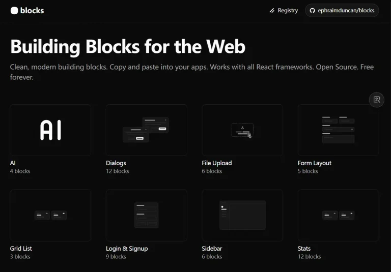
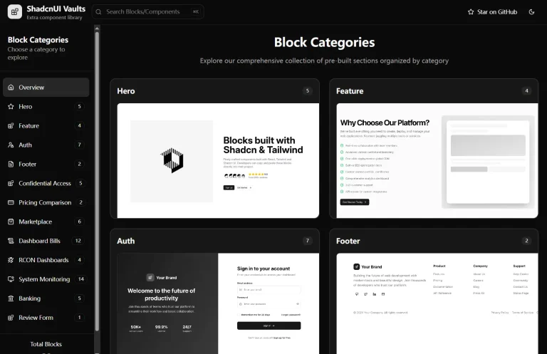
39+ Ready-to-Use Shadcn UI Blocks for Web Apps – Efferd UI
Copy-paste Shadcn UI blocks into your Next.js project. Efferd UI offers 39+ pre-styled components for faster web development.
Efferd UI is a component library that provides ready-to-use shadcn/ui blocks and components for building modern web interfaces.
The library currently offers 39+ blocks across 14 categories, from authentication forms to pricing tables. You can integrate them into your React/Next.js projects through either the Shadcn CLI or manual installation.
Features
📦 Copy-Paste Ready: Each block provides complete source code that you can copy directly into your project without additional configuration.
🎯 Shadcn UI Foundation: Built on Shadcn UI components for consistent design patterns and accessibility standards.
🎨 Tailwind CSS Styling: Uses Tailwind utility classes for easy customization and theme integration.
🎨 14 Component Categories: Includes forms, authentication screens, CTAs, FAQs, features, footers, headers, galleries, error pages, pricing tables, testimonials, logo clouds, contact sections, and not-found pages.
⚡ CLI Integration: Supports installation through Shadcn CLI with simple commands.
Use Cases
- Landing Pages: Quickly assemble hero sections, feature lists, and call-to-action blocks to create modern landing pages.
- Dashboards: Utilize form and data display components to build functional and clean dashboard UI.
- Authentication Flows: Implement user sign-up and login forms with the provided authentication blocks.
- Marketing Websites: Create professional-looking marketing sites with pre-built headers, footers, and testimonial sections.
CLI Installation
1. Make sure you first have a Next.js project with shadcn/ui configured. Run this command:
pnpm dlx shadcn@latest add @efferd/form-12. Replace form-1 with any available block identifier. The CLI automatically downloads the component files and places them in your components directory. You can then import and use the block in your pages.
import { CreateWorkspaceForm } from "@/components/create-workspace-form";
export default function Page() {
  return (
    <div className="flex min-h-screen items-center justify-center p-4">
      <CreateWorkspaceForm />
    </div>
  );
}
Manual Installation
For manual setup, you need to copy the component code from the Efferd UI repository. Create a new file in your components directory and paste the block code.
1. The form blocks require specific Shadcn UI components as dependencies. Install these base components first.
npx shadcn-ui@latest add button input label2. Create your component file. Here’s an example workspace creation form that demonstrates the pattern.
import { WordmarkIcon } from "@/components/logo";
import { Button } from "@/components/ui/button";
import { ButtonGroup, ButtonGroupText } from "@/components/ui/button-group";
import { Field, FieldDescription, FieldGroup, FieldLabel } from "@/components/ui/field";
import { Input } from "@/components/ui/input";
import { InputGroup, InputGroupAddon, InputGroupInput } from "@/components/ui/input-group";
import { Label } from "@/components/ui/label";
export function CreateWorkspaceForm() {
  return (
    <div className="w-full max-w-md rounded-xl border bg-background shadow-sm">
      <div className="flex flex-col items-center justify-center gap-6 rounded-t-xl border-b bg-card/60 py-12">
        <WordmarkIcon className="h-5" />
        <div className="flex flex-col items-center space-y-1">
          <h2 className="font-medium text-2xl">Create your workspace</h2>
          <a className="text-muted-foreground underline" href="#">
            What is a workspace?
          </a>
        </div>
      </div>
      <FieldGroup className="p-4">
        <Field className="gap-2">
          <FieldLabel htmlFor="name">Workspace Name</FieldLabel>
          <Input autoComplete="off" id="name" placeholder="e.g., Acme, Inc." />
          <FieldDescription>
            This is the name of your workspace on Efferd.
          </FieldDescription>
        </Field>
        <Field className="gap-2">
          <FieldLabel htmlFor="slug">Workspace Slug</FieldLabel>
          <ButtonGroup>
            <ButtonGroupText asChild>
              <Label htmlFor="slug">efferd.com/</Label>
            </ButtonGroupText>
            <InputGroup>
              <InputGroupInput id="slug" placeholder="e.g., acme" />
              <InputGroupAddon align="inline-end">
                <CircleCheckIcon />
              </InputGroupAddon>
            </InputGroup>
          </ButtonGroup>
          <FieldDescription>
            This is your workspace's unique slug on Efferd.
          </FieldDescription>
        </Field>
      </FieldGroup>
      <div className="rounded-b-xl border-t bg-card/60 p-4">
        <Button className="w-full" type="submit">
          Create Workspace
        </Button>
      </div>
    </div>
  );
}
3. Some blocks reference custom logo components. Create a logo file to provide the required icons.
export const LogoIcon = (props: React.ComponentProps<"svg">) => (
  <svg fill="currentColor" viewBox="0 0 24 24" {...props}>
    <path d="M15.52 23.926c-2.93-.059-5.594-.965-7.668-2.606..." />
  </svg>
);
export const WordmarkIcon = (props: React.ComponentProps<"svg">) => (
  <svg fill="currentColor" viewBox="0 0 84 24" {...props}>
    <path d="M45.035 23.984c-1.34-.062-2.566-.441-3.777-1.16..." />
  </svg>
);
4. Add background decorations or layout wrappers in your page component as needed.
export default function Page() {
  return (
    <div className="relative flex min-h-screen w-full items-center justify-center p-4">
      <div
        aria-hidden="true"
        className="-z-1 pointer-events-none absolute inset-0"
        style={{
          backgroundImage: "radial-gradient(rgba(255,255,255,0.1) 0.8px, transparent 1px)",
          backgroundSize: "14px 14px",
        }}
      />
      <CreateWorkspaceForm />
    </div>
  );
}
Available Block Categories
Form Blocks: 3 blocks including workspace creation forms, contact forms, and data entry interfaces.
Logo Cloud Blocks: 4 blocks for displaying client logos, partner brands, or technology stack badges.
Authentication Blocks: 2 blocks covering sign-in and registration screens.
Contact Blocks: 2 blocks for contact forms and support request interfaces.
CTA Blocks: 5 blocks for call-to-action sections with various layouts and button configurations.
FAQ Blocks: 5 blocks presenting frequently asked questions in different accordion and list formats.
Feature Blocks: 1 block showcasing product features with icons and descriptions.
Footer Blocks: 5 blocks for site footers with navigation links, social icons, and newsletter signups.
Header Blocks: 3 blocks for navigation headers with logo, menu items, and action buttons.
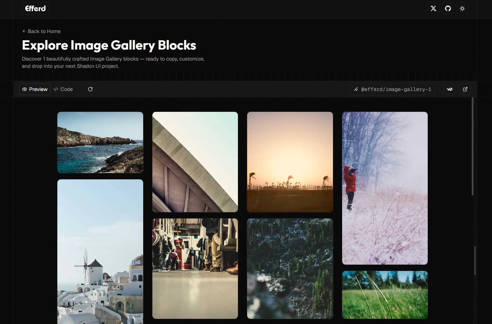
Image Gallery Blocks: 1 block for displaying image collections in grid or masonry layouts.
Not Found Blocks: 2 blocks for 404 error pages with navigation options.
Pricing Blocks: 4 blocks presenting pricing tiers and subscription options.
Testimonial Blocks: 2 blocks for customer reviews and social proof sections.
Related Resources
- Shadcn UI: The foundational component library that Efferd UI builds upon, offering unstyled and accessible components.
- Tailwind CSS: The utility-first CSS framework used for all block styling and customization.
- Next.js: The React framework recommended for using Efferd UI components in production applications.
FAQs
Q: Do I need to install Shadcn UI before using Efferd UI?
A: Yes. Efferd UI requires a working Shadcn UI setup in your Next.js project. Install Shadcn UI first and configure your project before adding Efferd blocks.
Q: Can I customize the styling of Efferd UI blocks?
A: Yes. All blocks use Tailwind CSS utility classes. You can modify the classes directly in the component code or adjust your Tailwind configuration to change colors, spacing, and other design tokens.
Q: How often does Efferd UI add new blocks?
A: The library recently launched with 39+ blocks and plans to add more over time. Follow the GitHub repository for updates on new block releases.