The Future of Web Dev
The Future of Web Dev
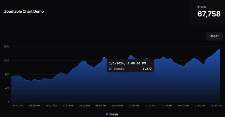
Interactive Chart Component with Brush to Zoom – shadcn-chart-brush
Build zoomable charts with shadcn-chart-brush. Click-and-drag selection, scroll zoom, and touch interactions for time-series data visualization.
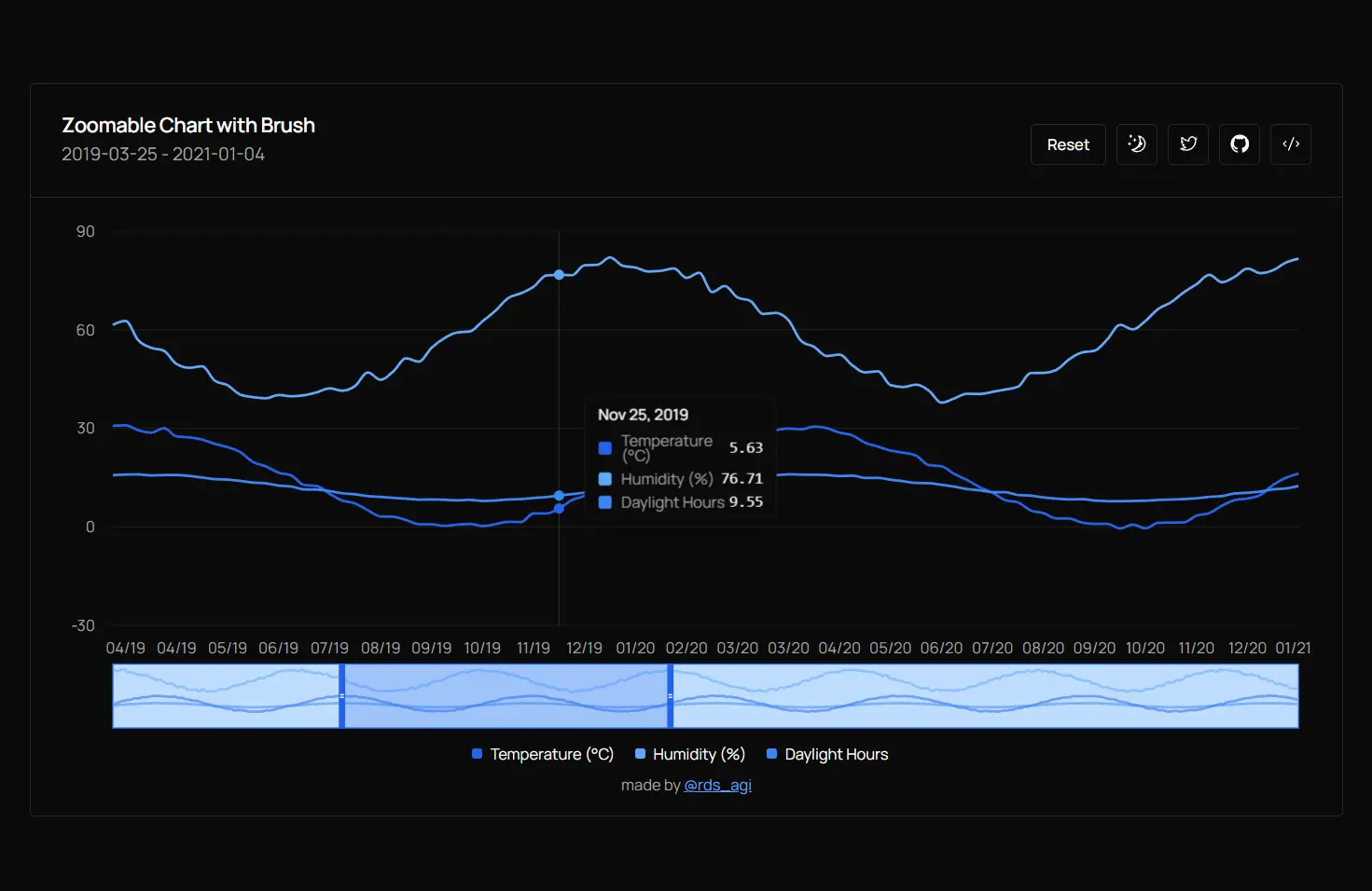
shadcn-chart-brush is a UI component that implements interactive zoom and pan controls for time-series data visualization.
The component extends the shadcn/ui chart & Rechart library with click-and-drag selection, scroll-based zoom, and a brush functionality for range manipulation.
You can use it in your Next.js or React applications to display large datasets while maintaining responsive interactions.
Features
🖱️ Click-and-Drag Zoom: Select a region on the chart by clicking and dragging to zoom into that specific range.
🔄 Scroll Zoom: Use mouse wheel or trackpad gestures to zoom in and out centered on cursor position.
📊 Brush Control: Manipulate the visible range through a miniature chart overview.
↔️ Pan Navigation: Adjust the visible window by dragging the brush boundaries or selecting new ranges.
🔁 Reset Function: Return to the full dataset view with a single button click.
📱 Touch Support: Handle pinch-to-zoom and touch-based interactions for mobile devices.
Use Cases
- Financial Dashboards: Display stock prices or trading data where users need to examine specific time periods and compare trends across multiple metrics.
- IoT Monitoring: Visualize sensor readings over extended periods and zoom into anomalies or specific events for detailed analysis.
- Analytics Platforms: Present user behavior metrics or system performance data where different time granularities reveal different patterns.
- Weather Applications: Show climate data across years while allowing users to inspect seasonal variations or specific weather events.
How to Use It
1. Install the required dependencies for shadcn/ui charts and Recharts in your Next.js or React project.
npm install recharts
npx shadcn@latest add chart
npx shadcn@latest add card
npx shadcn@latest add button
2. Clone the component from GitHub.
git clone https://github.com/rudrodip/shadcn-chart-brush.git
3. Import the component and create a chart in your app.
// page.tsx
import { CustomChartComponent } from "@/components/chart-component";

export default function Home() {
  return (
    <main className="w-full min-h-screen max-w-5xl mx-auto flex flex-col justify-center">
      <CustomChartComponent />
    </main>
  );
}
API Reference
State Management
chartData: Array of data points containing date strings and numeric values for each series.range: Object withleftandrightproperties that define the currently visible data indices.selection: Object tracking the temporary selection boundaries during drag operations.selecting: Boolean flag indicating whether a drag selection is in progress.chartRef: React ref attached to the container div for calculating mouse positions.
Event Handlers
handleMouseDown: Captures the starting point when a user clicks on the chart to begin a selection.handleMouseMove: Updates the selection preview as the user drags across the chart.handleMouseUp: Finalizes the selection and updates the visible range based on the drag boundaries.handleZoom: Processes scroll wheel events to zoom in or out centered on the cursor position.reset: Returns the visible range to show the complete dataset.
Chart Configuration
chartConfig: Object mapping data keys to display labels and color values using CSS variables.type: Line chart type set to “monotone” for smooth interpolation between data points.strokeWidth: Line thickness set to 2 pixels for clear visibility.dot: Disabled to improve performance with large datasets.isAnimationActive: Disabled to prevent animation lag during zoom operations.
Brush Component
dataKey: Specifies which field from the data array to use for the brush x-axis.height: Sets the brush miniature chart height in pixels.startIndex: Controls the left boundary of the visible range.endIndex: Controls the right boundary of the visible range.onChange: Callback function that updates the range state when the brush handles move.
Reference Area
x1: Left boundary of the selection preview based on the active drag operation.x2: Right boundary of the selection preview.fill: Background color for the selection highlight.fillOpacity: Transparency level for the selection overlay.
Related Resources
- Recharts: A composable charting library built on React components and D3.
- shadcn/ui: A collection of reusable components built with Radix UI and Tailwind CSS.
FAQs
Q: Can I use this component with real-time data streams?
A: Yes. Update the chartData state with new data points as they arrive. The component recalculates the range boundaries automatically when the data length changes.
Q: How do I customize the number of data series displayed?
A: Modify the chartConfig object to add or remove series. Each entry creates a new line on the chart with its own color and label.
Q: Does the component handle touch gestures on mobile devices?
A: The implementation includes basic touch support through the onTouchMove handler. You can extend it to handle pinch gestures by tracking the distance between two touch points.
Q: Can I change the zoom sensitivity?
A: Adjust the zoomFactor constant in the handleZoom function. Lower values create finer zoom control while higher values zoom more aggressively.
Q: How do I format the date labels differently?
A: Modify the tickFormatter function passed to the XAxis component. The function receives the date string and returns the formatted display text.