The Future of Web Dev
The Future of Web Dev
Customizable Corner Shape Plugin for Tailwind CSS
Add corner-shape utilities to Tailwind CSS. Support for squircle, bevel, notch, scoop, and custom superellipse values in your components.
Corner Shape is a Tailwind CSS plugin that adds utility classes for the CSS corner-shape property and its per-corner variants.
The CSS corner-shape property represents a newer addition to the CSS specification. Traditional border-radius creates rounded corners, but this property extends that capability to other geometric shapes.
Toolwind Corner Shape translates these native CSS features into Tailwind’s utility-first workflow. You write classes like corner-squircle or corner-t-bevel, and the plugin generates the corresponding CSS properties.
Features
🔧 Native CSS Property Support: Maps directly to the corner-shape property and its longhand variants like corner-top-left-shape.
🎨 Six Static Shape Keywords: Includes round, scoop, bevel, notch, square, and squircle for common corner styles.
📐 Superellipse Functional Values: Accepts numeric parameters and constants (e, pi, infinity) through Tailwind’s modifier syntax.
🧭 Physical and Logical Directional Utilities: Supports both standard directional classes (top, right, bottom, left) and logical properties (start, end) for RTL and writing-mode compatibility.
🎯 Per-Corner Control: Targets individual corners or edges with utilities like corner-tl-notch or corner-s-squircle.
⚡ Standard Tailwind Variants: Works with hover, focus, responsive breakpoints, and all other Tailwind state variants.
How to Use It
1. Install the plugin with your preferred package manager.
npm install @toolwind/corner-shape2. For Tailwind CSS v4 or later, import the plugin in your main CSS file. Add the plugin directive after the Tailwind import statement.
/* globals.css */
@import "tailwindcss";
@plugin "@toolwind/corner-shape";
3. For Tailwind CSS v3 and earlier, register the plugin in your configuration file. Use ES module syntax for modern JavaScript projects.
// tailwind.config.js
import cornerShape from '@toolwind/corner-shape';
export default {
  plugins: [cornerShape]
}
4. If your project uses CommonJS, require the plugin in your configuration file instead.
// tailwind.config.cjs
module.exports = {
  plugins: [
    require('@toolwind/corner-shape'),
  ]
}
5. Apply corner shape utilities to HTML elements. The corner-{shape} pattern affects all four corners simultaneously.
<div class="corner-squircle rounded-3xl bg-blue-500 p-8">
  Squircle corners
</div>
6. Target specific edges with directional utilities. The corner-t-{shape} class affects top-left and top-right corners together.
<div class="corner-t-bevel corner-b-round rounded-2xl bg-gray-100 p-6">
  Beveled top, rounded bottom
</div>
7. Apply shapes to individual corners using position-specific utilities. These classes give you complete control over each corner independently.
<div class="corner-tl-notch corner-tr-round corner-br-scoop corner-bl-square rounded-xl">
  Mixed corner shapes
</div>
8. Use the superellipse functional value through Tailwind’s modifier syntax. Pass numeric values or mathematical constants separated by a forward slash.
<div class="corner-superellipse/1.5 rounded-2xl">
  Custom superellipse with value 1.5
</div>
<div class="corner-superellipse/pi rounded-xl">
  Superellipse using pi constant
</div>
9. Combine corner utilities with responsive breakpoints and state variants. The utilities respond to standard Tailwind variant prefixes.
<button class="corner-round hover:corner-squircle focus:corner-bevel md:corner-notch rounded-lg">
  Interactive corner shapes
</button>
10. For internationalized layouts, use logical corner utilities that adapt to writing direction. The corner-s-{shape} utility targets the start edge regardless of whether the layout flows left-to-right or right-to-left.
<div class="corner-s-squircle corner-e-round rounded-lg" dir="rtl">
  Logical corner styling
</div>
11. Apply superellipse values to specific corners or edges. The modifier syntax works with all directional variants.
<div class="corner-tr-superellipse/e corner-bl-superellipse/-infinity rounded-2xl">
  Per-corner superellipse values
</div>
Remember that these utilities require a base
border-radiusvalue to take effect. Combine corner shape utilities with Tailwind’s standard rounding classes likerounded-lgorrounded-2xl.
API Reference
Static Shape Keywords
round: Creates a convex elliptical corner equivalent to superellipse(1). This matches the default rounded corner created by border-radius without additional shape specification.
scoop: Creates a concave elliptical corner equivalent to superellipse(-1). The corner curves inward rather than outward.
bevel: Creates a straight diagonal corner equivalent to superellipse(0). The corner is neither convex nor concave.
notch: Creates a 90-degree concave square corner equivalent to superellipse(-infinity). This produces the most dramatic inward curve.
square: Creates a 90-degree convex square corner equivalent to superellipse(infinity). This matches the default unrounded corner shape.
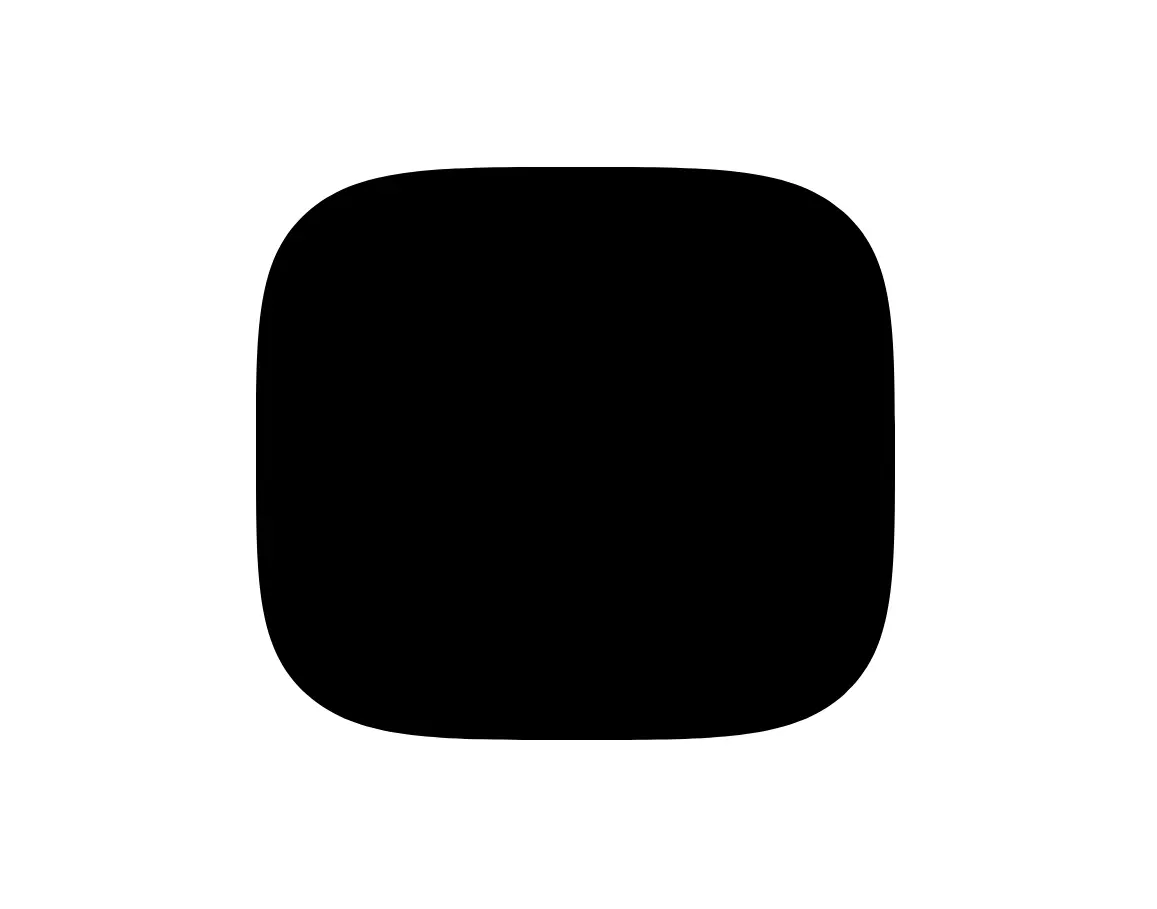
squircle: Creates a convex curve between round and square equivalent to superellipse(2). This popular shape appears in many modern interface designs.
All-Corner Utilities
corner-{shape}: Applies the specified shape to all four corners simultaneously.
corner-superellipse/{value}: Applies a custom superellipse value to all four corners. Accepts numbers or constants.
Physical Edge Utilities
corner-t-{shape}: Applies the shape to top-left and top-right corners.
corner-r-{shape}: Applies the shape to top-right and bottom-right corners.
corner-b-{shape}: Applies the shape to bottom-right and bottom-left corners.
corner-l-{shape}: Applies the shape to top-left and bottom-left corners.
corner-{t|r|b|l}-superellipse/{value}: Applies a custom superellipse value to the specified edge.
Physical Corner Utilities
corner-tl-{shape}: Applies the shape to the top-left corner only.
corner-tr-{shape}: Applies the shape to the top-right corner only.
corner-br-{shape}: Applies the shape to the bottom-right corner only.
corner-bl-{shape}: Applies the shape to the bottom-left corner only.
corner-{tl|tr|br|bl}-superellipse/{value}: Applies a custom superellipse value to the specified corner.
Logical Edge Utilities
corner-s-{shape}: Applies the shape to start-start and end-start corners. These adapt based on writing direction.
corner-e-{shape}: Applies the shape to start-end and end-end corners. These adapt based on writing direction.
corner-{s|e}-superellipse/{value}: Applies a custom superellipse value to the specified logical edge.
Logical Corner Utilities
corner-ss-{shape}: Applies the shape to the start-start corner. Adapts to writing direction.
corner-se-{shape}: Applies the shape to the start-end corner. Adapts to writing direction.
corner-ee-{shape}: Applies the shape to the end-end corner. Adapts to writing direction.
corner-es-{shape}: Applies the shape to the end-start corner. Adapts to writing direction.
corner-{ss|se|ee|es}-superellipse/{value}: Applies a custom superellipse value to the specified logical corner.
Superellipse Value Format
Superellipse values can be numeric (like 1.5, 0.5, -2) or one of the mathematical constants e, pi, or infinity. Negative values create concave curves. Values should not include units. Examples include /2, /pi, /-e, /-infinity.
Related Resources
- Tailwind CSS: A utility-first CSS framework for rapid UI development.
- MDN Web Docs: corner-shape: Documentation for the underlying CSS property.
FAQs
Q: Why do my corner-shape utilities not appear to work?
A: The corner-shape property requires a base border-radius value to take effect. Apply a Tailwind rounding utility like rounded-lg or rounded-xl alongside your corner-shape classes.
Q: Can I use arbitrary values with the superellipse utilities?
A: Yes. Use Tailwind’s modifier syntax with any numeric value or the constants e, pi, and infinity. For example, corner-superellipse/3.7 or corner-tl-superellipse/-0.5 both work correctly.
Q: Do logical corner utilities work with all writing modes?
A: Yes. The logical utilities (corner-s-, corner-e-, corner-ss-, corner-se-, corner-ee-, corner-es-) adapt automatically based on the element’s writing direction and mode. They map to the appropriate physical corners based on the dir attribute and writing-mode property.
Q: Can I combine multiple corner utilities on the same element?
A: Yes. More specific utilities override more general ones following standard CSS specificity rules. For example, corner-round corner-tr-bevel applies round to three corners and bevel to the top-right corner. Responsive and state variants also work together as expected.