The Future of Web Dev
The Future of Web Dev
Custom Bezier Gradients for Tailwind CSS – easing-gradients
A Tailwind CSS plugin for smooth gradient transitions. Use preset curves or custom cubic-bezier.
easing-gradients is a Tailwind CSS plugin that adjusts gradient stop distribution with easing curves.
It shifts the stop distribution along an easing curve to reduce the harsh visual edge that often appears in fades, overlays, and transparent gradients.
Features
🎨 Smoother gradient fades: Softens visible transition edges in linear gradients.
⚙️ Easing Curve Presets: Includes linear, ease-in, ease-out, and ease-in-out distributions.
🔧 Custom Bezier Support: Accepts any cubic-bezier function for fine-grained control.
📦 Lightweight: Adds only CSS custom properties without extra JavaScript.
Use Cases
- Landing page hero overlays gain a softer fade across photography or video.
- Card backgrounds transition more cleanly from color to transparency.
- UI highlights in dashboards look less abrupt across wide gradient areas.
- Decorative section dividers keep a smoother visual flow between colors.
How to Use It
1. Install the package with your package manager.
pnpm add easing-gradients2. Import Tailwind CSS, then register the plugin in the same stylesheet.
@import "tailwindcss";
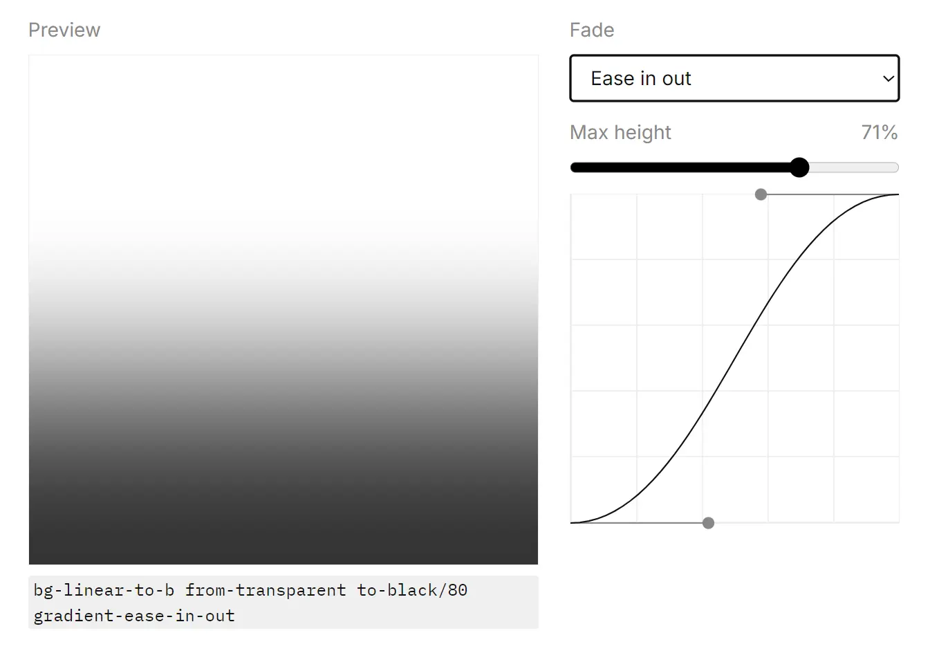
@plugin "easing-gradients";3. Start with a normal Tailwind linear gradient. Add one easing utility to change the stop distribution. This pattern works well for dark overlays on images, banners, and headers where the default fade looks too sharp near the top or bottom edge.
<section class="h-48 bg-linear-to-b from-black to-transparent gradient-ease-in-out">
  <div class="p-6 text-white">
    Soft overlay for readable hero text
  </div>
</section>
4. You can combine the plugin with any Tailwind linear gradient direction.
<div class="rounded-xl bg-linear-to-r from-sky-500 to-fuchsia-500 gradient-ease-out p-8 text-white">
  Horizontal gradient with a stronger shift near the start
</div>
5. Use the arbitrary value form when the preset easing modes do not match the visual result you want.
<div class="h-32 bg-linear-to-r from-indigo-600 to-transparent gradient-ease-[cubic-bezier(0.3,0,0.2,1)]">
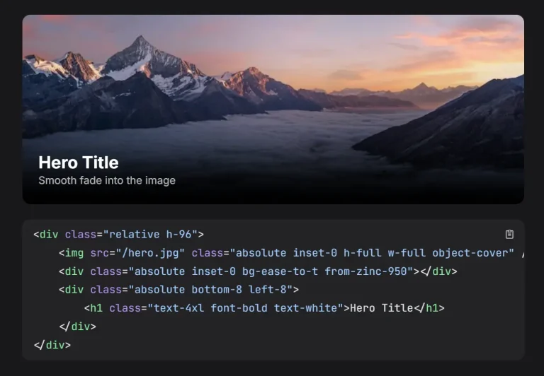
</div>6. A common use case is text over an image. The gradient can fade more naturally across the image surface.
<div class="relative overflow-hidden rounded-2xl">
  <img
    src="/images/cover.jpg"
    alt="Cover"
    class="block h-80 w-full object-cover"
  />
  <div class="absolute inset-0 bg-linear-to-t from-black to-transparent gradient-ease-in"></div>
  <div class="absolute bottom-0 p-6 text-white">
    <h2 class="text-2xl font-semibold">Editorial Card</h2>
    <p class="mt-2 text-sm text-white/85">Softer fade near the content area.</p>
  </div>
</div>
7. Pick the right easing mode. Each utility changes how the transition spreads across the gradient.
- Use the linear mode when you want the default distribution.
- Use the in mode when you want more color change toward the end.
- Use the out mode when you want more color change near the start.
- Use the in-out mode when you want a softer start and end with a stronger shift in the middle.
- Use a custom bezier when your design needs a specific curve.
All CSS Classes
| Class | Styles | Description |
|---|---|---|
gradient-ease-linear | --tw-gradient-via-stops: eased stops (0,0,1,1) | Keeps the default linear stop distribution. |
gradient-ease-in | --tw-gradient-via-stops: eased stops (0.42,0,1,1) | Concentrates more color change toward the end of the gradient. |
gradient-ease-out | --tw-gradient-via-stops: eased stops (0,0,0.58,1) | Concentrates more color change near the start of the gradient. |
gradient-ease-in-out | --tw-gradient-via-stops: eased stops (0.42,0,0.58,1) | Softens the start and end while pushing more transition into the middle. |
gradient-ease-[...] | --tw-gradient-via-stops: eased stops (custom bezier) | Uses a custom cubic-bezier(x1,y1,x2,y2) curve. |
FAQs
Q: Does easing-gradients work with Tailwind CSS v3?
A: The plugin targets Tailwind CSS v4 and uses the CSS-first @plugin workflow.
Q: Does it replace Tailwind’s normal gradient utilities?
A: No. You still use Tailwind’s regular gradient direction and color utilities. The plugin adds easing utilities that change how the stops distribute across the gradient.
Q: When should I use a custom cubic-bezier curve?
A: Use a custom curve when preset easing modes do not match the fade shape in your design.
Q: Does this plugin work only for transparent overlays?
A: No. It also works on color-to-color gradients. Transparent overlays are just one of the easiest places to notice the visual difference.