The Future of Web Dev
The Future of Web Dev
Add Gradient Edge Fades to Tailwind CSS with tailwindcss-fade Plugin
Create gradient edge fades in Tailwind CSS with tailwindcss-fade. Apply directional fades, adjust opacity, and animate transitions with utility classes.
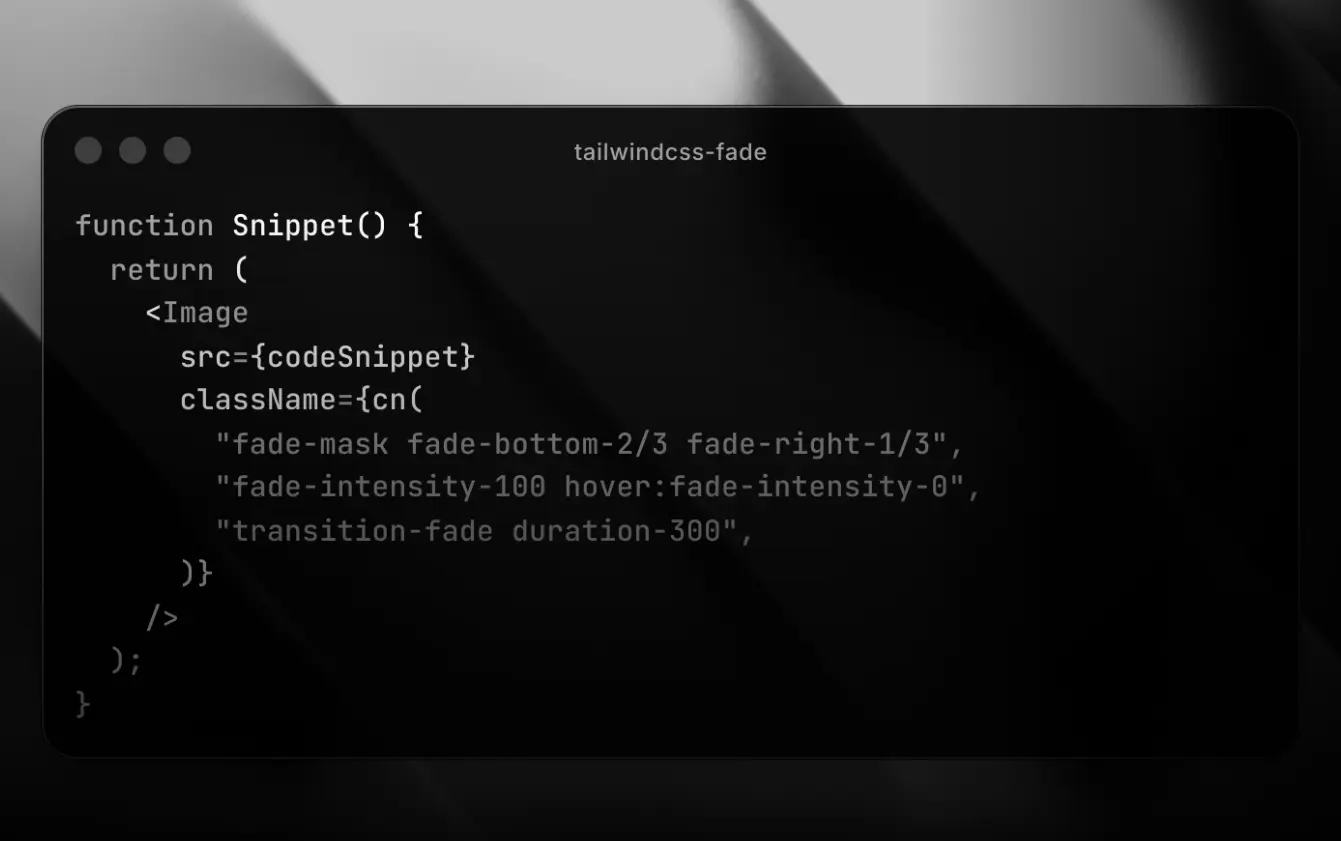
tailwindcss-fade is a Tailwind CSS plugin that provides a set of utility classes for applying gradient fades to any element’s edges using CSS mask properties.
You can control fade length, intensity, direction, and rotation through familiar Tailwind syntax. Works with both Tailwind v3 and v4.
Features
🎯 Directional Control: Apply fades to individual edges (top, bottom, left, right) or multiple edges simultaneously using axis utilities (x, y) or the all-sides fade utility.
🎨 Intensity Adjustment: Control fade opacity separately for each edge using intensity utilities that accept Tailwind opacity values or arbitrary percentages.
🔄 Rotation Support: Rotate the entire fade mask using Tailwind rotation values to create diagonal or angled fade effects.
⚡ Animation Ready: The included transition-fade utility animates all fade properties smoothly for hover states, scroll interactions, or dynamic content changes.
📏 Arbitrary Values: Use bracket notation for custom fade lengths, intensities, and rotation angles beyond Tailwind’s default scale.
🔧 Zero Configuration: Works immediately after installation with no additional setup required.
See It In Action
Use Cases
- Image Gallery Overlays: Create faded edges on image containers to blend content into the background or overlay UI controls without hard visual boundaries.
- Scrollable Content Indicators: Apply vertical fades to scrollable lists or horizontal carousels to indicate more content exists beyond the visible area.
- Card Hover Effects: Add dynamic fade transitions on hover to reveal or hide content edges, creating depth and focus on interactive elements.
- Text Overflow Handling: Fade long text blocks at the bottom to show truncation visually without abrupt cutoffs, improving readability in constrained spaces.
How to Use It
1. Install the plugin through npm in your project directory.
npm install tailwindcss-fade2. For Tailwind v4, import the plugin directly in your CSS file after the Tailwind directive.
@import "tailwindcss";
@plugin "tailwindcss-fade";
3. For Tailwind v3, add the plugin to your Tailwind configuration file.
import FadePlugin from "tailwindcss-fade";
export default {
  plugins: [FadePlugin],
};
4. Apply the base fade-mask class to any element you want to fade. This class initializes all CSS custom properties and sets up the mask composition. Without this base class, the fade utilities won’t function.
<div class="fade-mask">
Content with fade mask applied
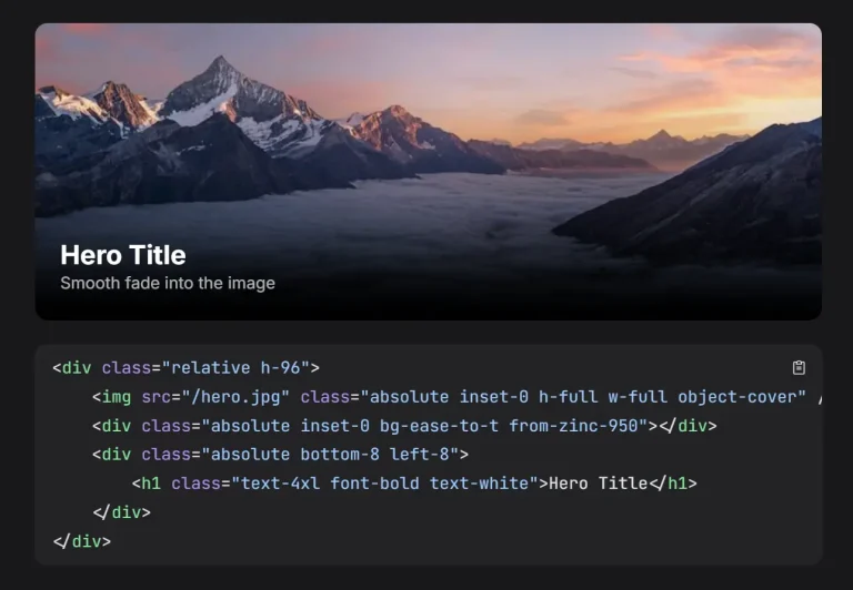
</div>5. Add directional fade utilities to specify which edges should fade and by how much. The value corresponds to Tailwind’s inset scale (spacing values). For example, fade-bottom-8 creates a 2rem fade from the bottom edge.
<div class="fade-mask fade-bottom-8">
  Fades from the bottom edge
</div>
6. Control multiple edges at once using axis utilities. The fade-x utility affects left and right edges, while fade-y affects top and bottom edges.
<div class="fade-mask fade-x-12 fade-y-6">
  Horizontal fade is 3rem, vertical fade is 1.5rem
</div>
7. Adjust fade intensity to control how transparent the faded edge becomes. The default intensity is 1 (fully opaque at the fade start), and 0 creates maximum transparency. Intensity utilities accept Tailwind opacity values.
<div class="fade-mask fade-bottom-16 fade-bottom-intensity-50">
  Bottom fades to 50% opacity instead of fully transparent
</div>
8. Set different intensities for different edges to create asymmetric effects. You can combine edge-specific fade lengths with edge-specific intensities.
<div class="fade-mask fade-top-8 fade-top-intensity-75 fade-bottom-16 fade-bottom-intensity-25">
  Top fades to 75% opacity, bottom fades to 25% opacity
</div>
9. Rotate the fade mask to create diagonal or angled effects. The rotation value uses Tailwind’s rotate scale.
<div class="fade-mask fade-y-12 fade-rotate-45">
  Vertical fade rotated 45 degrees
</div>
10. Add the transition-fade utility to animate fade changes. This applies transitions to all fade-related custom properties, making hover effects and dynamic updates smooth.
<div class="fade-mask fade-bottom-0 hover:fade-bottom-16 transition-fade duration-300">
  Fade animates on hover
</div>
11. Use arbitrary values for precise control beyond Tailwind’s default scales. Wrap custom values in square brackets.
<div class="fade-mask fade-right-[90%] fade-left-[120px]">
  Right edge fades 90% of container width, left edge fades exactly 120 pixels
</div>
<div class="fade-mask fade-x-8 fade-intensity-[0.33]">
  All edges fade to 33% opacity
</div>
<div class="fade-mask fade-top-8 fade-top-intensity-[90%]">
  Top edge fades to 90% opacity (percentage syntax supported for intensity)
</div>
<div class="fade-mask fade-y-8 fade-rotate-[23.5deg]">
  Vertical fade rotated 23.5 degrees
</div>
12. Combine utilities to create complex effects. The plugin composites horizontal and vertical gradients using mask intersection, allowing independent control of all four edges.
<div class="fade-mask fade-top-4 fade-bottom-8 fade-left-12 fade-right-6
            fade-top-intensity-80 fade-bottom-intensity-60
            transition-fade duration-500">
  All edges fade with different lengths and intensities, animated on change
</div>
API Reference (Utility Classes)
fade-mask: Required base class that initializes all fade custom properties and applies the CSS mask composition. Must be present for any fade utilities to take effect.
fade-{inset}: Sets the fade length for all four edges simultaneously. Accepts any Tailwind inset value or arbitrary value in brackets.
fade-x-{inset}: Sets the fade length for left and right edges. Accepts any Tailwind inset value or arbitrary value in brackets.
fade-y-{inset}: Sets the fade length for top and bottom edges. Accepts any Tailwind inset value or arbitrary value in brackets.
fade-top-{inset}: Sets the fade length for the top edge only. Accepts any Tailwind inset value or arbitrary value in brackets.
fade-bottom-{inset}: Sets the fade length for the bottom edge only. Accepts any Tailwind inset value or arbitrary value in brackets.
fade-left-{inset}: Sets the fade length for the left edge only. Accepts any Tailwind inset value or arbitrary value in brackets.
fade-right-{inset}: Sets the fade length for the right edge only. Accepts any Tailwind inset value or arbitrary value in brackets.
fade-intensity-{percentage}: Sets the fade intensity for all four edges. Lower values create more transparency. Accepts Tailwind opacity values or arbitrary percentages in brackets.
fade-x-intensity-{percentage}: Sets the fade intensity for left and right edges. Accepts Tailwind opacity values or arbitrary values in brackets.
fade-y-intensity-{percentage}: Sets the fade intensity for top and bottom edges. Accepts Tailwind opacity values or arbitrary values in brackets.
fade-top-intensity-{percentage}: Sets the fade intensity for the top edge only. Accepts Tailwind opacity values or arbitrary percentages in brackets.
fade-bottom-intensity-{percentage}: Sets the fade intensity for the bottom edge only. Accepts Tailwind opacity values or arbitrary percentages in brackets.
fade-left-intensity-{percentage}: Sets the fade intensity for the left edge only. Accepts Tailwind opacity values or arbitrary percentages in brackets.
fade-right-intensity-{percentage}: Sets the fade intensity for the right edge only. Accepts Tailwind opacity values or arbitrary percentages in brackets.
fade-rotate-{angle}: Rotates the fade mask by the specified angle. Accepts Tailwind rotate values, arbitrary degree values in brackets, and supports negative values.
transition-fade: Applies CSS transitions to all fade custom properties. Combine with Tailwind duration utilities to control animation speed.
Related Resources
- Tailwind CSS Documentation: Official Tailwind CSS documentation covering utility classes, configuration, and plugin development.
- CSS Mask Module: MDN reference for CSS masking properties that power this plugin’s fade effects.
- Tailwind CSS Plugins: Guide to creating and using Tailwind CSS plugins for extending framework functionality.
- CSS Custom Properties: MDN documentation on CSS variables used for animatable fade properties.
FAQs
Q: How does this plugin work?
A: It uses the CSS mask-image property with linear-gradient values to create transparent areas on the edges of an element. The plugin generates utility classes to control the size, direction, and intensity of these gradients.
Q: Can I animate fade changes on scroll or hover?
A: Yes. Add the transition-fade utility along with a Tailwind duration class. The plugin uses CSS custom properties that support transitions, so fade length, intensity, and rotation all animate smoothly when their values change.
Q: Do the fade utilities work with responsive prefixes?
A: Yes. All fade utilities support Tailwind’s responsive variants. You can apply different fade configurations at different breakpoints using the standard sm:, md:, lg: prefix syntax.
Q: What happens if I apply fade utilities without the fade-mask base class?
A: The utilities won’t have any visible effect. The fade-mask class sets up the CSS mask composition and initializes the custom properties that the directional utilities modify. Always include it on elements where you want fades.
Q: Can I use percentage values for fade intensity?
A: Yes. The plugin normalizes percentage values to decimal format. You can use fade-intensity-50 for 50% opacity or arbitrary values like fade-intensity-[75%] for 75% opacity.