The Future of Web Dev
The Future of Web Dev
Nuxt Documentation Site Template – shadcn-docs-nuxt
shadcn-docs-nuxt is a documentation template that runs on Nuxt and compiles documentation sites from markdown files stored in your content directory.
The template comes with pre-configured markdown processing, search functionality, and a collection of documentation-specific UI components built on shadcn-vue.
Features
📝 Markdown Processing: Nuxt Content parses markdown files and renders them with automatic syntax highlighting for code blocks.
🎨 shadcn-vue Components: Pre-built UI components like alerts, badges, callouts, and tabs integrate directly into markdown through MDC syntax.
🔍 Content Search: Built-in search indexes your documentation and returns results from headings and content.
📱 Mobile Navigation: Responsive sidebar collapses into a drawer menu on smaller screens.
🔧 Configuration System: Centralized configuration through app.config.ts controls theme colors, navigation structure, and feature flags.
🌙 Dark Mode: Theme switcher toggles between light and dark color schemes.
Use Cases
- Open Source Libraries: Host installation guides, API references, and changelogs for public software packages.
- Internal Knowledge Bases: Organize technical manuals, runbooks, and onboarding materials for engineering teams.
- Design System Documentation: Display component usage, props, and style tokens using interactive playgrounds and code blocks.
Installation
1. Create a new project
npx nuxi@latest init -t github:ZTL-UwU/shadcn-docs-nuxt-starter
cd YOUR-PROJECT
2. Start the development server. The documentation site runs at http://localhost:3000.
npm run dev3. Create markdown files in the content directory. Nuxt Content automatically generates routes based on file paths:
---
title: Getting Started
description: Learn how to install and configure the template
---
# Getting Started
Your documentation content goes here.
4. Import components directly in markdown using MDC syntax:
::alert{type="info"}
This is an informational alert.
::
::callout
#summary
Important Note
#content
This callout highlights critical information.
::
5. Edit app.config.ts to customize your documentation site:
const defaultConfig: DefaultConfig = {
  site: {
    name: 'shadcn-docs',
    description: 'Beautifully designed Nuxt Content template built with shadcn-vue. Customizable. Compatible. Open Source.',
    ogImage: '/hero.png',
    ogImageComponent: 'ShadcnDocs',
    ogImageColor: 'light',
    umami: {
      enable: false,
      src: 'https://cloud.umami.is/script.js',
      dataWebsiteId: '',
    },
  },
  theme: {
    customizable: true,
    color: 'zinc',
    radius: 0.5,
  },
  banner: {
    enable: false,
    showClose: true,
    content: 'Welcome to **shadcn-docs-nuxt**',
    to: '',
    target: '_blank',
    border: true,
  },
  header: {
    showLoadingIndicator: true,
    title: 'shadcn-docs',
    showTitle: true,
    logo: {
      light: '/logo.svg',
      dark: '/logo-dark.svg',
    },
    showTitleInMobile: false,
    border: false,
    darkModeToggle: true,
    languageSwitcher: {
      enable: true,
      triggerType: 'icon',
      dropdownType: 'select',
    },
    nav: [],
    links: [],
  },
  aside: {
    useLevel: true,
    levelStyle: 'aside',
    headerLevelNavAlign: 'start',
    collapse: false,
    collapseLevel: 1,
    folderStyle: 'default',
  },
  main: {
    breadCrumb: true,
    showTitle: true,
    codeCopyToast: false,
    codeCopyIcon: 'lucide:clipboard',
    codeCopyToastText: 'Copied to clipboard!',
    fieldRequiredText: 'required',
    padded: true,
    editLink: {
      enable: false,
      pattern: '',
      text: 'Edit this page',
      icon: 'lucide:square-pen',
      placement: ['docsFooter'],
    },
    backToTop: true,
    pm: ['npm', 'pnpm', 'bun', 'yarn'],
    imageZoom: true,
    codeIcon: {
      'package.json': 'vscode-icons:file-type-node',
      'tsconfig.json': 'vscode-icons:file-type-tsconfig',
      '.npmrc': 'vscode-icons:file-type-npm',
      '.editorconfig': 'vscode-icons:file-type-editorconfig',
      '.eslintrc': 'vscode-icons:file-type-eslint',
      '.eslintrc.cjs': 'vscode-icons:file-type-eslint',
      '.eslintignore': 'vscode-icons:file-type-eslint',
      'eslint.config.js': 'vscode-icons:file-type-eslint',
      'eslint.config.mjs': 'vscode-icons:file-type-eslint',
      'eslint.config.cjs': 'vscode-icons:file-type-eslint',
      '.gitignore': 'vscode-icons:file-type-git',
      'yarn.lock': 'vscode-icons:file-type-yarn',
      '.env': 'vscode-icons:file-type-dotenv',
      '.env.example': 'vscode-icons:file-type-dotenv',
      '.vscode/settings.json': 'vscode-icons:file-type-vscode',
      'nuxt': 'vscode-icons:file-type-nuxt',
      '.nuxtrc': 'vscode-icons:file-type-nuxt',
      '.nuxtignore': 'vscode-icons:file-type-nuxt',
      'nuxt.config.js': 'vscode-icons:file-type-nuxt',
      'nuxt.config.ts': 'vscode-icons:file-type-nuxt',
      'nuxt.schema.ts': 'vscode-icons:file-type-nuxt',
      'tailwind.config.js': 'vscode-icons:file-type-tailwind',
      'tailwind.config.ts': 'vscode-icons:file-type-tailwind',
      'vue': 'vscode-icons:file-type-vue',
      'ts': 'vscode-icons:file-type-typescript',
      'tsx': 'vscode-icons:file-type-typescript',
      'mjs': 'vscode-icons:file-type-js',
      'cjs': 'vscode-icons:file-type-js',
      'js': 'vscode-icons:file-type-js',
      'jsx': 'vscode-icons:file-type-js',
      'md': 'vscode-icons:file-type-markdown',
      'mdc': 'vscode-icons:file-type-markdown',
      'css': 'vscode-icons:file-type-css',
      'py': 'vscode-icons:file-type-python',
      'npm': 'vscode-icons:file-type-npm',
      'pnpm': 'vscode-icons:file-type-pnpm',
      'pnpm-lock.yaml': 'vscode-icons:file-type-pnpm',
      'pnpm-workspace.yaml': 'vscode-icons:file-type-pnpm',
      'npx': 'vscode-icons:file-type-npm',
      'yarn': 'vscode-icons:file-type-yarn',
      'bun': 'vscode-icons:file-type-bun',
      'bun.lock': 'vscode-icons:file-type-bun',
      'deno': 'vscode-icons:file-type-deno',
      'yml': 'vscode-icons:file-type-light-yaml',
      'json': 'vscode-icons:file-type-json',
      'terminal': 'lucide:terminal',
    },
  },
  footer: {
    border: true,
    credits: '',
    links: [],
  },
  toc: {
    enable: true,
    enableInMobile: false,
    enableInHomepage: false,
    progressBar: true,
    title: 'On This Page',
    links: [],
    iconLinks: [],
    carbonAds: {
      enable: false,
      disableInDev: false,
      disableInMobile: false,
      fallback: false,
      fallbackMessage: 'Please support us by disabling your ad blocker.',
      code: '',
      placement: '',
      format: 'cover',
    },
  },
  search: {
    enable: true,
    inAside: false,
    style: 'input',
    placeholder: 'Search...',
    placeholderDetailed: 'Search documentation...',
  },
};
Available UI Components
Prose Components
These components handle standard content rendering.
- Markdown: Standard text formatting.
- Code Blocks: Syntax highlighting for code snippets.
- Images and Embeds: Media handling.
- Mermaid Diagrams: Renders charts and graphs from text definitions.
Docs Components
These components provide specific utility for technical writing and documentation structure.
- Alert: Highlights critical information (warnings, notes).
- Badge: Displays status indicators or labels.
- Button Link: Renders navigation links as buttons.
- Callout: Emphasizes content blocks.
- Card / Card Group: Groups related information in boxed layouts.
- Code Group: Displays multiple code blocks (e.g., npm/yarn/pnpm) in a tabbed interface.
- Code Tree: Visualizes directory structures or code hierarchies.
- Field / Field Group: Documents API fields or object properties.
- File Tree: Renders file system structures.
- Icon: Renders SVG icons.
- Playground: Provides an interactive area for component demos.
- New: Labels new features or content.
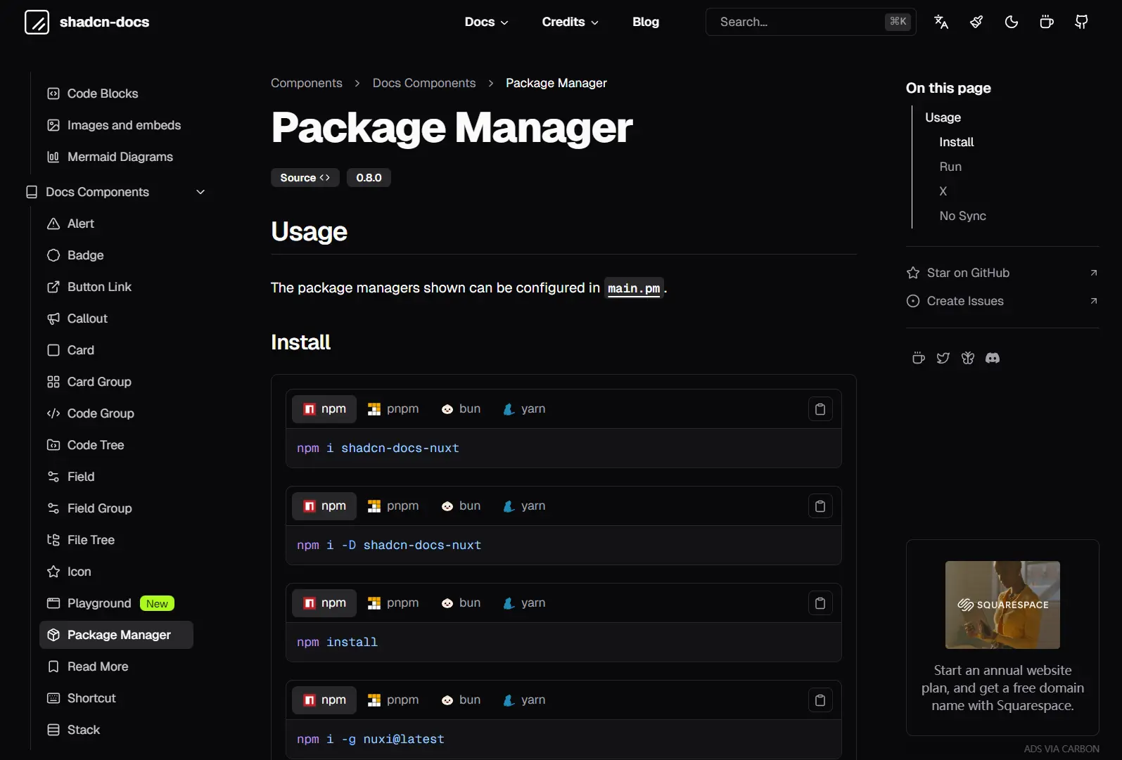
- Package Manager: Shows installation commands for different package managers.
- Read More: Links to external or related internal resources.
- Shortcut: Displays keyboard shortcuts.
- Stack: Arranges elements vertically or horizontally.
- Steps: Visualizes step-by-step instructions.
- Tabs: Organizes content into switchable tabs.
Page Components
These components construct high-level page layouts, such as landing pages.
- Accordion: Collapsible content sections.
- Collapsible: Toggles visibility of content blocks.
- Hero: Primary landing page banner with title and actions.
- HeroAlt: Alternative layout for the hero section.
- Team Card: Displays team member profiles.
Related Resources
- Nuxt Content: File-based CMS for Nuxt that parses markdown and handles content queries.
- Docus: Nuxt documentation theme from the Nuxt team with similar component patterns.
- VitePress: Vite-powered static site generator focused on documentation with Vue components.
FAQs
Q: How do I add custom components to the documentation?
A: Create Vue components in the components directory. Register them globally or import them in markdown files using MDC syntax. Components must accept slots or props that MDC can pass through.
Q: Does the search index update automatically during development?
A: Nuxt Content rebuilds the search index when you modify markdown files in development mode. Changes appear immediately in search results without restarting the dev server.
Q: Can I deploy this to platforms other than static hosting?
A: Yes. The template works with any Node.js hosting that supports Nuxt 3. Use npm run build for server-side rendering instead of npm run generate for static generation.