The Future of Web Dev
The Future of Web Dev
Responsive Swipeable Modal & Drawer for Vue & Nuxt
Build mobile-friendly drawers and modals with Slaydover. This Vue/Nuxt component adapts overlay positions based on breakpoints with gesture support.
Slaydover is a flexible, responsive modal and drawer component built for Vue and Nuxt applications. It allows you to create content panels that appear from different edges of the screen on mobile & desktop layouts.
You can configure Slaydover to slide from any side (top, right, bottom, or left) and specify different positions for different screen widths. The component includes touch gesture support for closing the overlay by swiping in the appropriate direction.
Features
📱 Responsive positioning that changes based on screen breakpoints like bottom md:right or left lg:top.
👆 Swipe-to-close gestures that adapt to the panel’s entry direction.
🎯 Support for all four sides (top, right, bottom, left) with breakpoint modifiers.
🎨 Custom overlay slot for replacing the default backdrop styling.
⚡ Configurable animation speed for transitions.
🔒 Smart scroll detection that prevents gesture conflicts during content scrolling.
♿ ARIA accessibility support with optional title element configuration.
🔧 Flexible installation options (global, local, or Nuxt module).
Use Cases
- Build mobile navigation menus that slide from the left on phones but appear as right sidebars on desktop screens.
- Create shopping cart overlays in e-commerce applications that slide from the bottom on mobile and from the right on larger displays.
- Implement filter panels for data tables that adapt their position based on available screen space.
- Design notification centers that appear from the top on mobile devices and from the right edge on desktop layouts.
- Develop settings panels that users can swipe away on touch devices while maintaining click-to-close on desktop browsers.
How to Use It
1. Install the package through npm in your project directory.
npm install @crossatko/slaydover2. You have three options for integrating it into your application.
For global registration in a Vue application, import the component and stylesheet in your main entry file.
import { createApp } from 'vue'
import App from './App.vue'
import Slaydover from '@crossatko/slaydover'
import '@crossatko/slaydover/style.css'
const app = createApp(App)
app.component('Slaydover', Slaydover)
app.mount('#app')
For component-level imports, bring in both the component and styles directly in your Vue single-file component.
<script setup lang="ts">
import Slaydover from '@crossatko/slaydover'
import '@crossatko/slaydover/style.css'
</script>
Nuxt users can register the component automatically through the provided module by adding it to the modules array in your Nuxt configuration.
export default defineNuxtConfig({
modules: ['@crossatko/slaydover/nuxt']
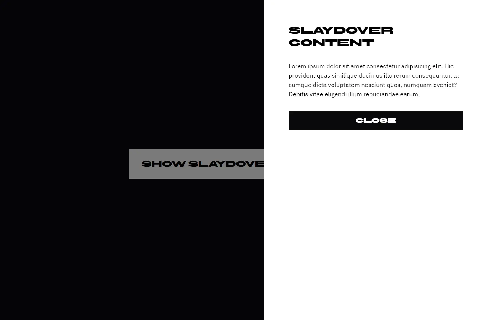
})3. Create a reactive boolean to control the overlay’s open state. Bind this to the v-model directive on the Slaydover component. The position prop accepts a string that defines which edge the overlay slides from.
The position prop uses a breakpoint-based syntax. You can specify different sides for different screen sizes by separating them with spaces. The format follows
side breakpoint:sidepatterns. For example,"bottom md:right"means the panel slides from the bottom on small screens and switches to sliding from the right at the medium breakpoint and above.
<script setup lang="ts">
import { ref } from 'vue'
import Slaydover from '@crossatko/slaydover'
import '@crossatko/slaydover/style.css'
const isOpen = ref(false)
</script>
<template>
  <button @click="isOpen = true">Show Panel</button>
  <Slaydover v-model="isOpen" position="bottom lg:right">
    <div class="panel-content">
      <h2>Panel Title</h2>
      <p>Content goes here</p>
    </div>
  </Slaydover>
</template>
4. Available sides include top, right, bottom, and left. The default breakpoints match common Tailwind CSS values: xs (360px), sm (480px), md (768px), lg (1024px), xl (1280px), and 2xl (1536px). You can override these by passing a custom breakpoints object.
<Slaydover
  v-model="isOpen"
  position="left md:bottom xl:right"
  :breakpoints="{ sm: 640, md: 768, lg: 1024 }"
>
  <div>Content adapts to three different positions</div>
</Slaydover>
5. Control the animation speed by passing a number in milliseconds to the speed prop. The default is 300ms.
<Slaydover v-model="isOpen" position="right" :speed="500">
  <div>Slower transition</div>
</Slaydover>
6. The component provides two slots. The default slot contains your main content. The overlay slot lets you replace the default semi-transparent backdrop with custom styling.
Users can close the overlay by swiping in the direction matching where the panel entered. A panel sliding from the bottom closes by swiping down. A panel from the right closes by swiping right. The component automatically adjusts gesture sensitivity based on screen size and ignores swipes when users are scrolling through content.
<Slaydover v-model="isOpen" position="bottom">
  <template #overlay>
    <div class="custom-backdrop" />
  </template>
  <div class="main-content">
    Your panel content
  </div>
</Slaydover>
7. For accessibility, pass a titleId prop that matches the ID of your panel’s heading element. This connects the overlay to its title for screen readers.
<Slaydover v-model="isOpen" position="right" titleId="panel-heading">
  <div>
    <h2 id="panel-heading">Settings</h2>
    <p>Panel content here</p>
  </div>
</Slaydover>
8. The component automatically detects window width changes and updates the active position. You can combine this with CSS framework classes for additional styling control.
<Slaydover
  v-model="isOpen"
  position="top md:right"
  class="shadow-xl"
>
  <template #overlay>
    <div class="bg-black/20 backdrop-blur-sm" />
  </template>
  <div class="bg-white rounded-lg p-6">
    <h3 class="text-xl mb-4">Notification Center</h3>
    <ul class="space-y-2">
      <li>Notification 1</li>
      <li>Notification 2</li>
    </ul>
  </div>
</Slaydover>
Related Resources
- Vue Use provides composable utilities for Vue applications, including useSwipe for custom gesture handling.
- Radix Vue delivers accessible component primitives for Vue applications.
- Nuxt UI includes pre-built components for Nuxt projects, including modal and slideover implementations.
FAQs
Q: Can I use multiple Slaydover components on the same page?
A: Yes, you can mount multiple instances with different v-model bindings. Each component manages its own state independently. Just ensure each has its own reactive boolean for controlling visibility.
Q: How do I prevent the overlay from closing when clicking inside the panel?
A: Click events on the panel content do not close the overlay by default. Only clicking the backdrop or using the swipe gesture triggers closure. If you need to prevent specific interactions, handle those events in your panel content and stop their propagation.
Q: How do I customize the backdrop opacity or color?
A: Use the overlay slot to replace the default backdrop with your own element. Pass any CSS classes or inline styles you need for opacity, color, or blur effects. The slot gives you complete control over the backdrop appearance.