The Future of Web Dev
The Future of Web Dev
Simple Inline & Nested Modal Dialogs For Svelte
Implement simple, accessible, inline, nested modal windows in Svelte apps using the native dialog element.

svelte-inline-modal is a Svelte component that allows you to implement modal dialogs directly within your component structure using the native <dialog> element.
It supports basic and nested modal dialogs and integrates natively with Svelte’s reactivity system.
Features
📍 Inline Rendering: The modal content renders directly within your component’s markup.
🎨 Customizable Styling: Override the default styles and animations by targeting the underlying <dialog> element and its backdrop.
🖱️ Simple API: The component provides an intuitive API using Svelte snippets for controlling modal visibility.
📦 Lightweight: A focused library providing modal functionality without unnecessary overhead.
Use Cases
- Confirmation Prompts: Use
svelte-inline-modalto create confirmation dialogs for actions like deleting an item. The modal can present a clear message and action buttons within the context of the triggering component. - Form Dialogs: Embed forms within modals for collecting user input. Placing the modal inline simplifies data handling within the relevant component.
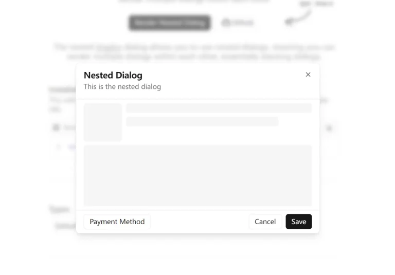
- Nested Settings Menus: Build layered settings interfaces where opening a setting reveals further options in a nested modal. This approach maintains visual hierarchy and keeps related settings grouped together.
- Detail Views: Display detailed information related to a specific item within a modal. For example, clicking on a product listing could open an inline modal showing more product specifications.
Installation
Install svelte-inline-modal using npm:
npm i svelte-inline-modalUsage
1. Import the InlineModal component into your Svelte component:
import { InlineModal } from 'svelte-inline-modal';2. Implement the modal within your template. Utilize the button snippet to define the trigger and the menu snippet for the modal content:
<InlineModal onClose={onCloseModal}>
  {#snippet button(open)}
    <button onclick={open}>Open Modal</button>
  {/snippet}
  {#snippet menu(close)}
    <div>
      <h2>Modal Content</h2>
      <p>This is the content of the modal.</p>
      <button on:click={close}>Close</button>
    </div>
  {/snippet}
</InlineModal>
3. To create nested modals, embed another InlineModal component within the menu snippet of the parent modal:
<InlineModal onClose={onCloseModal}>
  {#snippet button(open)}
    <button onclick={open}>Open Parent Modal</button>
  {/snippet}
  {#snippet menu(close)}
    <div>
      <h2>Parent Modal</h2>
      <InlineModal onClose={onCloseNestedModal}>
        {#snippet button(open)}
          <button onclick={open}>Open Nested Modal</button>
        {/snippet}
        {#snippet menu(close)}
          <div>
            <h3>Nested Modal</h3>
            <p>This is nested modal content.</p>
            <button on:click={close}>Close Nested</button>
          </div>
        {/snippet}
      </InlineModal>
      <button on:click={close}>Close Parent</button>
    </div>
  {/snippet}
</InlineModal>
4. Handle the modal close event using the onClose prop:
const onCloseModal = () => {
  console.log('Modal closed');
};
5. Customize the modal’s styling by overriding the default styles for the <dialog> element and its backdrop in your CSS:
dialog {
  border: 1px solid #ccc;
  padding: 20px;
  background-color: white;
  color: black;
}
dialog::backdrop {
  background-color: rgba(0, 0, 0, 0.7);
}
Preview