The Future of Web Dev
The Future of Web Dev
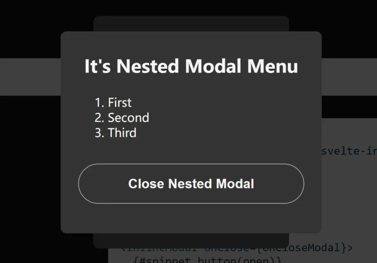
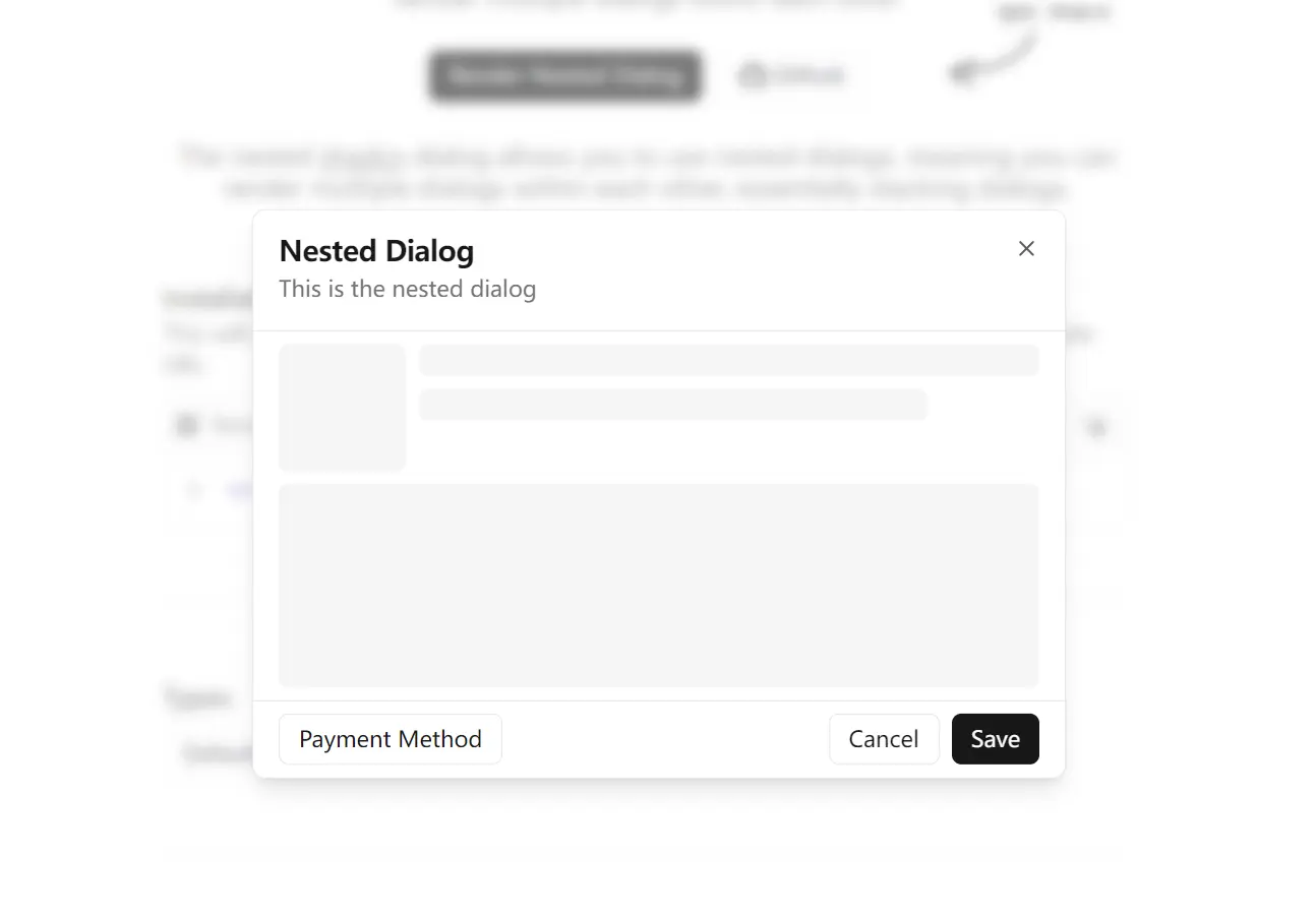
Create Nested & Drag-to-dismiss Modals with shadcn-dialog
Build nested shadcn/ui dialogs with shadcn-dialog. Features proper focus management, keyboard navigation, and drag-to-dismiss for complex UI workflows.
The shadcn-dialog component extends the standard shadcn/ui dialog system with nested dialog functionality.
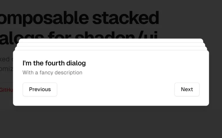
It allows you to create a stacking effect, where one dialog can trigger the opening of a subsequent one on top of it.
Features
🔄 Nested Dialog Support – Render multiple dialogs within each other with proper stacking.
🎯 Focus Management – Automatic focus handling between nested dialog layers.
⌨️ Keyboard Navigation – Custom escape key handling for nested dialog hierarchies.
📱 Drag-to-Dismiss – Optional draggable functionality for mobile-friendly interactions.
🎨 Multiple Positions – Support for different dialog positions including bottom, top, left, and right.
🔧 TypeScript Ready – Full TypeScript support with proper type definitions.
⚡ Performance Optimized – Context-based state management prevents unnecessary re-renders.
🎭 Animation Support – Built-in animations with Tailwind CSS classes for smooth transitions.
Use Cases
- Multi-Step Forms: Break down long forms into smaller, manageable steps, with each step presented in a nested dialog.
- Complex Confirmation Flows: Use a primary dialog for an action and a nested dialog to ask for a final confirmation, for instance, before deleting critical data.
- Displaying Supplementary Information: Show a list of items in one dialog and open a nested dialog to display the details of a selected item.
- User Onboarding Tours: Guide new users through application features using a series of stacked dialogs to explain different elements.
How to Use It
You can add shadcn-dialog to your project through two methods: a CLI command for quick setup or a manual installation for more control.
Quick Installation
Install the component using the shadcn CLI with the remote registry URL. This will automatically install all necessary dependencies and add the dialog component to your project.
npx shadcn add https://shadcn-dialog.vercel.app/registry/dialog.jsonManual Installation
Install the required peer dependencies.
npm i @radix-ui/react-dialog lucide-react clsx tailwind-mergeCreate a dialog.tsx file inside your components directory and add the component code:
"use client";

import * as React from "react";
import * as DialogPrimitive from "@radix-ui/react-dialog";
import { X } from "lucide-react";
import { cn } from "@/lib/utils";

interface DialogContextValue {
  innerOpen: boolean;
  setInnerOpen: React.Dispatch<React.SetStateAction<boolean>>;
}

const DialogContext = React.createContext<DialogContextValue | undefined>(
  undefined,
);

function Dialog({ children }: { children: React.ReactNode }) {
  const [outerOpen, setOuterOpen] = React.useState(false);
  const [innerOpen, setInnerOpen] = React.useState(false);

  return (
    <DialogContext.Provider value={{ innerOpen, setInnerOpen }}>
      <DialogPrimitive.Root open={outerOpen} onOpenChange={setOuterOpen}>
        {children}
      </DialogPrimitive.Root>
    </DialogContext.Provider>
  );
}

const DialogTrigger = DialogPrimitive.Trigger;
const DialogPortal = DialogPrimitive.Portal;
const DialogClose = DialogPrimitive.Close;

const DialogOverlay = React.forwardRef<
  React.ElementRef<typeof DialogPrimitive.Overlay>,
  React.ComponentPropsWithoutRef<typeof DialogPrimitive.Overlay>
>(({ className, ...props }, ref) => (
  <DialogPrimitive.Overlay
    ref={ref}
    className={cn(
      "fixed inset-0 z-50 bg-background/40 backdrop-blur-sm data-[state=open]:animate-in data-[state=closed]:animate-out data-[state=closed]:fade-out-0 data-[state=open]:fade-in-0",
      className,
    )}
    {...props}
  />
));
DialogOverlay.displayName = DialogPrimitive.Overlay.displayName;

const DialogContent = React.forwardRef<
  React.ElementRef<typeof DialogPrimitive.Content>,
  React.ComponentPropsWithoutRef<typeof DialogPrimitive.Content>
>(({ className, children, ...props }, ref) => {
  const context = React.useContext(DialogContext);
  if (!context) throw new Error("DialogContent must be used within a Dialog");

  return (
    <DialogPortal>
      <DialogOverlay />
      <DialogPrimitive.Content
        ref={ref}
        className={cn(
          "fixed left-[50%] top-[50%] z-50 grid w-full max-w-lg translate-x-[-50%] translate-y-[-50%] gap-4 rounded-lg border bg-background p-6 shadow-lg duration-200 data-[state=open]:animate-in data-[state=closed]:animate-out data-[state=closed]:fade-out-0 data-[state=open]:fade-in-0 data-[state=closed]:zoom-out-95 data-[state=open]:zoom-in-95 data-[state=closed]:slide-out-to-left-1/2 data-[state=closed]:slide-out-to-top-[48%] data-[state=open]:slide-in-from-left-1/2 data-[state=open]:slide-in-from-top-[48%] sm:rounded-lg",
          context.innerOpen && "translate-y-[-55%] scale-[0.97]",
          className,
        )}
        {...props}
      >
        {children}
        <DialogClose className="absolute right-4 top-4 rounded-sm opacity-70 ring-offset-background transition-opacity hover:opacity-100 focus:outline-none focus:ring-2 focus:ring-ring focus:ring-offset-2 disabled:pointer-events-none data-[state=open]:bg-accent data-[state=open]:text-muted-foreground">
          <X className="h-4 w-4" />
          <span className="sr-only">Close</span>
        </DialogClose>
      </DialogPrimitive.Content>
    </DialogPortal>
  );
});
DialogContent.displayName = DialogPrimitive.Content.displayName;

function InnerDialog({ children }: { children: React.ReactNode }) {
  const context = React.useContext(DialogContext);
  if (!context) throw new Error("InnerDialog must be used within a Dialog");

  React.useEffect(() => {
    const handleEscapeKeyDown = (event: KeyboardEvent) => {
      if (event.key === "Escape" && context.innerOpen) {
        context.setInnerOpen(false);
        event.stopPropagation();
      }
    };

    document.addEventListener("keydown", handleEscapeKeyDown);
    return () => {
      document.removeEventListener("keydown", handleEscapeKeyDown);
    };
  }, [context.innerOpen, context.setInnerOpen]);

  return (
    <DialogPrimitive.Root
      open={context.innerOpen}
      onOpenChange={context.setInnerOpen}
    >
      {children}
    </DialogPrimitive.Root>
  );
}

const InnerDialogTrigger = DialogPrimitive.Trigger;
const InnerDialogClose = DialogPrimitive.Close;

interface InnerDialogContentProps
  extends React.ComponentPropsWithoutRef<typeof DialogPrimitive.Content> {
  position?: "default" | "bottom" | "top" | "left" | "right";
  draggable?: boolean;
}

const InnerDialogContent = React.forwardRef<
  React.ElementRef<typeof DialogPrimitive.Content>,
  InnerDialogContentProps
>(
  (
    { className, children, position = "default", draggable = false, ...props },
    ref,
  ) => {
    const context = React.useContext(DialogContext);
    if (!context)
      throw new Error("InnerDialogContent must be used within a Dialog");

    const [isDragging, setIsDragging] = React.useState(false);
    const [startY, setStartY] = React.useState(0);
    const [currentY, setCurrentY] = React.useState(0);
    const [isClosingByDrag, setIsClosingByDrag] = React.useState(false);
    const contentRef = React.useRef<HTMLDivElement>(null);

    React.useEffect(() => {
      if (context.innerOpen) {
        setCurrentY(0);
        setIsClosingByDrag(false);
      }
    }, [context.innerOpen]);

    const handlePointerDown = (e: React.PointerEvent<HTMLDivElement>) => {
      if (!draggable) return;
      setIsDragging(true);
      setStartY(e.clientY - currentY);
      e.currentTarget.setPointerCapture(e.pointerId);
    };

    const handlePointerMove = (e: React.PointerEvent<HTMLDivElement>) => {
      if (!isDragging || !draggable) return;
      const newY = e.clientY - startY;
      setCurrentY(newY > 0 ? newY : 0);
    };

    const handlePointerUp = () => {
      if (!draggable) return;
      setIsDragging(false);
      if (currentY > (contentRef.current?.offsetHeight || 0) / 2) {
        setIsClosingByDrag(true);
        context.setInnerOpen(false);
      } else {
        setCurrentY(0);
      }
    };

    return (
      <DialogPortal>
        <DialogPrimitive.Content
          ref={ref}
          onPointerDown={handlePointerDown}
          onPointerMove={handlePointerMove}
          onPointerUp={handlePointerUp}
            style={{
            transform: `translate(-50%, calc(-50% + ${currentY}px))`,
            transition: isDragging ? "none" : "transform 0.3s ease-out",
          }}
          className={cn(
            "fixed left-[50%] top-[50%] z-[60] grid w-full max-w-lg translate-x-[-50%] translate-y-[-45%] gap-4 rounded-lg border bg-background p-6 shadow-lg duration-200",
            isClosingByDrag
              ? "data-[state=closed]:animate-none data-[state=closed]:fade-out-0"
              : "data-[state=open]:animate-in data-[state=closed]:animate-out data-[state=closed]:fade-out-0 data-[state=open]:fade-in-0 data-[state=closed]:zoom-out-95 data-[state=open]:zoom-in-95 data-[state=closed]:slide-out-to-left-1/2 data-[state=closed]:slide-out-to-top-[48%] data-[state=open]:slide-in-from-left-1/2 data-[state=open]:slide-in-from-top-[48%]",
            position === "default" &&
              "data-[state=closed]:slide-out-to-left-1/2 data-[state=closed]:slide-out-to-top-[48%] data-[state=open]:slide-in-from-left-1/2 data-[state=open]:slide-in-from-top-[48%]",
            position === "bottom" &&
              "data-[state=closed]:slide-out-to-bottom-full data-[state=open]:slide-in-from-bottom-full",
            position === "top" &&
              "data-[state=closed]:slide-out-to-top-full data-[state=open]:slide-in-from-top-full",
            position === "left" &&
              "data-[state=closed]:slide-out-to-left-full data-[state=open]:slide-in-from-left-full",
            position === "right" &&
              "data-[state=closed]:slide-out-to-right-full data-[state=open]:slide-in-from-right-full",
            draggable && "",
            className,
          )}
          {...props}
        >
          <div ref={contentRef}>{children}</div>
          <InnerDialogClose className="absolute right-4 top-4 rounded-sm opacity-70 ring-offset-background transition-opacity hover:opacity-100 focus:outline-none focus:ring-2 focus:ring-ring focus:ring-offset-2 disabled:pointer-events-none data-[state=open]:bg-accent data-[state=open]:text-muted-foreground">
            <X className="h-4 w-4" />
            <span className="sr-only">Close</span>
          </InnerDialogClose>
        </DialogPrimitive.Content>
      </DialogPortal>
    );
  },
);
InnerDialogContent.displayName = "InnerDialogContent";

const InnerDialogHeader = ({
  className,
  ...props
}: React.HTMLAttributes<HTMLDivElement>) => (
  <div
    className={cn(
      "flex flex-col space-y-1.5 text-center sm:text-left",
      className,
    )}
    {...props}
  />
);
InnerDialogHeader.displayName = "InnerDialogHeader";

const InnerDialogFooter = ({
  className,
  ...props
}: React.HTMLAttributes<HTMLDivElement>) => (
  <div
    className={cn("flex flex-col-reverse sm:flex-row sm:space-x-2", className)}
    {...props}
  />
);
InnerDialogFooter.displayName = "InnerDialogFooter";

const InnerDialogTitle = React.forwardRef<
  React.ElementRef<typeof DialogPrimitive.Title>,
  React.ComponentPropsWithoutRef<typeof DialogPrimitive.Title>
>(({ className, ...props }, ref) => (
  <DialogPrimitive.Title
    ref={ref}
    className={cn(
      "text-lg font-semibold leading-none tracking-tight",
      className,
    )}
    {...props}
  />
));
InnerDialogTitle.displayName = "InnerDialogTitle";

const InnerDialogDescription = React.forwardRef<
  React.ElementRef<typeof DialogPrimitive.Description>,
  React.ComponentPropsWithoutRef<typeof DialogPrimitive.Description>
>(({ className, ...props }, ref) => (
  <DialogPrimitive.Description
    ref={ref}
    className={cn("text-sm text-muted-foreground", className)}
    {...props}
  />
));
InnerDialogDescription.displayName = "InnerDialogDescription";

const DialogHeader = ({
  className,
  ...props
}: React.HTMLAttributes<HTMLDivElement>) => (
  <div
    className={cn(
      "flex flex-col space-y-1.5 text-center sm:text-left",
      className,
    )}
    {...props}
  />
);
DialogHeader.displayName = "DialogHeader";

const DialogFooter = ({
  className,
  ...props
}: React.HTMLAttributes<HTMLDivElement>) => (
  <div
    className={cn("flex flex-col-reverse sm:flex-row sm:space-x-2", className)}
    {...props}
  />
);
DialogFooter.displayName = "DialogFooter";

const DialogTitle = React.forwardRef<
  React.ElementRef<typeof DialogPrimitive.Title>,
  React.ComponentPropsWithoutRef<typeof DialogPrimitive.Title>
>(({ className, ...props }, ref) => (
  <DialogPrimitive.Title
    ref={ref}
    className={cn(
      "text-lg font-semibold leading-none tracking-tight",
      className,
    )}
    {...props}
  />
));
DialogTitle.displayName = DialogPrimitive.Title.displayName;

const DialogDescription = React.forwardRef<
  React.ElementRef<typeof DialogPrimitive.Description>,
  React.ComponentPropsWithoutRef<typeof DialogPrimitive.Description>
>(({ className, ...props }, ref) => (
  <DialogPrimitive.Description
    ref={ref}
    className={cn("text-sm text-muted-foreground", className)}
    {...props}
  />
));
DialogDescription.displayName = DialogPrimitive.Description.displayName;

export type { InnerDialogContentProps };
export {
  Dialog,
  DialogTrigger,
  DialogContent,
  DialogHeader,
  DialogFooter,
  DialogTitle,
  DialogDescription,
  DialogClose,
  InnerDialog,
  InnerDialogTrigger,
  InnerDialogContent,
  InnerDialogHeader,
  InnerDialogFooter,
  InnerDialogTitle,
  InnerDialogDescription,
  InnerDialogClose,
  DialogPortal,
  DialogOverlay,
};
You will also need a utils.ts file in your lib folder for the cn utility function, which merges Tailwind CSS classes.
import { clsx, type ClassValue } from "clsx"
import { twMerge } from "tailwind-merge"

export function cn(...inputs: ClassValue[]) {
  return twMerge(clsx(inputs))
}
Create a standard dialog:
<Dialog>
  <DialogTrigger asChild></DialogTrigger>
  <DialogContent>
    <DialogHeader>
      <DialogTitle></DialogTitle>
      <DialogDescription></DialogDescription>
    </DialogHeader>
    <DialogFooter>
      <DialogClose asChild></DialogClose>
    </DialogFooter>
  </DialogContent>
</Dialog>
Create nested dialogs:
<Dialog>
  <DialogTrigger asChild></DialogTrigger>
  <DialogContent>
    <DialogHeader>
      <DialogTitle></DialogTitle>
      <DialogDescription></DialogDescription>
    </DialogHeader>

    <InnerDialog>
      <InnerDialogTrigger asChild></InnerDialogTrigger>
      <InnerDialogContent>
        <InnerDialogHeader>
          <InnerDialogTitle></InnerDialogTitle>
          <InnerDialogDescription></InnerDialogDescription>
        </InnerDialogHeader>
        <InnerDialogFooter>
        <InnerDialogClose asChild></InnerDialogClose>
        </InnerDialogFooter>
      </InnerDialogContent>
    </InnerDialog>

    <DialogFooter>
      <DialogClose asChild></DialogClose>
    </DialogFooter>
  </DialogContent>
</Dialog>
Available Props
Dialog Components
- Dialog: The root component that wraps everything.
children*: Expects theDialogTriggerandDialogContentcomponents.
- DialogTrigger: The element that opens the dialog.
asChild: A boolean that, whentrue, merges its props and behavior with its immediate child component instead of rendering a defaultbutton.
- DialogContent: The main content of the dialog window.
className: A string for applying custom Tailwind CSS classes.children*: The content to be displayed inside the dialog, such asDialogHeaderandDialogFooter.
- DialogHeader: A container for the dialog’s title and description.
className: A string for applying custom Tailwind CSS classes.
- DialogFooter: A container for the dialog’s action buttons.
className: A string for applying custom Tailwind CSS classes.
- DialogTitle: The title of the dialog.
className: A string for applying custom Tailwind CSS classes.
- DialogDescription: The description text within the dialog.
className: A string for applying custom Tailwind CSS classes.
- DialogClose: An element that closes the dialog.
asChild: A boolean that allows a custom child component to act as the close trigger.
Inner Dialog Components
- InnerDialog: The root component for a nested dialog.
children*: Expects theInnerDialogTriggerandInnerDialogContentcomponents.
- InnerDialogTrigger: The element that opens the nested dialog.
asChild: A boolean that merges its props with its child component.
- InnerDialogContent: The main content of the nested dialog.
position: A string that sets the animation origin. Accepts"default","bottom","top","left", or"right". Defaults to"default".draggable: A boolean that, whentrue, allows the user to drag the nested dialog. Defaults tofalse.className: A string for applying custom Tailwind CSS classes.
- InnerDialogHeader: A container for the nested dialog’s title and description.
className: A string for applying custom Tailwind CSS classes.
- InnerDialogFooter: A container for the nested dialog’s action buttons.
className: A string for applying custom Tailwind CSS classes.
- InnerDialogTitle: The title of the nested dialog.
className: A string for applying custom Tailwind CSS classes.
- InnerDialogDescription: The description text within the nested dialog.
className: A string for applying custom Tailwind CSS classes.
- InnerDialogClose: An element that closes the nested dialog.
asChild: A boolean that allows a custom child component to act as the close trigger.
Related Resources
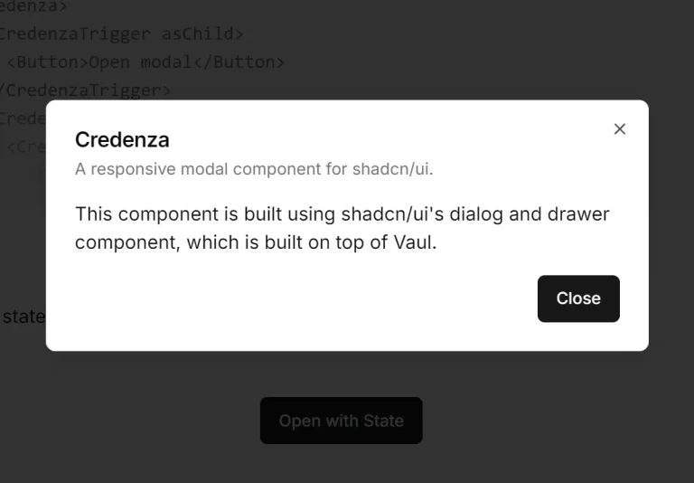
- Credenza – Auto-Adaptive Modal Dialog and Drawer for shadcn/ui.
- Radix UI Dialog Documentation – Official documentation for the underlying dialog primitives used in this component.
- shadcn/ui Component Library – The base component library that this nested dialog extends.
- Tailwind CSS – CSS framework used for styling and animations in the component.
FAQs
Q: Can I nest more than two dialogs?
A: Yes, the component supports multiple levels of nesting. You can create as many nested layers as needed by using InnerDialog components within other InnerDialog components.
Q: How does keyboard navigation work with nested dialogs?
A: The component includes custom escape key handling that closes dialogs in reverse order of opening. The innermost dialog closes first, followed by parent dialogs in sequence.
Q: Is the draggable feature compatible with all positions?
A: The draggable functionality works best with bottom and default positions. When enabled, users can drag the dialog downward to dismiss it.
Q: Can I customize the animations between dialog transitions?
A: Yes, the component uses Tailwind CSS classes for animations. You can modify the animation classes in the component or override them with custom CSS to create different transition effects.
Q: How does shadcn-dialog handle accessibility and focus management?
A: It is built on top of Radix UI’s Dialog primitive, which automatically manages focus trapping, screen reader announcements, and keyboard interactions (e.g., closing with the ‘Escape’ key) according to WAI-ARIA standards.
Q: What is the difference between Dialog and InnerDialog?
A: Dialog is the main component that controls the parent or outermost dialog. InnerDialog is a specialized component designed to be used inside a Dialog to create a nested modal. It uses React Context to communicate with the parent Dialog to create the stacking visual effect.