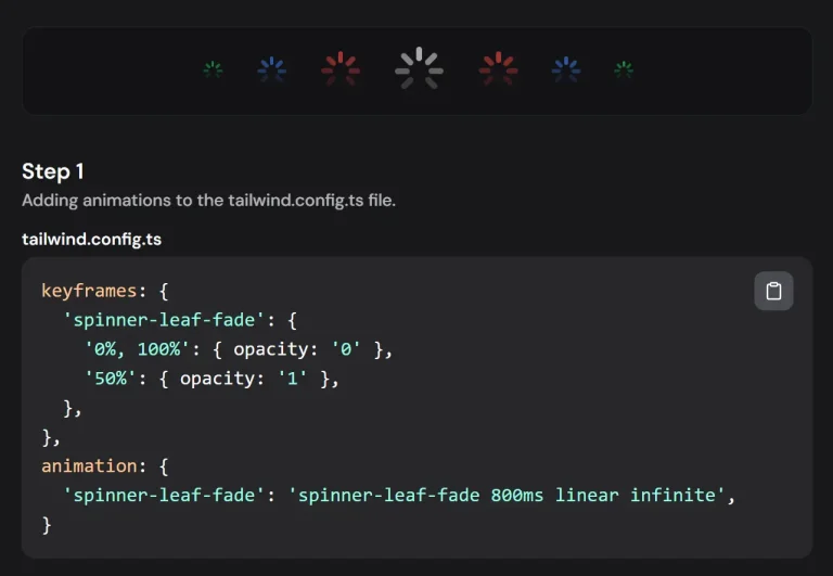
The Future of Web Dev
The Future of Web Dev
Customizable Button Progress Indicators with XState and shadcn/ui – ProgressButton
Add visual progress to buttons in your React app with ProgressButton. Uses XState & integrates with shadcn/ui.
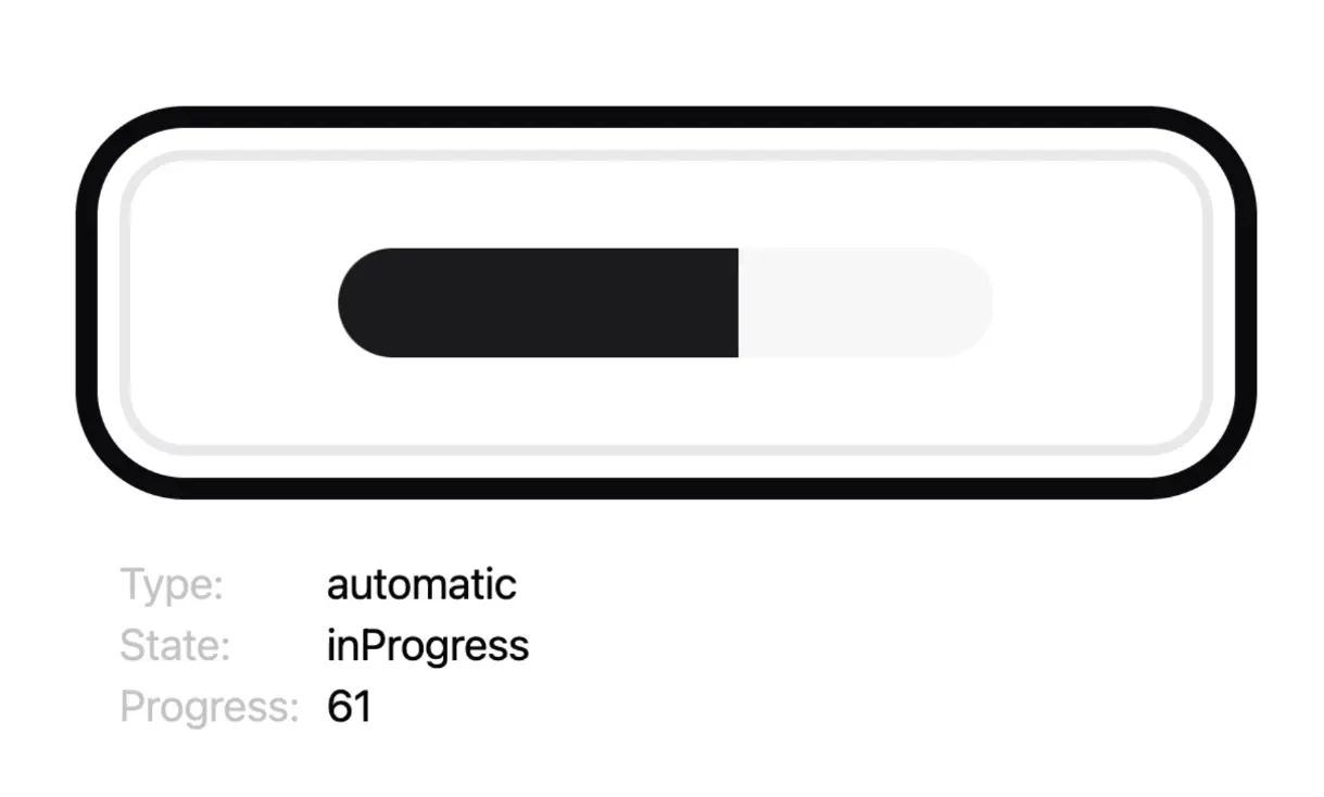
ProgressButton is a UI component for shadcn/ui that visually indicates progress during asynchronous operations like file uploads or form submissions.
It extends the button component from shadcn/ui and integrates XState for state management.
Features
🔄 Manual & Automatic Progress: Control progress updates manually or use the automatic simulation for timed operations.
🎨 Customizable Appearance: Modify the success state color using Tailwind CSS classes.
⚙️ State Management: Leverages XState for predictable and robust state transitions (idle, in-progress, success, error).
👁️ Visual Feedback: Clearly indicates the current state: idle, processing, success, or error.
Use Cases
- File Uploads: Show the percentage of a file upload directly on the upload button.
- Form Submissions: Indicate that a form is processing after submission and show success upon completion.
- Background Tasks: Display progress for longer-running background operations initiated by a button click.
- Data Fetching: Provide feedback when a button triggers a data fetch operation.
- Step-by-Step Processes: Guide users through multi-step actions where each step’s completion can be shown.
Usage
Integrate ProgressButton into your React components like any standard button. Pass props to configure its behavior and appearance.
Here is a basic implementation demonstrating automatic progress:
import React from "react";
import ProgressButton from "./ProgressButton"; // Adjust the import path
function App() {
  const handleAction = () => {
    console.log("Operation started");
    // Your async logic here
  };
  const handleCompletion = () => {
    console.log("Operation completed successfully");
  };
  const handleError = (err) => {
    console.error("Operation failed:", err);
    // Handle error state if needed
  };
  return (
    <div>
      <ProgressButton
        progressType="automatic" // Default is 'automatic'
        totalDuration={3000} // 3 seconds
        numberOfProgressSteps={6}
        successColorClass="emerald-500" // Example Tailwind color
        onClick={handleAction}
        onComplete={handleCompletion}
        onError={handleError}
      >
        Submit Data
      </ProgressButton>
    </div>
  );
}
export default App;
For manual control, set progressType to "manual" and update the progress prop (0-100) based on your application’s state.
import React, { useState, useEffect } from "react";
import ProgressButton from "./ProgressButton"; // Adjust the import path
function ManualProgressExample() {
  const [uploadProgress, setUploadProgress] = useState(0);
  const [isUploading, setIsUploading] = useState(false);
  // Simulate upload progress
  useEffect(() => {
    let interval;
    if (isUploading && uploadProgress < 100) {
      interval = setInterval(() => {
        setUploadProgress(prev => Math.min(prev + 10, 100));
      }, 500);
    } else if (uploadProgress >= 100) {
      setIsUploading(false);
      // onComplete callback would trigger here via the component's state machine
    }
    return () => clearInterval(interval);
  }, [isUploading, uploadProgress]);
  const handleStartUpload = () => {
    setUploadProgress(0);
    setIsUploading(true);
    console.log("Upload started");
    // Trigger actual upload logic here
  };
   const handleCompletion = () => {
    console.log("Upload completed successfully");
    setIsUploading(false); // Reset state if needed
  };

  return (
    <div>
      <ProgressButton
        progressType="manual"
        progress={uploadProgress}
        onClick={handleStartUpload}
        onComplete={handleCompletion}
        successColorClass="blue-500"
      >
        {isUploading ? `Uploading... ${uploadProgress}%` : "Upload File"}
      </ProgressButton>
    </div>
  );
}
export default ManualProgressExample;
Props
The ProgressButton component accepts the following props to control its behavior and appearance:
Base Props
| Prop | Type | Default | Description |
|---|---|---|---|
successColorClass | string | undefined | Tailwind color class for the success state (e.g., green-500). Do not include prefixes like bg-. Requires Tailwind setup. |
onClick | function | undefined | Function called when the button is clicked in its idle state. |
onComplete | function | undefined | Function called when the progress successfully completes and transitions out of the success state. |
onError | function | undefined | Function called if an error occurs (Note: Error state handling might need custom implementation based on the provided info). |
Progress Type and Manual Control
| Prop | Type | Default | Description |
|---|---|---|---|
progressType | string | manual | Set to "manual" to control progress via the progress prop. |
progress | number | 0 | Current progress value (0-100). Used only when progressType is "manual". |
Automatic Progress Control
| Prop | Type | Default | Description |
|---|---|---|---|
progressType | string | automatic | Set to "automatic" for simulated progress. This is the default if not specified. |
totalDuration | number | 5000 | Total time in milliseconds for the automatic progress simulation. |
numberOfProgressSteps | number | 5 | Number of discrete steps the automatic progress simulation is divided into. |
Related Resources
- shadcn/ui: https://ui.shadcn.com/ – The UI component library providing the base button styles used by ProgressButton.
- XState Documentation: https://xstate.js.org/docs/ – Learn more about the state machine library used internally by ProgressButton.
- Tailwind CSS: https://tailwindcss.com/docs/ – Official documentation for the utility-first CSS framework used for styling.
FAQs
Q: How does the automatic progress simulation work?
A: Automatic progress divides the totalDuration into numberOfProgressSteps. The time between steps is slightly randomized to create a more natural feel, but the total time remains consistent.
Q: Can I use custom hex colors for the success state?
A: Currently, successColorClass expects a standard Tailwind color name (e.g., red-500). Using arbitrary hex values like bg-[#ff0000] directly is not supported due to Tailwind’s Just-in-Time compilation requirements. You must use predefined Tailwind classes or safelist them in your configuration.
Q: What happens when manual progress reaches 100%?
A: When the progress prop in manual mode reaches or exceeds 100, the component’s internal state machine transitions to the success state, shows the success indication, and then returns to the idle state after a brief delay.
Q: What’s the difference between automatic and manual progress modes?
A: In automatic mode, the button simulates progress based on the configured duration and steps. In manual mode, you control the progress value directly through the progress prop.
Q: Can I integrate ProgressButton with form libraries?
A: Yes, ProgressButton works well with form libraries. Use the onClick event to trigger form submission and update progress manually or use automatic mode during submission.
Preview