Tablecn is a data table component that extends shadcn/ui with advanced features like server-side sorting, filtering, pagination, and more.
The component integrates TanStack Table with Next.js to handle large datasets without loading all records into memory.
It belongs to Dice UI, a collection of copy-paste accessible UI components built on shadcn/ui.
Features
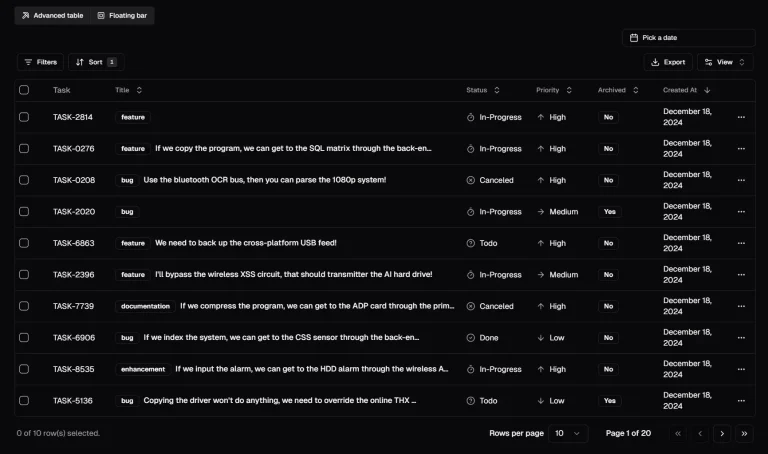
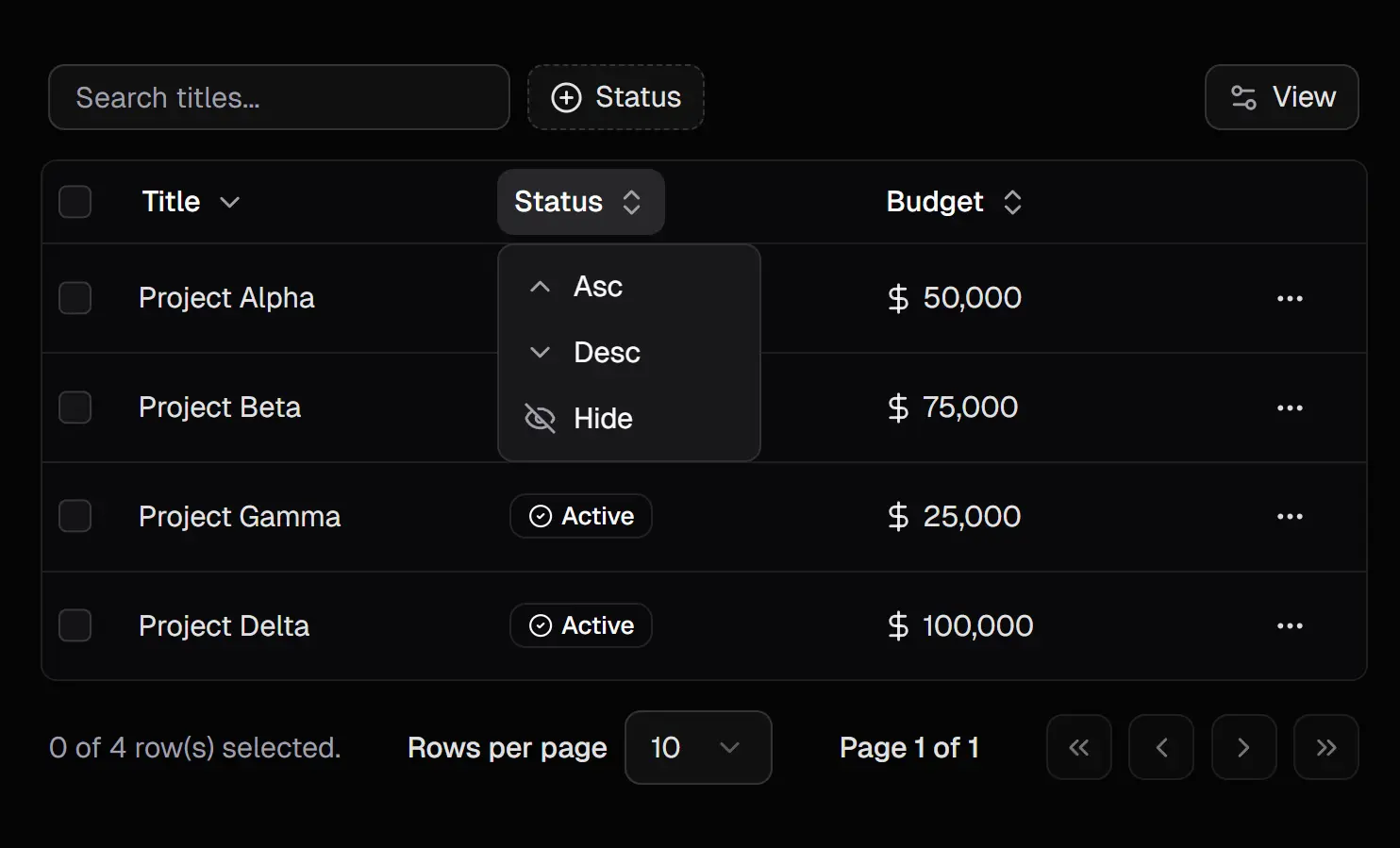
🔄 Server-Side Operations: Pagination, sorting, and filtering execute on the server to handle datasets of any size.
🎯 Automatic Filter Generation: Column definitions produce filter inputs without manual configuration.
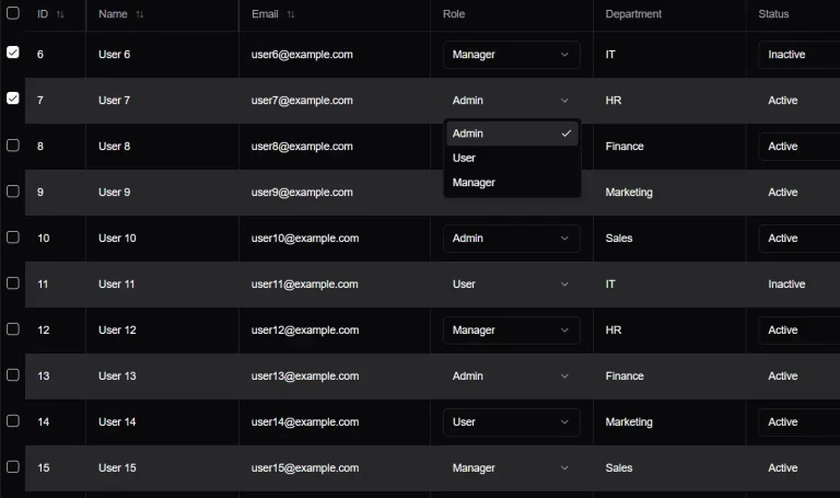
🎨 Customizable Columns: Header and cell components accept custom renderers for specialized display logic.
🔍 Advanced Filter Patterns: Notion-style compound filtering and Linear-style command palette for complex queries.
⚡ Dynamic Toolbar: Search, filters, and actions adapt based on active columns and user selections.
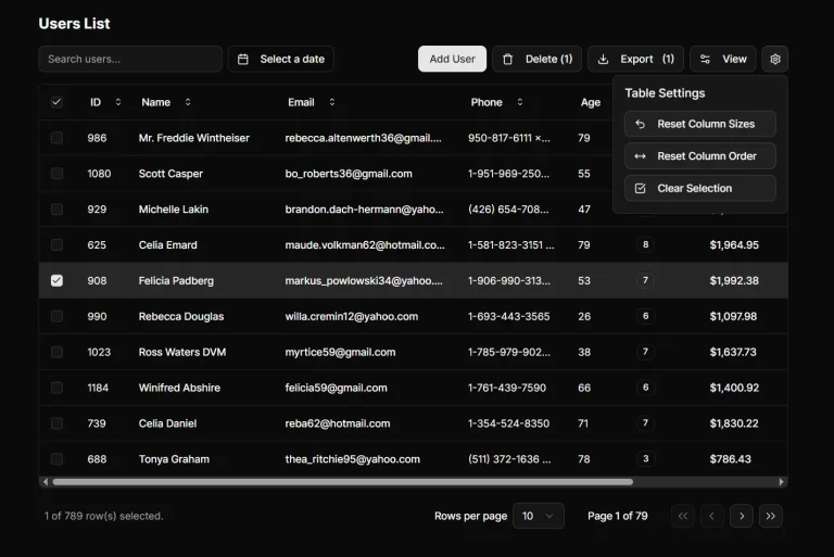
✅ Action Bar on Selection: Batch operations appear when you select multiple rows.
🎛️ Multiple Filter Variants: Text search, numeric ranges, date ranges, select menus, and boolean toggles.
🔗 URL State Persistence: Query parameters store table state for shareable links and browser navigation.
Use Cases
- Admin Dashboards: Display and manage large datasets with server-side performance.
- Customer Relationship Management (CRM) Systems: Filter and sort contact lists, deal pipelines, and interaction logs.
- E-commerce Backends: Manage product inventories, orders, and user data with complex filtering.
- Analytics Platforms: Present aggregated data tables where users need to explore results dynamically.
How to Use It
Installation
1. Install the main component using the shadcn CLI. The command pulls the data table component and its dependencies into your project.
You can choose your preferred package manager like NPM, PNMP, YARN, and BUN.
npx [email protected] add "https://diceui.com/r/data-table"2. Wrap your application with the NuqsAdapter to enable query state management. This adapter synchronizes table state with URL parameters.
import { NuqsAdapter } from "nuqs/adapters/next/app";
export default function RootLayout({ children }) {
  return (
    <NuqsAdapter>
      {children}
    </NuqsAdapter>
  );
}
3. Install optional components for sort lists, filter lists, filter menus, and action bars based on your interface requirements.
npx [email protected] add "https://diceui.com/r/data-table-sort-list"
npx [email protected] add "https://diceui.com/r/data-table-filter-list"
npx [email protected] add "https://diceui.com/r/data-table-filter-menu"
npx [email protected] add "https://diceui.com/r/data-table-action-bar"
Column Configuration
Define columns with metadata that controls filter inputs and sort behavior. Each column needs a unique identifier and an accessor key to retrieve row data.
import { Text } from "lucide-react";
import { DataTableColumnHeader } from "@/components/data-table/data-table-column-header";
const columns = [
  {
    id: "title",
    accessorKey: "title",
    header: ({ column }) => (
      <DataTableColumnHeader column={column} title="Title" />
    ),
    cell: ({ row }) => <div>{row.getValue("title")}</div>,
    meta: {
      label: "Title",
      placeholder: "Search titles...",
      variant: "text",
      icon: Text,
    },
    enableColumnFilter: true,
  },
  {
    id: "status",
    accessorKey: "status",
    header: ({ column }) => (
      <DataTableColumnHeader column={column} title="Status" />
    ),
    meta: {
      label: "Status",
      variant: "select",
      options: [
        { label: "Active", value: "active" },
        { label: "Inactive", value: "inactive" },
      ],
    },
    enableColumnFilter: true,
  },
];
The meta object controls how filters render. Text variants generate search inputs, select variants create dropdown menus, and range variants produce minimum and maximum inputs.
Table Initialization
Initialize table state using the useDataTable hook. Pass your data, columns, and page count to configure server-side pagination.
import { useDataTable } from "@/hooks/use-data-table";
function DataTableDemo({ data, pageCount }) {
  const { table } = useDataTable({
    data,
    columns,
    pageCount,
    initialState: {
      sorting: [{ id: "createdAt", desc: true }],
      pagination: { pageSize: 10 },
    },
    getRowId: (row) => row.id,
  });
  return (
    <DataTable table={table}>
      <DataTableToolbar table={table}>
        <DataTableSortList table={table} />
      </DataTableToolbar>
    </DataTable>
  );
}
The table instance contains all state and methods for sorting, filtering, and pagination. The getRowId function identifies unique rows for selection tracking.
Standard Toolbar Layout
Compose the table with a standard toolbar for basic filtering and sorting. This layout includes search inputs and column visibility controls.
import { DataTable } from "@/components/data-table/data-table";
import { DataTableToolbar } from "@/components/data-table/data-table-toolbar";
import { DataTableSortList } from "@/components/data-table/data-table-sort-list";
<DataTable table={table}>
  <DataTableToolbar table={table}>
    <DataTableSortList table={table} />
  </DataTableToolbar>
</DataTable>
Advanced Filtering Interface
Use the advanced toolbar for compound filters and complex queries. This interface mimics Notion and Airtable filtering patterns.
import { DataTableAdvancedToolbar } from "@/components/data-table/data-table-advanced-toolbar";
import { DataTableFilterList } from "@/components/data-table/data-table-filter-list";
<DataTable table={table}>
  <DataTableAdvancedToolbar table={table}>
    <DataTableFilterList table={table} />
    <DataTableSortList table={table} />
  </DataTableAdvancedToolbar>
</DataTable>
Command Palette Filter Menu
Replace the filter list with a command palette menu for keyboard-driven filtering. This interface follows Linear’s filter design.
import { DataTableFilterMenu } from "@/components/data-table/data-table-filter-menu";
<DataTable table={table}>
  <DataTableAdvancedToolbar table={table}>
    <DataTableFilterMenu table={table} />
    <DataTableSortList table={table} />
  </DataTableAdvancedToolbar>
</DataTable>
Action Bar for Bulk Operations
Render an action bar when users select table rows. Place custom action components inside the action bar to handle batch operations.
import { DataTableActionBar } from "@/components/data-table/data-table-action-bar";
function DeleteButton({ table }) {
  const selectedRows = table.getSelectedRowModel().rows;
  return (
    <button onClick={() => deleteRows(selectedRows)}>
      Delete {selectedRows.length} items
    </button>
  );
}
<DataTable
  table={table}
  actionBar={
    <DataTableActionBar table={table}>
      <DeleteButton table={table} />
    </DataTableActionBar>
  }
>
  <DataTableToolbar table={table} />
</DataTable>
Server-Side Data Fetching
Fetch data on the server using table state from URL parameters. This example shows a Next.js Server Component pattern.
import { searchParamsCache } from "@/lib/nuqs";
export default async function ProjectsPage({ searchParams }) {
  const { page, pageSize, sort, filters } = searchParamsCache.parse(searchParams);
  const { data, pageCount } = await fetchProjects({
    page,
    pageSize,
    sort,
    filters,
  });
  return <DataTableDemo data={data} pageCount={pageCount} />;
}
The searchParamsCache parses URL query strings into typed parameters. Your API endpoint receives these parameters and returns paginated results.
API Reference
Column Definition Properties
id: Unique identifier for the column, used as the query key for filters
accessorKey: Property name to read from row data
accessorFn: Custom function to access nested or computed values
header: React component that receives column props for custom headers
cell: React component that receives row props for custom cell rendering
meta: Metadata object for filter generation and display options
enableColumnFilter: Boolean to enable filtering for this column (defaults to false)
enableSorting: Boolean to enable sorting for this column
enableHiding: Boolean to allow column visibility toggling
Column Meta Options
label: Display name shown in filter menus and column headers
placeholder: Placeholder text for filter input fields
variant: Filter type (text, number, range, date, dateRange, boolean, select, multiSelect)
options: Array of options for select and multiSelect variants, each with label, value, and optional count and icon
range: Tuple of minimum and maximum values for range filters
unit: Unit label for numeric filters (hr, $, etc.)
icon: React component used as the column icon in filter menus
useDataTable Hook
data: Array of row objects to display in the table
columns: Column definitions array
pageCount: Total number of pages for server-side pagination
initialState: Initial table state including sorting, pagination, and column visibility
getRowId: Function that returns unique identifier for each row
enableRowSelection: Boolean or function to control row selection
enableMultiRowSelection: Boolean to allow multiple row selection
onRowSelectionChange: Callback function when row selection changes
defaultColumnFilters: Default filters applied to columns
defaultColumnSorting: Default sorting applied to columns
DataTable Component
table: Table instance from useDataTable hook
actionBar: Optional action bar component for selected rows
children: Toolbar and other components to render above the table
className: CSS classes for the table container
DataTableToolbar Component
table: Table instance from useDataTable hook
children: Additional toolbar components like sort lists
className: CSS classes for the toolbar container
DataTableAdvancedToolbar Component
table: Table instance from useDataTable hook
children: Filter and sort components
className: CSS classes for the toolbar container
DataTableColumnHeader Component
column: Column instance from table
title: Display title for the column header
className: CSS classes for the header
DataTableSortList Component
table: Table instance from useDataTable hook
className: CSS classes for the sort list container
DataTableFilterList Component
table: Table instance from useDataTable hook
className: CSS classes for the filter list container
DataTableFilterMenu Component
table: Table instance from useDataTable hook
className: CSS classes for the filter menu container
DataTableActionBar Component
table: Table instance from useDataTable hook
children: Custom action buttons and controls
className: CSS classes for the action bar container
DataTablePagination Component
table: Table instance from useDataTable hook
className: CSS classes for the pagination controls
DataTableViewOptions Component
table: Table instance from useDataTable hook
className: CSS classes for the view options dropdown
Accessibility
Keyboard Shortcuts
Ctrl + Shift + F or Cmd + Shift + F: Opens the filter menu
Ctrl + Shift + S or Cmd + Shift + S: Opens the sort menu
Backspace or Delete: Removes the focused filter or sort item, or removes the last applied filter when the menu trigger has focus
Related Resources
- TanStack Table: Headless UI library that powers the table logic and state management in Tablecn.
- shadcn/ui: Component library that provides the base UI components and design system.
- Nuqs: Type-safe URL query state management library that syncs table state with browser URLs.
- Drizzle ORM: TypeScript ORM used in the reference implementation for database queries.
FAQs
Q: Can I use this component with databases other than PlanetScale?
A: Yes. The component works with any database that your ORM supports. The reference implementation uses Drizzle ORM with PlanetScale, but you can substitute any query layer that returns paginated data and total page counts.
Q: How do I add custom filter operators beyond the default variants?
A: Extend the column meta object with a custom variant name, then create a corresponding filter component that reads this variant. Register your custom filter component in the DataTableFilterList or DataTableFilterMenu to render it when that variant appears.
Q: Can I persist filter and sort state beyond URL parameters?
A: URL parameters handle most persistence needs, but you can store additional state in localStorage or a database. Read initial state from your storage layer in the useDataTable initialState prop, then update storage when table state changes.
Q: How do I implement server-side search across multiple columns?
A: Parse the search parameter from URL query strings in your server component, then construct a database query with OR conditions across the columns you want to search. Return results that match any of the search terms.
Q: Why do I need the Nuqs adapter?
A: The table stores its state (filters, sorting, pagination) in the URL query parameters. The Nuqs adapter synchronizes the URL with the React state to ensure shareable links and browser history support.