The Future of Web Dev
The Future of Web Dev
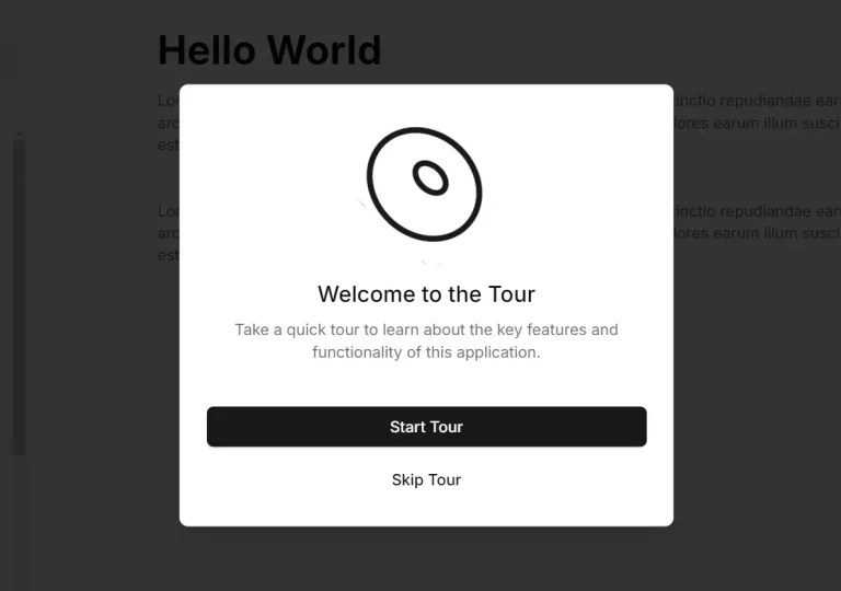
Build User Walkthroughs with Tour Component for Shadcn/UI
A tour component that extends shadcn/ui with onboarding walkthroughs. Highlight elements and guide users through your applications with custom styling.
Tour is a lightweight UI component that manages onboarding flows and guided walkthroughs within applications built on shadcn/ui.
It allows you to build customizable, interactive, step-by-step guides by targeting specific DOM elements through data attributes and displaying contextual information in popover cards.
Features
🎯 Element Targeting: Attach tours to specific DOM elements using data attributes that the system automatically locates and highlights.
🧭 Multi-Tour Support: Define separate tour flows for different features and trigger them independently through unique identifiers.
📍 Popover Positioning: Control card placement with side, alignment, and offset parameters inherited from Radix UI primitives.
🔄 Route Navigation: Link tour steps to specific routes so the component handles page transitions during the walkthrough.
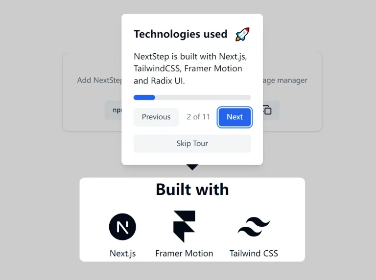
⚙️ Custom Styling: Override default appearances per step or globally through className properties and CSS modifications.
🎛️ Context API Control: Start and close tours programmatically from any component using the provided React hook.
See It In Action
Use Cases
- Application Onboarding: Walk new users through your dashboard layout and primary actions when they first log in.
- Feature Announcements: Highlight newly released functionality with a dedicated tour that appears after deployment.
- Settings Walkthroughs: Guide users through configuration panels when they access complex settings for the first time.
- Multi-Page Workflows: Connect tour steps across different routes to demonstrate processes that span multiple screens.
- Interactive Documentation: Create contextual help systems that highlight parts of a complex dashboard.
- Tutorial Creation: Build sequential, in-app tutorials for specific user tasks or configurations.
How to Use It
1. Install the component into your existing shadcn/ui project using the CLI.
# pnpm
pnpm dlx shadcn@latest add https://onboarding-tour.vercel.app/r/tour.json
# npm
npx shadcn@latest add https://onboarding-tour.vercel.app/r/tour.json
# yarn
yarn shadcn@latest add https://onboarding-tour.vercel.app/r/tour.json
# bun
bunx --bun shadcn@latest add https://onboarding-tour.vercel.app/r/tour.json
2. Wrap your application root with TourProvider and pass an array of tour definitions. Each tour contains an id and a steps array.
import { type Tour, TourProvider } from "@/components/ui/tour"
const tours = [
{
id: "onboarding",
steps: [
{
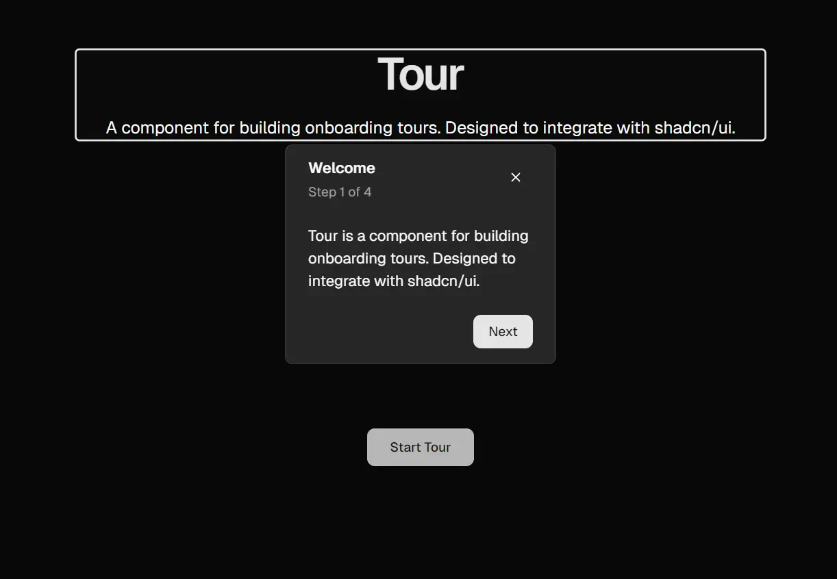
id: "welcome",
title: "Welcome",
content: "This tour shows you the main features.",
},
{
id: "dashboard",
title: "Dashboard",
content: "View your analytics here.",
},
],
},
] satisfies Tour[]
export default function RootLayout({ children }: { children: React.ReactNode }) {
return (
<html>
<body>
<TourProvider tours={tours}>
{children}
</TourProvider>
</body>
</html>
)
}3. Add data attributes to the elements you want to highlight. The tour matches step ids to these attributes and displays the popover near the target.
export function DashboardPage() {
  return (
    <div>
      <div data-tour-step-id="welcome">
        <h1>Welcome to the App</h1>
      </div>
      <div data-tour-step-id="dashboard">
        <p>Your analytics dashboard</p>
      </div>
    </div>
  )
}
4. Trigger tours from any component using the useTour hook. Call the start method with the tour id.
"use client"
import { Button } from "@/components/ui/button"
import { useTour } from "@/components/ui/tour"
export function StartButton() {
  const tour = useTour()
  return (
    <Button onClick={() => tour.start("onboarding")}>
      Start Tour
    </Button>
  )
}
5. Customize step appearance with positioning props. These control where the popover renders relative to the target element.
const customTour = [
  {
    id: "features",
    steps: [
      {
        id: "sidebar",
        title: "Navigation",
        content: "Access different sections here.",
        side: "right",
        sideOffset: 20,
        align: "start",
        className: "w-80",
      },
    ],
  },
] satisfies Tour[]
6. Link steps to routes when your tour spans multiple pages. The component handles navigation automatically when users click next or previous.
{
  id: "settings-tour",
  steps: [
    {
      id: "profile",
      title: "Profile Settings",
      content: "Update your information.",
      nextRoute: "/settings/security",
    },
    {
      id: "security",
      title: "Security Options",
      content: "Manage authentication.",
      previousRoute: "/settings/profile",
    },
  ],
}
7. Override button labels for specific steps when the default text does not fit your context.
{
  id: "complete",
  title: "Finished",
  content: "You completed the tour.",
  nextLabel: "Get Started",
  previousLabel: "Review",
}
API Reference
TourProvider Props
| Prop | Type | Description |
|---|---|---|
| tours | Tour[] | Array of tour configurations that define all available tours in the application. |
| children | React.ReactNode | Application content that receives tour context. |
Tour Configuration
| Property | Type | Description |
|---|---|---|
| id | string | Unique identifier used to start the tour programmatically. |
| steps | Step[] | Ordered array of step objects that define the tour sequence. |
Step Configuration
| Property | Type | Description |
|---|---|---|
| id | string | Unique identifier that matches the data-tour-step-id attribute on target elements. |
| title | React.ReactNode | Heading displayed at the top of the tour card. |
| content | React.ReactNode | Main text or components shown in the card body. |
| side | “top” | “bottom” | “left” | “right” | Preferred placement of the popover relative to the target element. |
| sideOffset | number | Distance in pixels between the popover and the target element. |
| align | “start” | “center” | “end” | Alignment of the popover along the chosen side. |
| alignOffset | number | Pixel offset from the start or end alignment position. |
| className | string | CSS classes applied to the popover container for custom styling. |
| nextRoute | string | Route path to navigate to when the next button is clicked. |
| previousRoute | string | Route path to navigate to when the previous button is clicked. |
| nextLabel | React.ReactNode | Custom content for the next button. Defaults to “Next” or “Finish” on the last step. |
| previousLabel | React.ReactNode | Custom content for the previous button. Defaults to “Previous”. |
useTour Hook
| Method | Type | Description |
|---|---|---|
| start | (tourId: string) => void | Initiates the tour matching the provided id. |
| close | () => void | Terminates the currently active tour. |
Related Resources
- Radix UI Popover: Primitive component that handles popover positioning and accessibility logic.
- shadcn/ui: Component collection that Tour extends for consistent design patterns.
- Intro.js: Alternative onboarding library with different API patterns and vanilla JavaScript support.
- React Joyride: Tour component with beacon animations and standalone React implementation.
- Best Guide JS Plugins: 10 Best Tour Plugins To Guide Visitors Through Your App.
FAQs
Q: Can I target the same element in multiple tour steps?
A: Yes. Pass an array of step ids to the data-tour-step-id attribute. The element will appear in each specified step.
Q: How do I customize the tour appearance globally instead of per step?
A: Modify the tour.tsx component file directly. Apply default styling changes to the popover wrapper or card components.
Q: Does the tour work with client-side routing libraries?
A: Yes. The nextRoute and previousRoute properties integrate with Next.js routing. The component triggers navigation when users advance through steps.
Q: Can I close a tour programmatically without user interaction?
A: Yes. Call the close method from the useTour hook. This terminates the active tour from any component.
Q: What happens if a target element does not exist on the page?
A: The tour skips that step automatically. Make sure elements with matching data attributes render before starting the tour.