The Future of Web Dev
The Future of Web Dev
Feature-rich Tag Input Component for shadcn/ui – Emblor
Simplify complex form inputs with Emblor's customizable tag component. Built on shadcn/ui with autocomplete, validation, and keyboard navigation.
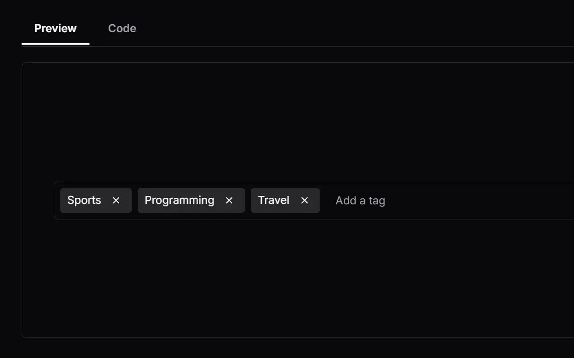
Emblor is a highly customizable, accessible, and fully-featured tag input component built with Shadcn/ui components.
From basic features like adding and removing tags to more advanced functionalities like validation, autocomplete, and drag-and-drop reordering, Emblor has you covered.
Features
Autocomplete: 🚀 Provides suggestions as you type.
Limit: 🔢 Control the maximum and minimum number of tags.
Character Limit: 📏 Set the maximum length for each tag.
Truncation: ✂️ Shortens long tags to a defined length.
Custom Delimiters: ⌨️ Specify characters to separate tags.
Accessibility: ♿ Ensure that all users can access and use the tag input.
Read-only Mode: 🔒 Disable editing of the tag input.
Add on Paste:➕ Automatically create tags when pasting text.
Validation: ✅ Checks tags against custom rules you set.
Duplicate Control: 👯 Prevent or allow duplicate tags.
Sorting: 🔀 Arrange tags alphabetically.
Popovers: 💬 Display tags in popovers for a cleaner interface.
Customization: 🎨 Modify the appearance and behavior by using a custom tag renderer.
Drag and Drop: 🖱️ Reorder tags by dragging them.
Keyboard Navigation: ⌨️ Navigate and interact with tags using keyboard shortcuts.
Use Cases
- Blog Post Tagging: When creating a content management system, Emblor allows authors to add relevant tags to their blog posts. You can set validation rules to ensure consistent tag formatting and limit the number of tags per post.
- E-commerce Product Categorization: In an online store, Emblor can categorize products. Use the autocomplete feature to suggest existing categories and prevent the creation of redundant tags.
- Image Galleries: Use Emblor to improve user experience for websites which use image galleries. Let the user add tags for his photos. With drag-and-drop reordering, you can even rearrange the tags and keep your gallery nice and tidy.
- Recipe Websites: Enable users to tag recipes with dietary restrictions, cuisines, or ingredients. Tag validation can enforce specific tag formats (e.g., “vegetarian,” “gluten-free”).
- Internal Document Management: Organize internal documents by using Emblor to add tags. The read-only mode can prevent accidental modification of tags by unauthorized users.
How to use it:
1. Get started with Emblor by installing it via npm or pnpm:
# NPM
$ npm install emblor

# PNPM
$ pnpm install emblor
2. Import the component and set up the necessary state:
const [tags, setTags] = React.useState<Tag[]>([]);
const [activeTagIndex, setActiveTagIndex] = React.useState<number | null>(null);
3. Add the tags input component to your app.
<TagInput
  {...field}
  placeholder="Enter a topic"
  tags={tags}
  setTags={(newTags) => {
    setTags(newTags);
    setValue('topics', newTags as [Tag, ...Tag[]]);
  }}
  activeTagIndex={activeTagIndex}
  setActiveTagIndex={setActiveTagIndex}
/>;
4. Available props, methods, and events to customize & manage the tags input.
type TagInputProps = {

  // Placeholder text for the input.
  placeholder?: string; // default: ""

  // Array of tags displayed as pre-selected.
  tags: Array<{ id: string; text: string }>; // default: []

  // Function to set the state of tags.
  setTags: React.Dispatch<React.SetStateAction<{ id: string; text: string }[]>>;

  // Enable or disable the autocomplete feature.
  enableAutocomplete?: boolean; // default: false

  // List of autocomplete options.
  autocompleteOptions?: Array<{ id: string; text: string }>; // default: []

  // Maximum number of tags allowed.
  maxTags?: number; // default: null

  // Minimum number of tags required.
  minTags?: number; // default: null

  // Make the input read-only.
  readOnly?: boolean; // default: false

  // Disable the input.
  disabled?: boolean; // default: false

  // Callback function when a tag is added.
  onTagAdd?: (tag: string) => void; // default: null

  // Callback function when a tag is removed.
  onTagRemove?: (tag: string) => void; // default: null

  // Allow duplicate tags.
  allowDuplicates?: boolean; // default: false

  // Maximum length of a tag.
  maxLength?: number; // default: null

  // Minimum length of a tag.
  minLength?: number; // default: null

  // Function to validate a tag.
  validateTag?: (tag: string) => boolean; // default: null

  // Character used to separate tags.
  delimiter?: Delimiter; // default: null

  // Show the count of tags.
  showCount?: boolean; // default: false

  // Placeholder text when tag limit is reached.
  placeholderWhenFull?: string; // default: ""

  styleClasses?: {
    // Class name styles for the tag input container (use when inlineTags is set to true).
    inlineTagsContainer?: string;

    // Class name styles for the tag popover sub components
    tagPopover?: {
      popoverTrigger?: string;
      popoverContent?: string;
    };

    // Class name styles for the tag list sub components (the tag list renders the tags as a list)
    tagList?: {
      container?: string;
      sortableList?: string;
    };

    // Class name styles for the autocomplete component sub components
    autoComplete?: {
      command?: string;
      popoverTrigger?: string;
      popoverContent?: string;
      commandList?: string;
      commandGroup?: string;
      commandItem?: string;
    };

    // Class name styles for the tag
    tag?: {
      body?: string;
      closeButton?: string;
    };

    // Class name styles for the main input field
    input?: string;
  }; // default: {}

  // Sort tags alphabetically.
  sortTags?: boolean; // default: false

  // List of characters that can be used as delimiters.
  delimiterList?: string[]; // default: []

  // Truncate tag text to a certain length.
  truncate?: number; // default: null

  // Function to filter autocomplete options.
  autocompleteFilter?: (option: string) => boolean; // default: null

  // Layout direction of the tag inputs.
  direction?: 'row' | 'column'; // default: 'row'

  // A callback function that is called whenever the input value changes.
  onInputChange?: (value: string) => void; // default: null

  // A callback function that is used to render custom tag elements.
  customTagRenderer?: (tag: { id: string; text: string }) => React.ReactElement; // default: null

  // Function to be called when the input field gains focus.
  onFocus?: React.FocusEventHandler<HTMLInputElement>; // default: null

  // Function to be called when the input field loses focus.
  onBlur?: React.FocusEventHandler<HTMLInputElement>; // default: null

  // Only allow tags that are present in the autocomplete options.
  restrictTagsToAutocompleteOptions?: boolean; // default: false

  // A callback function to be called when a tag is clicked.
  onTagClick?: (tag: { id: string; text: string }) => void; // default: null

  // Enable drag and drop functionality.
  draggable?: boolean; // default: false

  // Position of the input field in relation to the tags.
  inputFieldPosition?: 'bottom' | 'top' | 'inline'; // default: 'bottom'

  // Show a button to clear all tags.
  clearAll?: boolean; // default: false

  // A callback function to be called when the clear all button is clicked.
  onClearAll?: () => void; // default: null

  // Additional props to be passed to the input field.
  inputProps?: React.InputHTMLAttributes<HTMLInputElement>; // default: {}

  // Use a popover to display tags instead of inline.
  usePopoverForTags?: boolean; // default: false

  // A callback function that generates an id for a newly created tag.
  generateTagId?: () => string; // default: crypto.getRandomValues(new Uint32Array(1))[0].toString
};
FAQs
Q: Can I use Emblor with other UI libraries besides Shadcn/ui?
A: Emblor is specifically designed for Shadcn/ui. Using it with other UI libraries directly isn’t supported.
Q: How do I limit the number of characters in a tag?
A: You can use the maxLength prop to specify the maximum number of characters allowed for each tag.
Q: How to prevent duplicate tags?
A: Set the allowDuplicates prop to false. This ensures that users cannot enter the same tag multiple times.
Q: Can I customize the appearance of the tags?
A: Yes, Emblor’s flexible styleClasses object enables users to modify various style elements, including the tags, autocomplete component, input field, and more. There is also the customTagRenderer prop, which takes a function for rendering custom elements.
Q: Can Emblor be used with form validation libraries?
A: Yes, Emblor can be integrated with form validation libraries like React Hook Form or Formik. You can pass the form field props to the TagInput component and connect it to your form state.
Q: Does Emblor support server-side rendering?
A: Yes, Emblor is compatible with server-side rendering frameworks like Next.js.
Q: Can Emblor handle large datasets for autocomplete?
A: Yes, Emblor’s autocomplete functionality includes filtering capabilities that can handle large datasets efficiently. You can also implement your own filtering logic using the autocompleteFilter prop.
Preview


