The Future of Web Dev
The Future of Web Dev
Build Accessible Tag Inputs in React with Tagmento
Create powerful tag inputs in React with Tagmento. Features autocomplete, validation, drag-and-drop, and full Shadcn UI integration.
Tagmento is a highly customizable, accessible, and fully featured tag input component built on top of Shadcn UI.
It simplifies tag management in forms by offering autocomplete suggestions, tag validation, keyboard navigation, and drag and drop support.
Features
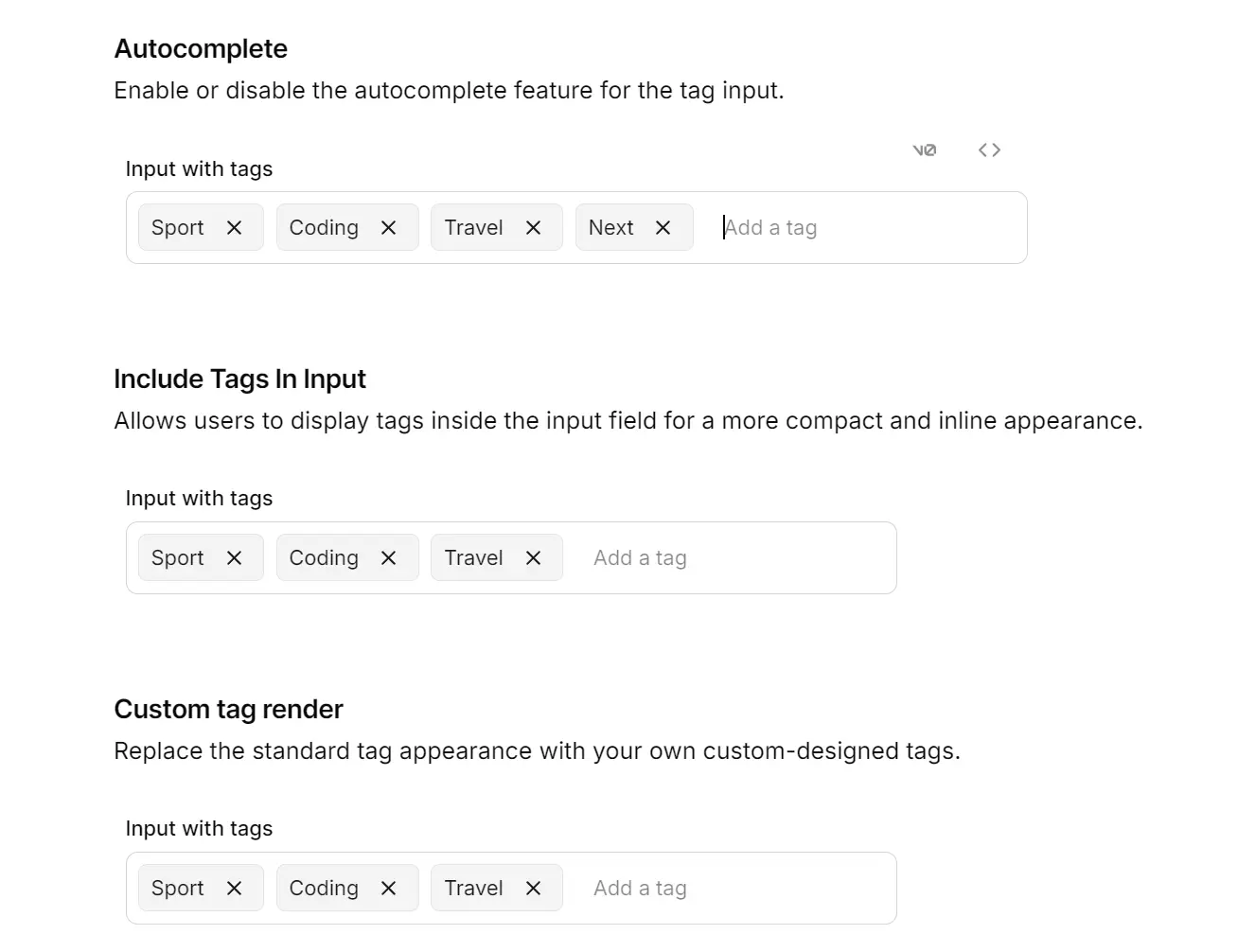
⚙️ Autocomplete: Suggests tags as you type.
⏳ Tag Limits: Sets minimum and maximum tags.
📏 Customization: Supports custom tag rendering.
🔔 Additional Options: Features like truncation, delimiters, add on paste, and read-only mode.
✍️ Validation: Enforces custom rules for tag entries.
🔌 Duplication Control: Allows or disallows duplicate tags.
🎨 Keyboard Navigation: Efficient tag entry and removal.
🔄 Drag and Drop: Easily reorder tags.
Use Cases
- Content Management Systems (CMS): Allowing editors to easily tag articles, blog posts, or media assets.
- E-commerce Product Catalogs: Managing product tags for filtering and search.
- Social Media Platforms: Enabling users to add tags to posts, images, or videos.
- Project Management Tools: Assigning tags to tasks or issues for better organization and filtering.
How to Use Tagmento
1. Install Tagmento:
npm install tagmento2. Import the TagInput component and initialize state in your React component. For example:
   'use client';
   import React from 'react';
   import { TagInput } from 'tagmento';
   import { useForm } from 'react-hook-form';
   import { z } from 'zod';
   import { zodResolver } from '@hookform/resolvers/zod';
   import { toast } from '@/components/ui/use-toast';
   import Link from 'next/link';
   import { Button } from '@/components/ui/button';
   const FormSchema = z.object({
     topics: z.array(
       z.object({
         id: z.string(),
         text: z.string(),
       })
     ),
   });
   export default function Hero() {
     const form = useForm<z.infer<typeof FormSchema>>({
       resolver: zodResolver(FormSchema),
     });
     const [tags, setTags] = React.useState([]);
     const { setValue } = form;
     function onSubmit(data) {
       toast({
         title: 'Submitted Data:',
         description: (
           <pre className="mt-2 w-[340px] rounded-md bg-slate-950 p-4">
             <code className="text-white">{JSON.stringify(data, null, 2)}</code>
           </pre>
         ),
       });
     }
     return (
       <section className="z-10 max-w-5xl w-full flex flex-col items-center text-center gap-5">
         <div className="w-full flex flex-col items-center gap-5">
           <h1 className="text-4xl font-bold">Shadcn Tag Input</h1>
           <p className="max-w-[450px] text-muted-foreground">
             Tagmento provides a powerful tag input built on Shadcn UI’s accessible components.
           </p>
           <div className="flex gap-2">
             <Link href="#try" className="min-w-[150px] shadow-sm">Try it out</Link>
             <Link href="https://github.com/YOUR_USERNAME/tagmento" className="shadow-sm">Github</Link>
           </div>
         </div>
         <div id="try" className="w-full py-8">
           <div className="preview flex min-h-[350px] w-full justify-center items-center p-10 mt-2 rounded-md border">
             <form onSubmit={form.handleSubmit(onSubmit)} className="space-y-8 flex flex-col items-start">
               <div className="flex flex-col items-start">
                 <label className="text-left">Topics</label>
                 <TagInput
                   placeholder="Enter a topic"
                   tags={tags}
                   setTags={(newTags) => {
                     setTags(newTags);
                     setValue('topics', newTags);
                   }}
                 />
                 <p className="text-muted-foreground">Topics you are interested in.</p>
               </div>
               <Button type="submit">Submit</Button>
             </form>
           </div>
         </div>
       </section>
     );
   }
3. Available props.
| Prop | Type | Description | Default Value |
|---|---|---|---|
placeholder | string | Placeholder text for the input field. | "" |
tags | Array<{ id: string; text: string }> | Initial tags to display. | [] |
setTags | React.Dispatch<React.SetStateAction<Tag[]>> | Function to update the tag state. | |
enableAutocomplete | boolean | Enable/disable autocomplete. | false |
autocompleteOptions | Array<{ id: string; text: string }> | Options for autocomplete. | [] |
maxTags | number | Maximum number of tags allowed. | null |
minTags | number | Minimum number of tags required. | null |
readOnly | boolean | Make the input read-only. | false |
disabled | boolean | Disable the input. | false |
onTagAdd | (tag: string) => void | Callback on tag addition. | null |
onTagRemove | (tag: string) => void | Callback on tag removal. | null |
allowDuplicates | boolean | Allow duplicate tags. | false |
maxLength | number | Maximum tag length. | null |
minLength | number | Minimum tag length. | null |
validateTag | (tag: string) => boolean | Custom tag validation function. | null |
delimiter | Delimiter | Character to separate tags (Comma or Enter). | null |
showCount | boolean | Show the tag count. | false |
placeholderWhenFull | string | Placeholder when maxTags is reached. | "" |
styleClasses | { inlineTagsContainer?: string; ... } | CSS class names for styling various parts of the component. | {} |
sortTags | boolean | Sort tags alphabetically. | false |
delimiterList | string[] | List of characters for delimiters. | [] |
truncate | number | Truncate tag text to this length. | null |
autocompleteFilter | (option: string) => boolean | Filter autocomplete options. | null |
direction | 'row' | 'column' | Layout direction. | 'row' |
onInputChange | (value: string) => void | Callback on input value change. | null |
customTagRenderer | (tag: { id: string; text: string }) => React.ReactElement | Render custom tag elements. | null |
onFocus | React.FocusEventHandler<HTMLInputElement> | Callback on input focus. | null |
onBlur | React.FocusEventHandler<HTMLInputElement> | Callback on input blur. | null |
restrictTagsToAutocompleteOptions | boolean | Only allow tags from autocompleteOptions. | false |
onTagClick | (tag: { id: string; text: string }) => void | Callback on tag click. | null |
draggable | boolean | Enable drag-and-drop. | false |
inputFieldPosition | 'bottom' | 'top' | 'inline' | Position of the input field. | 'bottom' |
clearAll | boolean | Show a “Clear All” button. | false |
onClearAll | () => void | Callback on “Clear All” click. | null |
inputProps | React.InputHTMLAttributes<HTMLInputElement> | Additional props for the input field. | {} |
usePopoverForTags | boolean | Use a popover to display tags. | false |
generateTagId | () => string | Function for generating unique tag IDs, defaulting to a cryptographically secure random number. | crypto.getRandomValues... |
Alternatives & Related Resources
- Feature-rich Tag Input Component for shadcn/ui – Emblor
- 10 Best Tags Input Plugins In jQuery & Vanilla JavaScript
FAQs
Q: How do I handle server-side validation of tags?
A: Tagmento’s validateTag prop handles client-side validation. For server-side validation, you’d typically handle that in your form submission logic. You could use the onTagAdd callback to trigger an API call to your server, validate the tag, and then either add it to the tags state or display an error message.
Q: What about accessibility?
A: Tagmento benefits greatly from Shadcn UI’s built-in accessibility features. The underlying components are designed with ARIA attributes and keyboard navigation in mind.
Q: How can I customize the appearance of the tags?
A: You have a few ways to customize. You can use the styleClasses prop to override the Tailwind classes on the input field, tag container, and other elements. You can override the styles by passing in Tailwind utility classes as a string to override the default styles.
Preview


