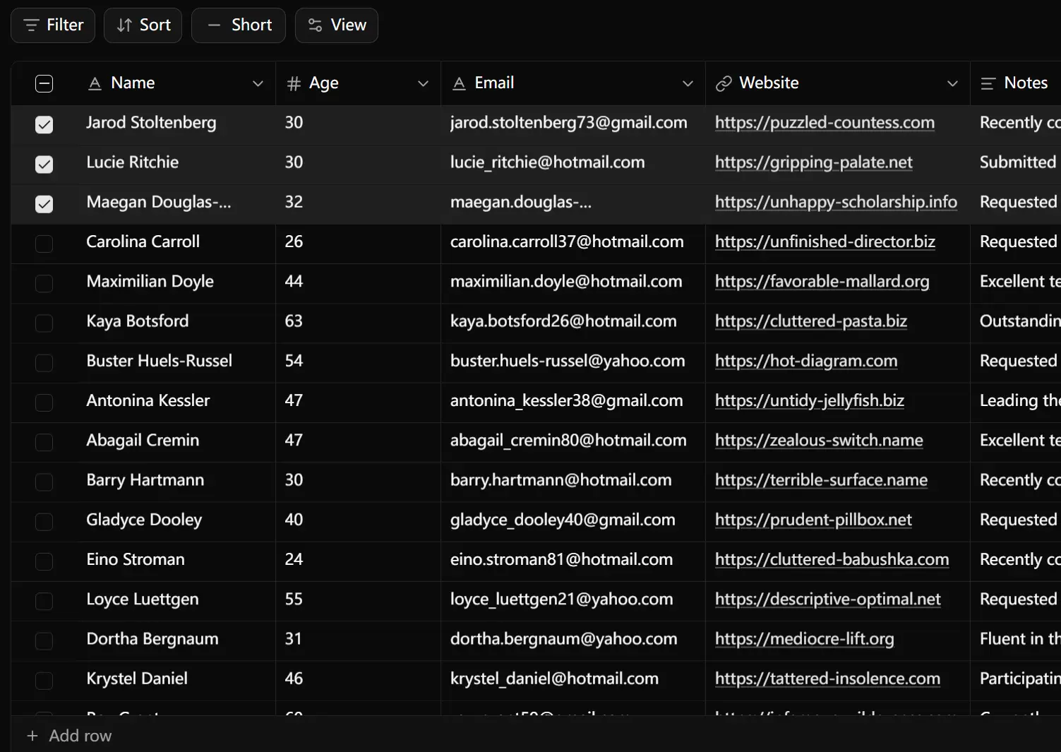
Svelte TableCN is a data table & data grid component that allows you to handle complex table interactions in Svelte applications. The library ports the original TableCN implementation to work with Svelte’s latest version and runes system.
The component supports multiple cell types, including text, numbers, dates, selects, checkboxes, URLs, and file uploads. Each cell type includes specific validation and formatting options that match real data entry patterns.
Features
📝 Multiple Cell Types: Text, number, date, select, multi-select, checkbox, URL, and file cells handle different data formats with built-in validation.
⌨️ Keyboard Navigation: Arrow keys, Tab, Enter, and Escape let users move through cells and edit data without reaching for the mouse.
🎯 Cell Selection: Single-cell selection, multi-select with Ctrl/Cmd, and range selection with Shift support different selection workflows.
📋 Copy and Paste: Copy single cells or ranges and paste data back into the grid with standard keyboard shortcuts.
🔍 Search with Highlighting: Find specific values across all columns and see matches highlighted in the interface.
📊 Column Operations: Sort, filter, pin, resize, and toggle column visibility to customize the view for different tasks.
⚡ Row Virtualization: Render only visible rows to maintain smooth scrolling and interaction with large datasets.
🖱️ Context Menu: Right-click cells to access common operations like cut, copy, paste, and delete.
↩️ Undo and Redo: Track changes and revert edits with standard Ctrl/Cmd + Z keyboard shortcuts.
📏 TypeScript: Includes full type definitions.
🏗️ TanStack Integration: Uses TanStack Table for state management and TanStack Virtual for efficient rendering.
Use Cases
- Admin Dashboards: Manage user lists, product inventories, or transaction logs where inline editing is required.
- Data Management Interfaces: Let users review and update spreadsheet-like information within a web application.
- Internal Tools: Build custom CRM, project management, or analytics panels for team use.
How to Use It
1. To get started, make sure your project has shadcn-svelte configured with Tailwind CSS.
bunx shadcn-svelte@latest init
2. Add Svelte TableCN to your project using the shadcn-svelte CLI.
bunx shadcn-svelte@latest add https://svelte-tablecn.vercel.app/r/data-grid.json3. Import the DataGrid component and useDataGrid hook in your Svelte file. Define your data type with TypeScript to get proper type checking for column definitions and cell values.
<script lang="ts">
  import { DataGrid } from '$lib/components/data-grid';
  import { useDataGrid } from '$lib/hooks/use-data-grid.svelte';
  import type { ColumnDef } from '@tanstack/table-core';
  type Product = {
    id: string;
    name: string;
    price: number;
    category: string;
    inStock: boolean;
    releaseDate: string;
  };
  const categories = ['Electronics', 'Clothing', 'Books', 'Home'];
  let products = $state<Product[]>([
    {
      id: '1',
      name: 'Laptop',
      price: 999,
      category: 'Electronics',
      inStock: true,
      releaseDate: '2024-01-15'
    },
    {
      id: '2',
      name: 'T-Shirt',
      price: 29,
      category: 'Clothing',
      inStock: false,
      releaseDate: '2024-02-20'
    },
    {
      id: '3',
      name: 'Novel',
      price: 15,
      category: 'Books',
      inStock: true,
      releaseDate: '2024-03-10'
    }
  ]);
</script>
4. Configure your columns using TanStack Table column definitions. Each column needs an accessor key that matches your data properties and a meta object that defines the cell variant and options.
<script lang="ts">
  const columns: ColumnDef<Product, unknown>[] = [
    {
      accessorKey: 'name',
      header: 'Product Name',
      meta: { cell: { variant: 'short-text' } }
    },
    {
      accessorKey: 'price',
      header: 'Price',
      meta: {
        cell: {
          variant: 'number',
          min: 0,
          step: 0.01
        }
      }
    },
    {
      accessorKey: 'category',
      header: 'Category',
      meta: {
        cell: {
          variant: 'select',
          options: categories.map(c => ({ label: c, value: c }))
        }
      }
    },
    {
      accessorKey: 'releaseDate',
      header: 'Release Date',
      meta: { cell: { variant: 'date' } }
    },
    {
      accessorKey: 'inStock',
      header: 'In Stock',
      meta: { cell: { variant: 'checkbox' } }
    }
  ];
</script>
5. Initialize the data grid with useDataGrid and pass your data, columns, and event handlers. The hook returns table state and props that you spread onto the DataGrid component.
<script lang="ts">
  const { table, ...dataGridProps } = useDataGrid({
    data: () => products,
    columns,
    onDataChange: (updatedProducts) => {
      products = updatedProducts;
    },
    getRowId: (row) => row.id,
    enableSearch: true,
    enablePaste: true
  });
</script>
<DataGrid {...dataGridProps} {table} height={500} />
6. Add row operations by implementing the onRowAdd and onRowsDelete callbacks. These handlers receive the current state and let you update your data array with new or removed rows.
<script lang="ts">
  const { table, ...dataGridProps } = useDataGrid({
    data: () => products,
    columns,
    onDataChange: (updatedProducts) => {
      products = updatedProducts;
    },
    onRowAdd: () => {
      const newProduct: Product = {
        id: crypto.randomUUID(),
        name: '',
        price: 0,
        category: categories[0],
        inStock: false,
        releaseDate: new Date().toISOString().split('T')[0]
      };
      products = [...products, newProduct];
    },
    onRowsDelete: (rows, indices) => {
      products = products.filter((_, index) => !indices.includes(index));
    },
    getRowId: (row) => row.id,
    enableSearch: true
  });
</script>
7. Handle file uploads by implementing the onFilesUpload callback. The function receives file objects and metadata, processes the uploads, and returns file cell data with URLs and display information.
<script lang="ts">
  const handleFileUpload = async (params: {
    files: File[];
    rowIndex: number;
    columnId: string;
  }) => {
    // Upload files to your storage service
    const uploadedFiles = await Promise.all(
      params.files.map(async (file) => {
        const formData = new FormData();
        formData.append('file', file);
        const response = await fetch('/api/upload', {
          method: 'POST',
          body: formData
        });
        const { url } = await response.json();
        return {
          id: crypto.randomUUID(),
          name: file.name,
          url: url,
          size: file.size,
          type: file.type
        };
      })
    );
    return uploadedFiles;
  };
  const { table, ...dataGridProps } = useDataGrid({
    data: () => products,
    columns,
    onFilesUpload: handleFileUpload,
    onFilesDelete: (params) => {
      console.log('Deleting files:', params.files);
    },
    getRowId: (row) => row.id
  });
</script>
API Reference
useDataGrid Configuration
| Option | Type | Description |
|---|---|---|
data | TData[] | (() => TData[]) | Array of row data or getter function that returns data for reactive updates. |
columns | ColumnDef<TData>[] | Column definitions following TanStack Table format with cell variant metadata. |
getRowId | (row: TData) => string | Function that returns unique identifier for each row. |
enableSearch | boolean | Activates search bar and highlighting across all columns. |
enablePaste | boolean | Allows pasting data from clipboard into cells and ranges. |
readOnly | boolean | Disables all editing interactions when set to true. |
rowHeight | 'short' | 'medium' | 'tall' | 'extra-tall' | Sets row height preset for the entire grid. |
initialState | object | Initial state for sorting, filtering, column visibility, and pagination. |
onDataChange | (data: TData[]) => void | Called with updated data array when any cell value changes. |
onRowAdd | () => void | Triggered when user adds a new row through the interface. |
onRowsAdd | (count: number) => void | Called when multiple rows are added at once with row count. |
onRowsDelete | (rows: TData[], indices: number[]) => void | Receives deleted rows and their indices when rows are removed. |
onFilesUpload | (params: FileUploadParams) => Promise<FileCellData[]> | Handles file upload logic and returns file metadata with URLs. |
onFilesDelete | (params: FileDeleteParams) => void | Called when files are removed from file cells. |
Cell Variant Options
| Variant | Description | Configuration |
|---|---|---|
short-text | Single line text input for brief content. | No additional options required. |
long-text | Multi-line text area with expandable editor for longer content. | No additional options required. |
number | Numeric input with increment/decrement controls. | min, max, step for validation and stepping. |
date | Date picker with calendar interface. | No additional options required. |
select | Dropdown with single selection from predefined options. | options array with label and value pairs. |
multi-select | Multiple selection with tag display for chosen items. | options array with label and value pairs. |
checkbox | Boolean toggle for true/false values. | No additional options required. |
url | URL input with validation and link preview. | No additional options required. |
file | File upload cell with drag and drop support. | maxFiles, maxFileSize, accept for upload constraints. |
row-select | Checkbox in first column for row selection. | No additional options required. |
Column Meta Configuration
meta: {
  label: string;              // Display label for column header
  cell: {
    variant: CellVariant;     // Type of cell editor and renderer
    min?: number;             // Minimum value for number cells
    max?: number;             // Maximum value for number cells
    step?: number;            // Increment step for number cells
    options?: Array<{         // Options for select and multi-select
      label: string;
      value: string;
    }>;
    maxFiles?: number;        // Maximum files for file cells
    maxFileSize?: number;     // Maximum file size in bytes
    accept?: string;          // Accepted file MIME types
  }
}
Keyboard Shortcuts
| Shortcut | Action |
|---|---|
| Arrow Keys | Navigate between cells in all directions. |
| Tab | Move to next cell, wrapping to next row at end. |
| Shift + Tab | Move to previous cell, wrapping to previous row at start. |
| Enter | Start editing current cell or move down when editing. |
| Escape | Cancel editing mode or clear current selection. |
| Ctrl/Cmd + C | Copy selected cells to clipboard. |
| Ctrl/Cmd + V | Paste clipboard content into selected cells. |
| Ctrl/Cmd + X | Cut selected cells to clipboard. |
| Ctrl/Cmd + Z | Undo last change to data. |
| Ctrl/Cmd + Shift + Z | Redo previously undone change. |
| Ctrl/Cmd + F | Open search dialog. |
| Delete | Clear content from selected cells. |
| Backspace | Clear content and start editing. |
Related Resources
- TanStack Table: Headless table library that handles sorting, filtering, pagination, and column operations.
- TanStack Virtual: Virtualization library that renders only visible rows for performance with large datasets.
- shadcn-svelte: Component collection built on Bits UI with Tailwind CSS styling for Svelte applications.
- Bits UI: Headless component library for Svelte that handles accessibility and keyboard interactions.
FAQs
Q: Can I use this component with Svelte 4?
A: No. Svelte TableCN requires Svelte 5+ because it uses the new runes system for reactivity.
Q: How do I customize the appearance of cells?
A: The component uses Tailwind CSS classes through shadcn-svelte. You can modify the component files in your project after installation to adjust colors, spacing, and typography to match your design system.
Q: Does the grid support server-side operations?
A: The component handles all operations client-side by default. You need to implement server-side logic in the onDataChange, onRowAdd, and onRowsDelete callbacks to sync changes with your backend API.

