The Future of Web Dev
The Future of Web Dev
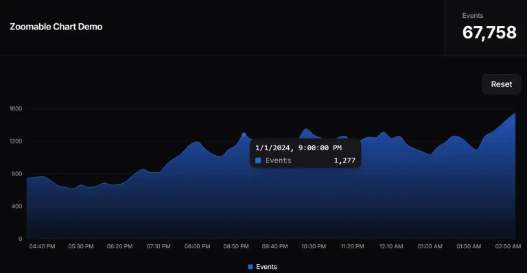
Lightweight Line Chart Component for Data Trends – Sparkline-Svelte
Create lightweight, customizable sparklines in Svelte 5. Visualize data trends with interactive tooltips and labels.

Sparkline-Svelte is a lightweight component for creating responsive, scalable, animated, customizable inline line charts (also called Sparkline) within Svelte applications.
Based on the popular fnando/sparkline library, the component offers significant improvements and is perfect for displaying trends and patterns in data compactly.
Features
✨ Lightweight and Fast: Minimal overhead for quick integration and rendering in Svelte projects.
🤏 Compact Visualization: Ideal for dashboards and reports where space is at a premium.
🔄️ Reactive Data Updates: Charts update automatically when data changes, ensuring visualizations are always current.
🏷️ Data Point Labels: Add custom labels to data points, which then appear in interactive tooltips.
📐 Responsive SVG Output: Sparklines scale seamlessly to fit any container size.
🎨 Highly Customizable: Control line color, fill, cursor, tooltip styles, and more to match your design aesthetic. Colors adjust automatically based on a primary lineColor.
📱 Touchscreen Friendly: Fully functional on touch devices for broad accessibility.
🖱️ Interactive Tooltips: Display detailed data point information on hover for enhanced user interaction.
🔗 Bindable Cursor Data: Access data point details programmatically for more advanced interactions and logic.
Use Cases
- IoT Device Monitoring: Display sensor data from Internet of Things (IoT) devices, such as temperature, humidity, or battery levels. The small size of the sparklines allows for efficient display of numerous data points in a confined space. The ability to customize colors helps to indicate different sensor types or status levels.
- Real-Time Dashboards: Display live data streams, such as stock prices, server metrics, or sensor readings, in a compact and easily digestible format.
- Financial Reports: Visualize financial trends over time, such as revenue growth, expenses, or portfolio performance. You can add data labels to clearly identify the value for each data point.
- Fitness Trackers: Show progress metrics like steps taken, calories burned, or heart rate over a period. The interactive tooltips can display precise values when users hover over specific data points.
- E-commerce Analytics: Visualize sales trends, customer engagement metrics, or website traffic within an e-commerce admin panel. Integrate with various data sources to provide a quick overview of key performance indicators. Use the interactive features to allow users to explore data in more detail.
Installation
npm install sparkline-svelteUsage
1. Create a basic sparkline with the provided data array.
<script>
    import { Sparkline } from "sparkline-svelte";
    let data = [5, 10, 15, 10, 5];
</script>
<Sparkline data={data} />
2. Create a sparkline with custom line color and interactive tooltips. When hovering over a data point, the tooltip will display the label and value in a “label: value” format.
<script>
    import { Sparkline } from "sparkline-svelte";
    let data = [
        { label: "Jan", value: 10 },
        { label: "Feb", value: 15 },
        { label: "Mar", value: 12 },
        { label: "Apr", value: 20 },
        { label: "May", value: 18 }
    ];
</script>
<Sparkline data={data} options={{ lineColor: "#27ae60", interactive: true }} />
3. This sparkline will update every second with new random data.
<script>
    import { Sparkline } from "sparkline-svelte";
    import { $state, $effect } from 'svelte/store'
    let data = $state([]);
    let interval;
    $effect(() => {
        interval = setInterval(() => {
            let value = Math.floor(Math.random() * 100); data.push(value);
            if (data.length > 10) {
                data.shift();
            }
        }, 1000);
        return () => clearInterval(interval);
    });
</script>
<Sparkline data={data} options={{ lineColor: "#e74c3c", interactive: true }} />
4. This allows you to access and display the details of the currently hovered data point.
<script>
    import { Sparkline } from "sparkline-svelte";
    import { $state } from 'svelte/store';
    let data = [5, 10, 15, 10, 5];
    let cursorData = $state(null);
</script>
<Sparkline {data} options={{ interactive: true }} bind:cursorData />
{#if cursorData}
    <p>Current Value: {cursorData.value}</p>
    <p>Index: {cursorData.index}</p>
    <p>X: {cursorData.x}</p>
    <p>Y: {cursorData.y}</p>
    {#if cursorData.label}
        <p>Label: {cursorData.label}</p>
    {/if}
{/if}
Available Props
The Sparkline component accepts several properties to control its appearance and behavior:
| Prop Name | Type | Default | Description |
|---|---|---|---|
data | number[] or { label: string, value: number }[] | Required | An array of numbers or objects (with label and value properties) representing data points. |
options | object | Optional | An object containing various customization options for the sparkline’s appearance and behavior. |
cursorData | DataPoint or null | Optional, Bindable | Represents the current data point under the cursor when the sparkline is interactive. |
options Properties
The options prop accepts an object with the following properties:
| Option Name | Type | Default | Description |
|---|---|---|---|
lineColor | string | #FF476F | The color of the sparkline. Affects other colors automatically (fill, cursor, tooltip). |
fillColor | string | A lighter shade based on lineColor | The fill color under the sparkline. |
cursorColor | string | A contrasting color based on lineColor | The color of the cursor line when hovering over the sparkline. |
strokeWidth | number | 6 | The width of the sparkline line. |
spotRadius | number | 2 | The radius of the data point spots on the sparkline. |
interactive | boolean | false | Enables cursor and tooltip on hover. |
showTooltip | boolean | true | Determines whether to display the tooltip on hover. |
tooltipTextColor | string | Based on tooltipFillColor | The text color of the tooltip. |
tooltipFillColor | string | A contrasting color based on fillColor | The background color of the tooltip. |
tooltipFontSize | string | "0.875rem" | The font size of the tooltip text. |
cursorWidth | number | 2 | The width of the cursor line. |
svgClass | string | "" | CSS class to apply to the SVG element. |
toolTipClass | string | "tooltip-class" | CSS class to apply to the tooltip element. |
cursorData Properties (DataPoint Interface)
The cursorData prop, when bound, provides access to an object with the following properties:
| Property | Type | Description |
|---|---|---|
x | number | The x-coordinate of the data point within the SVG. |
y | number | The y-coordinate of the data point within the SVG. |
value | number | The numeric value of the data point. |
index | number | The index of the data point within the data array. |
label | string | The optional label associated with the data point (if provided). |
Related Resources
- fnando/sparkline: The original JavaScript library that inspired
sparkline-svelte. It offers similar functionality for non-Svelte projects. If you work with plain JavaScript, this is a good place to start. https://github.com/fnando/sparkline
Preview