The Future of Web Dev
The Future of Web Dev
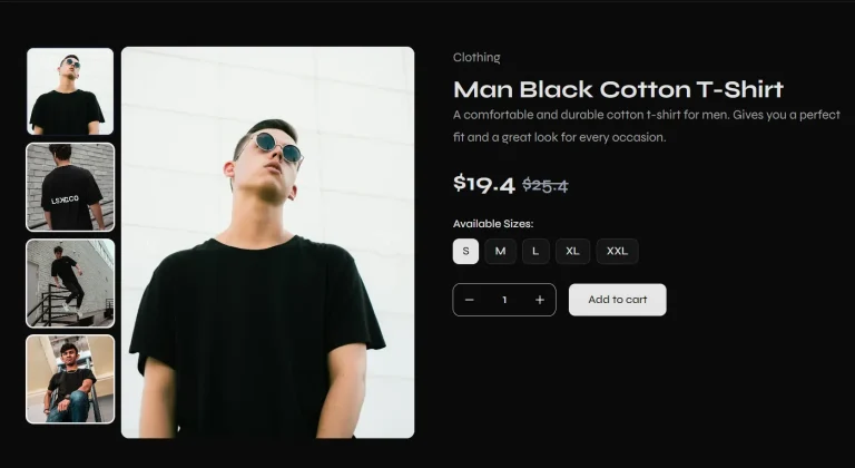
50+ Svelte 5 UI Blocks with Tailwind CSS & shadcn/ui
A collection of pre-built, responsive marketing and UI blocks using Svelte, Tailwind CSS, and shadcn-svelte.
cnblocks is a collection of over 50 ready-to-use UI and marketing blocks built with Svelte, Tailwind CSS, and shadcn-svelte.
The library includes components for essential webapp sections like hero sections, feature highlights, testimonials, and authentication forms. Each block supports both light and dark modes and works across all screen sizes.
Features
📱 Fully Responsive – Perfect display across desktops, tablets, and mobile devices
⚡ Optimized for Performance: Designed for fast loading times and a minimal footprint.
🎨 Easy Customization – Modify colors, styles, and content to match your brand.
⚡ Svelte optimized – Uses latest reactivity features.
Use Cases
- Landing Pages: Quickly assemble engaging landing pages using the diverse Hero, Features, and CTA blocks.
- SaaS Websites: Build out comprehensive SaaS application interfaces with pre-built sections for features, integrations, pricing, and testimonials.
- Marketing Websites: Create compelling marketing sites by combining various content, testimonial, and contact blocks.
- User Authentication Flows: Implement user sign-up, login, and password reset functionalities with modern and secure designs.
- Portfolio Sites: Showcase projects and skills effectively using customizable content and feature blocks.
Installation
Setting up cnblocks in your Svelte project:
1. Create a new Svelte project:
npx [email protected] create my-app2. Add Tailwind CSS:
npx [email protected] add tailwindcss3. Add Shadcn Svelte:
npx shadcn-svelte@next init4. Install JSRepo CLI and blocks of your choice:
npx jsrepo add @sv/cnblocks/hero/hero-one5. Enter the path to save components:
./src/blocksUsage
Here is an example of how to add a hero section:
<script>
import Button from "$lib/components/ui/button/button.svelte";
// You can store Hero Header Component in seperate file
// I have used snippet for better readability
// Hero Header Component
import Logo from "$lib/components/web/Logo.svelte";
import { cn } from "$lib/utils";
import Menu from "@lucide/svelte/icons/menu";
import X from "@lucide/svelte/icons/x";
import ArrowRight from "@lucide/svelte/icons/arrow-right";
import ChevronRight from "@lucide/svelte/icons/chevron-right";
import { scrollY } from "svelte/reactivity/window";
let menuItems = [
{ name: "Features", href: "#a" },
{ name: "Solution", href: "#a" },
{ name: "Pricing", href: "#a" },
{ name: "About", href: "#a" },
];
let menuState = $state(false);
let isScrolled = $derived.by(() => {
if (scrollY.current !== undefined && scrollY.current > 50) {
return true;
}
return false;
});
</script>
<div>
<!-- Scroll below to see the snippet code -->
{@render heroheader()}
<main class="overflow-hidden">
<div
class="absolute inset-0 isolate hidden opacity-65 contain-strict lg:block"
>
<div
class="w-140 h-320 -translate-y-87.5 absolute left-0 top-0 -rotate-45 rounded-full bg-[radial-gradient(68.54%_68.72%_at_55.02%_31.46%,hsla(0,0%,85%,.08)_0,hsla(0,0%,55%,.02)_50%,hsla(0,0%,45%,0)_80%)]"
></div>
<div
class="h-320 absolute left-0 top-0 w-60 -rotate-45 rounded-full bg-[radial-gradient(50%_50%_at_50%_50%,hsla(0,0%,85%,.06)_0,hsla(0,0%,45%,.02)_80%,transparent_100%)] [translate:5%_-50%]"
></div>
<div
class="h-320 -translate-y-87.5 absolute left-0 top-0 w-60 -rotate-45 bg-[radial-gradient(50%_50%_at_50%_50%,hsla(0,0%,85%,.04)_0,hsla(0,0%,45%,.02)_80%,transparent_100%)]"
></div>
</div>
<section>
<div class="relative pt-24 md:pt-36">
<div
class="absolute inset-0 -z-10 size-full [background:radial-gradient(125%_125%_at_50%_100%,transparent_0%,var(--color-background)_75%)]"
></div>
<div class="mx-auto max-w-7xl px-6">
<div class="text-center sm:mx-auto lg:mr-auto lg:mt-0">
<div>
<a
href="#link"
class="hover:bg-background dark:hover:border-t-border bg-muted group mx-auto flex w-fit items-center gap-4 rounded-full border p-1 pl-4 shadow-md shadow-zinc-950/5 transition-colors duration-300 dark:border-t-white/5 dark:shadow-zinc-950"
>
<span class="text-foreground text-sm"
>Introducing Support for AI Models</span
>
<span
class="dark:border-background block h-4 w-0.5 border-l bg-white dark:bg-zinc-700"
></span>
<div
class="bg-background group-hover:bg-muted size-6 overflow-hidden rounded-full duration-500"
>
<div
class="flex w-12 -translate-x-1/2 duration-500 ease-in-out group-hover:translate-x-0"
>
<span class="flex size-6">
<ArrowRight class="m-auto size-3" />
</span>
<span class="flex size-6">
<ArrowRight class="m-auto size-3" />
</span>
</div>
</div>
</a>
</div>
<h1
class="mt-8 text-balance text-6xl md:text-7xl lg:mt-16 xl:text-[5.25rem]"
>
Modern Solutions for Customer Engagement
</h1>
<p class="mx-auto mt-8 max-w-2xl text-balance text-lg">
Highly customizable components for building modern websites and
applications that look and feel the way you mean it.
</p>
<div
class="mt-12 flex flex-col items-center justify-center gap-2 md:flex-row"
>
<div
class="bg-foreground/10 border p-0.5"
style="border-radius: calc(0.5rem + 0.125rem + 4px);"
>
<Button
href="#link"
size="lg"
class="rounded-xl px-5 text-base"
>
<span class="text-nowrap">Start Building</span>
</Button>
</div>
<Button size="lg" variant="ghost" class="rounded-xl px-5">
Request a demo
</Button>
</div>
</div>
</div>
<div
class="relative -mr-56 mt-8 overflow-hidden px-2 sm:mr-0 sm:mt-12 md:mt-20"
>
<div
class="bg-linear-to-b to-background absolute inset-0 z-10 from-transparent from-35%"
></div>
<div
class="inset-shadow-2xs ring-background dark:inset-shadow-white/20 bg-background relative mx-auto max-w-6xl overflow-hidden rounded-2xl border p-4 shadow-lg shadow-zinc-950/15 ring-1"
>
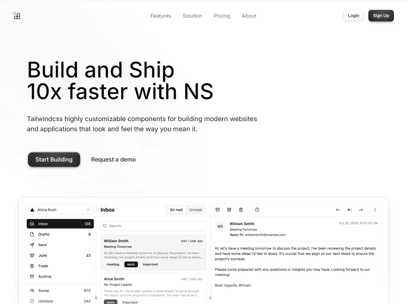
<img
class="bg-background aspect-15/8 relative hidden rounded-2xl dark:block"
src="/mail2.png"
alt="app screen"
width="2700"
height="1440"
/>
<img
class="z-2 border-border/25 aspect-15/8 relative rounded-2xl border dark:hidden"
src="/mail2-light.png"
alt="app screen"
width="2700"
height="1440"
/>
</div>
</div>
</div>
</section>
<section class="bg-background pb-16 pt-16 md:pb-32">
<div class="group relative m-auto max-w-5xl px-6">
<div
class="absolute inset-0 z-10 flex scale-95 items-center justify-center opacity-0 duration-500 group-hover:scale-100 group-hover:opacity-100"
>
<a href="/" class="block text-sm duration-150 hover:opacity-75">
<span> Meet Our Customers</span>
<ChevronRight class="ml-1 inline-block size-3" />
</a>
</div>
<div
class="group-hover:blur-xs mx-auto mt-12 grid max-w-2xl grid-cols-4 gap-x-12 gap-y-8 transition-all duration-500 group-hover:opacity-50 sm:gap-x-16 sm:gap-y-14"
>
<div class="flex">
<img
class="mx-auto h-5 w-fit dark:invert"
src="https://html.tailus.io/blocks/customers/nvidia.svg"
alt="Nvidia Logo"
height="20"
width="auto"
/>
</div>
<div class="flex">
<img
class="mx-auto h-4 w-fit dark:invert"
src="https://html.tailus.io/blocks/customers/column.svg"
alt="Column Logo"
height="16"
width="auto"
/>
</div>
<div class="flex">
<img
class="mx-auto h-4 w-fit dark:invert"
src="https://html.tailus.io/blocks/customers/github.svg"
alt="GitHub Logo"
height="16"
width="auto"
/>
</div>
<div class="flex">
<img
class="mx-auto h-5 w-fit dark:invert"
src="https://html.tailus.io/blocks/customers/nike.svg"
alt="Nike Logo"
height="20"
width="auto"
/>
</div>
<div class="flex">
<img
class="mx-auto h-5 w-fit dark:invert"
src="https://html.tailus.io/blocks/customers/lemonsqueezy.svg"
alt="Lemon Squeezy Logo"
height="20"
width="auto"
/>
</div>
<div class="flex">
<img
class="mx-auto h-4 w-fit dark:invert"
src="https://html.tailus.io/blocks/customers/laravel.svg"
alt="Laravel Logo"
height="16"
width="auto"
/>
</div>
<div class="flex">
<img
class="mx-auto h-7 w-fit dark:invert"
src="https://html.tailus.io/blocks/customers/lilly.svg"
alt="Lilly Logo"
height="28"
width="auto"
/>
</div>
<div class="flex">
<img
class="mx-auto h-6 w-fit dark:invert"
src="https://html.tailus.io/blocks/customers/openai.svg"
alt="OpenAI Logo"
height="24"
width="auto"
/>
</div>
</div>
</div>
</section>
</main>
</div>
{#snippet heroheader()}
<header>
<nav class="fixed z-20 w-full px-2">
<div
class={[
"mx-auto mt-2 max-w-6xl px-6 transition-all duration-300 lg:px-12 rounded-2xl",
isScrolled &&
"bg-background/50 max-w-4xl rounded-2xl border backdrop-blur-lg lg:px-5",
]}
>
<div
class="relative flex flex-wrap items-center justify-between gap-6 py-3 lg:gap-0 lg:py-4"
>
<div class="flex w-full justify-between lg:w-auto">
<a href="/" aria-label="home" class="flex items-center space-x-2">
<Logo />
</a>
<button
onclick={() => (menuState = !menuState)}
aria-label={menuState == true ? "Close Menu" : "Open Menu"}
class="relative z-20 -m-2.5 -mr-4 block cursor-pointer p-2.5 lg:hidden"
>
<Menu
class={[
"m-auto size-6 duration-200",
menuState && "rotate-180 scale-0 opacity-0",
]}
/>
<X
class={[
"absolute inset-0 m-auto size-6 -rotate-180 scale-0 opacity-0 duration-200",
menuState && "rotate-0 scale-100 opacity-100",
]}
/>
</button>
</div>
<div class="absolute inset-0 m-auto hidden size-fit lg:block">
<ul class="flex gap-8 text-sm">
{#each menuItems as item, index}
<li>
<a
href={item.href}
class="text-muted-foreground hover:text-accent-foreground block duration-150"
>
<span>{item.name}</span>
</a>
</li>
{/each}
</ul>
</div>
<div
class={[
"bg-background mb-6 w-full flex-wrap items-center justify-end space-y-8 rounded-3xl border p-6 shadow-2xl shadow-zinc-300/20 md:flex-nowrap lg:m-0 lg:flex lg:w-fit lg:gap-6 lg:space-y-0 lg:border-transparent lg:bg-transparent lg:p-0 lg:shadow-none dark:shadow-none dark:lg:bg-transparent",
menuState ? "block lg:flex" : "hidden lg:flex",
]}
>
<div class="lg:hidden">
<ul class="space-y-6 text-base">
{#each menuItems as item, index}
<li>
<a
href={item.href}
class="text-muted-foreground hover:text-accent-foreground block duration-150"
>
<span>{item.name}</span>
</a>
</li>
{/each}
</ul>
</div>
<div
class="flex w-full flex-col space-y-3 sm:flex-row sm:gap-3 sm:space-y-0 md:w-fit"
>
<Button
variant="outline"
size="sm"
class={cn(isScrolled && "lg:hidden")}
href="#"
>
Login
</Button>
<Button href="#" size="sm" class={cn(isScrolled && "lg:hidden")}>
Sign Up
</Button>
<Button
size="sm"
href="#"
class={cn(isScrolled ? "lg:inline-flex" : "hidden")}
>
Get Strated
</Button>
</div>
</div>
</div>
</div>
</nav>
</header>
{/snippet}
Related Resources
- Svelte – The latest version of the popular JavaScript framework with new reactive primitives – svelte.dev
- Tailwind CSS – Utility-first CSS framework for rapid UI development – tailwindcss.com
- shadcn-svelte – Re-usable components built with Tailwind CSS for Svelte applications – github.com/huntabyte/shadcn-svelte
- JSRepo CLI – Tool for managing and installing code blocks to your projects – jsrepo.com