The Future of Web Dev
The Future of Web Dev
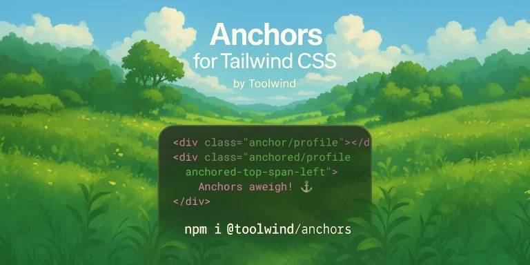
Native CSS Anchor Positioning Plugin for Tailwind CSS
Add CSS Anchor Positioning to Tailwind CSS with declarative utilities. Position elements relative to anchors using simple classes and built-in animations.

Anchors for Tailwind is a plugin that brings declarative support for the CSS Anchor Positioning API directly into the Tailwind CSS framework.
It translates the native CSS anchor positioning properties, such as anchor-name, position-anchor, and position-area into Tailwind utilities.
You can define an anchor point on one element and then “tether” another element to it. The tethered element can be positioned precisely without complex JavaScript calculations, and it can even be configured to reposition itself automatically to avoid overflowing the viewport.
Features
📐 Flexible Positioning: Position elements with utilities like anchored-top-center that map to the 9-cell position-area grid.
🙈 Conditional Visibility: Control when an element appears with anchored-visible-anchor, which shows the element only when its anchor is visible.
↔️ Directional Offsets: Explicitly position elements with top-anchor-bottom-4, which uses calc() and theme spacing for precise offsets.
⚓ Declarative Anchoring: Use anchor/{name} to define an anchor and anchored/{name} to link an element to it.
📏 Dynamic Sizing: Apply w-anchor or h-anchor-width to size an element based on its anchor’s dimensions using anchor-size().
✨ View Transitions: Animate position changes automatically, as every anchored element gets a unique view-transition-name.
Use Cases
- Intelligent Tooltips: Create tooltips that are anchored to a specific element. You can use fallback utilities to make them flip to the top, bottom, or sides to avoid being cut off by the edge of the screen.
- Contextual Menus: Build a dropdown menu that appears next to a button. The menu remains perfectly aligned with the button, and its position can be animated when it appears or disappears using the View Transitions integration.
- Interactive Guided Tours: Develop user onboarding flows where tutorial popups are anchored to the specific UI elements they describe. As the user scrolls, the popups remain attached to their respective elements.
- Responsive Labels: Position a label next to a form input. The label can be sized relative to the input’s height or width and can be repositioned for different screen sizes using responsive variants.
Basic Usage
1. Install the package with the package manager:
npm install -D @toolwind/anchors2. Add the plugin to your Tailwind configuration. The setup differs between Tailwind CSS versions:
Tailwind CSS v4+
/* style.css */
@import "@toolwind/anchors";
Tailwind CSS v3:
// tailwind.config.js
import anchors from "@toolwind/anchors";
export default {
  plugins: [anchors],
  // ... rest of your config
}
3. Create anchor points using the anchor/{name} utility. The plugin automatically handles CSS anchor-name requirements by converting simple identifiers into the required dashed format:
<div class="anchor/my-button">Button</div>This generates the CSS property anchor-name: --tw-anchor_my-button.
4. Position elements relative to anchors using the anchored utilities. You can anchor and position in separate steps:
<div class="anchored/my-button anchored-top-center">Tooltip</div>Or combine both actions in a single utility:
<div class="anchored-top-center/my-button">Tooltip</div>5. Use explicit directional positioning with offset support:
<div class="top-anchor-bottom-4">Positioned with 1rem offset</div>6. Size elements based on their anchor dimensions:
<div class="w-anchor h-anchor-height">Element sized by anchor</div>7. Implement intelligent repositioning when space is constrained:
<div class="anchored-top/my-anchor try-flip-all">Adaptive tooltip</div>Related Resources
- CSS Anchor Positioning Specification – The official W3C specification defining the CSS Anchor Positioning API and its complete feature set
- MDN CSS Anchor Positioning Guide – Comprehensive documentation and examples for understanding native CSS anchor positioning concepts
- Tailwind CSS Documentation – Official Tailwind CSS documentation for understanding utility-first CSS framework concepts and configuration options
FAQs
Q: What is CSS Anchor Positioning?
A: It is a modern CSS API that allows you to position an element relative to one or more other elements (anchors) on the page, without using JavaScript.
Q: Does this plugin have a JavaScript runtime?
A: No, the plugin is fully JIT-compatible and does not require any runtime JavaScript to function. It generates utility classes that map directly to native CSS properties.
Q: How does the plugin handle elements that go off-screen?
A: It provides try-* utilities, like try-flip-all, that correspond to the position-try-fallbacks CSS property. This lets the browser automatically try different positions to keep the element within the viewport.
Q: Can I override the default position: absolute?
A: Yes. The plugin applies position: absolute with zero specificity using :where(). You can override it by adding a class like fixed to the anchored element.
Q: How do the built-in View Transitions work?
A: The plugin automatically assigns a unique view-transition-name to every element using an anchored/* utility. This allows you to create smooth animations for position changes by wrapping the class modifications in document.startViewTransition().