The Future of Web Dev
The Future of Web Dev
Smooth Cubic Bezier Gradients for Tailwind – tw-easing-gradients
Create professional gradients in Tailwind CSS with smooth transitions using cubic bezier curves and perceptually uniform OKLCH colors.
tw-easing-gradients is a Tailwind CSS plugin that generates smooth color transitions using cubic bezier easing curves. It uses CSS easing functions and the OKLCH color space to make color transitions appear more natural.
Standard CSS gradients apply color stops at linear intervals. This often creates harsh lines in the transition, especially with transparency. This plugin calculates color stops along a cubic bezier curve. It uses the color-mix() function within the OKLCH color model for better blending.
Features
🎯 Four Cubic Bezier Functions: Choose from ease, ease-in, ease-out, or ease-in-out to control transition curves.
📐 Eight Gradient Directions: Apply gradients in all cardinal directions (top, right, bottom, left) and diagonals (top-left, top-right, bottom-left, bottom-right).
🎨 OKLCH Color Interpolation: Colors blend in perceptually uniform space to prevent muddy midtones and gray mixing artifacts.
⚡ Zero Runtime Cost: The plugin generates static CSS gradients with multiple color stops. No JavaScript executes at runtime.
🔄 Native from-* and to-* Support: Works directly with Tailwind’s standard gradient color utilities.
📦 Pure CSS Output: Creates standard linear-gradient rules with calculated stop positions.
Use Cases
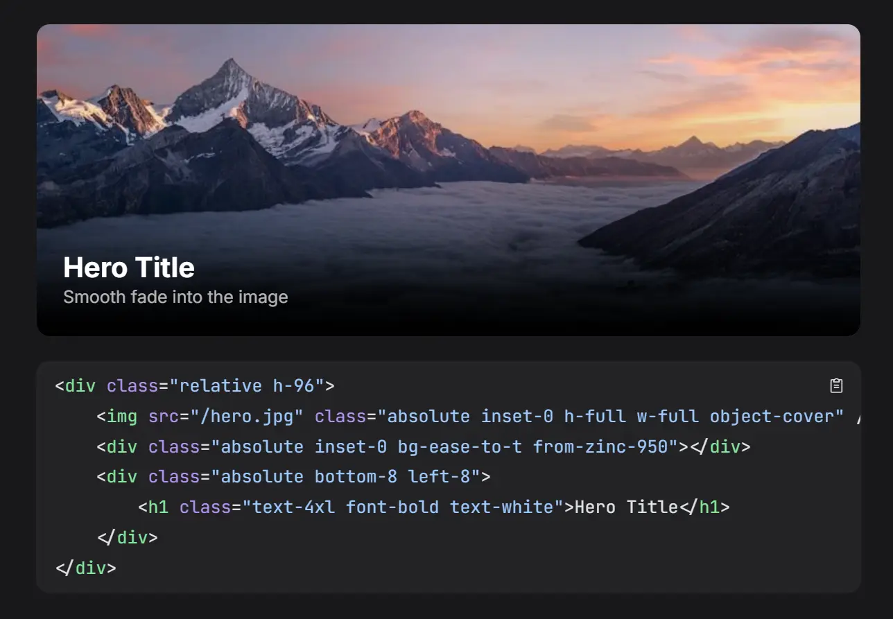
- Transparency Overlays: Fade images to transparent backgrounds naturally for hero sections or card overlays.
- Color Transitions: Blend brand colors smoothly across background elements without visible banding.
- UI Gradients: Create professional gradient backgrounds for buttons, cards, or navigation bars where standard linear gradients look harsh.
- Dark Mode Transitions: Implement smooth color shifts between light and dark theme elements.
How To Use It
1. Add the TailwindCSS plugin to your project.
# pnpm
pnpm add tw-easing-gradients
# npm
npm install tw-easing-gradients
# yarn
yarn add tw-easing-gradients
2. Import the plugin directly into your main CSS file.
@import 'tailwindcss';
@plugin 'tw-easing-gradients';
3. You can optionally configure the resolution of the gradient. The default is 15 stops, which balances smoothness and code size.
@plugin 'tw-easing-gradients' {
  stops: 20;
}
4. Use the new easing classes alongside standard Tailwind color utilities.
Basic Fade to Transparent:
<!-- Smooth fade from black to transparent flowing downwards -->
<div class="bg-ease-to-b from-black to-transparent h-64"></div>
Complex Color Blending:
<!-- Ease-out gradient from Emerald to Cyan flowing downwards -->
<div class="bg-ease-out-to-b from-emerald-400 to-cyan-500 h-64"></div>
Diagonal Gradient:
<!-- Ease-in-out gradient from Amber to Rose flowing to bottom-right -->
<div class="bg-ease-in-out-to-br from-amber-500 to-rose-600 h-64"></div>
5. The plugin provides 4 easing functions that control how color transitions progress:
The bg-ease-to-* utilities apply the standard ease curve, which creates the most natural-looking transition for general use. The curve accelerates at the beginning and decelerates toward the end.
The bg-ease-in-to-* utilities create transitions that start slowly and accelerate toward the end. This works well for elements that should appear to speed up.
The bg-ease-out-to-* utilities create transitions that start quickly and decelerate toward the end. Use these when elements should slow down as they approach their final state.
The bg-ease-in-out-to-* utilities create transitions with slow starts and ends, accelerating only in the middle. This creates symmetrical transitions.
6. You can apply gradients in eight directions using shorthand notation:
<!-- Cardinal directions -->
<div class="bg-ease-to-t from-blue-500">Top</div>
<div class="bg-ease-to-r from-blue-500">Right</div>
<div class="bg-ease-to-b from-blue-500">Bottom</div>
<div class="bg-ease-to-l from-blue-500">Left</div>

<!-- Diagonal directions -->
<div class="bg-ease-to-tl from-blue-500">Top Left</div>
<div class="bg-ease-to-tr from-blue-500">Top Right</div>
<div class="bg-ease-to-bl from-blue-500">Bottom Left</div>
<div class="bg-ease-to-br from-blue-500">Bottom Right</div>
7. The plugin integrates directly with Tailwind’s color system. You can use any color from your palette:
<div class="bg-ease-to-r from-indigo-500 to-cyan-500">
  <!-- Indigo to cyan gradient -->
</div>
<div class="bg-ease-out-to-b from-emerald-400 to-cyan-500">
  <!-- Emerald to cyan with ease-out -->
</div>
<div class="bg-ease-in-out-to-br from-amber-500 to-rose-600">
  <!-- Diagonal gradient with ease-in-out -->
</div>
8. When you omit the to-* utility, gradients automatically fade to transparent. This creates natural overlays:
<div class="bg-ease-to-t from-blue-500">
  <!-- Fades from blue to transparent upward -->
</div>
API Reference
Plugin Configuration
The plugin accepts a configuration object with the following option:
stops (number, default: 15): Controls how many color stops the plugin generates for each gradient. Higher values produce smoother transitions but increase CSS output size. Values between 10 and 25 work well for most applications.
Example configuration:
import plugin from 'tw-easing-gradients';
plugin({ stops: 20 });
Utility Class Pattern
All easing gradient utilities follow this structure:
bg-{easing}-to-{direction}
The {easing} segment accepts ease, ease-in, ease-out, or ease-in-out. The {direction} segment accepts t, r, b, l, tl, tr, bl, or br.
Generated CSS Structure
The plugin generates linear gradients with multiple color stops calculated along easing curves. Each stop uses oklch() with relative color syntax and color-mix() for interpolation. Here’s what the plugin generates for bg-ease-in-out-to-r:
.bg-ease-in-out-to-r {
  background-image: linear-gradient(
    to right,
    var(--tw-gradient-from) 0%,
    oklch(from color-mix(in oklch, var(--tw-gradient-to, oklch(from var(--tw-gradient-from) l c h / 0)) 1.3%, var(--tw-gradient-from)) l c h / alpha) 8.1%,
    oklch(from color-mix(in oklch, var(--tw-gradient-to, oklch(from var(--tw-gradient-from) l c h / 0)) 4.9%, var(--tw-gradient-from)) l c h / alpha) 15.5%,
    /* Additional stops interpolated along the curve */
    oklch(from var(--tw-gradient-to, oklch(from var(--tw-gradient-from) l c h / 0)) l c h / alpha) 100%
  );
}
The var(--tw-gradient-from) and var(--tw-gradient-to) values come from Tailwind’s standard from-* and to-* utilities. The plugin calculates position percentages using cubic bezier math and mixes colors at those positions in OKLCH space.
Easing Curve Implementation
The plugin implements four cubic bezier curves that match CSS timing functions:
- ease:
[0.25, 0.1, 0.25, 1]creates a gentle acceleration and deceleration. - ease-in:
[0.42, 0, 1, 1]accelerates from a slow start. - ease-out:
[0, 0, 0.58, 1]decelerates from a fast start. - ease-in-out:
[0.42, 0, 0.58, 1]creates symmetrical slow starts and ends.
Each curve consists of four control point values that define the bezier function. The plugin samples these curves at regular intervals based on the configured stop count, then calculates the position and color mix percentage for each stop.
Exported Functions
The plugin exports utility functions for programmatic access:
getCoordinates(easing, stops): Returns an array of coordinate objects representing points along the easing curve. Each coordinate has x and y properties representing progress and eased progress respectively.
import { getCoordinates } from 'tw-easing-gradients';
const coords = getCoordinates('ease-in-out', 15);
// Returns: [{ x: 0, y: 0 }, { x: 0.081, y: 0.021 }, ...]
TypeScript Support
The plugin includes complete TypeScript definitions. You can import types for easing functions, directions, and coordinate objects:
import type {
  EasingFunction,
  Direction,
  Coordinate
} from 'tw-easing-gradients';
const easing: EasingFunction = 'ease-in-out';
const direction: Direction = 'br';
FAQs
Q: Does this work with Tailwind CSS v3?
A: No. The plugin requires Tailwind CSS v4 and its new plugin system.
Q: Why use OKLCH instead of RGB or HSL?
A: OKLCH provides perceptually uniform color interpolation. When you blend colors in RGB or HSL, the midpoint often looks muddy or gray. OKLCH maintains color saturation and prevents unwanted hue shifts during transitions.
Q: How much does this increase CSS file size?
A: Each gradient utility generates one linear-gradient rule with 15 color stops by default. The exact size depends on how many easing utilities you use in your project. A single utility adds approximately 800-1200 bytes to your CSS.
Q: Can I use arbitrary color values?
A: Yes. The plugin works with Tailwind’s arbitrary value syntax. You can use from-[#ff0000] or to-[#00ff00] with any valid CSS color value.