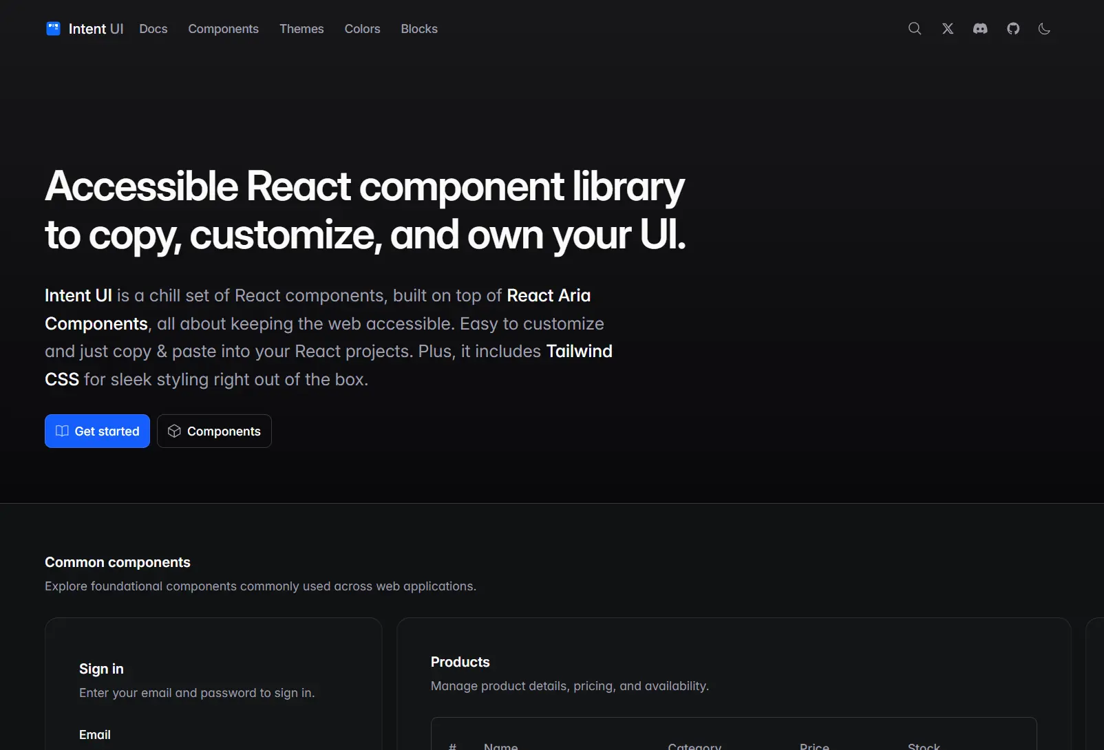
Intent UI is a component library that provides 80+ accessible, production-ready UI components built on React Aria and styled with Tailwind CSS.
You can copy these UI components directly into your Next.js, Vite, or TanStack Router projects without installing the entire package as a dependency.
Features
🎨 Tailwind CSS: All components use Tailwind CSS v4 utility classes.
♿ Accessibility First: Built on React Aria Components with complete ARIA attribute handling, keyboard navigation, and screen reader support.
🎭 Multiple Themes: Includes 11 preset color themes (blue, sky, indigo, emerald, teal, purple, pink, rose, green, lime, cyan) with shades from 50 to 950.
📦 Copy and Paste Installation: Uses the shadcn CLI pattern for component installation.
🌍 Internationalization: Components handle date formatting, number formatting, and text direction automatically based on user locale.
🔧 TypeScript: Written entirely in TypeScript with full type definitions for props, events, and component APIs.
Use Cases
Form-Heavy Applications: Build complex forms with validation, error handling, and accessibility features using text fields, number fields, date pickers, and combo boxes.
Data Tables and Lists: Create sortable, filterable tables and grid lists with keyboard navigation, selection management, and screen reader announcements for state changes.
Design System Foundation: Use Intent UI as the base layer for your company’s design system, customizing the Tailwind configuration and component variants to match your brand guidelines.
Dashboard Interfaces: Construct admin panels and analytics dashboards with charts, progress indicators, navigation elements, and overlay components that maintain accessibility standards.
Installation
Installation for Next.js Projects
Create a new Next.js project using the Intent UI starter template. This template includes all necessary configuration files and dependencies.
npx create-next-app@latest -e https://github.com/intentui/next.js my-app
cd my-app
The starter includes components.json configured for Intent UI, Tailwind CSS v4 setup, and the default theme. You can begin adding components immediately.
Installation for TanStack Router Projects
Initialize a new TanStack Router project with Tailwind CSS support.
npx create-tsrouter-app@latest my-app --template file-router --tailwind
cd my-app
Initialize Intent UI with the default theme.
npx shadcn@latest init @intentui/theme-defaultIf you encounter an error about an existing components.json file, run the init command again. The second execution will complete successfully.
Adding Individual Components
Install specific components using the shadcn CLI with Intent UI package names. The CLI copies component files into your project’s components directory.
npx shadcn@latest add @intentui/button @intentui/text-field @intentui/dialogEach component installs with its TypeScript definition, Tailwind variant configuration, and any required dependencies. You can modify the copied files directly since they become part of your codebase.
Switching Themes
Change the color theme by installing a different theme package. Available themes include blue, sky, indigo, emerald, teal, purple, pink, rose, green, lime, and cyan.
npx shadcn@latest add @intentui/theme-emeraldTheme packages modify your Tailwind configuration to use different color scales. You can also create custom themes by editing the CSS variables in your globals.css file.
Installing All Components
Add every available component in a single command using the all package.
npx shadcn@latest add @intentui/allThis approach works well for prototyping or when you know you will use many components. The installation creates a complete component library in your project.
Overwriting Existing Components
Update components to the latest version using the overwrite flag. This replaces your local files with the current package versions.
npx shadcn@latest add @intentui/button -oUse this flag carefully since it discards any customizations you made to the component files.
Manual Installation Without CLI
Install the required peer dependencies if you prefer manual setup instead of using the CLI.
npm i react-aria-components tailwindcss-react-aria-components tailwind-variants tailwind-merge @heroicons/react tw-animate-cssCopy component files from the Intent UI repository into your project. You need to manually configure Tailwind CSS to scan the component directories and set up the CSS variables for theming.
Using a Button Component
Import the Button component and use it with standard React props. The component handles focus management, keyboard interactions, and ARIA attributes automatically.
"use client"
import { Cog6ToothIcon } from "@heroicons/react/24/outline"
import { Button } from "@/components/ui/button"
export function Component() {
  return (
    <div className="mx-auto flex max-w-xs flex-wrap items-start justify-center gap-6">
      <Button intent="primary">
        <Cog6ToothIcon /> Label
      </Button>
      <Button intent="secondary">
        <Cog6ToothIcon /> Label
      </Button>
      <Button intent="warning">
        <Cog6ToothIcon /> Label
      </Button>
      <Button intent="danger">
        <Cog6ToothIcon /> Label
      </Button>
      <Button intent="outline">
        <Cog6ToothIcon /> Label
      </Button>
      <Button intent="plain">
        <Cog6ToothIcon /> Label
      </Button>
    </div>
  )
}
All Available Components
Buttons
Button Group
Button
File Trigger
Toggle Group
Toggle
Colors
Color Area
Color Field
Color Picker
Color Slider
Color Swatch Picker
Color Swatch
Color Thumb
Color Wheel
Date And Time
Calendar
Date Field
Date Picker
Date Range Picker
Range Calendar
Time Field
Layouts
Container
Navbar
Sidebar
Media
Avatar
Carousel
Navigation
Breadcrumbs
Disclosure Group
Disclosure
Link
Pagination
Tabs
Surfaces
Card
Description List
Heading
Separator
Show More
Text
Visualizations
Area Chart
Bar Chart
Bar List
Chart
Line Chart
Pie Chart
Tracker
Collections
Choice Box
Dropdown
Grid List
List Box
Menu
Table
Tag Group
Tree
updated
Controls
Command Menu
Context Menu
Keyboard
Slider
Switch
Toolbar
Drag And Drop
Drop Zone
Forms
Checkbox Group
Checkbox
Field
Input Otp
Input
Number Field
Radio Group
Search Field
Tag Field
Text Field
Textarea
Overlays
Dialog
Drawer
Modal
Popover
Sheet
Tooltip
Statuses
Badge
Loader
Meter
Note
Progress Bar
Progress Circle
Skeleton
Toast
Pickers
Combo Box
Multiple Select
Select
Related Resources
- React Aria Components provides the accessibility foundation that Intent UI builds upon.
- Tailwind CSS powers the styling system used throughout Intent UI.
- shadcn/ui uses a similar copy-paste installation approach for React components.
FAQs
Q: Is Intent UI a standard npm package?
A: No. Intent UI works as a copy-paste library. You download the source code for each component directly into your project.
Q: Can I use this with frameworks other than React?
A: No. Intent UI relies on React and React Aria Components.
Q: Is the library free for commercial use?
A: Yes. You can use it in personal and commercial projects without attribution.
Q: How do I customize the styling?
A: You customize components by editing the Tailwind classes directly in the copied component files.