The Future of Web Dev
The Future of Web Dev
40+ Copy-paste Widgets for React/Next.js – Wigggle UI
40+ free, open-source widgets for React and Next.js. Easily integrate calendars, clocks, stocks, sports, and more into your shadcn/ui projects.
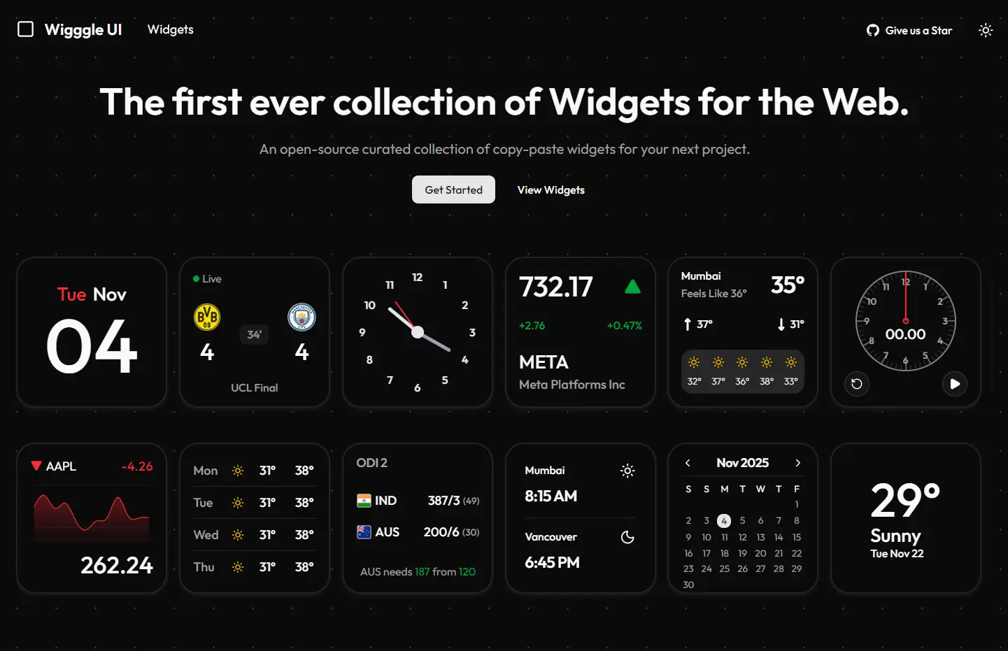
Wigggle UI is a React/Next.js component library that provides 40+ customizable, copy-paste widgets for calendar, clock, weather, sports, and stock market displays.
The component library is built with shadcn/ui architecture, so you can easily add widgets to your projects through CLI commands or direct code copying.
Features
📦 Free and Open Source: Access all 40+ widgets without cost, with complete source code available for modification and learning.
🔧 shadcn/ui Integration: Works directly with shadcn/ui CLI for one-command installation into existing projects.
📅 Various Widgets: Choose from calendar, clock, weather, sports, and stock market components for different application needs.
🔄 Active Development: Receives regular updates with new widgets, bug fixes, and feature improvements from the maintainer.
Use Cases
- Dashboard Applications: Build admin panels or analytics dashboards with ready-made clock, calendar, and stock market widgets that display real-time information.
- Weather Applications: Integrate weather display components into travel apps, outdoor activity planners, or location-based services without creating weather UI from scratch.
- Sports Platforms: Add live sports score displays and statistics widgets to fantasy sports apps, sports news sites, or team management tools.
- Financial Tools: Include stock market widgets in investment tracking apps, portfolio managers, or financial news platforms for quick market data visualization.
How to Use It
1. Start by browsing the Wigggle UI website to view all available widgets and their live previews.
2. Install a widget using the shadcn/ui CLI. For a calendar widget installation, run one of these commands based on your package manager:
pnpm dlx shadcn@latest add https://wigggle-ui.vercel.app/r/calendar-sm-01.jsonyarn dlx shadcn-ui@latest add https://wigggle-ui.vercel.app/r/clock-sm-01.jsonnpx shadcn-ui@latest add https://wigggle-ui.vercel.app/r/clock-sm-01.jsonbunx --bun shadcn@latest add https://wigggle-ui.vercel.app/r/calendar-sm-01.jsonThis will add the widget’s source code to your project’s components directory. You can then import and use it like any other React component.
2. Copy the widget code directly from the preview page for manual installation.
Import the necessary shadcn/ui dependencies if you choose manual copying. The Widget and WidgetContent components come from shadcn/ui’s base components, and Label provides text display functionality. Install these dependencies through shadcn/ui CLI if they don’t exist in your project.
Here’s an example of a basic calendar widget implementation:
import * as React from "react";
import { Widget, WidgetContent } from "@/components/ui/widget";
import { Label } from "@/components/ui/label";
export default function WidgetDemo() {
  const now = new Date();
  const day = now.toLocaleDateString("en-US", { weekday: "short" });
  const month = now.toLocaleDateString("en-US", { month: "short" });
  const date = now.getDate().toString().padStart(2, "0");
  return (
    <Widget>
      <WidgetContent className="mx-auto flex-col items-start">
        <div className="flex w-full items-center justify-center gap-2">
          <Label className="text-destructive text-2xl">{day}</Label>
          <Label className="text-2xl">{month}</Label>
        </div>
        <Label className="text-8xl">{date}</Label>
      </WidgetContent>
    </Widget>
  );
}
3. Import and render this component within your application.
4. Customize the widgets by modifying className props and component structure. Change the text size, color schemes, or layout orientation to match your design requirements.
Related Resources
- shadcn/ui: The underlying component system that Wigggle UI builds upon, providing base components and CLI installation infrastructure.
- Tailwind CSS: The utility-first CSS framework used for styling all Wigggle UI components.
- React Documentation: Official React guides covering hooks, component patterns, and state management used throughout the widget library.
- Next.js Documentation: Reference materials for integrating Wigggle UI widgets into Next.js applications with server and client component patterns.
FAQs
Q: Can I modify the widget code after installation?
A: Yes, all widgets install as editable source code in your project. Modify any aspect of the components, including styling, functionality, and structure.
Q: Do these widgets work with TypeScript projects?
A: The widgets support TypeScript out of the box. The shadcn/ui installation process generates TypeScript-compatible components if your project uses TypeScript configuration.
Q: Are the widgets responsive for mobile devices?
A: The widgets use Tailwind CSS responsive utilities and adapt to different screen sizes. Customize responsive behavior by adjusting the Tailwind classes in each widget’s code.