The Future of Web Dev
The Future of Web Dev
40+ Animated UI Compopnents with Framer Motion – Framer Ground
40+ copy-paste animated components for React and Next.js. Built with Framer Motion and TailwindCSS. No installation required, just copy and customize.
Framer Ground is a collection of open-source animated UI components built with React/Next.js, TailwindCSS, and Framer Motion.
You can integrate these animated components into your project through copy and code. This avoids adding another dependency to your project.
Features
🎨 Copy-Paste Architecture: No npm installation required. Each component can be directly copied into your project, similar to the shadcn/ui approach.
⚡ Performance-Optimized Animations: Built with Framer Motion for smooth 60fps animations.
🎯 TypeScript Support: All components include full TypeScript definitions for type safety and better developer experience.
🎨 TailwindCSS: Uses utility-first CSS classes for layout and structure while leaving visual customization open to your preferences.
How to Use It
1. Install the core libraries
npm install tailwind-merge clsx lucide-react tailwindcss-animate framer-motion2. Update your tailwind.config.js file to include the required animation plugin.
module.exports = {
  // ... other config
  plugins: [require("tailwindcss-animate")],
};
3. Framer ground relies on a utility function to merge Tailwind classes dynamically. Create a file named utils.ts inside your libs or utils folder and add this code:
import { type ClassValue, clsx } from "clsx";
import { twMerge } from "tailwind-merge";
export function cn(...inputs: ClassValue[]) {
  return twMerge(clsx(inputs));
}
4. Some components use a custom utility class called .center for alignment. You can add this to your global CSS file or rely on Tailwind utilities directly.
/* globals.css */
.center {
  @apply flex items-center justify-center;
}
5. Choose a UI component from the official documentation, create a file for it, and paste the code. For example, to use the Checkout button:
// components/buttons/checkout.tsx
"use client";

import React, { useState } from "react";
import { motion, AnimatePresence } from "framer-motion";
import { ShoppingCart } from "lucide-react";

const Checkout = () => {
  const variants = {
    initial: {
      height: 10,
      opacity: 0,
    },
    animate: {
      height: 100,
      opacity: 1,
    },
    exit: {
      height: 10,
      opacity: 0,
    },
  };

  const [focus, setFocus] = useState(false);
  return (
    <div className="h-full w-full center">
      <div className="relative z-0 ">
        <motion.button
          onMouseEnter={() => setFocus(true)}
          onMouseLeave={() => setFocus(false)}
          className="h-12 px-10 text-primary-foreground overflow-hidden z-10 flex items-center gap-2 rounded-xl bg-primary"
        >
          <span className="text-lg font-semibold">Checkout</span>
          <span className="relative">
            <ShoppingCart className="h-5 w-5 ml-2" />
            <motion.span
              animate={{
                y: focus ? "-100%" : 0,
                opacity: focus ? 0 : 1,
              }}
              transition={{
                duration: 0.2,
              }}
              className="text-xs h-4 w-4 rounded-full bg-primary text-primary-foreground -top-1.5 -right-1.5 absolute"
            >
              3
            </motion.span>
          </span>
          <AnimatePresence onExitComplete={() => setFocus(false)}>
            {focus && (
              <motion.div
                variants={variants}
                initial="initial"
                animate="animate"
                exit="exit"
                className="absolute bg-primary/50 text-primary-foreground p-2 flex text-lg -z-10 bottom-0 w-full left-0 rounded-xl"
              >
                3 items in cart
              </motion.div>
            )}
          </AnimatePresence>
        </motion.button>
      </div>
    </div>
  );
};

export default Checkout;
6. Import the component into your page or layout file.
import Checkout from "@/components/buttons/Checkout";
export default function Page() {
return (
<main className="p-10">
<Checkout />
</main>
);
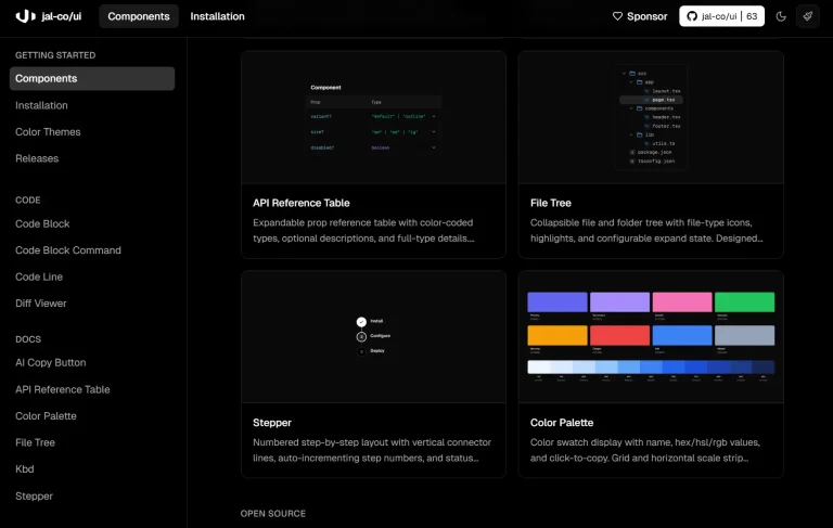
}Available UI Components
Buttons
- Checkout
- Create
- Delete
- Github Button
- Second brain
- Sparkles
Cards
- Birthday
- Booking
- Calendar
- Call
- Counter
- Experience
- Frequency
- Hello world
- Linear
- Morphing pill
- Notch
- Notch-two
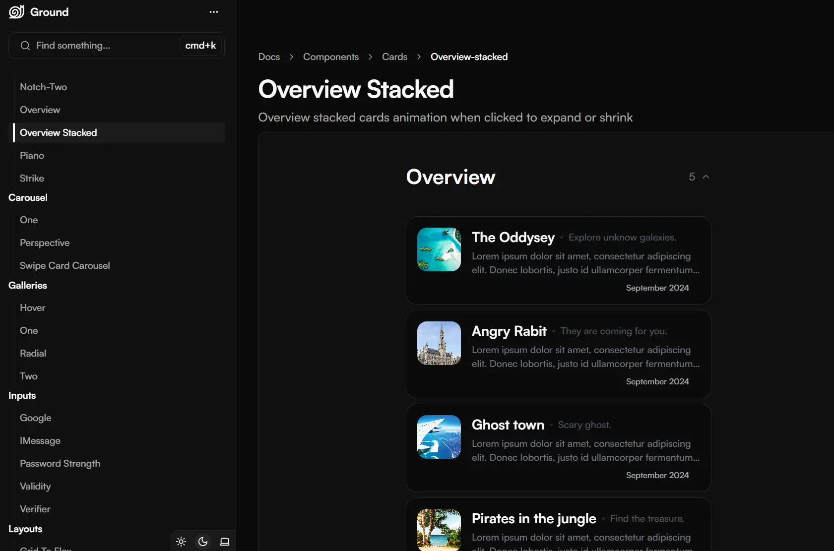
- Overview
- Overview Stacked
- Piano
- Strike
Carousel
- One
- Perspective
- Swipe Card Carousel
Inputs
- iMessage
- Password strength
- Validity
- Verifier
Layouts
- Grid to Flex
- Scroll Count
Menus
- Circular
- Hamburger
- Mode toggle
Navbars
- Liquid
- Reveal
- Vercel
Related Resources
- Framer Motion: The animation library powering all Framer Ground components, offering declarative animations and gestures for React.
- TailwindCSS: The utility-first CSS framework used for component styling and responsive design.
- shadcn/ui: A component collection using the same copy-paste philosophy, excellent for building complete UI systems alongside Framer Ground.
- Berlix UI: Another animation-focused component library with similar goals but different animation styles and approaches.
FAQs
Q: Is Framer Ground an npm package?
A: No, it is not a package you install via npm. It is a collection of code snippets that you copy and paste directly into your project files.
Q: Can I use Framer Ground with other UI libraries like Material-UI or Chakra UI?
A: Yes. Framer Ground focuses solely on animations and effects, not complete UI systems. You can integrate these animated components alongside any UI library, though you’ll need TailwindCSS configured in your project.
Q: How do I customize the colors and fonts in Framer Ground components?
A: The components intentionally leave visual styling minimal. You can modify colors by adjusting TailwindCSS classes in the component code or by adding custom classes through the className prop.