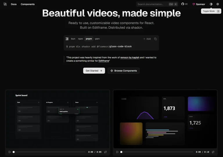
The Future of Web Dev
The Future of Web Dev
Build SaaS Billing UI Faster with Billing SDK for Next.js/React
Production-ready billing UI for Next.js/React apps. Billing SDK includes pricing tables, subscription flows, and payment integration with TypeScript support.

Billing SDK is a component library from Dodo Payments that provides type-safe billing and subscription management UI components for Next.js/React apps.
Each component comes with full TypeScript support and Tailwind CSS styling that works perfectly with shadcn/ui.
Features
🎨 Production-Ready: Ships with pricing tables, subscription management interfaces, usage meters, cancellation flows, banner notifications, and more.
⚙️ CLI Setup: Command-line tools for single-command component installation, automated project initialization, and payment provider configuration.
🔧 Full-Stack Integration: Includes pre-built API routes for checkout processing, customer management, product catalogs, and webhook handling for Next.js applications.
🎨 Theme Flexibility: Supports multiple built-in themes including Classic and Minimal variants, plus custom theme tokens you can modify through CSS variables.
🔌 Payment Provider Support: Integrates with Dodo Payments out of the box, with additional provider support in development.
📦 Component Registry System: Uses a centralized registry for distributing components that ensures version consistency across projects.
Use Cases
- SaaS Application Billing: Add complete billing interfaces to your SaaS product, from initial pricing pages through subscription management and usage tracking dashboards.
- Subscription Service Upgrades: Build upgrade and downgrade flows that show plan comparisons, price differences, and prorated charges before users commit to changes.
- Usage-Based Pricing Models: Track and display API quotas, compute usage, storage limits, or request counts with real-time meter components that update as users consume resources.
- Customer Retention Workflows: Implement cancellation flows with feedback collection, alternative plan suggestions, and discount offers to reduce churn.
How To Use It
1. Install components into an existing React or Next.js project with Tailwind CSS configured. You can add individual components through shadcn or use the Billing SDK CLI directly.
For example, to add a pricing table component using the shadcn/ui CLI:
# npx
npx shadcn@latest add @billingsdk/pricing-table-one
# pnpm
pnpm dlx shadcn@latest add @billingsdk/pricing-table-one
# yarn
yarn dlx shadcn@latest add @billingsdk/pricing-table-one
# bun
bunx shadcn@latest add @billingsdk/pricing-table-one
2. For new projects or full billing integration, run the CLI initialization command:
npx @billingsdk/cli init3. After installing a pricing table component, create a configuration file to define your plans. The CLI generates this file automatically during component installation:
// lib/billingsdk-config.ts
export const plans = [
  {
    id: 'starter',
    title: 'Starter',
    description: 'Perfect for small teams',
    monthlyPrice: '$0',
    yearlyPrice: '$0',
    buttonText: 'Get Started',
    features: [
      { name: 'Up to 5 team members', icon: 'check' },
      { name: 'Basic analytics', icon: 'check' },
      { name: 'Community support', icon: 'check' }
    ]
  },
  {
    id: 'professional',
    title: 'Professional',
    description: 'For growing businesses',
    monthlyPrice: '$29',
    yearlyPrice: '$290',
    buttonText: 'Start Free Trial',
    features: [
      { name: 'Unlimited team members', icon: 'check' },
      { name: 'Advanced analytics', icon: 'check' },
      { name: 'Priority support', icon: 'check' },
      { name: 'Custom integrations', icon: 'check' }
    ]
  }
];
4. Import and use the component:
"use client"

import { PricingTableOne } from "@/components/billingsdk/pricing-table-one"
import { plans } from "@/lib/billingsdk-config"

export function PricingTableOneDemo() {
  return (
    <PricingTableOne
      plans={plans}
      title="Pricing"
      description="Choose the plan that's right for you"
      onPlanSelect={(planId) => console.log("Selected plan:", planId)}
      size="medium" // small, medium, large
      theme="classic" // minimal or classic
      className="w-full"
    />
  )
}
5. UI components included
- Pricing Tables: Includes seven different variants for various use cases.
- Subscription Management: Components for managing plans, viewing invoice history, and updating subscription details.
- Usage-based Pricing: Tools for displaying usage tables and limited offer dialogs.
- Plan Updates: UI for handling plan upgrades, downgrades, and cancellations.
- Billing & Usage Analytics: Components for billing settings, usage meters, and viewing upcoming charges.
- Banners: Top banners for announcements and promotions.
- Trial Management: Cards to display trial expiry information.
- Payment Processing: UI for payment details, method selection, and success dialogs.
6. Customize the appearance of components by modifying the CSS variables in your global.css file.
:root {
  --radius: 0.625rem;
  --background: oklch(1 0 0);
  --foreground: oklch(0.145 0 0);
  --card: oklch(1 0 0);
  --card-foreground: oklch(0.145 0 0);
  --popover: oklch(1 0 0);
  --popover-foreground: oklch(0.145 0 0);
  --primary: oklch(0.205 0 0);
  --primary-foreground: oklch(0.985 0 0);
  --secondary: oklch(0.97 0 0);
  --secondary-foreground: oklch(0.205 0 0);
  --muted: oklch(0.97 0 0);
  --muted-foreground: oklch(0.556 0 0);
  --accent: oklch(0.97 0 0);
  --accent-foreground: oklch(0.205 0 0);
  --destructive: oklch(0.577 0.245 27.325);
  --border: oklch(0.922 0 0);
  --input: oklch(0.922 0 0);
  --ring: oklch(0.708 0 0);
}
.dark {
  --background: oklch(0.145 0 0);
  --foreground: oklch(0.985 0 0);
  --card: oklch(0.205 0 0);
  --card-foreground: oklch(0.985 0 0);
  --popover: oklch(0.205 0 0);
  --popover-foreground: oklch(0.985 0 0);
  --primary: oklch(0.922 0 0);
  --primary-foreground: oklch(0.205 0 0);
  --secondary: oklch(0.269 0 0);
  --secondary-foreground: oklch(0.985 0 0);
  --muted: oklch(0.269 0 0);
  --muted-foreground: oklch(0.708 0 0);
  --accent: oklch(0.269 0 0);
  --accent-foreground: oklch(0.985 0 0);
  --destructive: oklch(0.704 0.191 22.216);
  --border: oklch(1 0 0 / 10%);
  --input: oklch(1 0 0 / 15%);
  --ring: oklch(0.556 0 0);
}
Related Resources
- shadcn/ui: Component library that Billing SDK is designed to work alongside.
- Next.js Documentation: Official Next.js guides covering App Router, API routes, and server components used in Billing SDK templates.
- Tailwind CSS: CSS framework documentation for customizing component styles and theme tokens.
- Dodo Payments: Payment provider documentation for API integration and webhook configuration.
FAQs
Q: Can I use Billing SDK with an existing shadcn/ui project?
A: Yes. Billing SDK components integrate directly with shadcn/ui projects. Install components using the shadcn CLI with the @billingsdk scope, and they will follow your existing shadcn configuration for component paths and styling.
Q: How do I connect Billing SDK components to my payment provider?
A: Run the CLI init command and select your payment provider during setup. The CLI generates API routes and webhook handlers that connect your components to the provider’s API. You need to add your API keys to environment variables after initialization.
Q: What happens to my data when I install components?
A: Billing SDK components are UI-only and don’t store data. You connect them to your own backend API routes and database. The CLI-generated templates include example API routes that you modify to work with your data layer.