The Shadcn Extension component library provides additional UI components that extend the functionality of Shadcn/ui to help you build more feature-rich web applications quickly.
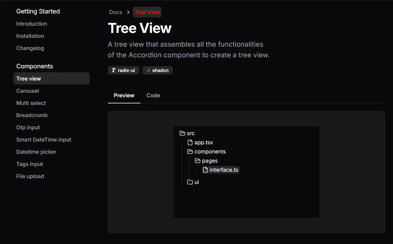
This library includes UI components such as tree view, carousel, multi-select, breadcrumb, OTP input, and various date/time pickers.
All UI Components follow Shadcn’s modular philosophy—copy desired elements into projects, adjust Tailwind classes, and retain full control over styling.
Features
🔧 Customizable Elements: Modify components to match your design specifications.
🚀 Quick Setup: Get started rapidly by leveraging components built on the stable Shadcn/ui library.
⚡ Ease of Integration: Copy and paste code to add components without additional installation.
Use Cases
- Building an E-commerce Dashboard: You could use the
Tree viewcomponent to display product categories and subcategories, making navigation intuitive for administrators. TheMulti selectcould help manage product tags or filter options. - Creating a Project Management Tool: The
Breadcrumbcomponent provides clear navigation for users drilling down into tasks and subtasks. - Developing a File Management System: The
File uploadcomponent handles file inputs, while theTags Inputcould help users organize and categorize their files. - Interactive Forms: Use
Otp inputto build verification forms. UseSmart DateTime input,Datetime pickerto build appointment apps.
Installation
Before you start, you need a basic understanding of ReactJs/NextJs, Tailwinds, and Shadcn ui.
To use Shadcn extension, first, configure the Shadcn/ui components it uses. You can do this by checking out instructions from Shadcn/ui.
Usage
Shadcn extension works on a copy-and-paste basis. Find the component you need on the Shadcn extension website, copy the code, and paste it into your project.
Here’s how you create a carousel component:
import {
  Carousel,
  CarouselMainContainer,
  CarouselThumbsContainer,
  SliderMainItem,
  SliderThumbItem,
} from "@/components/extension/carousel";
const CarouselExample = () => {
  return (
    <Carousel orientation="vertical" className="flex items-center gap-2">
      <div className="relative basis-3/4 ">
        <CarouselMainContainer className="h-60">
          {Array.from({ length: 10 }).map((_, index) => (
            <SliderMainItem
              key={index}
              className="border border-muted flex items-center justify-center h-52 rounded-md"
            >
              Slide {index + 1}
            </SliderMainItem>
          ))}
        </CarouselMainContainer>
      </div>
      <CarouselThumbsContainer className="h-60 basis-1/4">
        {Array.from({ length: 10 }).map((_, index) => (
          <SliderThumbItem
            key={index}
            index={index}
            className="rounded-md bg-transparent"
          >
            <span className="border border-muted flex items-center justify-center h-full w-full rounded-md cursor-pointer bg-background">
              Slide {index + 1}
            </span>
          </SliderThumbItem>
        ))}
      </CarouselThumbsContainer>
    </Carousel>
  );
};
export default CarouselExample;
Related Resources
- Shadcn/ui – The base component library that Shadcn Extension builds upon. It provides the foundation and styling system that the extension uses. https://ui.shadcn.com/
- Radix UI – Many Shadcn components are built using Radix UI primitives. Understanding Radix can help you customize the components further. https://www.radix-ui.com/
- Tailwind CSS – The CSS framework used by Shadcn/ui and Shadcn Extension. Knowledge of Tailwind is essential for customizing the components. https://tailwindcss.com/
FAQs
Q: Do I need to install Shadcn extension separately?
A: No, Shadcn extension uses a copy-and-paste approach. You don’t need a separate installation process beyond setting up the required Shadcn/ui components.
Q: How do I customize the appearance of the components?
A: You can customize the components using Tailwind CSS classes through the className prop, just like with regular Shadcn/ui components.
Q: How does this differ from the main Shadcn UI library?
A: It extends Shadcn UI with new components rather than replacing existing ones.
Q: Does it work with other UI libraries like Material UI?
A: No. The system depends on Shadcn UI’s specific Tailwind configuration.